1. Forums
  2. Discord
  3. About Mapcore
  4. Patreon Supporters
  • Login
  • Register
  • Search
This Thread
  • Everywhere
  • This Thread
  • This Forum
  • Articles
  • Pages
  • Forum
  • More Options
  1. Mapcore
  2. Discussions
  3. Level Design

[WIP][CSGO]de_tango

  • Michael Greenwood
  • October 18, 2015 at 10:38 PM
  • Michael Greenwood
    • October 18, 2015 at 10:38 PM
    • #1

    Now that I've decided on a name and it's been playtested, it seemed a good idea to make a finalized thread for it. Please leave any ideas or feedback here, I'd really appreciate any help before I do major/minor re-paths, scrap it or go ahead with texturing.


    Description:[/b]

    - Large B-site with a main entrance onto site with a path to continue around and up a set of stairs to enter the site from the rooftop balcony. Entrance to site at back right for CTs and behind building from mid.

    - Mid is either entered by CT through A or B with no direct path from CT. CT gets to mid about 1 second before Ts can peak from their path from A (which is raised up with cover provided by a series of archways.

    - A-Site has 1 main entrance with the meeting point between teams at the two horizontal barriers in the room before the site. The room is set up so if T's are stymied in that room, they can smoke and run across into mid.

    -A-site is a large covered structure with 4 main pillars. The site is overlooked by a manor house with a semicircle balcony up front and a small side balcony. The strong sightline from the balcony is mitigated by timing making it so T's can get onto the site area at the same moment the CT would be getting onto the balcony. There are also multiple smokes over the walls.

    - Tspawn -> B: 17s, engagement happens at 14s; Tspawn -> A: 13s; Tspawn-> B through mid: 15s; CT-> B: 6s; CT-> A: 8s, 13s to door; rotate through CT: 14s; rotate through mid: 12s

    -Theme will be based on south american coastal towns: http://www.digitaljournal.com/img/6/8/7/0/1/…t_La_Popa_1.jpg https://adventuresinfoodandculture.files.wordpress.com/2014/01/cartag…lombia-008a.jpg

    Overview

    [Blocked Image: http://i.imgur.com/FCjeWSE.jpg]

    Pics:

    T-Spawn. Minor thematic additions to give first idea of how I want it to look.
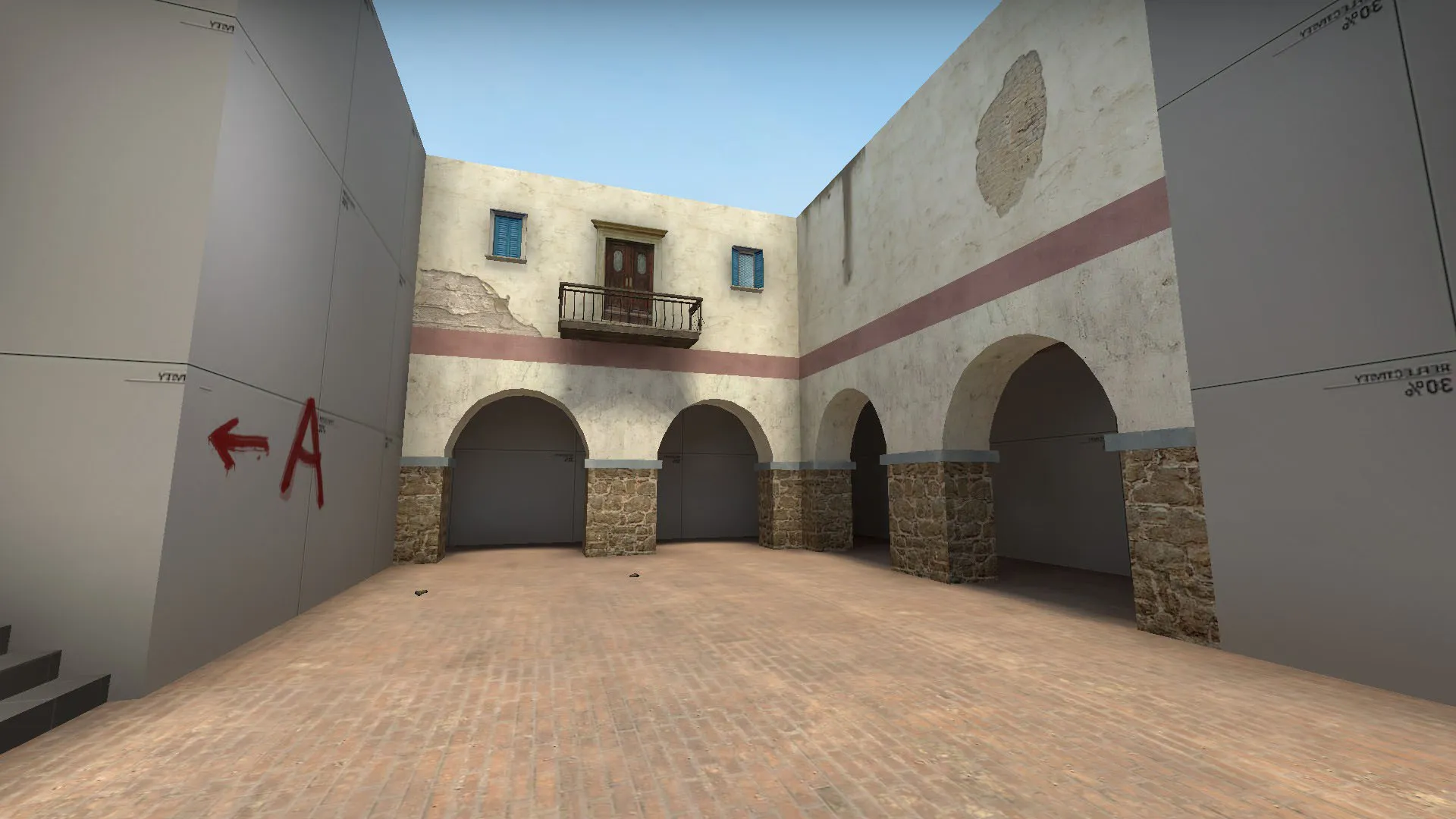

    Rest of Images

    Quote

    [Blocked Image: http://i.imgur.com/OmWQlbL.jpg]

    Looking into A site from T.

    [Blocked Image: http://i.imgur.com/fIwvMFS.jpg]

    Looking at A site just within the entrance

    [Blocked Image: http://i.imgur.com/7KymGjn.jpg]

    B site from CT

    [Blocked Image: http://i.imgur.com/G68tBrG.jpg]

    B site from T

    [Blocked Image: http://i.imgur.com/yngsXOC.jpg]

    Mid from T

    [Blocked Image: http://i.imgur.com/1BYkNkn.jpg]

    Mid from CT A site.

    Display More
  • deXii
    • October 19, 2015 at 4:21 AM
    • #2

    I really like the second picture you posted, it'd be great to see lots of color. Maybe make some balconies like those and have them be accessible.

  • laminutederire
    • October 19, 2015 at 9:28 AM
    • #3

    Those passage before the balconies for T's to B have to be simplified, it made a lot of very flanky situations during the playtest.

    As mentioned too by others, the models on bombsites are sometimes creating weird angles (the wooden palettes on B for instance)

  • jackophant
    • October 19, 2015 at 9:52 AM
    • #4

    You have the bombsites the wrong way round in game/radar.

    I would advise using "bot_show_battlefront 1" to see where team rush times meet to get a feel for how teams will occupy an area because right now CTs molest the Ts from all angles.

    Mid is very wide open and CTs can close the distance very quickly.

    For Ts, the left connector whcih takes you out on to the bombsite with the arches is such a massive risk as you can be shot from literally every angle, including the pallet bombsite (which massively needs to have brushes in the pallets to stop nasty viewing angles).

    Speaking of the pallet bombsite, you can plant as a T (going long) pretty much outside the bombsite, and can also plant for mid which can be camped from a long way away, especially using wall cover on the arch bombiste.

    As a T, if you run out of the rat maze towards the pallet bombsite, you drop into an area which feels much more like a bombsite in every way.

    You have a lot of routes which overlap each other and should either be separated properly, or simplified into 1 route with a split at the end.

    I'm afraid to say that words cannot describe how much I disliked the CT/T fights if you went "long" to the arch bombsite. That balcony area which CTs shoot down from and can then jump down to flank any Ts that do slip past, plus the window in the side which allows CTs up on the arches to look down into that route.

    CTs always managed to be behind Ts, and that is usually a sign of too many routes.

    Going from here, I would advise tightening up some of the areas as there was a lot of dead space, and very few people every progressed toward the arch bombsite. I would also put some real thought into the timings and after that, look how Ts have to engage. Pretty much every chokepoint Ts have to run in sideways through a very narrow opening. It's important to get a balance of long/short sight lines to make a map interesting, too much of either leads to bad meta such as AWP or shotguns/P90 only.

  • Michael Greenwood
    • October 19, 2015 at 3:03 PM
    • #5

    That sounds about as close to 'scrap it' as you can get without saying it. It's too bad that my plan didn't work out how I envisioned it, but since it was my first project, I can't say I am very surprised. I do apologize that the testing doesn't sound like it was very enjoyable and I'll put this experience to mind when trying again and hopefully avoid the mistakes made thus far.

  • Vaya
    • October 19, 2015 at 3:26 PM
    • #6

    I wouldn't say 'scrap it' yet.

    Honestly I think you're better taking your first project as far as possible so your second map is better. Delete now and you're probably going to learn very little from the project.

    You need to build up a head for problem solving and understanding how De_map design works. Amend the map to see if you can fix these issues- understand the feedback and how you can correct design mistakes.


    This is obviously just my opinion...;)

  • Michael Greenwood
    • October 19, 2015 at 3:39 PM
    • #7

    I'm not one to give up easily and have been plugging away at this for a few months now (obviously on and off with the majority of time spent getting familiar with all the functionality of the sdk), but when the feedback is saying that every area but the spawns (which are probably unmentioned because they don't serve much purpose) needs some major reworking, I would say that is time to go back to the drawing board. I hold no ill will towards bearers of bad news, it just means I need to do more planning on my next project.

  • Vaya
    • October 19, 2015 at 3:54 PM
    • #8

    Sure- if that's how you feel- but make sure you understand the feedback presented and how you could fix it. If you don't there's a good chance you'll just make the same mistakes again (personal experience talking here). :)

  • jackophant
    • October 19, 2015 at 4:11 PM
    • #9

    @Michael Greenwood my apologies for being the bearer of bad news, but you definitely don't need to scrap the map! You've got some interesting spaces and ideas, but you just need to refine them.

    I'm not sure what sort of level you play csgo at, but I'm more than happy to give you a little 1 on 1 session in your map to go around and discuss the pros and cons of the different areas regarding level design and how it affects competitive play.

    Analysing your own map is the best way to learn what does and doesn't work just like Vaya said. There's knowing in theory what was wrong with certain areas, but unless you fix them to know what makes them work, there's a high chance the same could occur in a new map.

    It's an iterative process, and you'll very likely never make the perfect map first off so being able to improve like this is a skill unto itself to learn.

    My offer's there, feel free to message me here or add me on steam if you want to progress :)

  • Bodd Jonar
    • October 19, 2015 at 4:44 PM
    • #10

    I feel that the layout is interesting. Especially the little ramp in mid where T's and CT's can peek each other over it. The two long hallways leading to A ( according to the wall signs) could use some work, and couldn't the bomb site be at the dropdown there? Would increase rotate times for CT's and make rushing strats for T's easier. Like mirage B site.


    The curved wall up to B is also very interesting, but the long "balcony" going over it is OP af for CT's. You can't even smoke it before showing urself there.

    You should also lower the wall on the big platform at B, when coming from mid and going into B, they are to high and give too much cover.


    Should be simple fixes that would make the map much better.

  • Michael Greenwood
    • October 19, 2015 at 5:03 PM
    • #11

    @jackophant I appreciate the feedback, without it there wouldn't be any way to improve. I've been holding back on doing any texturing and I'm glad I did. I would like to take you up on the offer at some point! Thank you very much.

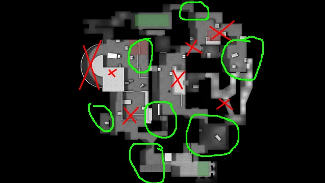
    I am currently DMG level so I have a decent knowledge of the game, but not anything amazing. I illustrated my current concerns here with red for bad/concern and green for where I like it:

    Starting from T spawn and going clockwise:

    I like the ramp down from T spawn into the path to Bsite (arch site). I like the alternate entrance into mid to give another angle to peak/rotate for Ts. I don't like the current entrance to B site as its REALLY tight turns and only exists because of the balcony over the entrance to the curved ramp. My big X over the curved ramp is because I was initially finding that it was likely to be too easy to pincer B site as T's from the main entrance and curved ramp. This is why I made the balcony room over it, but my concern that this would be too strong an answer was correct. Is the curved ramp worth keeping? I also do like the main platform/balcony over the Bsite. It may be too restrictive for vision (which can be fixed) but I like the elevation of it and how it can be used offensively or defensively.

    Moving on to CT spawn, I like the options you get right form the start including the path to A site. I do like the raised area behind the site, but the connector through to mid and the site itself not so much. The drop area with the room to the left is way better, and I could move the site to there if you think it looks better and make it like a combo of A site and B site on mirage. Apartments are mostly fine in my mind, though the angled path I added probably makes it too confusing and easy to be flanked.

    I've had a lot of concerns with mid from the start, but they were actually that I was concerned T's could smoke connecter to B and sniper nest and have full control over the mid and map. Apparently it was a mid that overly favoured CT? I do like how I timed the upper area on mid so that both teams rushing it get up their ramp at the same time.

  • Michael Greenwood
    • February 3, 2016 at 4:09 PM
    • #12

    So I redid the map keeping only the small little area of T spawn. So far, the map feels far more like an actual CS GO map and has some really interesting dynamic play, even just against bots. I updated the OP with the description of the map and my crappy handpainted layout. I'll be posting the full overview and pics later tonight. With bot_show battlefront, the engagement points are in mid slightly towards T side (as CTs peek first), between the two horizontal barriers on the way to A site (my goal was an interesting peek, grenade bounce, peel to mid etc. strategy there) and just at the entrance to B site (may change it to something more similar to the cache engage in a main where CTs get another second or 2 head start).


    I have a conceptual idea of how my themeing is going to go (see OP.) by my general question would be: In a south american town with spanish colonial style architecture, what would be the generic 'box'. Cache has crates and shipping crates. Dust has pallets and boxes, Inferno has trucks, cars, boxes, carts... What would make the most sense for making small, medium and large rectangular-ish shaped barriers to sight and bullets? Small could just use the drug pallets, generic crates whatever, the larger sizes are more what I am at a loss for.

  • Michael Greenwood
    • February 4, 2016 at 12:07 AM
    • #13

    Overview and new images added to OP

  • jackophant
    • February 4, 2016 at 8:40 AM
    • #14

    Firstly can I suggest you stop editing OP by replacing what is there, just stick it in a spoiler so you can have good documentation of your map development.

    Secondly, please update your lighting. It's a ridiculous strain to see anything, let alone trying to play it.

  • Michael Greenwood
    • February 4, 2016 at 3:34 PM
    • #15
    Quote from jackophant

    Firstly can I suggest you stop editing OP by replacing what is there, just stick it in a spoiler so you can have good documentation of your map development.

    Secondly, please update your lighting. It's a ridiculous strain to see anything, let alone trying to play it.

    I'm keeping with the same theme but that's about it. I have recreated 95% of the map from scratch. It made sense to not spam and make a new thread, but it also didn't make much sense in this case to keep anything.


    As for the lighting, yeah, it's pretty crap. I think I have my dull ambient blue color overpowering the main yellowish light_env (and also have it using a really bad angle, it was making the leaf/bush props have awful shadows). I'll fix that tonight and re-upload better images. Other than that, I have it nodrawed, generally optimized and just need to make some minor fixes to the skybox around B site and the entrances to mid. Is there anything obviously glaring layout issues that would need to be fixed before trying it out with real players? I'll put up the workshop link tonight. The only main concern I have currently is the trees in mid - they may have weird hit boxes? Pillars are a possibility. The inspiration was: http://www.hotelboutiquecasapestagua.com/img/slide/ligh…me-hotel/01.jpg

    The engagement point at B is also a little bit onto the start of the site area, which gives the CTs only 1-1.5 seconds to set up around the site before T's come rushing in. My main thought is just increase the distance from T spawn by 2 seconds which should fix all the issues around that site.

  • jackophant
    • February 4, 2016 at 5:38 PM
    • #16

    We had discussed this before, particularly trying to fix what you had originally created to learn from it. By scrapping and starting over you are just creating new problems and completely invalidating any feedback previously given.

    I also didn't mention starting a new thread. I suggested adding to the OP, rather than completely removing everything that was there.

    I don't advise trying to create your own lighting setup, just use one of the examples in the CSGO Sky List with the accompanying skybox texture that you feel matches the mood of your map. It looks more like your brightness value is too low than an "overpowering" ambient light.

  • Michael Greenwood
    • February 8, 2016 at 3:26 PM
    • #17

    That doesn't seem a very fair criticism to me. I greatly (greatly) appreciate that the community playtested a map I built (and I apologize for the fact that it didn't turn out so great), but I would hope that I am not committing some egregious faux pas by deciding that there wasn't enough positives to a project to not want to take all that I've learned from the feedback and try again. I have spent far more time sketching, planning and tweaking the initial routes, timings and angles and routes. I don't feel I threw out any feedback that was given and did my best to avoid the issues that existed in the new map. It just doesn't make sense to me that asking for a playtest (which again, I appreciate the time that people put in very much!) has now committed me to that map despite its major flaws and that I have no attachment to it.


    I see your point with regards to documentation. I considered it less of a big deal as I already had my old WIP thread from before it was playtested, but it makes no sense to have people reply to a thread than change the content in the OP. I will make sure to do that in the future.


    Lighting has been fixed. My values were really similar to inferno already but my angle and pitch were really off, so I think the darkness was caused by the light going pretty much horizontally over the map. I was trying to take a shortcut quickly plugging in my own values, but as you can see, didn't work out great.

  • jackophant
    • February 8, 2016 at 4:15 PM
    • #18

    I'm not disputing that you appreciated the feedback, merely commenting on the effectiveness of your approach and highlighting what it means to the people who helped.

    You may have decided the map is too flawed to continue, but we've hopefully provided the means to make it better so those flaws would be phased out with the work you put in. Nothing is perfect first off, and if all you do is scrap the layout when problems arise, you will never progress.

    None of the operation maps got their layout perfect first off, but perhaps being more experienced mappers were initially closer to something working. The success comes from being able to improve something not get it right first time.

    Of course you aren't committed to anything, this is just advice to consider.

  • Michael Greenwood
    • February 8, 2016 at 4:33 PM
    • #19

    In a general sense, I should mention I completely agree with you. In this case, I'm just saying that this was my first project larger than a room with hammer and was an undertaking I was vastly under-prepared to make work. I don't plan on making this a habit and think my new map has a really good base to build on, but if it would allay the fears that I am wasting anyone's time, I could split the projects and do the fixes on the old map to both learn from my mistakes and see if it could become something more!

  • Michael Greenwood
    • February 9, 2016 at 10:15 PM
    • #20

    I have a couple conceptual questions that should be easy to answer:

    1) Should I avoid the use of trees in mid as cover/props as they are unpredictable for cover, grenades and clipping?

    2) T's can smoke both Entrances to mid for CTs without revealing themselves, but also get to mid about 2 seconds after CTs. Would making cover a bit further up into mid that CTs could rush to (like white box on cache) make it so mid control isn't too easy for T's? Is this even a problem?

    3) One site looks to be noticeably easier to take than the other assuming full builds (but also likely to be easier to retake) - How much should this be avoided? The other site has more rushing opportunities available and ways of holding closer angles.

    4) Should metal railings (like the ones on inferno balcony) be set to not block bullets? Or be really easy to penetrate? I like metal railings for the visibility (and theme) but I don't like the unpredictability of the clipping.

Participate now!

Don’t have an account yet? Register yourself now and be a part of our community!

Register Yourself Login
Discord

The Mapcore Discord is our lively IRC channel of the 2000s reborn. Chat about level design, gaming, and more.

Latest Posts

  1. Why is data science needed

    shilpa
    July 17, 2026 at 12:39 PM
  2. Any of the old guard still around? D:

    Warby
    July 12, 2026 at 8:23 PM
  3. About our archived forums

    Thrik
    June 30, 2026 at 2:12 PM
  4. Mapcore Discord

    mason_fan123
    June 24, 2026 at 8:52 PM
  5. [CS2] Valley

    Serialmapper
    June 22, 2026 at 11:56 AM
  6. Free Music / SFX Resource - Over 2500 Tracks

    Eric Matyas
    June 18, 2026 at 12:32 PM
  7. Pango [WIP]

    Elowen
    June 11, 2026 at 10:13 AM
  8. [CS2] Dvina

    Jeremy Rivera
    June 11, 2026 at 10:03 AM
  9. Bridges 2.0 by NEXSIDE, MAP SHOWCASE. ( Steam Workshop )

    MrTrane18
    June 1, 2026 at 7:46 PM
  10. Classic Maps Reborn For CS2

    SillySpaceCat
    May 31, 2026 at 10:33 PM

Users Viewing This Thread

  • 1 Guest
  1. Privacy Policy
  2. Contact
Powered by WoltLab Suite™