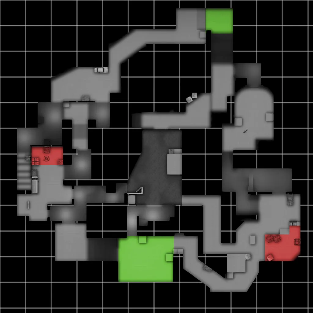
Delta is a work in progress competitive defuse map I am working on. Right now it is in version a6.
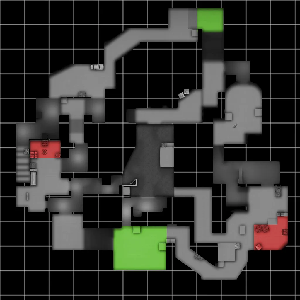
Feedback would be appreciated.
Screenshots - Old
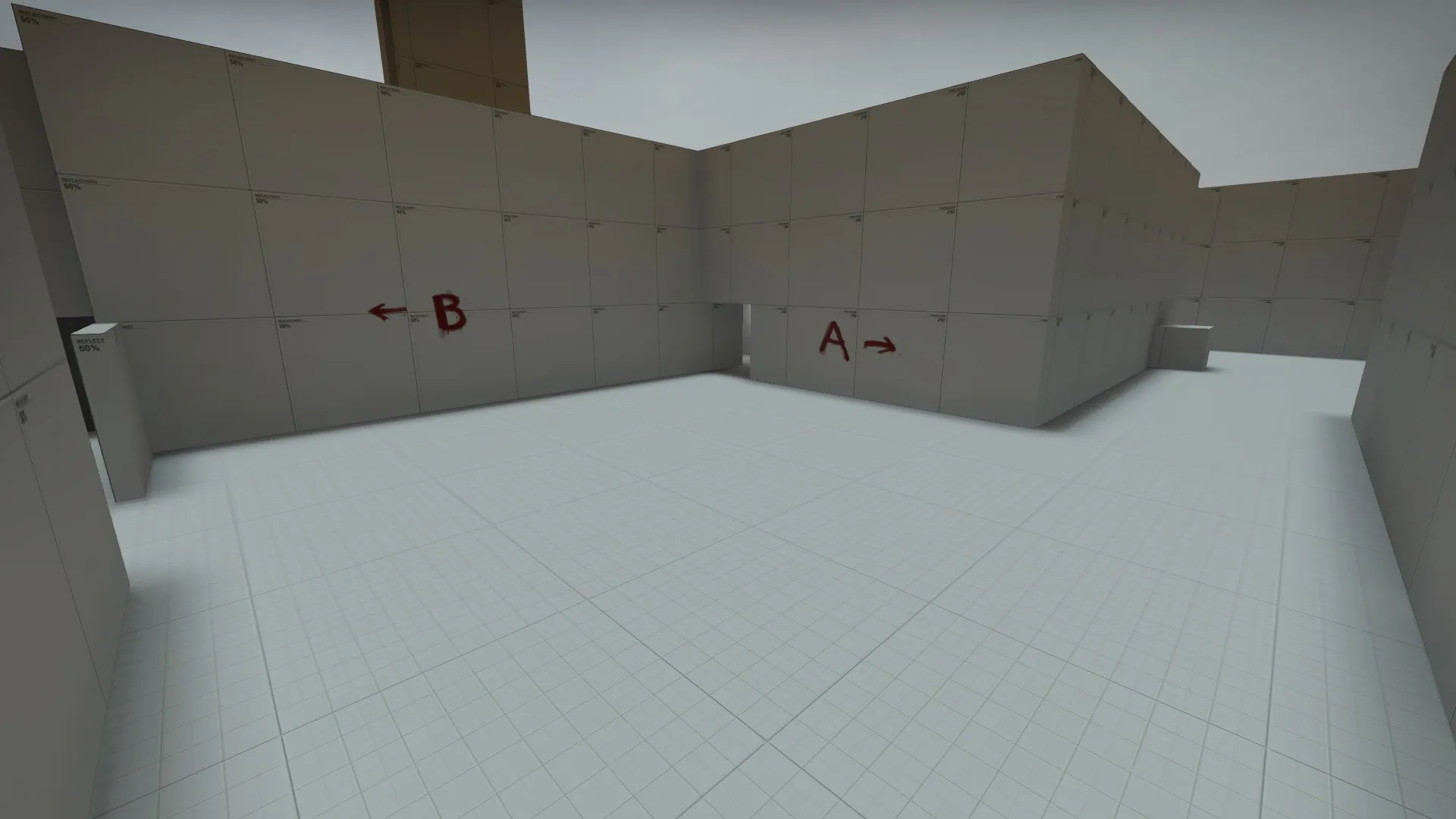
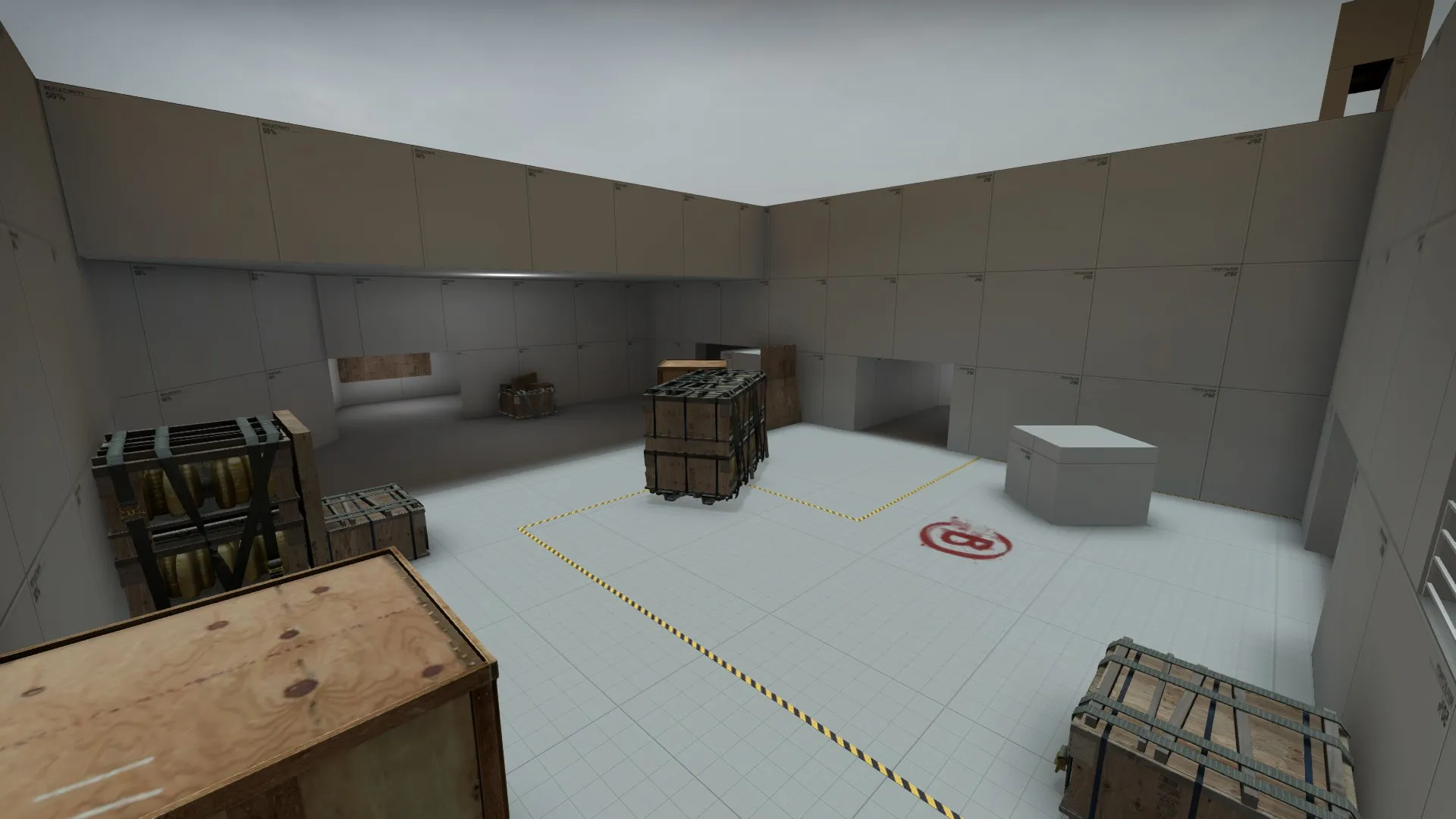
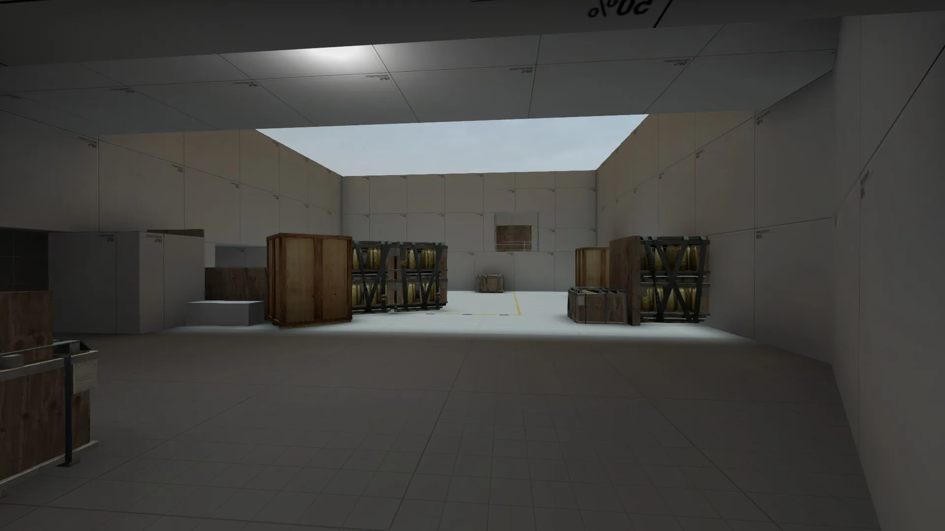
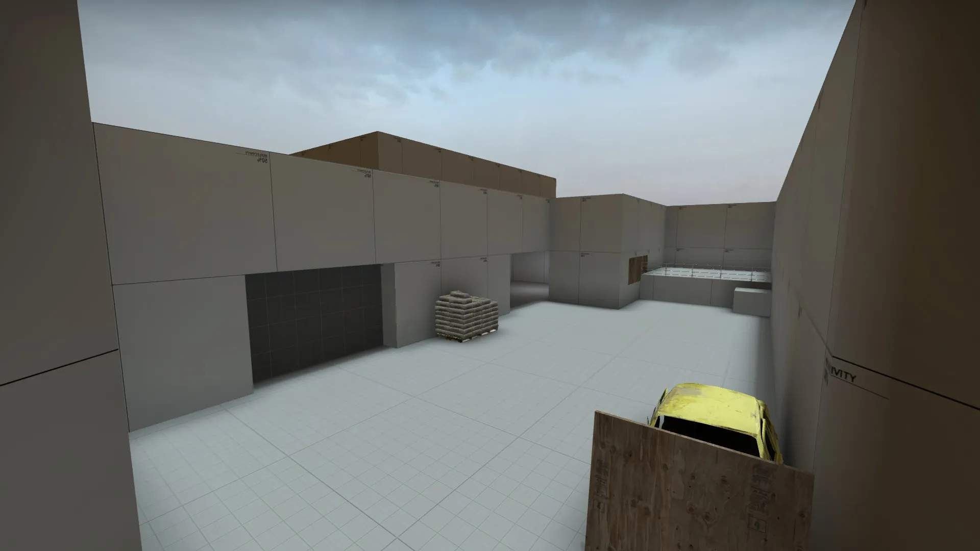
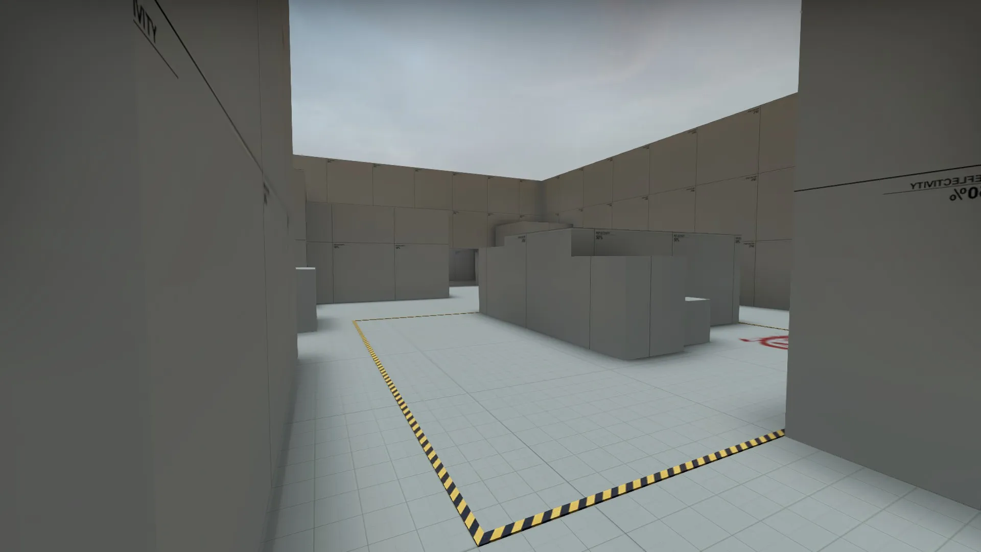
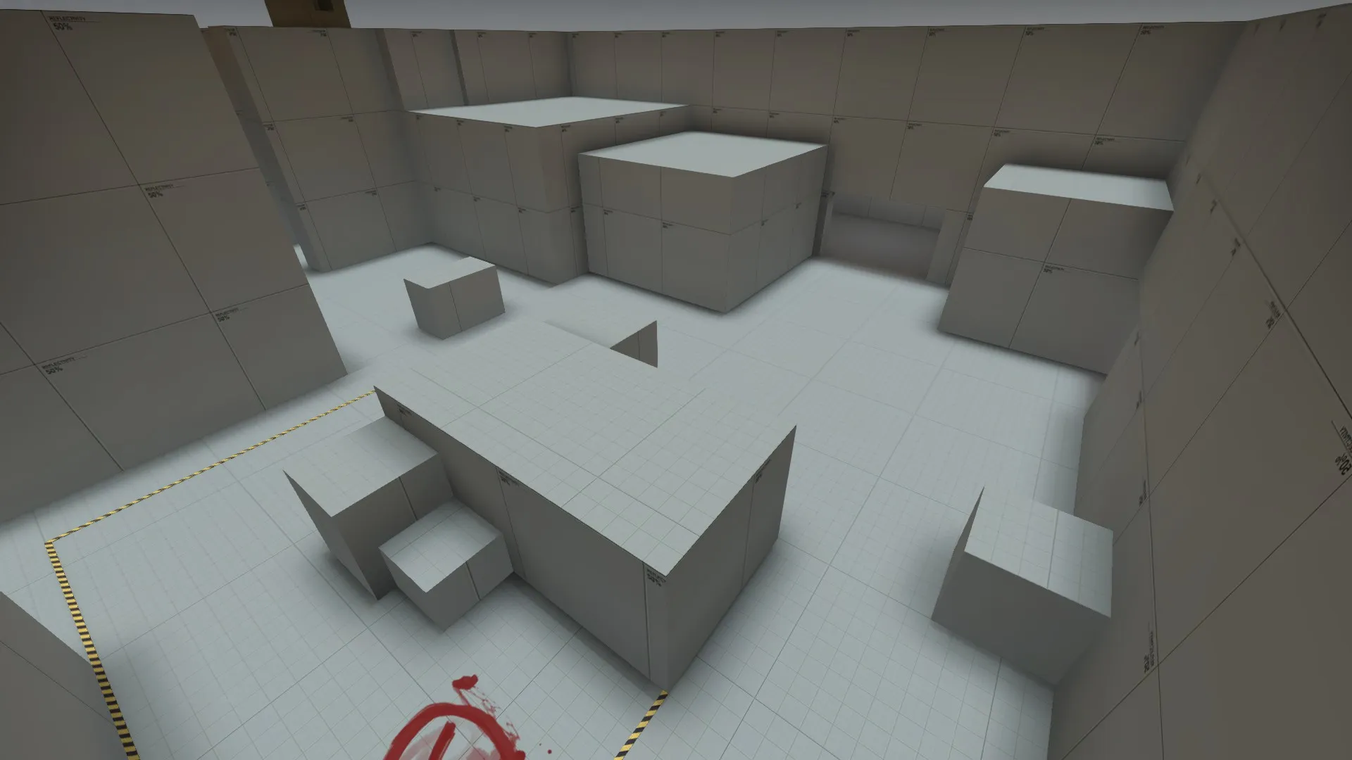
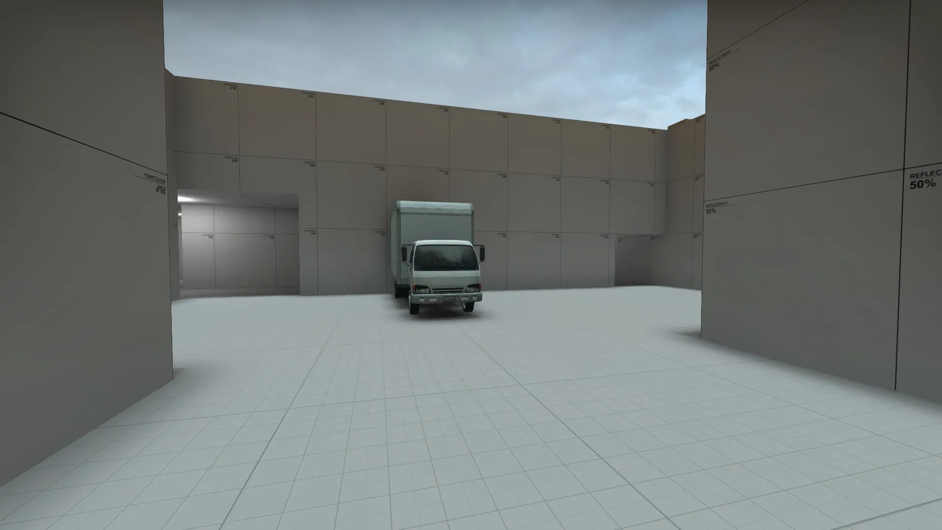
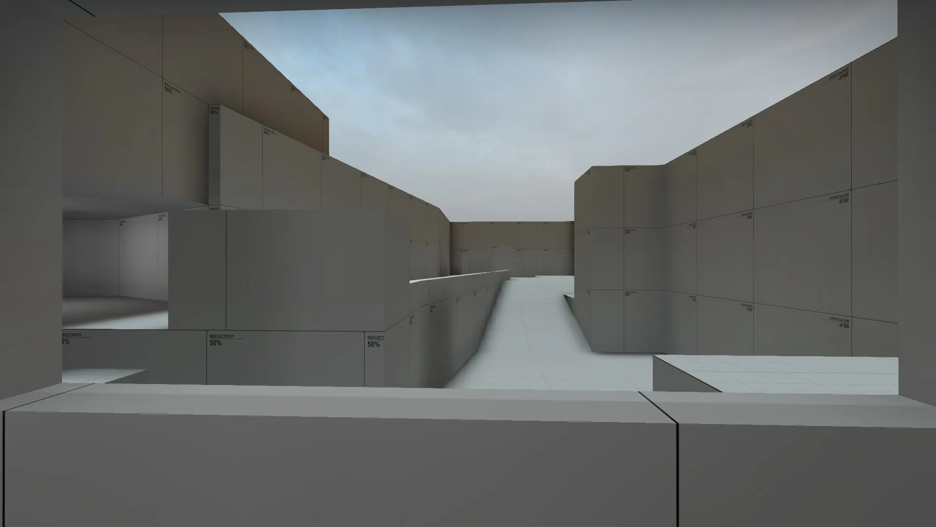
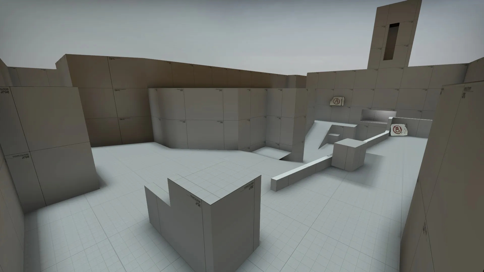
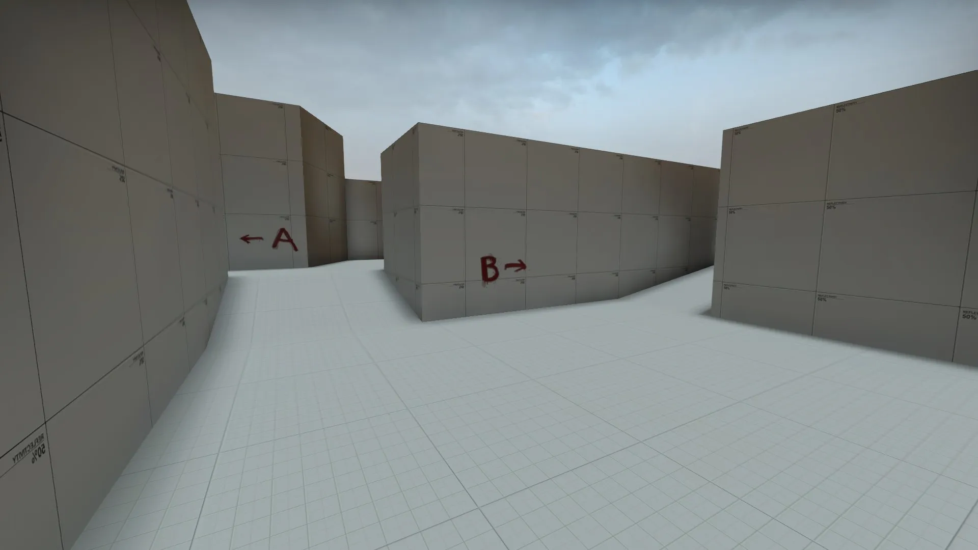

Delta is a work in progress competitive defuse map I am working on. Right now it is in version a6.
Feedback would be appreciated.
Screenshots - Old
A2 is out!
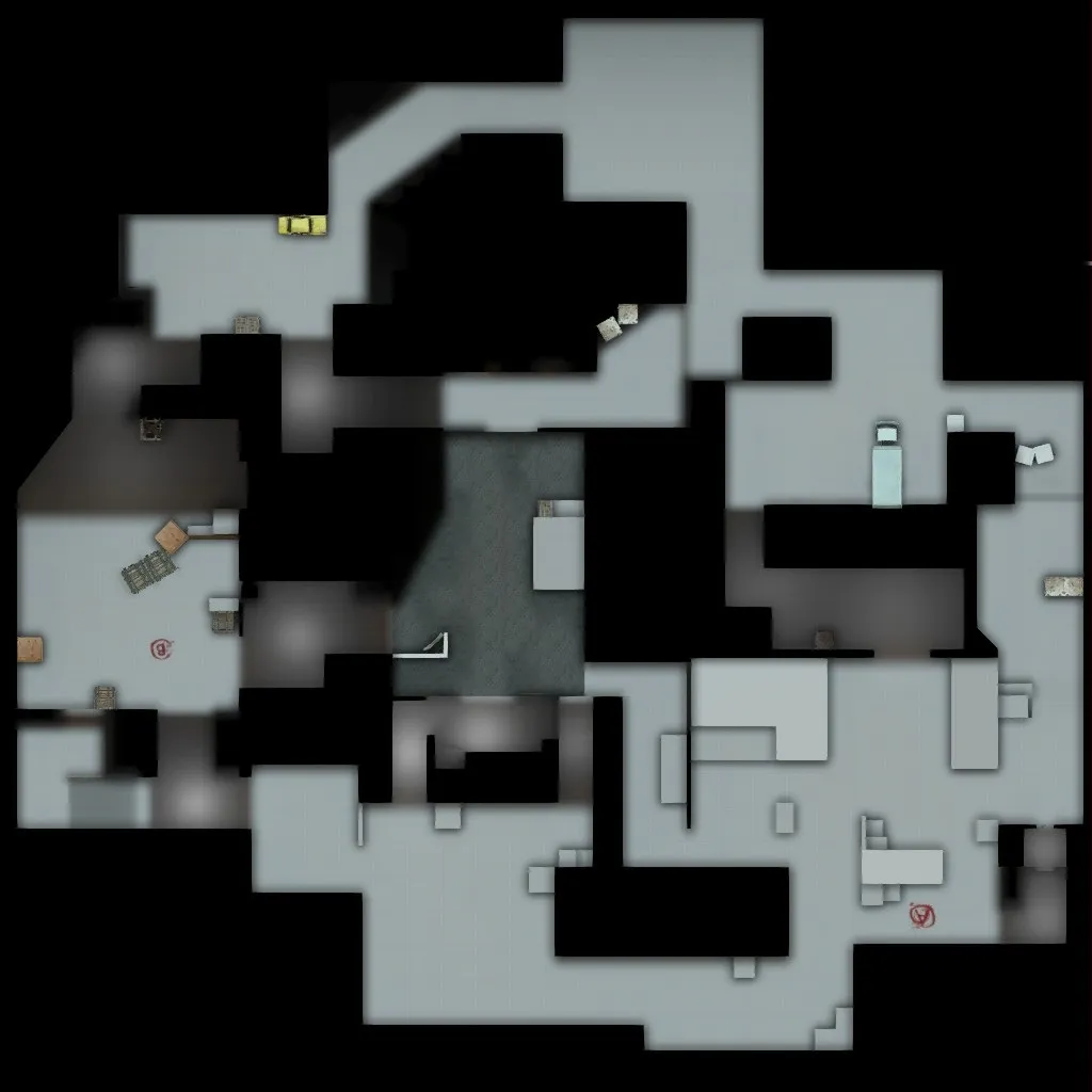
The radar is currently slightly wrong. It shows two paths that were removed,(T side - side entrance to B, and CT's left side entrance to mid)
Changes:
Working on a few changes, including finally finding a theme.
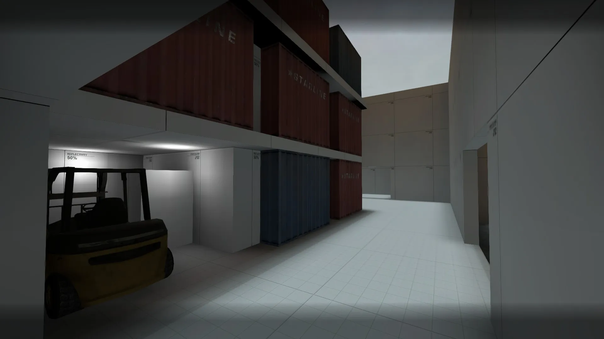
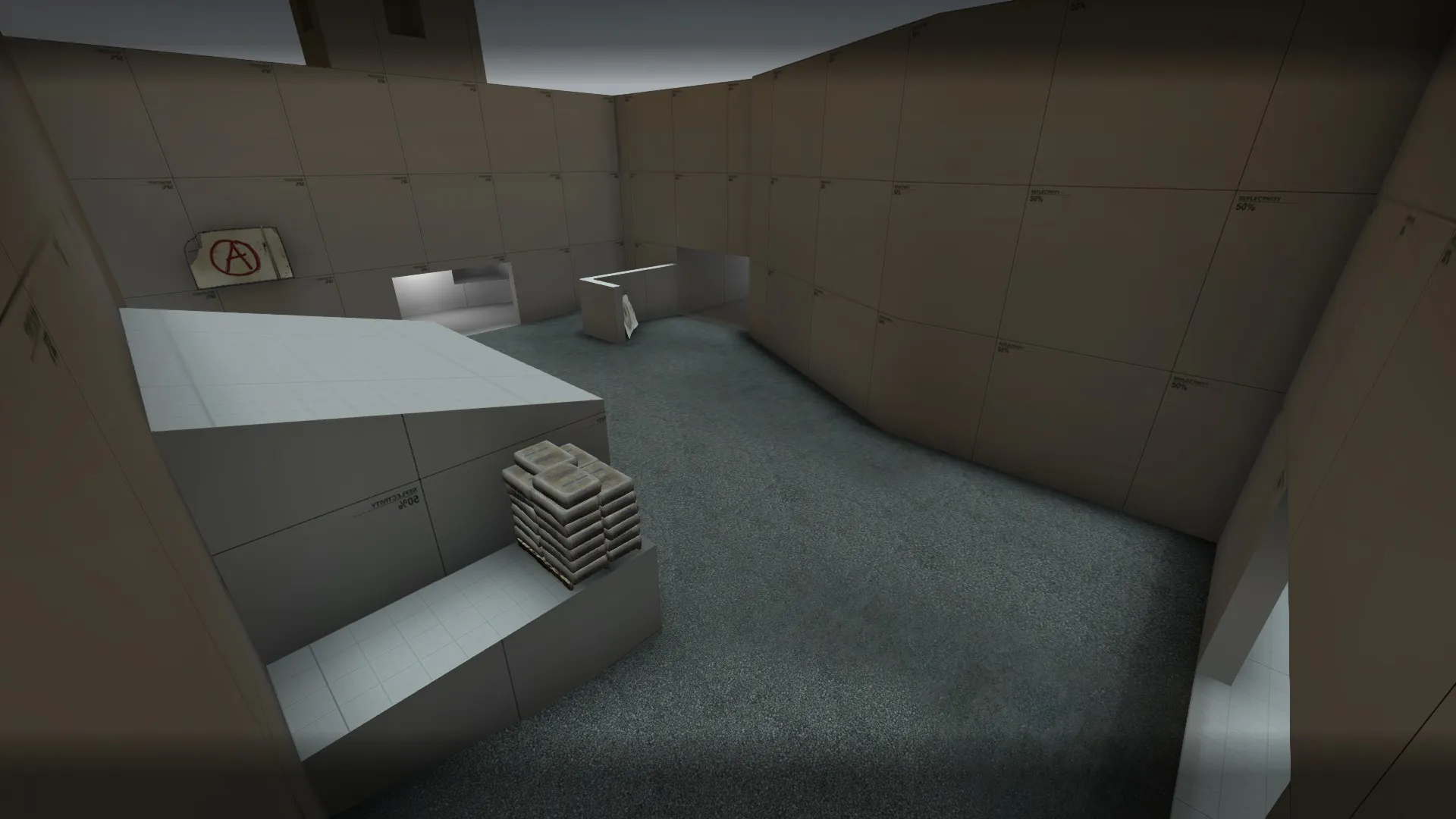
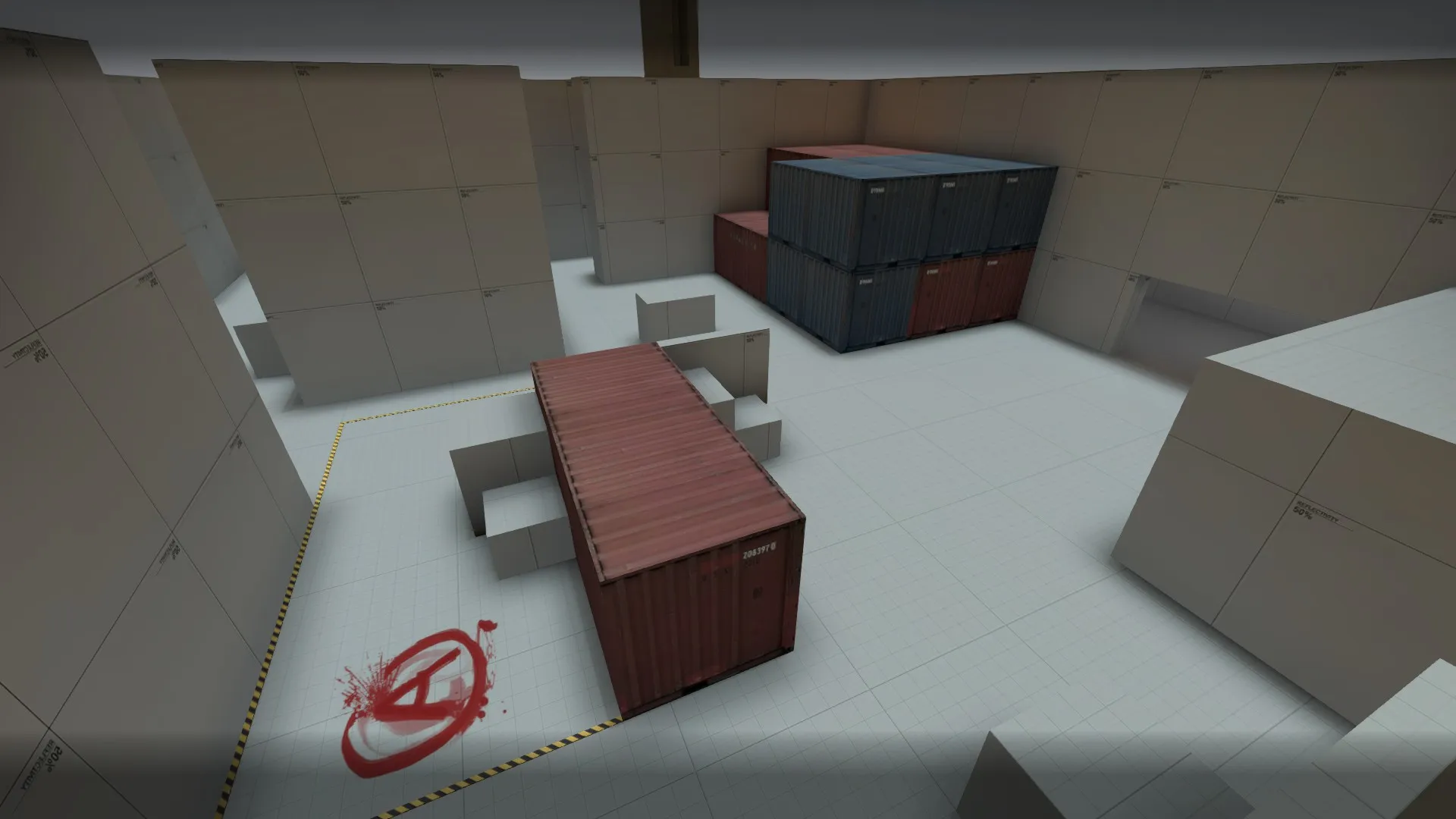
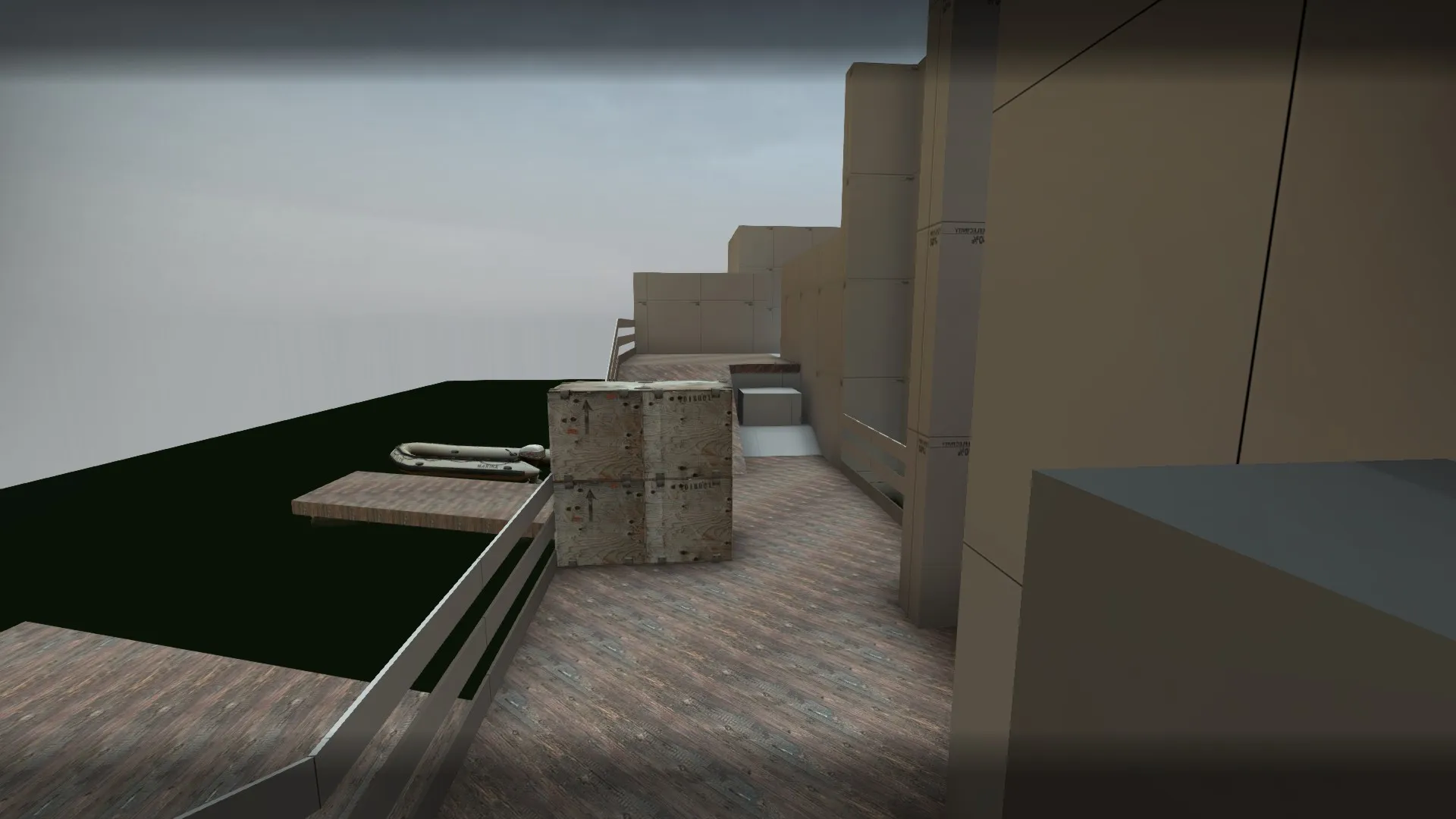
I wouldn't be applying a theme yet. you'll end up more focused on making the theme work than the layout
Any screeshots of the suggested changes from the playtests we've had?
Looks good based on the layout, but, dear god, dont go for a shipping port, it and its industrial style has been overdone waaaay too often. Just search for de_ship and you will probably find 100reds of maps, and its rather difficult to make this theme look to good.
I would recommend you to take inspiration on the web, or even just look through every official map that was there and try to go for any theme other than what was already there 
Someone already told you to not go for industrial shipping port theme. I can see you haven't had a real reference. Which is more why you shouldn't do that.
At ports containers are picked up from above. The second row of containers make me think- how in the hell they got them in there ? While im busy with that idea, 1500$ went to "xX-Bogdan-Xx-PL"
Im trying to say, the second row of containers doesn't make any sense. Not the slightest bit. First row could be pushed in there. Third row could be put from above. The second row? Hououin Kyouma special brew helped ?
[Blocked Image: https://migrationtest.mapcore.org/uploads/monthly_2015_10/de_deltadelta0001.thumb.jpg.8182f9b0a4279420b56eec2bf86dab1f.jpg]
The theme even if its a little generic can work out good aslong as you don't make it feel enclosed. I also think you need to make it feel alot warmer and more summer-sih, then it feels atm.
Like in these screenshots from the port in GTA V.[Blocked Image: http://i.ytimg.com/vi/mqs_fKoq-uA/maxresdefault.jpg]
[Blocked Image: http://orcz.com/images/thumb/f/f8/Bilgecoshippingservicesgtav.jpg/400px-Bilgecoshippingservicesgtav.jpg]
If the theme is very generic the atmosphere needs to be very strong and immersive. If you have a more uniqe theme the theme itself adds to the immersion.
So I would say either a really sunny and nice setting with a skybox like vertigohdr_blue or a really dark and rainy setting. But a setting with a clear/sunny sky is better for visibility.
a4 is out!
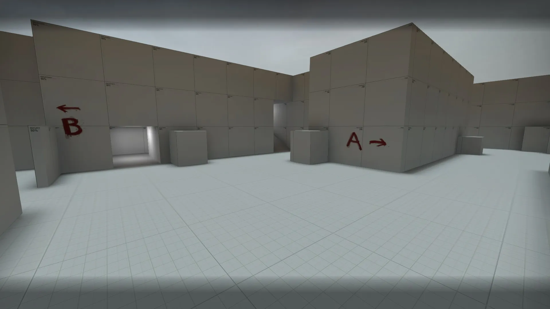
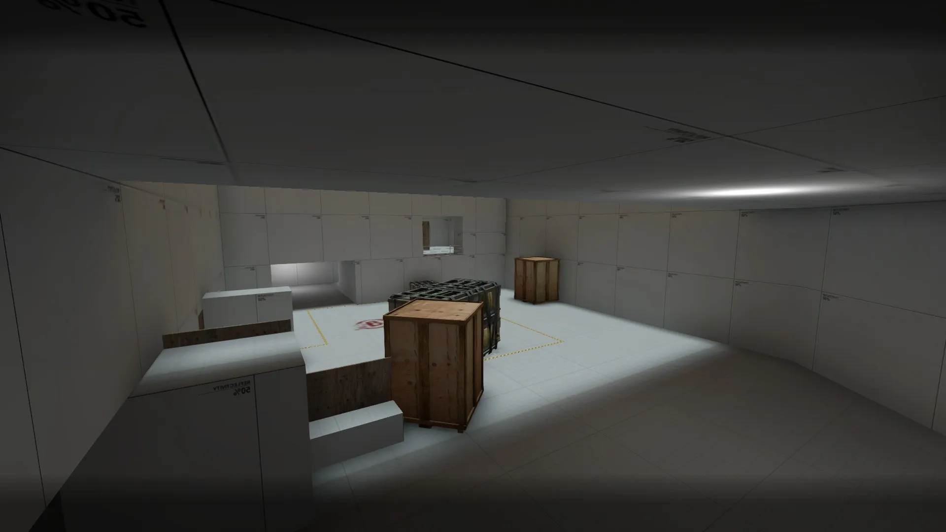
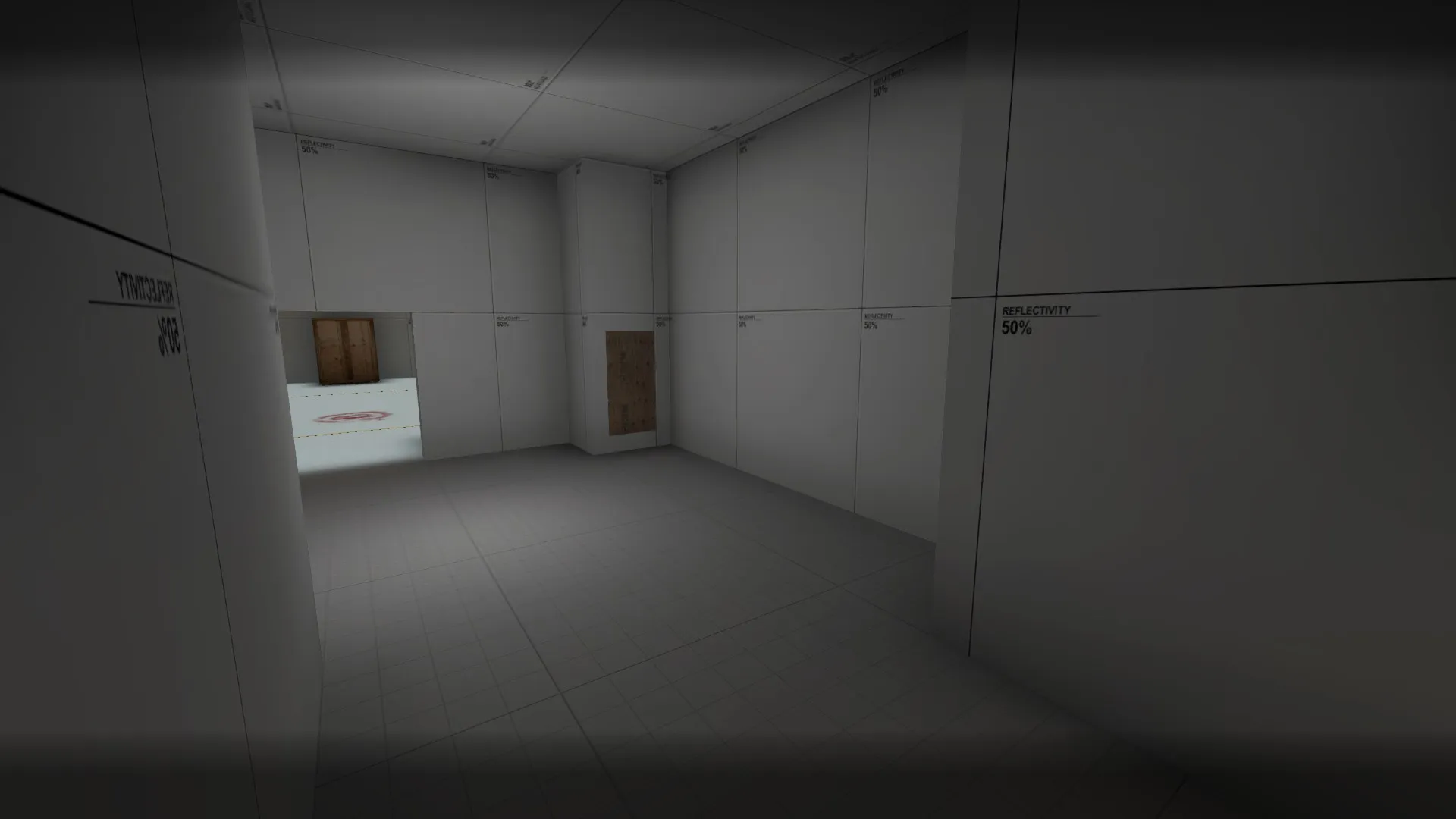
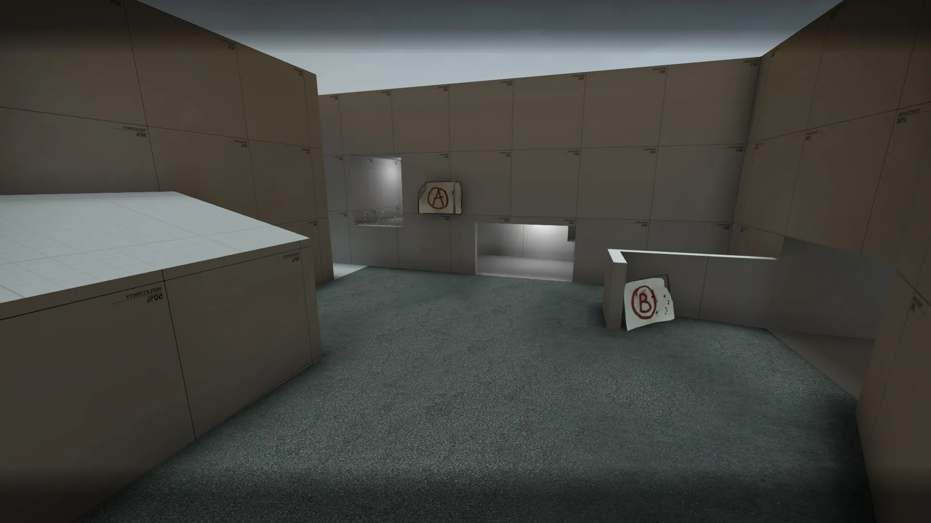
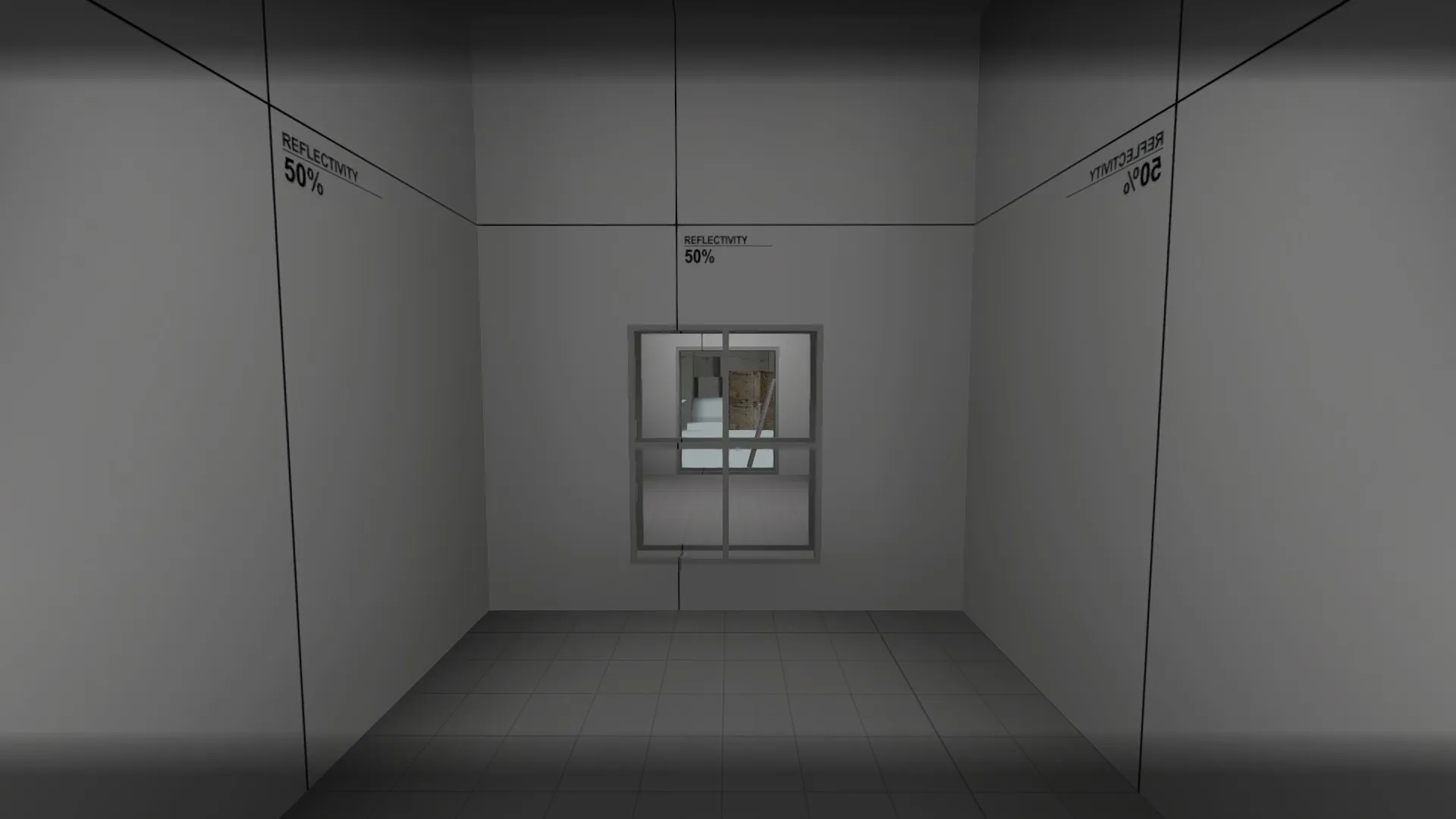
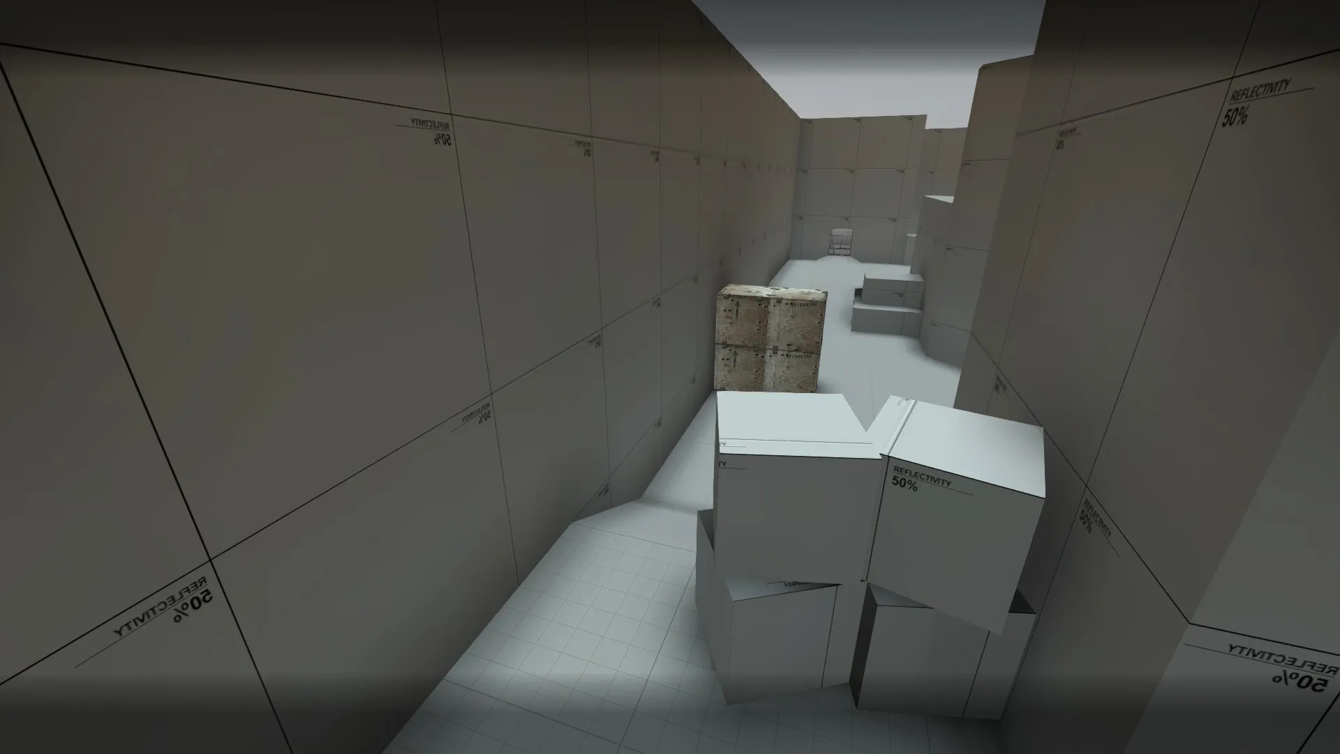
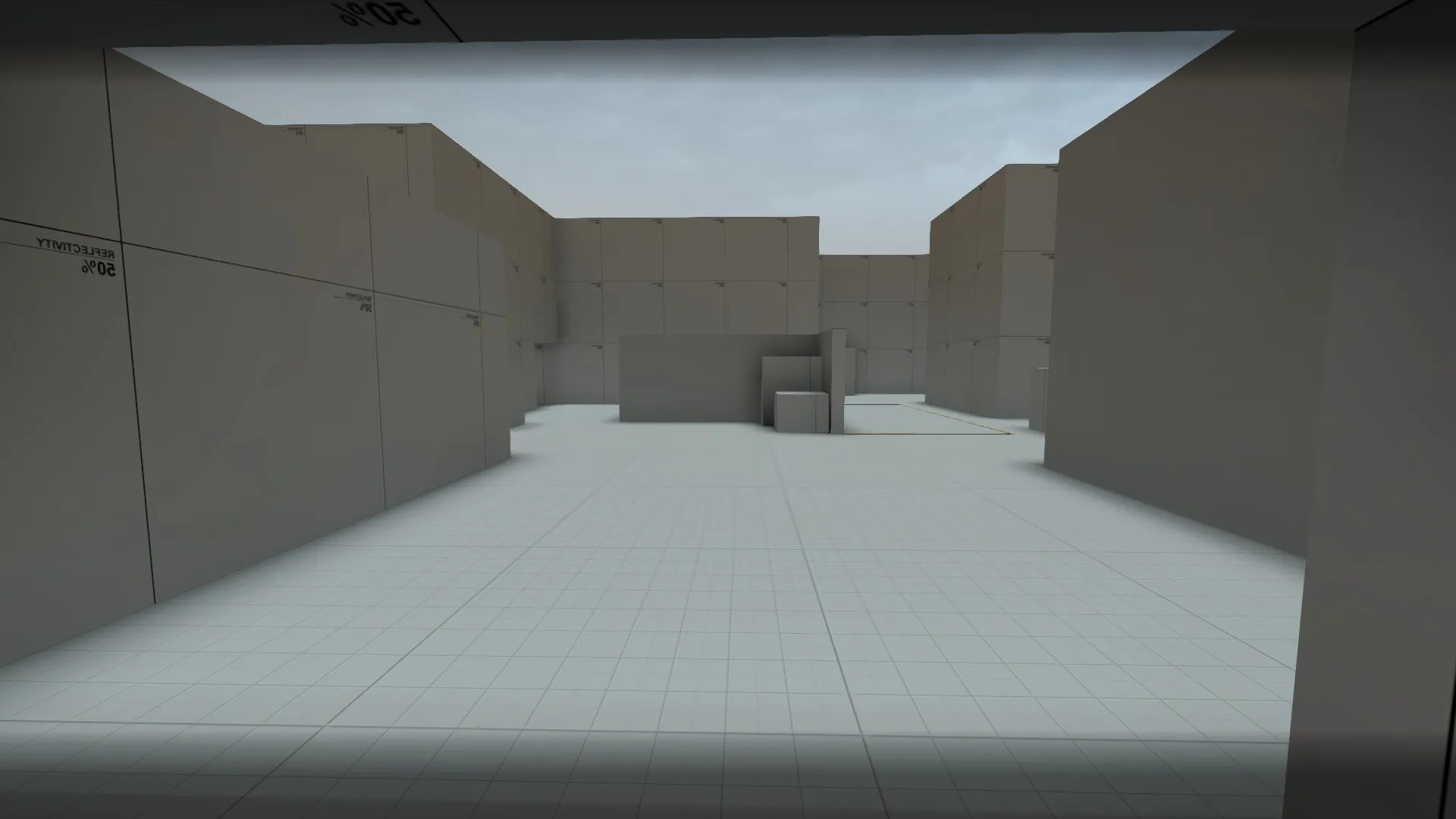
dropping the theme for now
Right of the new radar I can tell you that you might want to change the geometry of the bombsites (instead of having both as two cubic places with a bunch of cover thrown in...).
The sites have been one of the biggest issues of the last playtest and I will keep further judgement until after the playtest. But I can already tell that the "open" site with these simple entrances will be incredibly boring to play. And yea, dont go for shipping docks theme please.
I don't really understand what you've done. It looks like you've changed a lot that was actually ok, and have ignored a lot of what wasn't. Mid was getting better and now I have no idea. That A window/sniper room seems entirely pointless: the window I could maybe understand, but I can't fathom what either team would gain by trapping themselves in there.
It's always dangerous to completely change something because there's no precedent for how it will fit with your map and more or less invalidates any prior testing.
You still have a lot of large, open, shapeless corridors. You would do better to tighten these up to better control the flow of your map and give a more distinct path.
Major changes in progress right now.
Redid B site completely
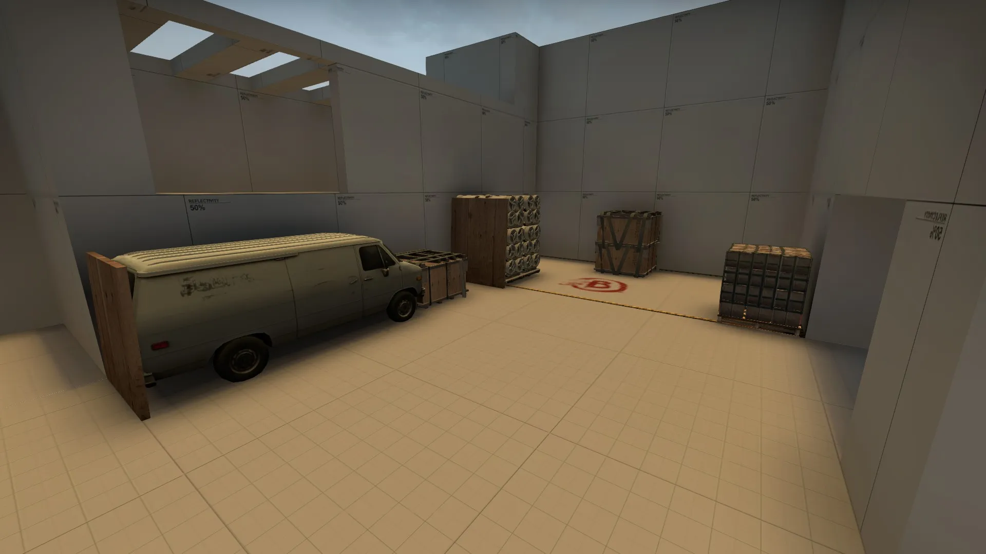
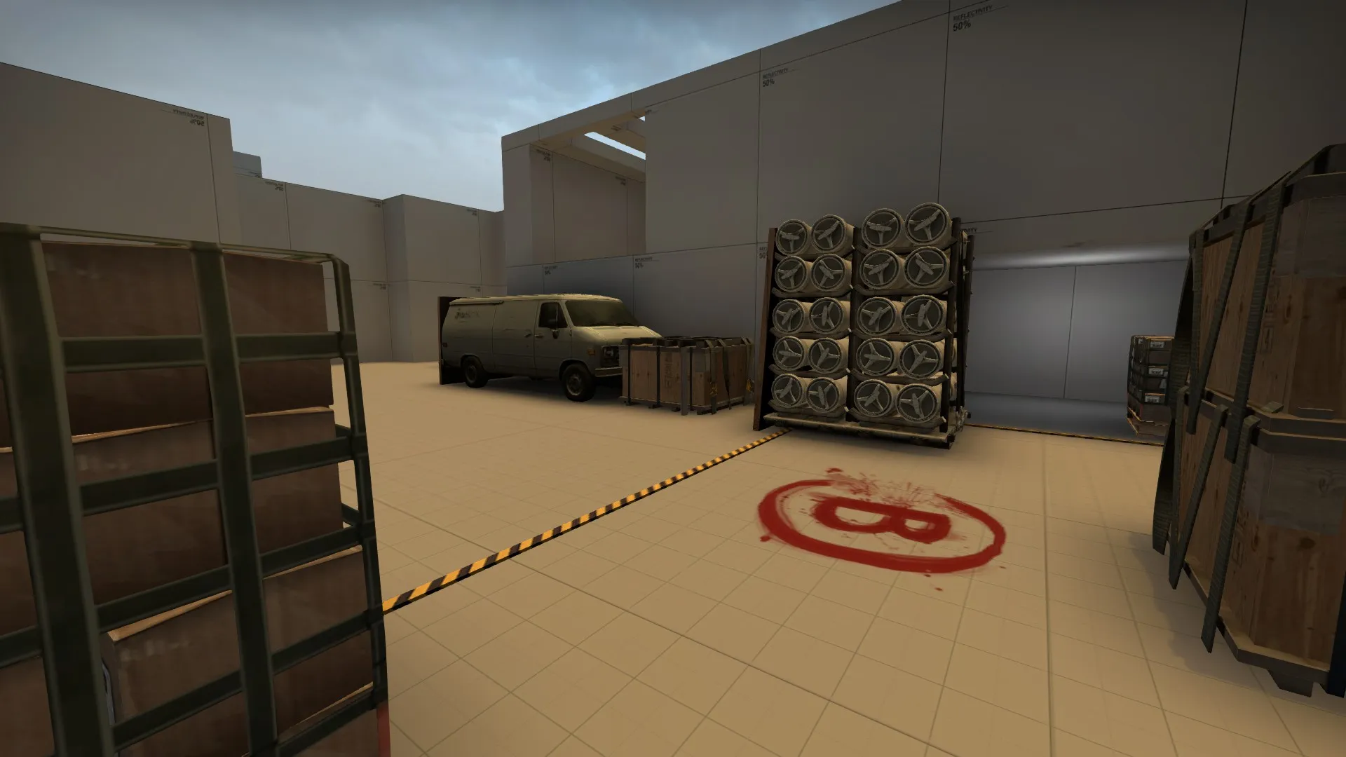
Upper B
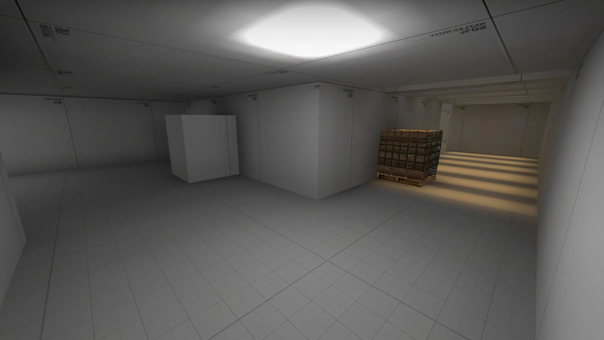
New B connector
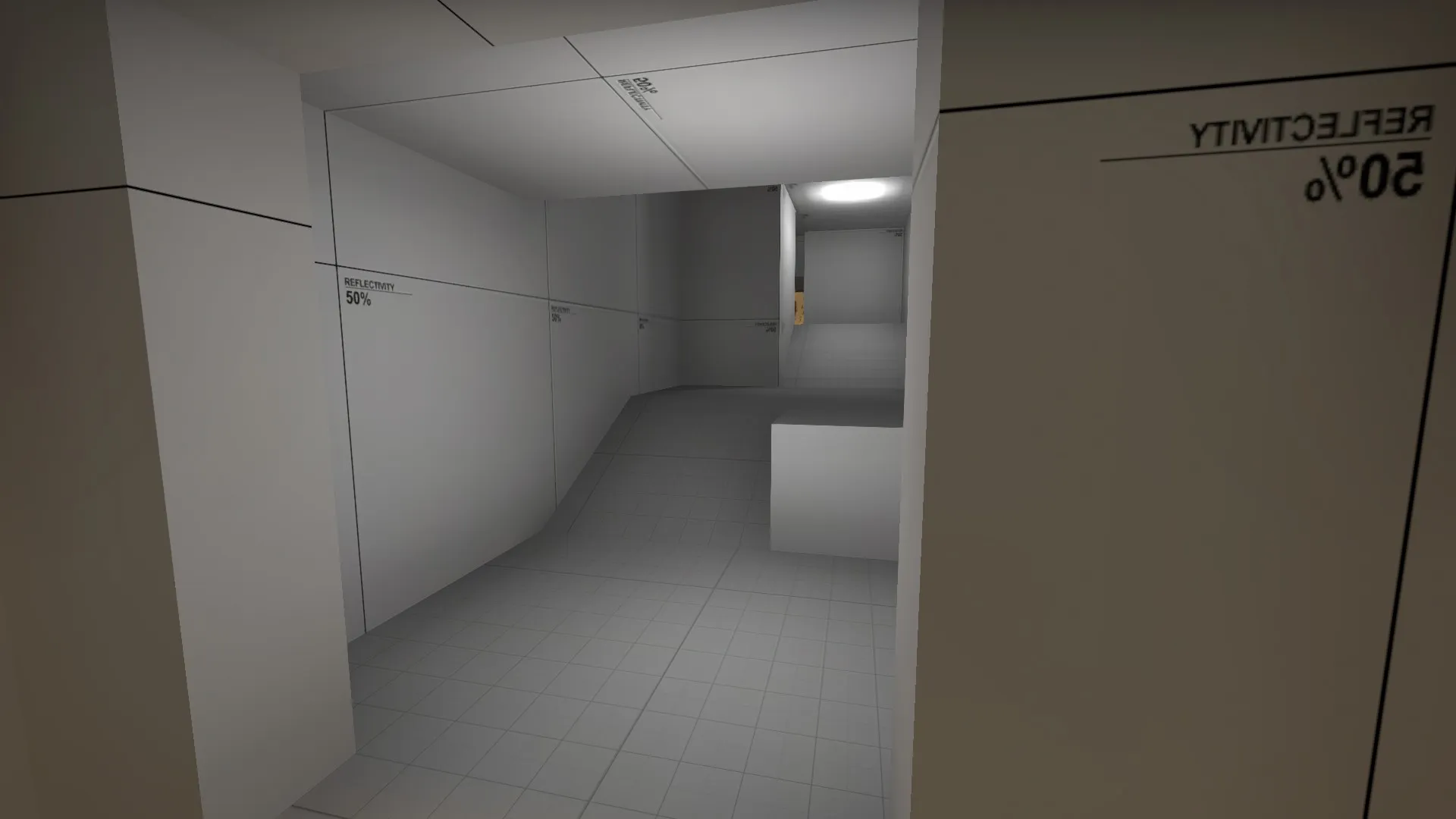
Redid A site
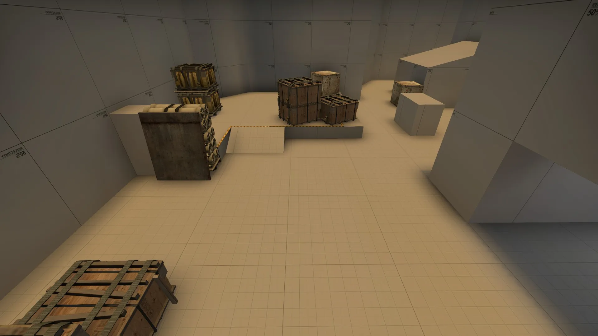
and removed routes to A, simplifying it.
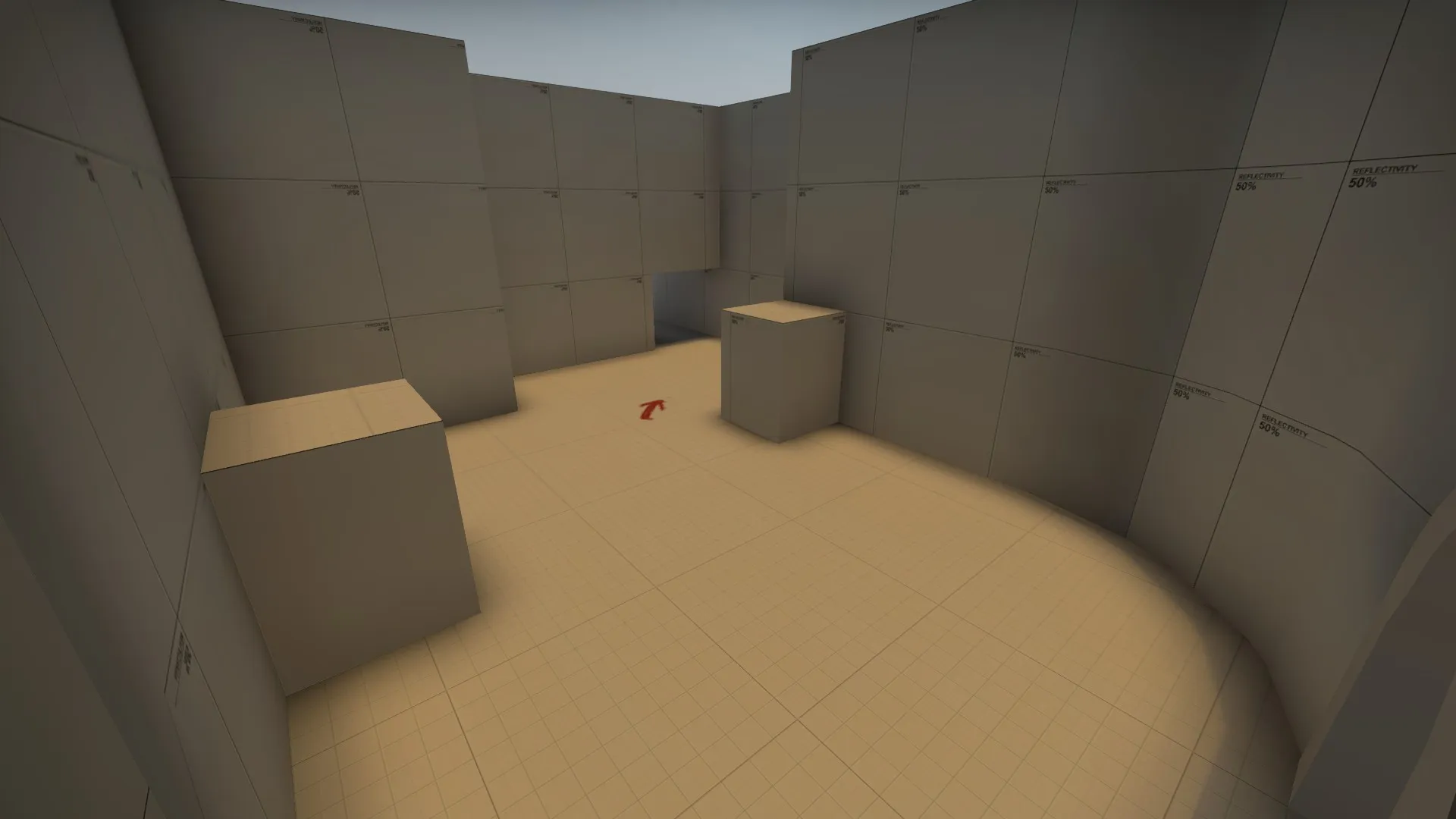
B was redone, A heavily modified
Lighting is now changed, I just need to get a good sunset skybox.
Routes are more narrow, map should play more smoothly now.
Mid balcony was blocked off, but mid hasn't had any major changes yet.
A is looking better ^^, although kindof looks like two bombsites stuck next to each over. Not sure, cant really see from the screenshot, need to see an overview.
If its final design is going to be a docks setting then im not sure if having a sandy environment light, i would picture a cool mild blue or white, afterall, it is next to the sea 
Looks a lot better, and the new lighting immediately makes it feel nicer.
Have you got an overview for us to see?
Tightening the map up to shorten rotate times
https://i.gyazo.com/bfc3af3e951348394a3c2cecbb97080d.png - old
https://i.gyazo.com/824ba74df7ba17fd845361ce40a9a2fc.png - new
Rotate times for T's between sites are about 18 seconds right now, still long but bearable.
Moved T spawn to make it less out of the way and to speed up timings to sites. Instead of taking 17 seconds to get to site from spawn, it takes closer to 12-14.
A7 is out! Not really a large update, more of a quality of life thing.
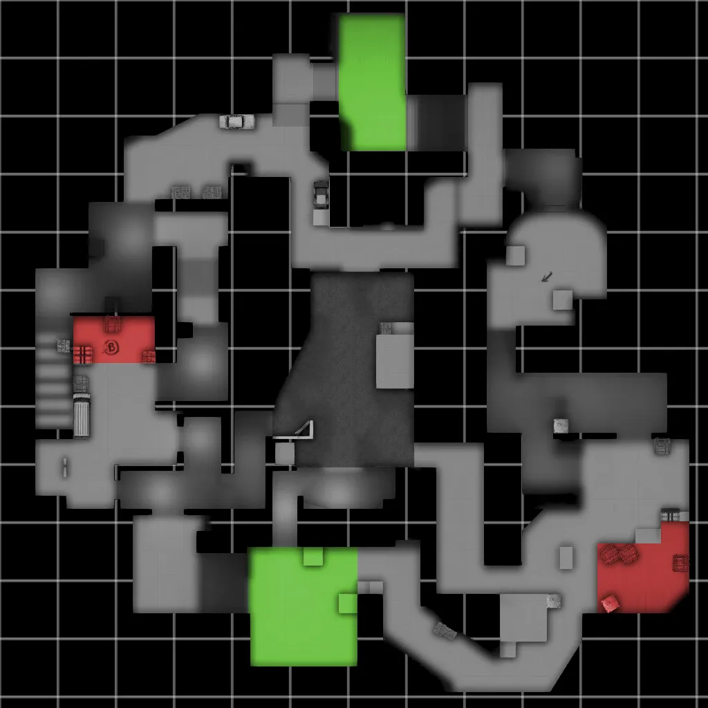
New Overview
Redid Entrance to B side to delay lower.
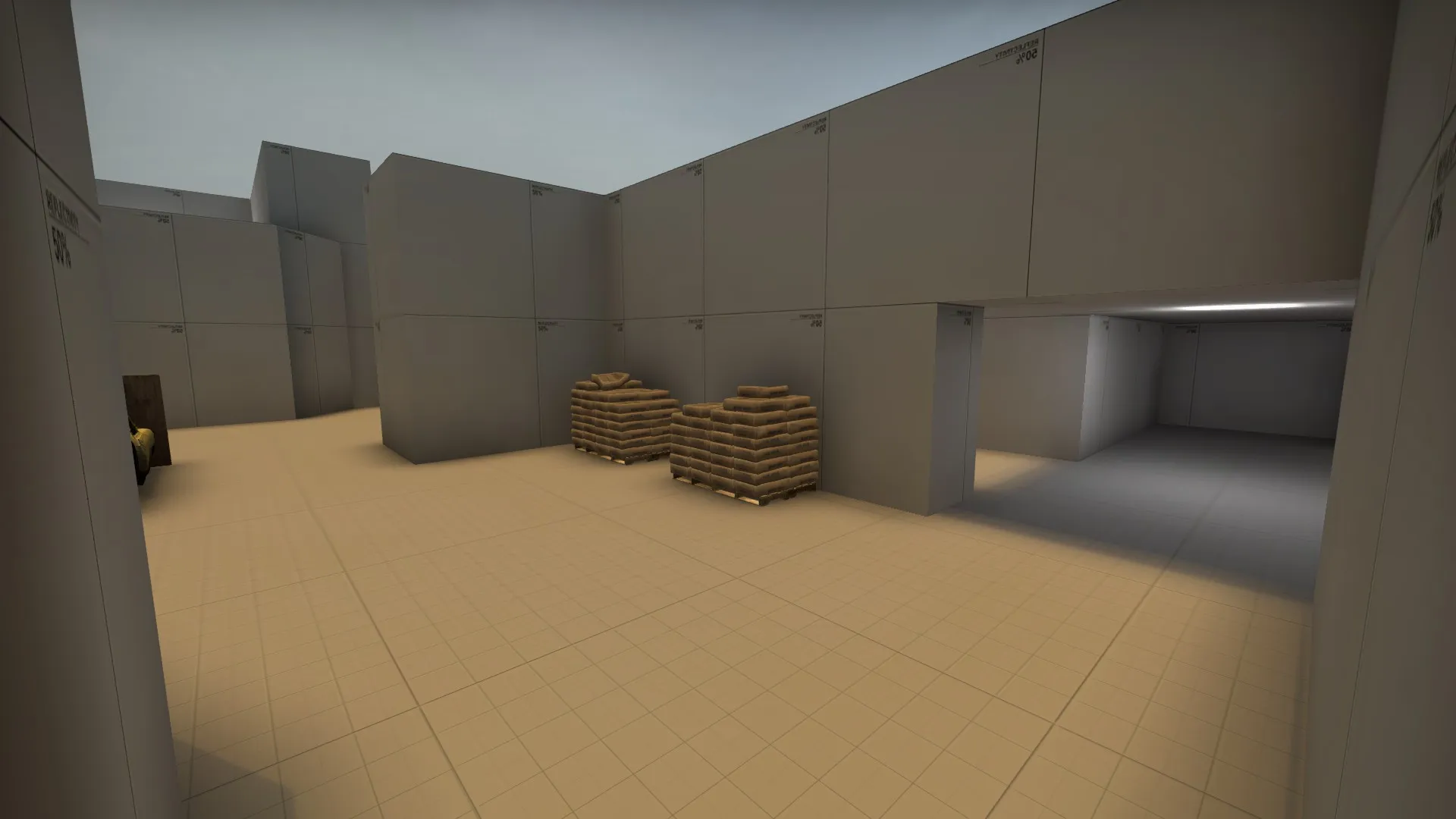
Added connection from T side outer B to mid
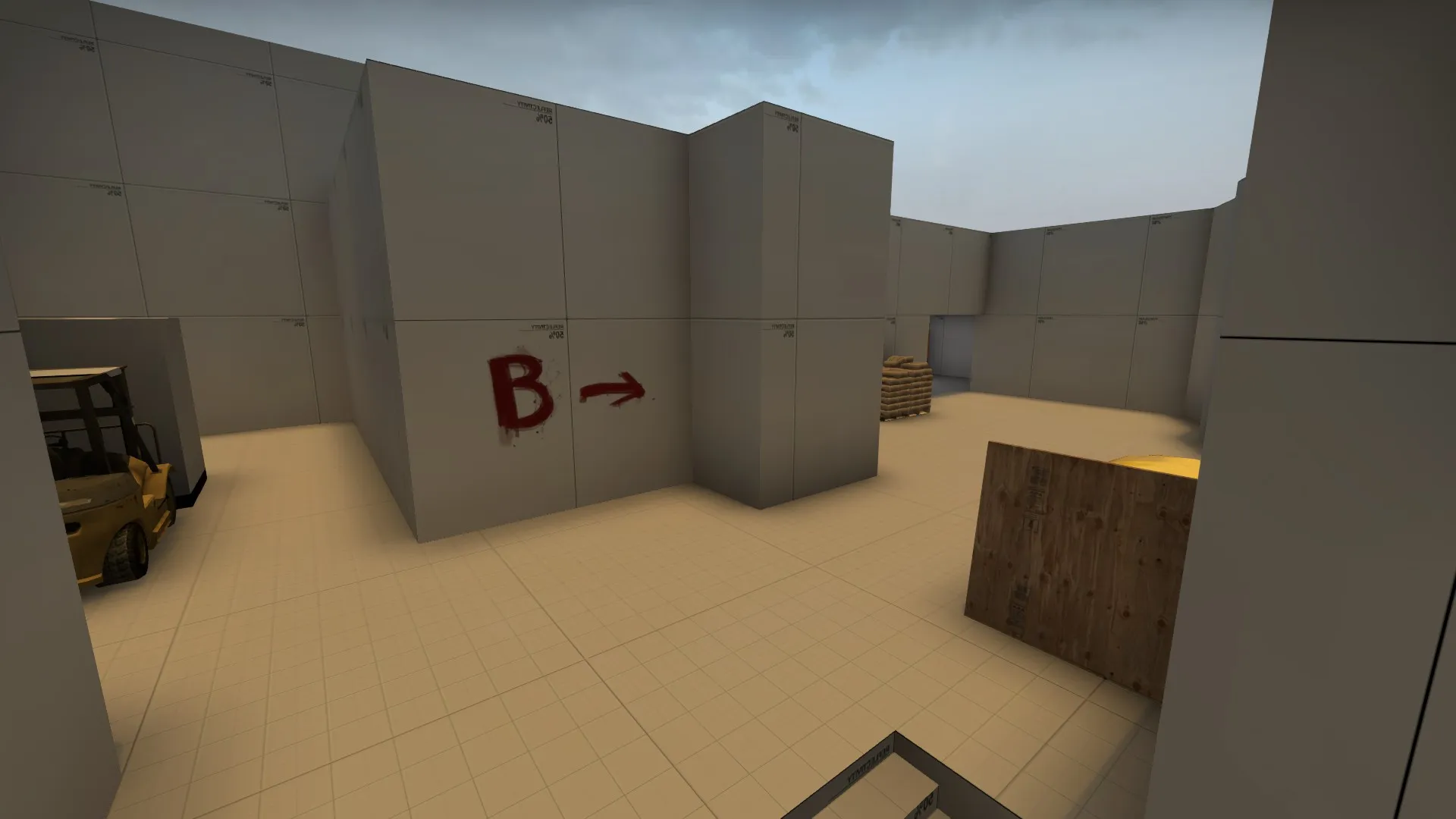
Redid T spawn, moved both sites closer to speed up timings for Ts and CT, as well as reducing rotation times further.
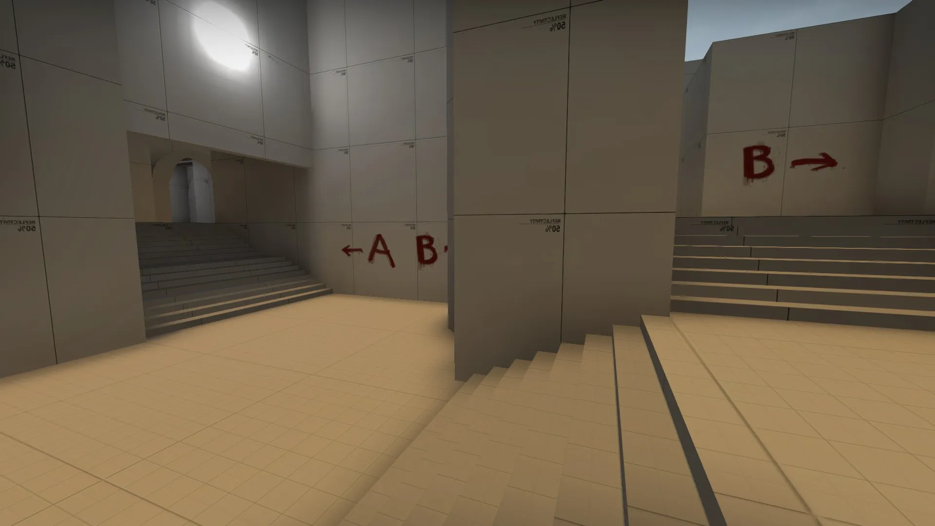
Removed a box on B site that may be troublesome.
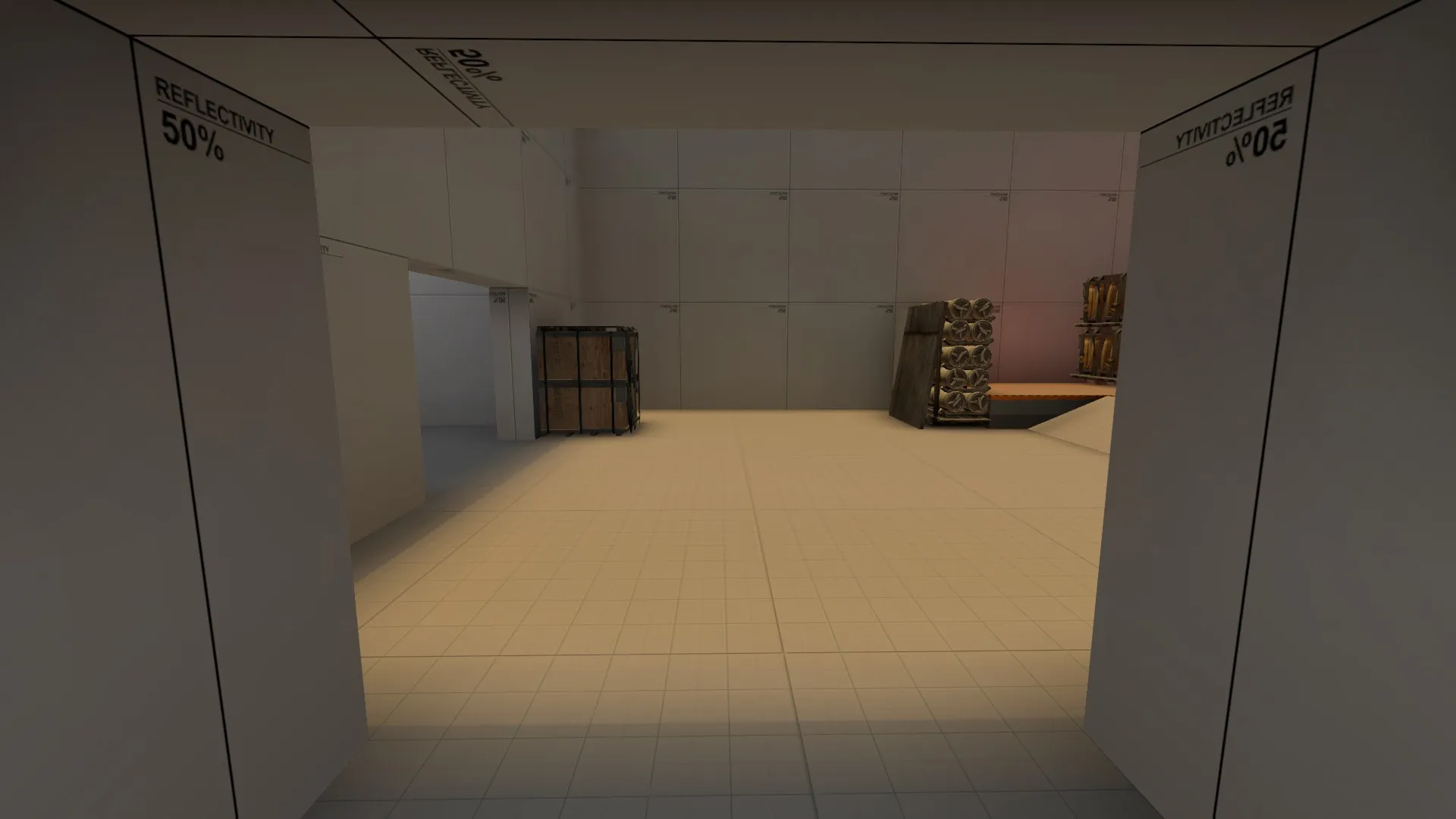
Had a run around it this morning, as for A, it feels a lot more developed  and I can see it playing very well. The screenshot defied me as it looked like the old Site with the loop was still stuck onto the back of it. I cant spot anything wrong with the layout choices, other than the entrances to both sites are sort of similar (1 path to a split), which is not necessarily a bad thing but we will see what the play test returns!
So your going with a mirage type setting now?
Hi! I had to get some sleep right after the playtest, so I'll give you some feedback now instead.
A-site was by far the better bombsite, that said, I think it's pretty hard for Ct's to defend. CT's can't really peek into where the T's are coming from without standing by the boxes on site. They have very limited space to fall back on. Also, in case of a T rush the CT's would have to smoke off both entrances in order to stop it. If only one entrance is smoked off T's could just instantly switch to the other entrance.
B-site felt very claustrophobic, other than that I can see it play well if only the area was a lot bigger and the site wasn't as small. I liked the broken wall at the back since it was a good counter spot from the connector to middle.
Mid was okay, just okay. It didn't feel like it belonged to any team and I'm not sure how I feel about that. It's also very generic. You should look into making it stand out a bit and make the timings a bit more interesting. Don't be afraid to use verticality to achieve this.
The current radar in this thread isn't up to date, you might wanna fix that 
Happy mapping!
Don’t have an account yet? Register yourself now and be a part of our community!