1. Forums
  2. Discord
  3. About Mapcore
  4. Patreon Supporters
  • Login
  • Register
  • Search
This Thread
  • Everywhere
  • This Thread
  • This Forum
  • Articles
  • Pages
  • Forum
  • More Options
  1. Mapcore
  2. Discussions
  3. Level Design

[WIP] de_change (Big Update 08/18/2015)

  • y-man
  • June 20, 2015 at 12:45 PM
  • y-man
    • June 20, 2015 at 12:45 PM
    • #1

    Hello MapCore Community,

    this is de_change my map for the CS:Go Mapping Contest : de_change in Steam Workshop

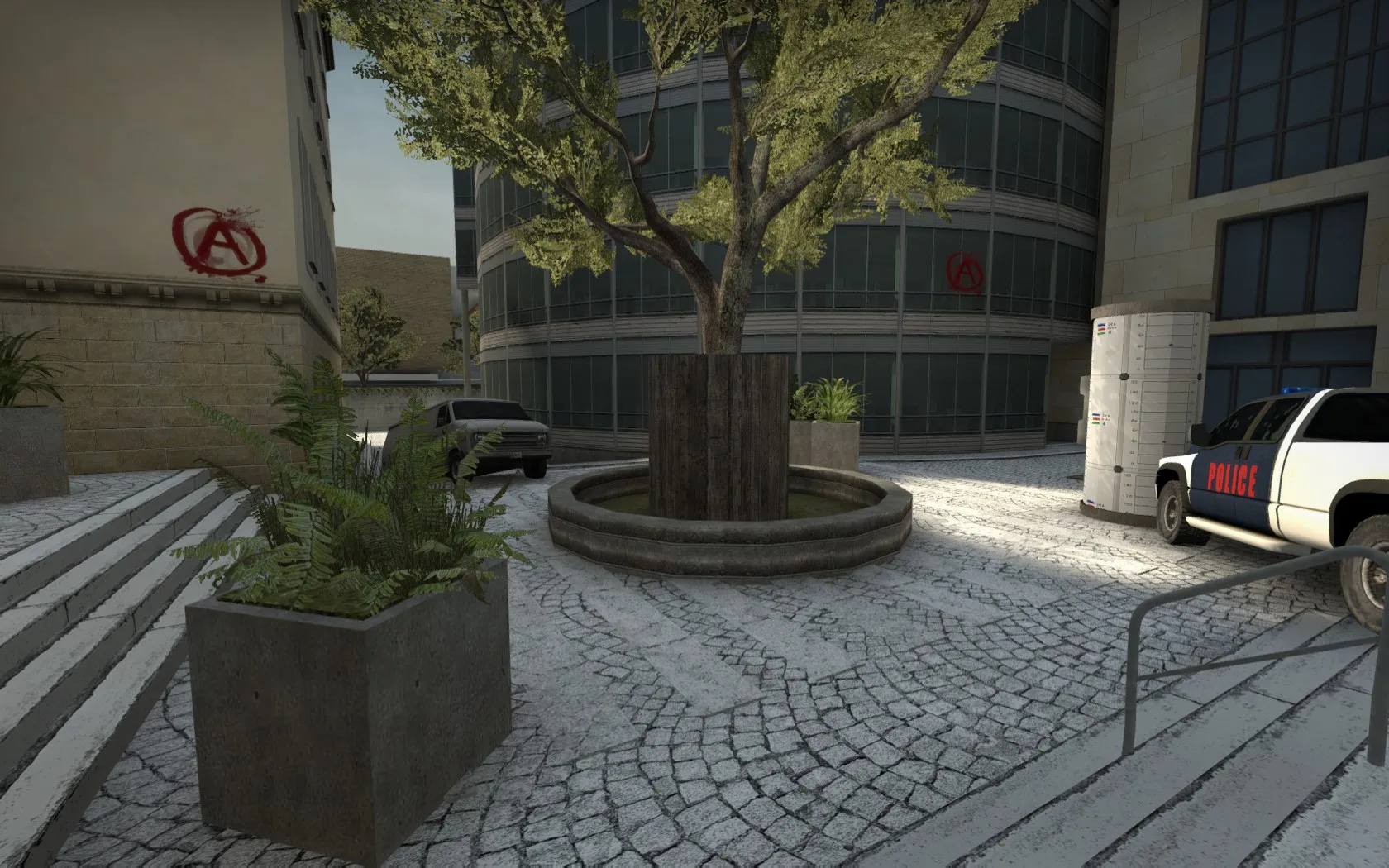
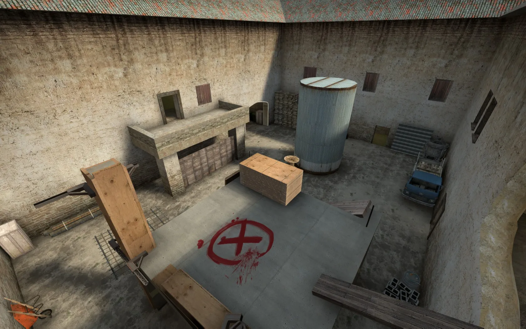
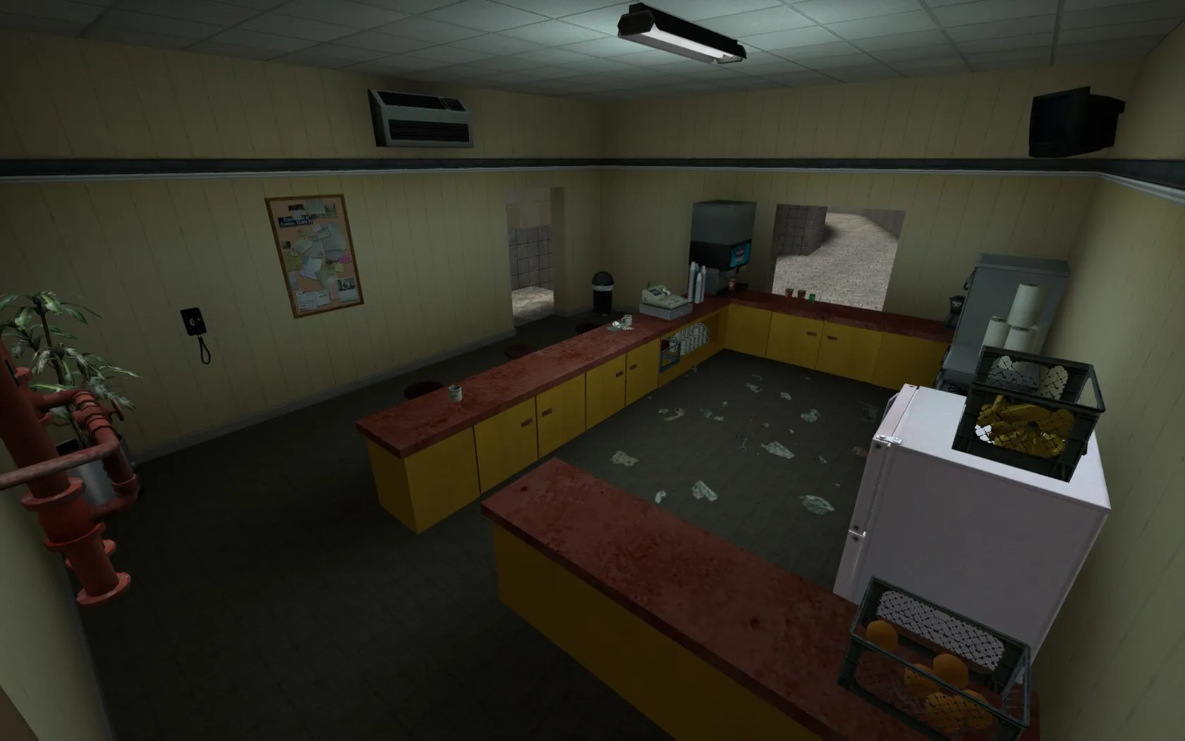
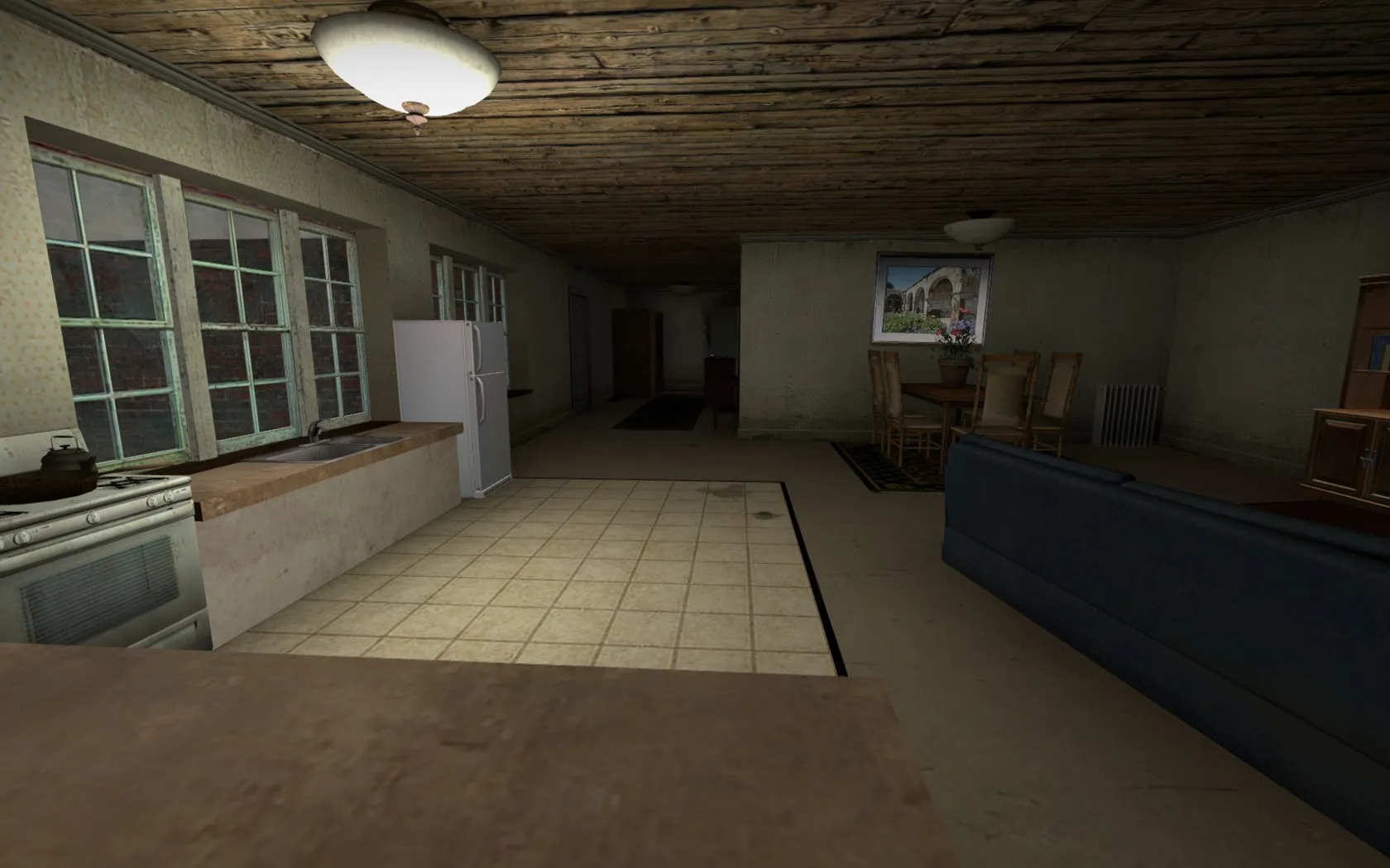
    Here are some screenshots:

    Quote

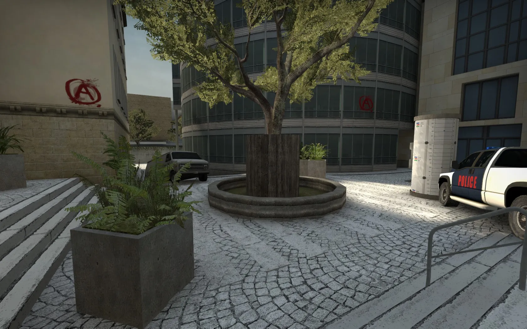
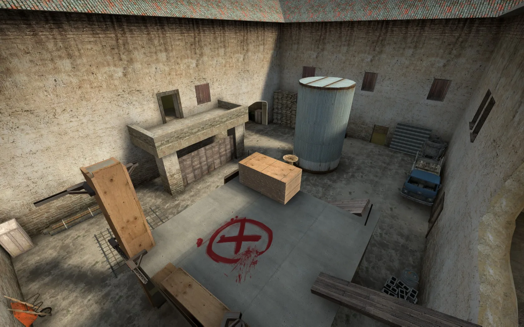
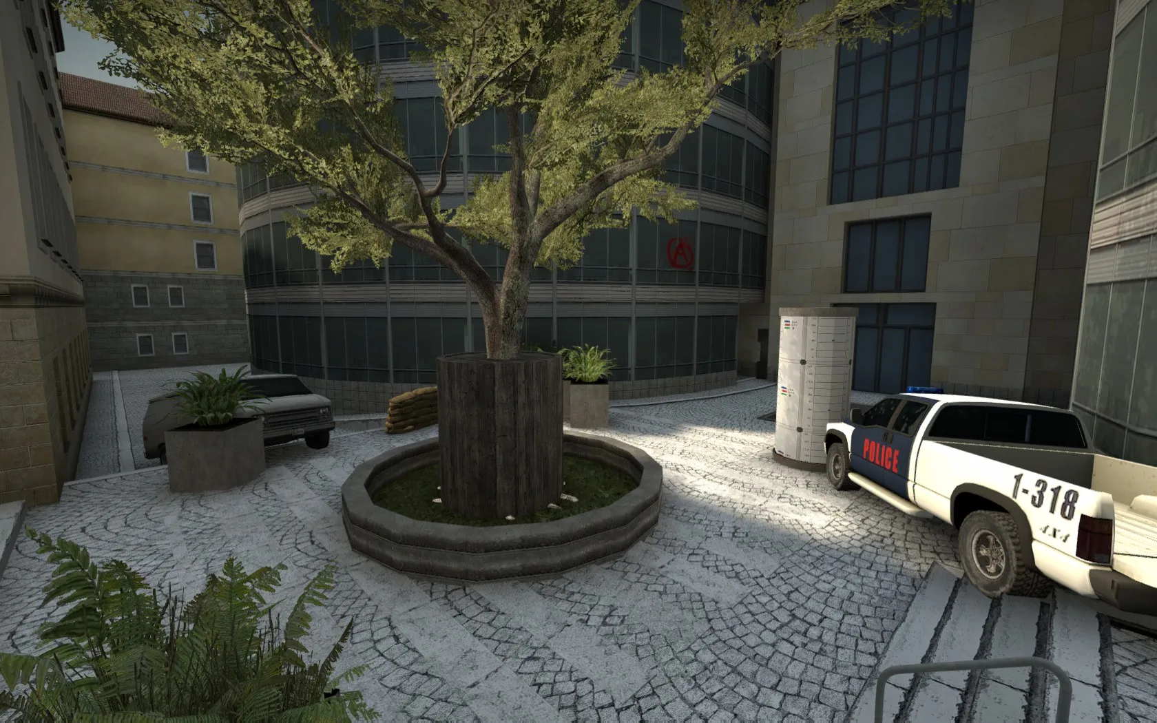
    The A Spot


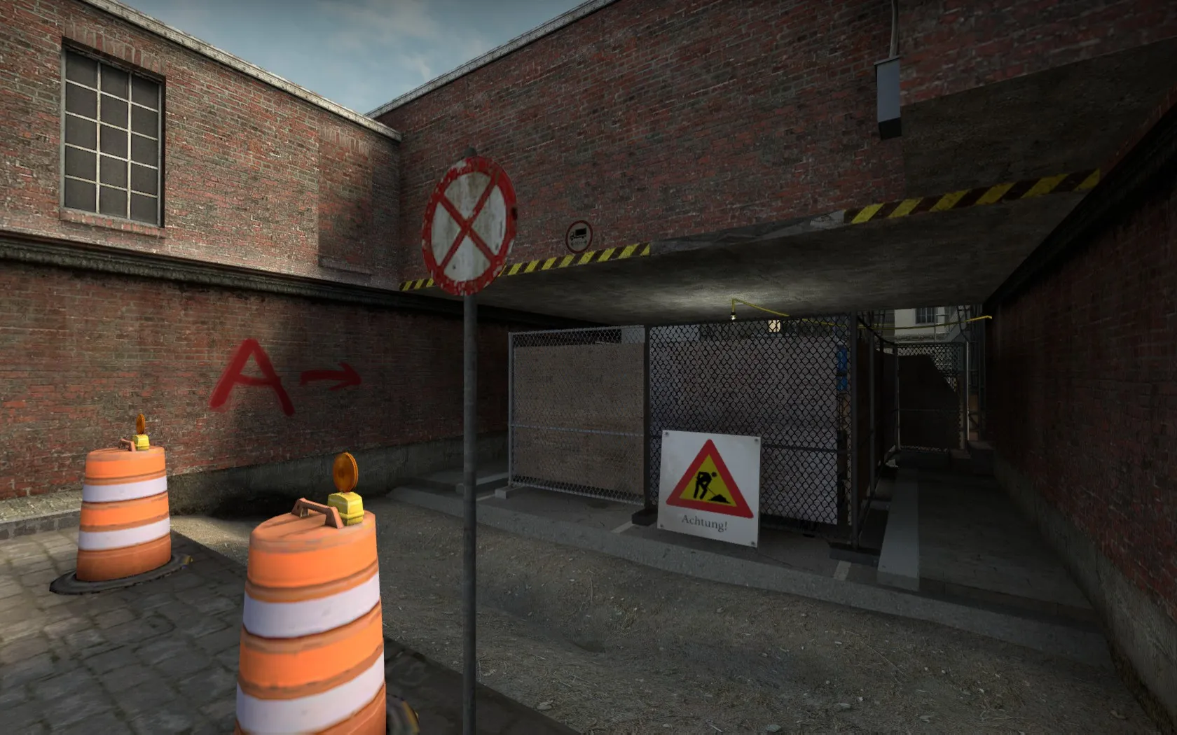
    The B Spot


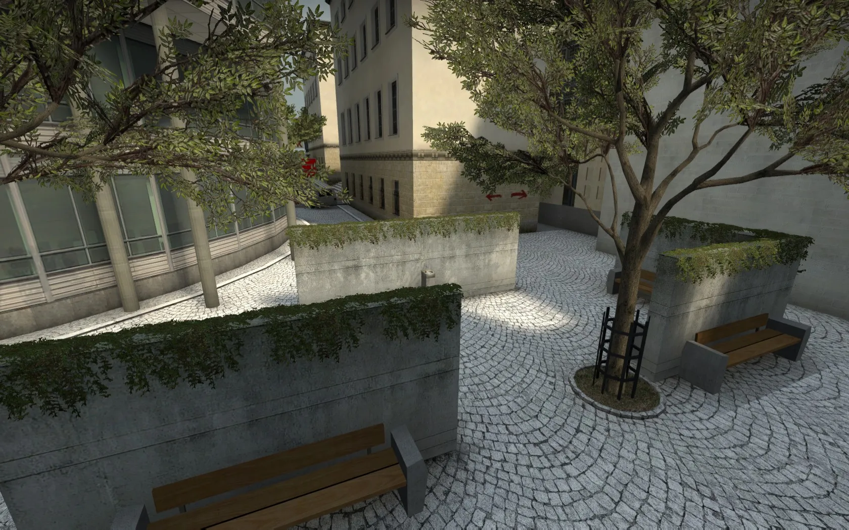
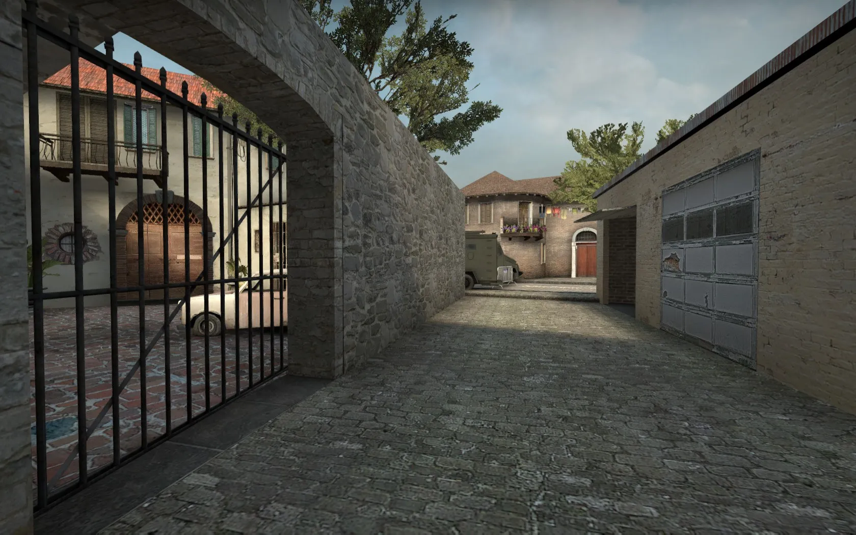
    Two picture from mid route:
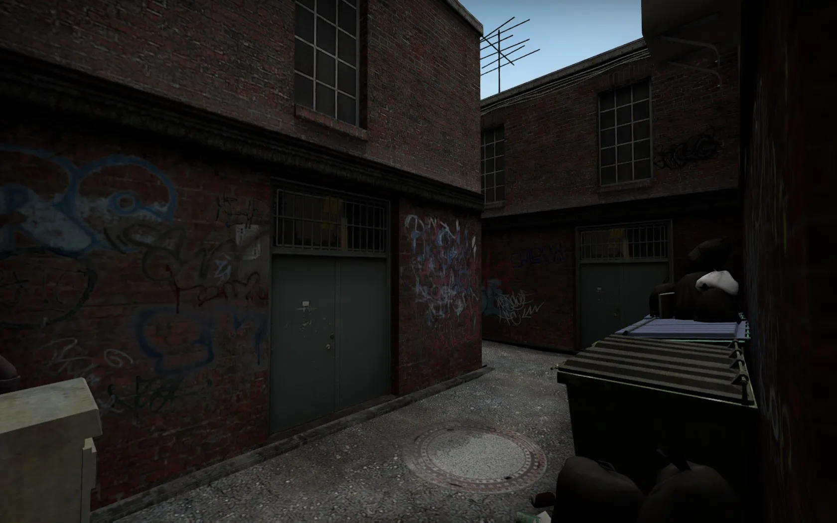

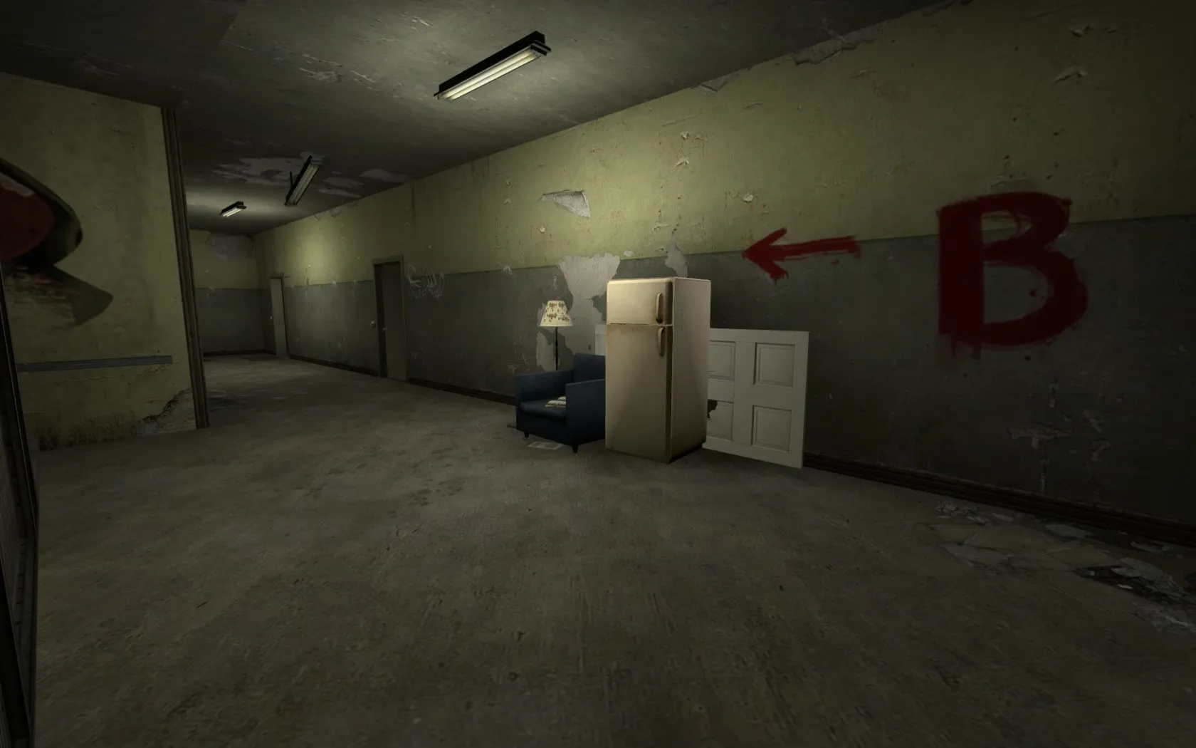
    Terror house on B route:
    Display More

    If you got any feedback, please let me now!
  • y-man
    • July 5, 2015 at 3:13 PM
    • #2

    New update live:

    • A spot is taking shape
    • New 2D skybox and new global lighting
    • Minor changes here and there

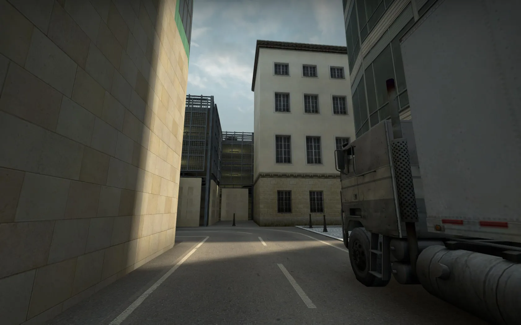
    Two new screens, which illustrate alterations:

    Quote

    A spot:


    CT route to A:

  • laminutederire
    • July 5, 2015 at 6:00 PM
    • #3

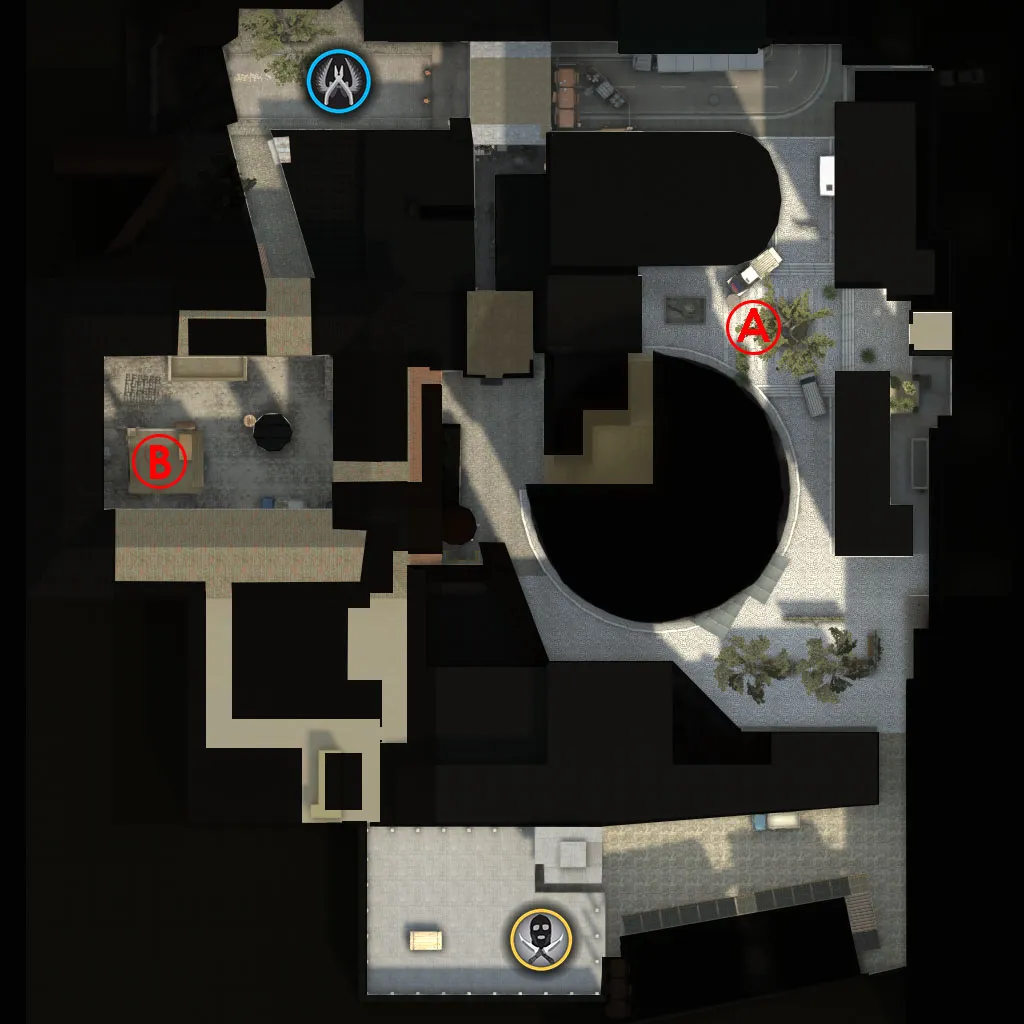
    You should fix your radar, paths are mostly hidden in your radar.

    On another note, path are a bit too empty.. add some cover or things like that!

  • jackophant
    • July 6, 2015 at 10:19 AM
    • #4

    Perhaps you could upload an image of your overview somewhere? It's hard to judge the map from screenshots of it's detail, but regarding detail, I would say it feels very "GoldSrc" and subsequently you might want to look at some tutorials for detailing.

  • y-man
    • July 6, 2015 at 6:04 PM
    • #5

    I added some color features to the radar to highlight paths, underpasses and interior space and put it in the first post. I hope it helps to orientate yourself.

    Yeah I know there is not much cover on some paths, I will look into that!

    What do you mean exactly by detailing? Things like decals, sutucco and props or more architectural?

  • laminutederire
    • July 6, 2015 at 7:54 PM
    • #6

    The radar is way better, it helps a lot for orientation indeed!

  • Panda
    • July 8, 2015 at 11:32 PM
    • #7
    Quote from y-man

    I added some color features to the radar to highlight paths, underpasses and interior space and put it in the first post. I hope it helps to orientate yourself.

    Yeah I know there is not much cover on some paths, I will look into that!

    What do you mean exactly by detailing? Things like decals, sutucco and props or more architectural?

    I'm guessing what jack means by detailing is brushwork on buildings and how you use textures in the map to portray the theme of the map.

    The main thing I would say that should be improved on your map are the paths. For example. The paths that CTs must take to both bombsites, from looking at the overview, doesnt look interesting. Instead of being straight lines I would make it wider and change some angles. I havent seen it ingame so I'm not sure if it looks different

  • laminutederire
    • July 9, 2015 at 8:32 AM
    • #8

    To corroborate what's being told here, I think that jackophant comment is that textures feel like old counter strike and not new generation cs. Simply find textures more actual and less old-ish. You could find an inspiration in de_season, or maybe closer to what you want to do: New York maps from Will2k, he has well updated his textures for the cs go version compared to his previous version. I think that visually, you can achieve something a lot better without starting detailing too much. I don't know if it is what he wanted to say, but that's what I understood of it, so I hope it'll help.

  • jackophant
    • July 9, 2015 at 11:43 AM
    • #9

    the scale 1.6 maps was a lot larger as you moved faster as well, csgo on the whole requires slightly tighter pathways. I also refer to it as GoldSrc, as some of the details are very blocky, specifically the picture with holes in the wall and the rather chunky slab of angled wood.

    You've also used a lot of noisy textures in close proximity to each other and looping a lot. Like when someone wears a heavily patterned shirt with heavily patterned shorts, there's too much going on and it looks a mess.

    The best example I think you've provided of how things should look is your corridor with the B sign in it and the stack of rubbish next to the sign. Although I would probably change the floor texture, and/or rotate it to follow the hallway, not run diagonally across it.

  • Guni
    • July 9, 2015 at 12:34 PM
    • #10

    Some of de_change I would like to see is towards your pathways, they are very narrow and long. I think the map needs to be made a bit smaller. It would be a smart move to also implement some neutral textures (dev) while you work on the layout and size of the map. Seems a little silly to line up all your textures now, just adding extra work to your workload.

  • y-man
    • July 9, 2015 at 6:35 PM
    • #11

    Thank all of you for the impressions!

    Quote from Panda

    The main thing I would say that should be improved on your map are the paths. For example. The paths that CTs must take to both bombsites, from looking at the overview, doesnt look interesting. Instead of being straight lines I would make it wider and change some angles. I havent seen it ingame so I'm not sure if it looks different

    I'll think about it. Maybe I get a sudden clever idea to change the path there. Meanwhile please take a look ingame whether it confirms your impression.


    Quote from laminutederire

    Simply find textures more actual and less old-ish. You could find an inspiration in de_season, or maybe closer to what you want to do: New York maps from Will2k, he has well updated his textures for the cs go version compared to his previous version. I think that visually, you can achieve something a lot better without starting detailing too much.

    Maybe I can grab some inspirations from this. Thanks.


    Quote from jackophant

    I also refer to it as GoldSrc, as some of the details are very blocky, specifically the picture with holes in the wall and the rather chunky slab of angled wood.

    You refer to the B spot here. This is one of the least current parts of the map. This should be just a sketch of the layout and theme you can expect there in the future. But you are right, in it's current state it's not very pleasing. Most likely it's the next part I will rework (or ct spawn).


    Quote from jackophant

    You've also used a lot of noisy textures in close proximity to each other and looping a lot. Like when someone wears a heavily patterned shirt with heavily patterned shorts, there's too much going on and it looks a mess.

    Do you mean the A spot in particular? I defused some very frequent texture (glass tower) and added new texture for the ground (see last update first picture). Do you think it is still to noisy?


    Quote from Guni

    Some of de_change I would like to see is towards your pathways, they are very narrow and long. I think the map needs to be made a bit smaller. It would be a smart move to also implement some neutral textures (dev) while you work on the layout and size of the map. Seems a little silly to line up all your textures now, just adding extra work to your workload.

    A lot of textures, especially on b site of the map, are just placeholders, because i did not want to publish the map with dev textures. It seems it was a bad decission, because many people are bothered about them.

  • Panda
    • July 9, 2015 at 7:12 PM
    • #12

    Ingame it does not feel too bad however I would remove the furthest path to A as it has no purpose. And any others like that because I just makes the map complicated and people can get lost like I did. The texturing is quite bland......try making it like A site which wasn't that bad.

  • y-man
    • August 18, 2015 at 2:04 PM
    • #13

    Finally, right before playtesting session this thursday, big update on de_change (new overview on top):

    - all new CT spawn
    - big B spot overhaul (inclusive T house)
    - removed some dark spots
    - closed one redundant(?) CT route to A spot
    - clean-up on A spot
    - altered T route to A (removed a house, added another, some trees...)
    - minor changes everywhere


    This map will be playtested this thursday (20. August) at 21:00[/b] CEST[/b]. I want to invite everybody to join us. See you there!


    Some new pictures

    Quote

    A spot again:


    T route to A:


    CT route to A:


    B spot:


    CT route to B:

    Display More

Participate now!

Don’t have an account yet? Register yourself now and be a part of our community!

Register Yourself Login
Discord

The Mapcore Discord is our lively IRC channel of the 2000s reborn. Chat about level design, gaming, and more.

Latest Posts

  1. How to Use a Free Kundali Maker for Accurate Future Predictions

    astr09
    July 23, 2026 at 6:35 AM
  2. Tangerine

    Harry Poster
    July 18, 2026 at 11:10 AM
  3. Any of the old guard still around? D:

    Warby
    July 12, 2026 at 8:23 PM
  4. About our archived forums

    Thrik
    June 30, 2026 at 2:12 PM
  5. Mapcore Discord

    mason_fan123
    June 24, 2026 at 8:52 PM
  6. [CS2] Valley

    Serialmapper
    June 22, 2026 at 11:56 AM
  7. Free Music / SFX Resource - Over 2500 Tracks

    Eric Matyas
    June 18, 2026 at 12:32 PM
  8. Pango [WIP]

    Elowen
    June 11, 2026 at 10:13 AM
  9. [CS2] Dvina

    Jeremy Rivera
    June 11, 2026 at 10:03 AM
  10. Bridges 2.0 by NEXSIDE, MAP SHOWCASE. ( Steam Workshop )

    MrTrane18
    June 1, 2026 at 7:46 PM
  1. Privacy Policy
  2. Contact
Powered by WoltLab Suite™