1. Forums
  2. Discord
  3. About Mapcore
  4. Patreon Supporters
  • Login
  • Register
  • Search
This Thread
  • Everywhere
  • This Thread
  • This Forum
  • Articles
  • Pages
  • Forum
  • More Options
  1. Mapcore
  2. Discussions
  3. Level Design

WIP in WIP, post your level screenshots!

  • Marcos
  • November 25, 2004 at 12:11 PM
  • fewseb
    • April 15, 2019 at 4:06 AM
    • #13,801
    Quote from blackdog

    16 hours ago, blackdog said: I think its one of those cases where being too faithful to a reference hurts the final product, it’s waaay off the left field for people not to notice and criticise. It just looks dangerous, as in I can’t see how people wouldn’t get their foot stuck in there, so it’s not inviting to be used. I mean, in real life is not meant to be used, so the natural reaction in game is to stay away as well.

    You can achieve the same intended effect of metal noise by using metal grills such as this heavy duty stuff used in building sites as well as public installations (catwalks leading to natural beauty spots for eg)

    https://images.app.goo.gl/hyKEcqySkpkrUotx7

    I would convert the left side to a concrete ramp (or wooden! if the map represents a site in early development). Or make a fully finished concrete set of stairs, but one side has wooden board on it to make a ramp. A ramp would make a lot of sense for moving heavy building materials up and down the height difference, and would be accessible if the final site is intended for public use (not moving goods). Ultimately I think would look more logic/organic.

    ~

    I’d like to see this in context, as in: I’m a bit sceptical that such small positioning difference is so advantageous for one team or the other, it sounds wrong. Not that it’s a bad idea to differentiate peek spots, but the closest example I can think is underpass on Santorini and the two angles are separated by a wall and there’s an accentuated difference in the way you walk up to the spot that makes sense. If there has to be a clearly more advantageous way to peek, than I argue that you should have a clearly different variant (like forking the path to go indoor and come out from a window/door or you peek from a platform which you would have had to choose to get up to before getting here)

    Display More

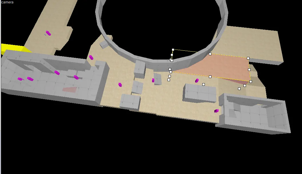
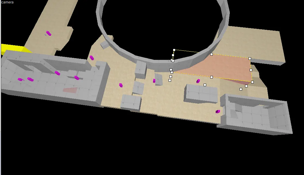
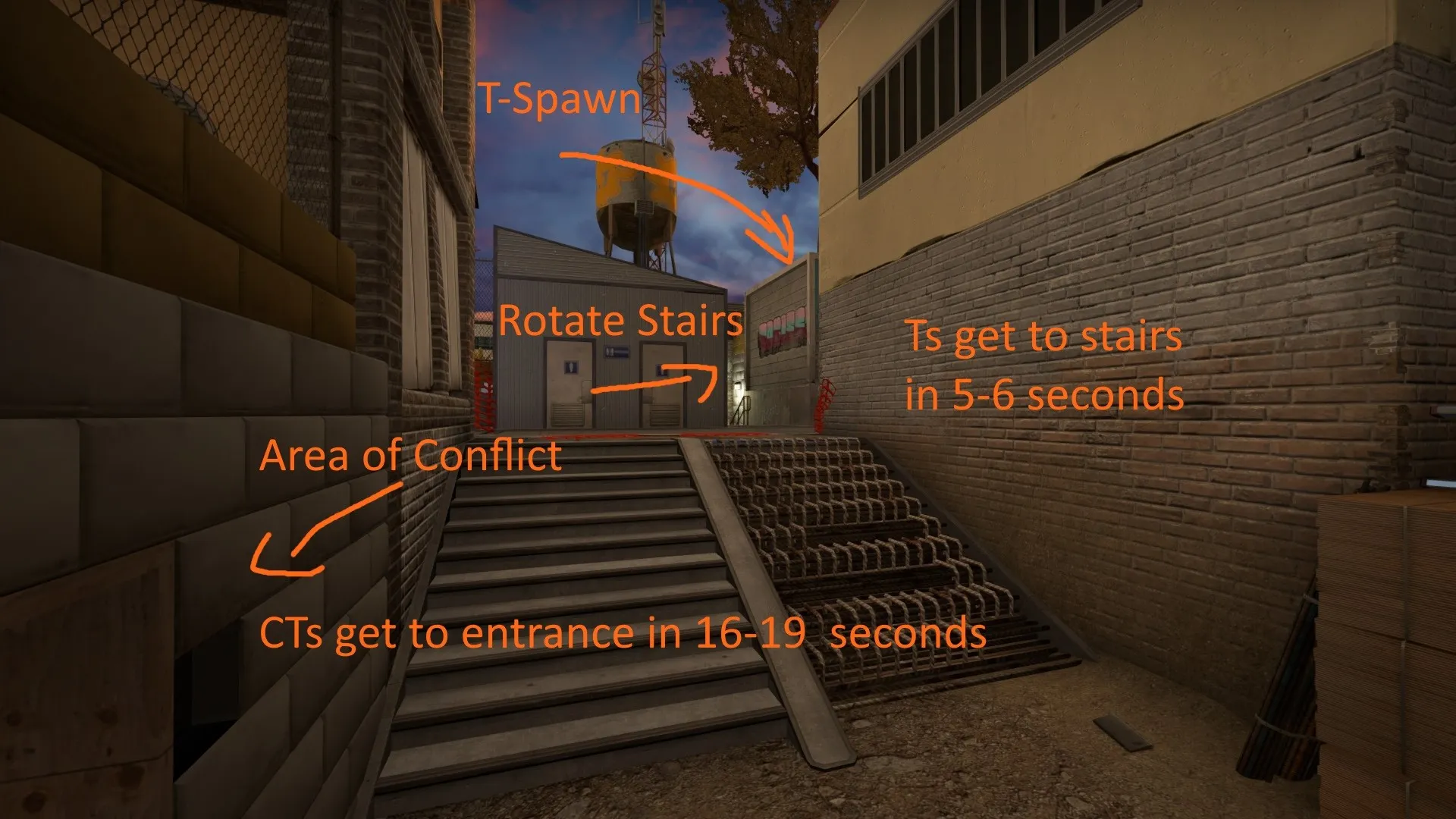
    The stair area overall isnt that big of a gameplay area. Its serves as a way for Ts t get to the area of conflict just ahead. (see picture) CTs arnt going to get to the stair area faster then the Ts ever. CTs are most likely to hold back on the exits to the area of conflict or stay on their side. Its not as important as the hallway in Santorini


    The noise difference is mainly for two things.

    1. The metal_grate landing sound effect is louder then the concrete landing sound, and more distinctive, if the cts can push up, they may be able to hear a lurker or an awper thats trying to speedily get to their best peak spot. Very situational though.

    2. In the event that the ts rotate back through the stair well (see picture) a ct in the area of conflict would be able to push up and listen for them. In this scenario, having quieter and louder materials is good for both detecting the amount of enemies and as well as their positions.


    I do agree that the bottom of the stairs do look fairly unwelcoming, this was the first time I compiled for that area and have since changed some things around and added ply wood boards. Though gameplay is obviously the most important, the unfinished stairs also served to help explain the stair area a little bit better in relation to whats going on in the map.


    Id like to have been able to provide more context as to where everything is as well as the changes ive made to the stairs, however thats currently not possible, as ive run into a little bit of a snag where the game hard crashes the second bots/players load into the map (speaking off, does anyone know why that might be?) so ive tried my best to explain with this screenshot
  • Soldat Du Christ
    • April 16, 2019 at 5:41 PM
    • #13,802

    The content cannot be displayed because it is no longer available.

  • RA7
    • April 17, 2019 at 1:51 PM
    • #13,803
    Quote from slavikov4

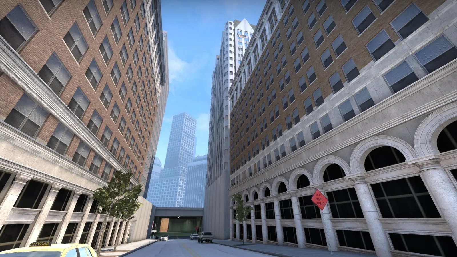
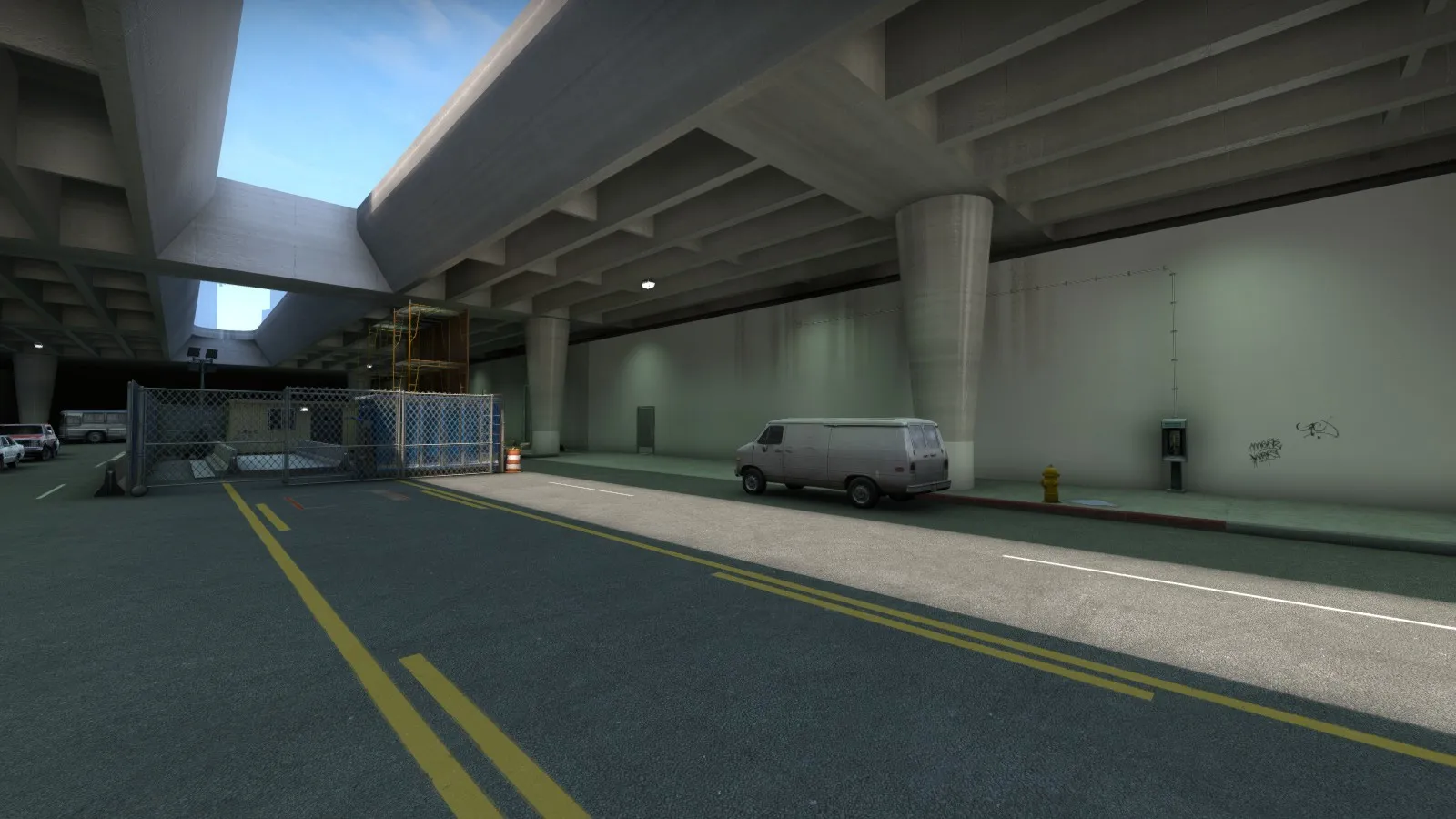
    On 4/5/2019 at 11:17 AM, slavikov4 said: cs_block based on Los Angeles

    It needs more "dirt". The streets look too clean...

  • neptune
    • April 17, 2019 at 4:11 PM
    • #13,804
    Quote from RA7

    2 hours ago, RA7 said: It needs more "dirt". The streets look too clean...

    the municipality is working.

  • Interfearance
    • April 18, 2019 at 2:10 AM
    • #13,805

    @RA7 Maybe you pimped the streets too much

  • That50'sGuy
    • April 20, 2019 at 10:12 PM
    • #13,806

    A friend of mine made a hilarious video with me about my map (de_border) ?

    External Content www.youtube.com
    Content embedded from external sources will not be displayed without your consent.
    Through the activation of external content, you agree that personal data may be transferred to third party platforms. We have provided more information on this in our privacy policy.

  • Levelboi
    • April 20, 2019 at 11:04 PM
    • #13,807

    de_archives

    After days of countless threats, a small terrorist group has launched an attack on a small town outside of Grosseto, Italy.

    The group hopes to hold the archives complex for it's powerful strategic position, and high elevation.

    Thankfully, a GIS Counter-Terrorist squad has made efforts against the group, leaving only the most powerful members alive, holding a formidable position in the archives complex...A tough scenario lies ahead for both sides of the conflict.

    Workshop link https://steamcommunity.com/sharedfiles/fi…/?id=1702736973

    Screenshots - https://imgur.com/a/wyyaZ95

    Overview Radar Image

    [Blocked Image: https://i.imgur.com/4awao1O.png]

    Trailer -

    External Content www.youtube.com
    Content embedded from external sources will not be displayed without your consent.
    Through the activation of external content, you agree that personal data may be transferred to third party platforms. We have provided more information on this in our privacy policy.

    Let me know if you have any feedback. Would love to make this better. Thanks! Good luck, have fun!

  • Interfearance
    • April 21, 2019 at 11:34 PM
    • #13,808

    @Levelboi I love the Roman elements like the statues. So far I haven't seen a map that uses them!

  • Interfearance
    • April 25, 2019 at 6:16 PM
    • #13,809

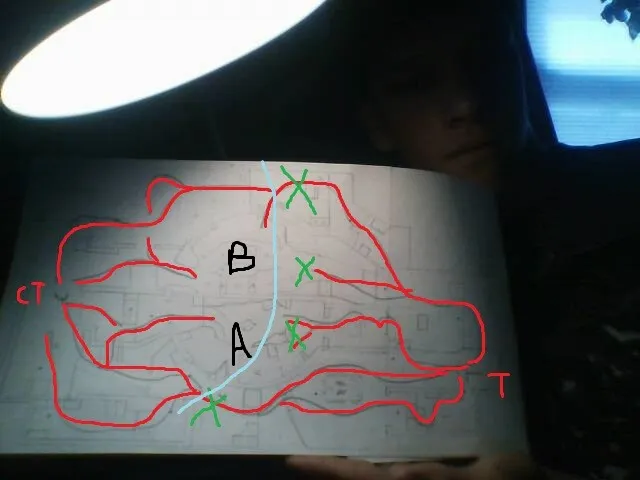
    Its gonna have 4 lanes, no middle, and two back to back bombsites (obv not connected directly). The idea was originally some sort of desert research lab, but then I saw a greenhouse project with plastic geodesic domes that had biomes, so I went with a mashup of the two ideas. One biome will be the jungle and the other will be the savannah (a and b). I am scared that the theme is too much like Biome, although the dome structure, indoor areas and stuff are different. Wut u guy sthink


  • TECHNICKER
    • April 25, 2019 at 9:48 PM
    • #13,810
    Quote from Interfearance

    3 hours ago, Interfearance said:

    Its gonna have 4 lanes, no middle, and two back to back bombsites (obv not connected directly). The idea was originally some sort of desert research lab, but then I saw a greenhouse project with plastic geodesic domes that had biomes, so I went with a mashup of the two ideas. One biome will be the jungle and the other will be the savannah (a and b). I am scared that the theme is too much like Biome, although the dome structure, indoor areas and stuff are different. Wut u guy sthink


    I think its very interesting idea and should be done, but I think that the layout will be too confusing for a first time player. And just think how pros would play that, would it be even possible? But anyways I think its overall an grat idea and should be done! GoodLuck

  • Logic
    • April 26, 2019 at 8:19 AM
    • #13,811

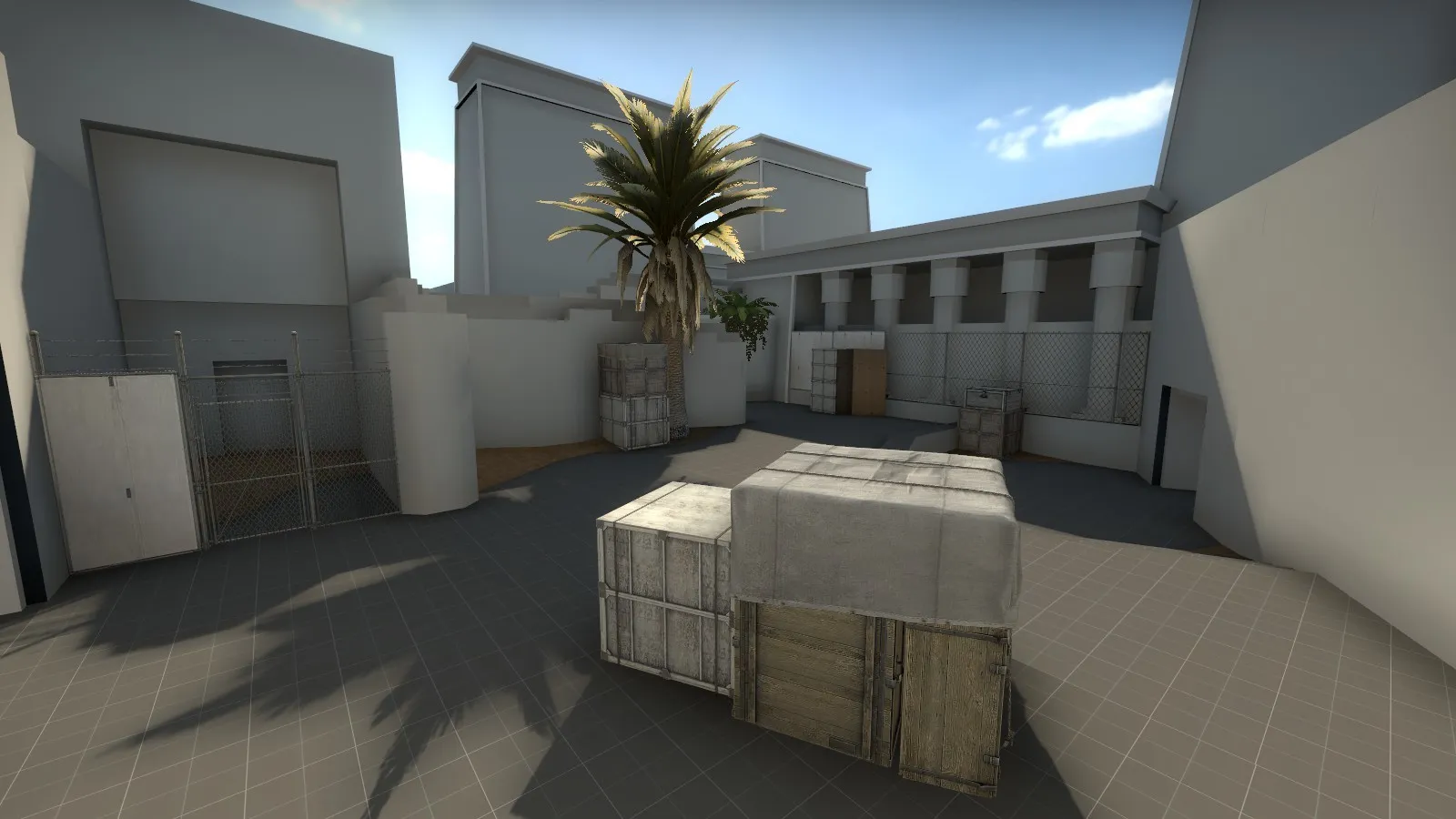
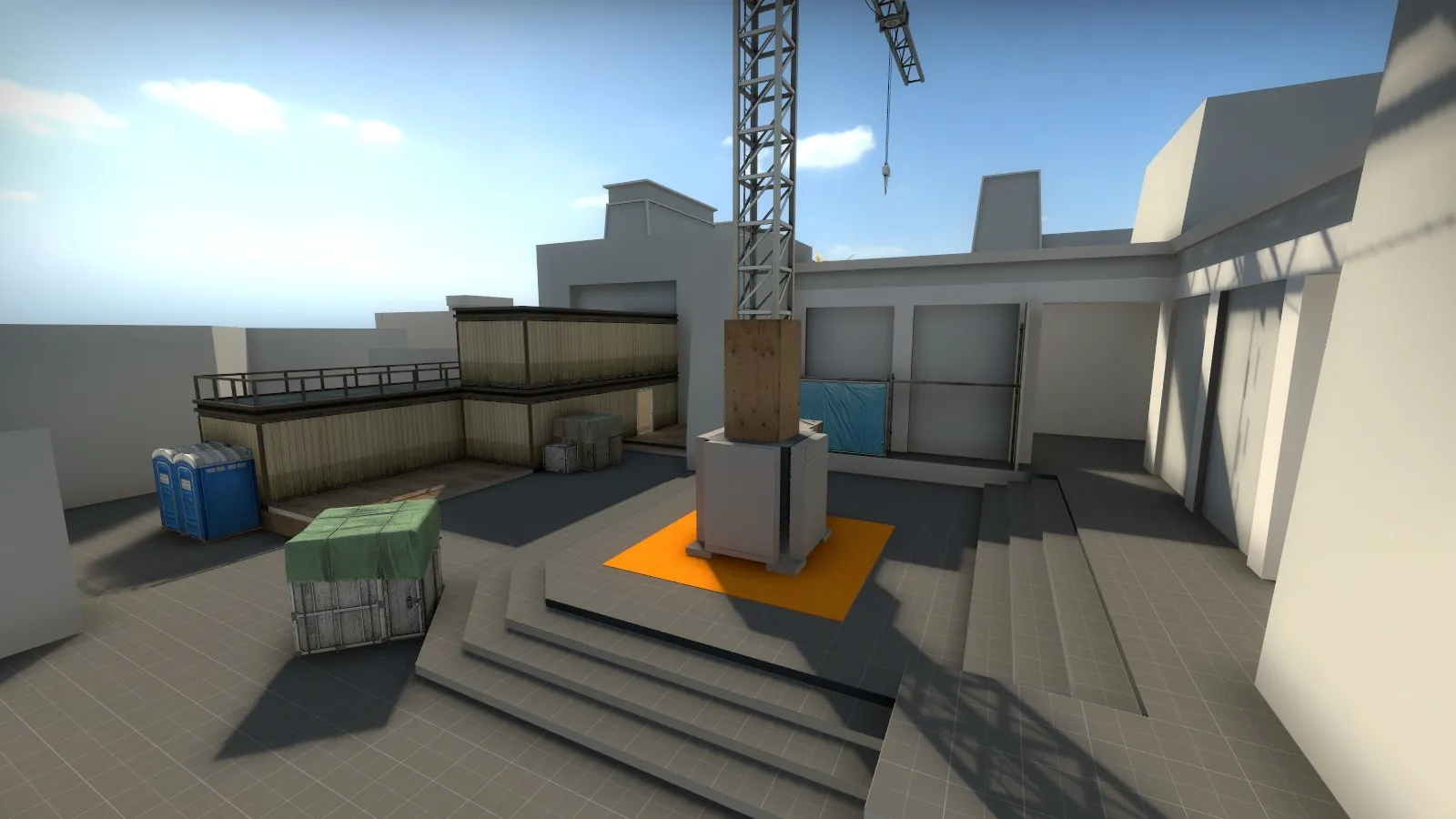
    Have had a break from mapping for a while. Finally managed to solve some timing issues in mid to make the map play well (in theory).

    Will playtest with a couple of friends next week and probably make a thread after that.

    Mid

    A-site

  • Interfearance
    • April 26, 2019 at 2:07 PM
    • #13,812

    @Logic the geometry looks really good, and seems Egyptian to me.

  • Logic
    • April 26, 2019 at 3:43 PM
    • #13,813
    Quote from Interfearance

    1 hour ago, Interfearance said: @Logic the geometry looks really good, and seems Egyptian to me.

    Correct! Thank you! The level is based on the Temple of Philae, located on an island in the Nile :)

  • zombi
    • April 28, 2019 at 1:56 AM
    • #13,814

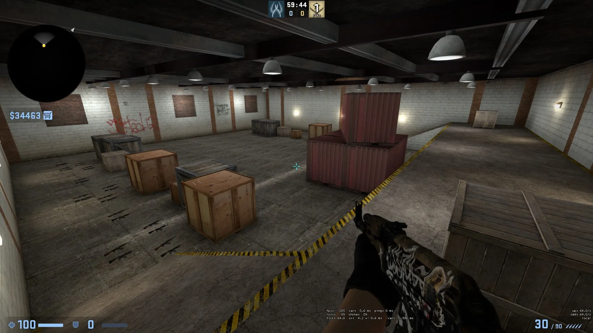
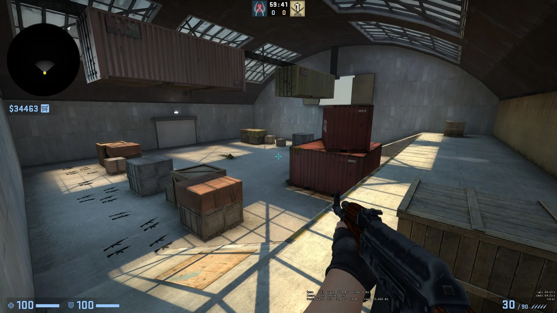
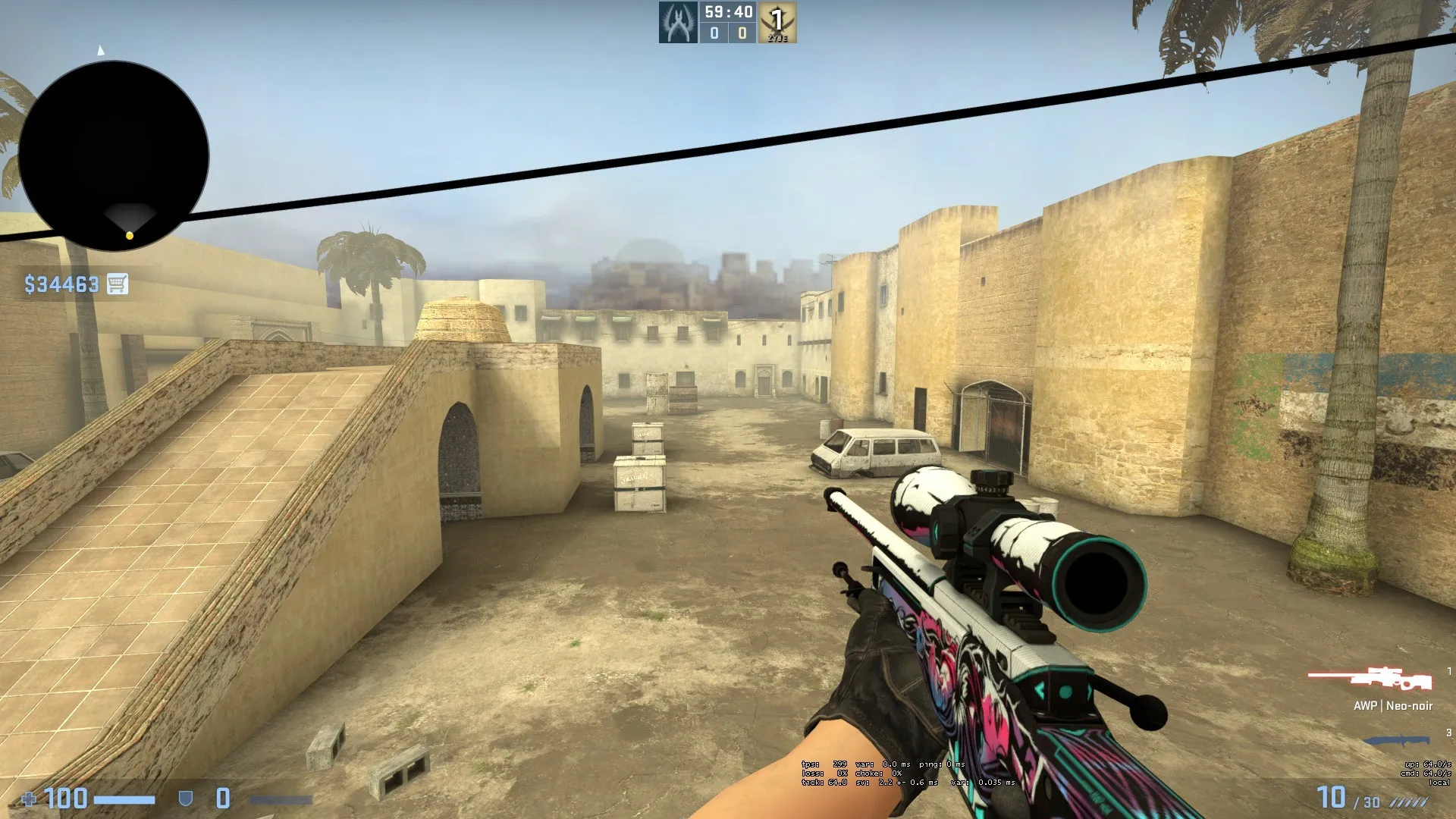
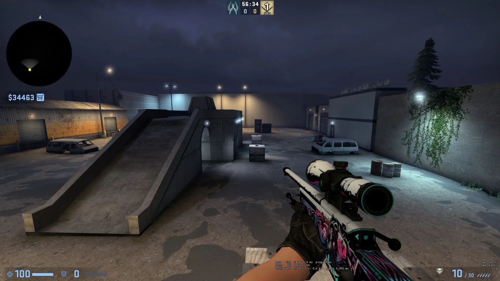
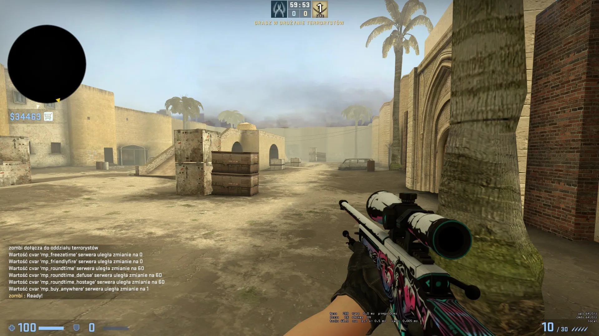
    Remake of popular aim maps aim_redline and awp_india.

    FPS should be the same but this need test on full server.


  • Levelboi
    • April 28, 2019 at 3:41 AM
    • #13,815
    Quote from Interfearance

    On 4/21/2019 at 3:34 PM, Interfearance said: @Levelboi I love the Roman elements like the statues. So far I haven't seen a map that uses them!

    Thank you! Yeah I haven't seen too many maps use them either. They are cool lookin! Thanks for checking out the map!

  • That50'sGuy
    • April 28, 2019 at 5:30 AM
    • #13,816

    So today I felt like creating a fictional brand for all those cola props in de_border (Lecker-Cola)! And this was the result!

    That 20's style poster I made for it still needs some tweaking, but I'll get to it! (Side note: "Lecker" is German for "Delicious" or "Yummy", or so I've been told by a native speaker)

    If I made any mistakes with the poster grammar, please tell me! If you want to know how I made the poster, here's a little walkthrough: https://imgur.com/a/DoslOu3:)

    The content cannot be displayed because it is no longer available.

  • neptune
    • April 28, 2019 at 8:35 AM
    • #13,817
    Quote from I ♡ The 1950

    2 hours ago, I ♡ The 1950's said: So today I felt like creating a fictional brand for all those cola props in de_border (Lecker-Cola)! And this was the result!

    That 20's style poster I made for it still needs some tweaking, but I'll get to it! (Side note: "Lecker" is German for "Delicious" or "Yummy", or so I've been told by a native speaker)

    If I made any mistakes with the poster grammar, please tell me! If you want to know how I made the poster, here's a little walkthrough: https://imgur.com/a/DoslOu3:)

    The content cannot be displayed because it is no longer available.

    My advice this poster need remake. I search 20's advertisement poster and the common style of these posters is that they look like oil paint. I share a sample.

    Coca Cola 1920's Advertisement Sample

  • Vaya
    • April 28, 2019 at 10:37 AM
    • #13,818
    Quote from Logic

    On 4/26/2019 at 8:19 AM, Logic said: Have had a break from mapping for a while. Finally managed to solve some timing issues in mid to make the map play well (in theory).

    Will playtest with a couple of friends next week and probably make a thread after that.

    Glad you are back dude

  • Logic
    • April 28, 2019 at 10:41 AM
    • #13,819

    Thanks man :) Glad to be back!

    Quote from Vaya

    4 minutes ago, Vaya said: Glad you are back dude

    Thanks man! :) Glad to be back!

  • blackdog
    • April 28, 2019 at 1:41 PM
    • #13,820
    Quote from I ♡ The 1950

    8 hours ago, I ♡ The 1950's said: So today I felt like creating a fictional brand for all those cola props in de_border (Lecker-Cola)! And this was the result!

    https://imgur.com/a/DoslOu3:)

    The content cannot be displayed because it is no longer available.

    It has already been pointed out but doesn’t look much in tone with 20s advertising. I guess you can get away with the cartoon illustration, but the palette seems way off, don’t recall ever seeing that aqua colour in that sort of stuff, was always quite warm palettes even whites as off-whites like ivory/magnolia. Not an expert but that’s what I remember.

    The other big part of selling such an idea would be font choice, which are quite off atm.

    in fact you could deffo sell this poster idea without illustrations and just the right combo of colour and font.

    Also the brand should be the most noticeable wording on there, but is yellow, almost invisible compared to the rest.

    Finally I think the aspect ratio is not ideal, I would think stuff from that era would be mostly 2:3, any standard paper size. In Day of Defeat there weren’t weird sized poster for eg.

Participate now!

Don’t have an account yet? Register yourself now and be a part of our community!

Register Yourself Login
Discord

The Mapcore Discord is our lively IRC channel of the 2000s reborn. Chat about level design, gaming, and more.

Latest Posts

  1. Any of the old guard still around? D:

    Warby
    July 12, 2026 at 8:23 PM
  2. About our archived forums

    Thrik
    June 30, 2026 at 2:12 PM
  3. Mapcore Discord

    mason_fan123
    June 24, 2026 at 8:52 PM
  4. [CS2] Valley

    Serialmapper
    June 22, 2026 at 11:56 AM
  5. Free Music / SFX Resource - Over 2500 Tracks

    Eric Matyas
    June 18, 2026 at 12:32 PM
  6. Pango [WIP]

    Elowen
    June 11, 2026 at 10:13 AM
  7. [CS2] Dvina

    Jeremy Rivera
    June 11, 2026 at 10:03 AM
  8. Bridges 2.0 by NEXSIDE, MAP SHOWCASE. ( Steam Workshop )

    MrTrane18
    June 1, 2026 at 7:46 PM
  9. Classic Maps Reborn For CS2

    SillySpaceCat
    May 31, 2026 at 10:33 PM
  10. [CS2] Dvina

    Pulbusha
    May 29, 2026 at 5:54 PM

Users Viewing This Thread

  • 1 Guest
  1. Privacy Policy
  2. Contact
Powered by WoltLab Suite™