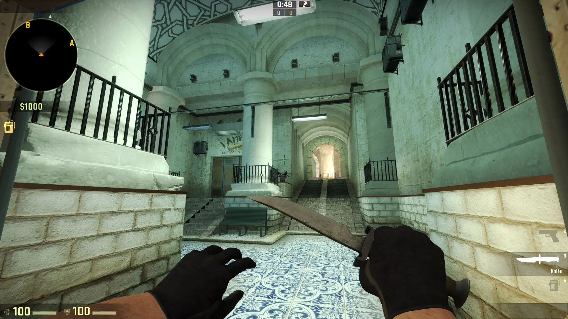
@kinggambit that blue and red logo on the gate made think about the Korean Air logo^^
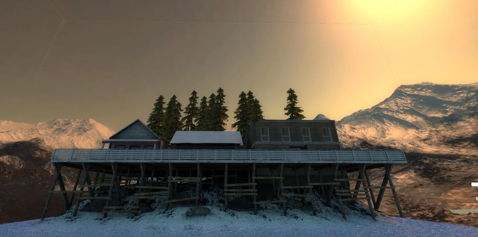
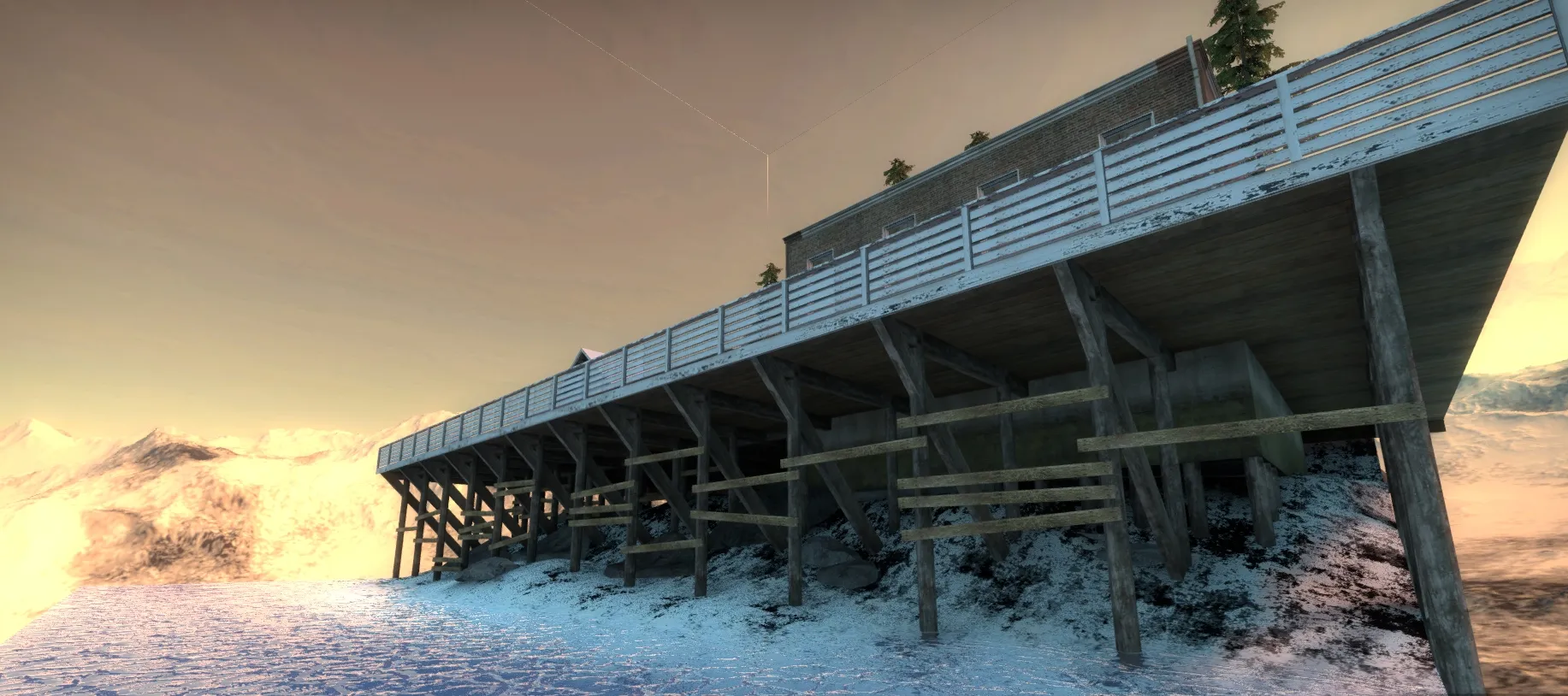
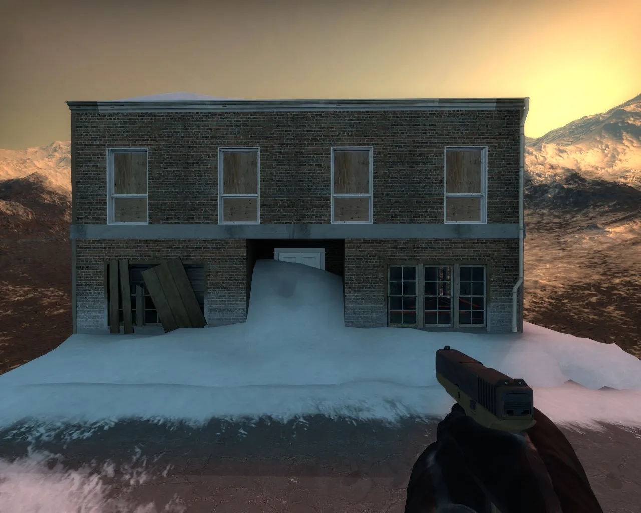
I think what are missing the most are shadows, it feels too unnatural without them I guess. That'd be the main things to fix through a better lighting.
PS: I know it's hard to balance this with readability 


 Any WiP thread?