

perhaps get some contrast on that back wall in the first shot...looks like the light source is actually in the corner of the room.

WIP in WIP, post your level screenshots!
-
-
waaaaaaay better! great improvement, dude!
-
Looking better with this lighting, indeed. Even so you might want to try to get some more interesting reflections/spec details on the floor and also add some more dirt/garbage decals/models. The floor itself looking quite... empty right now.
Edit:
Like the a cell in Batman arkham asylum. Sadly I only found this small image with quite a bad angle for reflections...
Anyway the scene looking great right now!
-
thx man, about the floor you are totally right, that's why i didn't mess with the spec but i've added a mesh to make the composition a lil bit complete

here it is[Blocked Image: http://www.knj-art.com/proj/the_last/the_last_01.jpg]
-
How about getting more debris on the floor and catch some specular from the floor? It's perfect straight right now. I guess the soft light won't do the job here. I'd prefer hard spot light from the window and some caustics from one omni light.
-
Beginning the art pass. (cross posting)
[Blocked Image: http://i.imgur.com/Fc3CBv5.jpg]
[Blocked Image: http://i.imgur.com/GzlkszQ.jpg]
[Blocked Image: http://i.imgur.com/nUpiX7C.jpg]
-
Nice colors! (maybe just a bit too much of yellow around? – i'm imagining it with HDR, it wouldn't be that easy for the eyes)
-
Hey all! Time to unveil my latest project! Like any Level Designer, I have many started projects, but not very many have ever made it all the way to completion. Anyway, I was browsing through all of my old UT3 Level files, when I came upon one little gem of a layout; all of the basic brush-work was done, and most of the surfaces already had materials applied. It did not take much imagination to see where I could take it visually, and a few rounds with bots allowed me to discern that the layout was already quite fun. This gave me the idea, of revisiting old concepts and layouts that I never had the time to finish. I would only work on the most promising ones, and after an evening of comparing various BSP shells, I have settled on 2 or 3 that I think will provide the greatest reward for the least amount of time. In the interests of getting these levels finished in a timely manner, the rules are as follows: No Custom MeshesNo Custom MaterialsNo Major Changes To Existing LayoutsWhat you see below, is the product of a mornings work on one of the most promising layouts that I found. Click here, or on any of the below images, to see more pictures, and jump straight to my site. [Blocked Image: http://georgehulm.files.wordpress.com/2013/07/slumstoscrapers.jpg?w=1000&h=][Blocked Image: http://georgehulm.files.wordpress.com/2013/07/redflagbase.jpg?w=1000&h=][Blocked Image: http://georgehulm.files.wordpress.com/2013/07/upwardsglance.jpg?w=1000&h=][Blocked Image: http://georgehulm.files.wordpress.com/2013/07/defenseboulevard.jpg?w=1000&h=][Blocked Image: http://georgehulm.files.wordpress.com/2013/07/burningsun.jpg?w=1000&h=][Blocked Image: http://georgehulm.files.wordpress.com/2013/07/redflagbase.jpg?w=1000&h=] I am calling the map Despot, which is short for “Despotism”. As you may already be able to tell, the map takes place in the slums area of a futuristic city. A futuristic city in which the gleaming homes of the privileged exist atop great skyscrapers, and look down upon those less fortunate than themselves with disgust. There are a set of contrasts that comprise the main visual themes of the map, which are: The contrast between Light and DarkThe contrast between the shining spires up above, and the grotty slums belowThe contrast between warm natural light, which struggles to reach so far down, and cold, artificial lanterns that light up the alleyways. I also plan on having many dynamic elements, such as spaceships that fly between the skyscrapers, fans, hanging cables and wires, sparks, fog and smoke. These dynamic elements are what I believe will set this level apart from other Designs. I will try to keep everyone updated, Feedback is very welcome.
-
holiestcows: That neon yellow is bad. You can do bright colors but that is really hard on the eyes.
Cuplacakes: Looking pretty good for an early WIP. Work on breaking up those repetitive textures though. Also, your description makes it sound like you're going to be adding a lot of lights/moving things/etc. in the scenery area above the level. Be careful about doing this, since you don't want to end up drawing the player's eye away from the gameplay area and to some distracting scenery,
-
 Quote from holiestcows
Beginning the art pass. (cross posting)
[Blocked Image: http://i.imgur.com/Fc3CBv5.jpg]
[Blocked Image: http://i.imgur.com/GzlkszQ.jpg]
[Blocked Image: http://i.imgur.com/nUpiX7C.jpg]
Love it, finally a CS:GO map that doesn't look like CS
 I love the colors but you could try a neutral color pm the containers so they are not on your face so much. The water could also use some love!
Keep up the good work
-
 Quote from TarrySruman
Cuplacakes: Looking pretty good for an early WIP. Work on breaking up those repetitive textures though. Also, your description makes it sound like you're going to be adding a lot of lights/moving things/etc. in the scenery area above the level. Be careful about doing this, since you don't want to end up drawing the player's eye away from the gameplay area and to some distracting scenery,
Hey, thanks a lot! I'll bear in mind what you said about the textures in mind. And yes, the map is going to have many, many dynamic elements, I am contemplating even having dynamic weather.
On the contrary to all of these vertical elements being distracting, they will be designed to draw players eyes upwards, and hopefully, towards the upper levels of the arena. The map will have many Z-axis battles, and hopefully by having eye catching elements above the player, I will be able to persuade them to not only look at the floor in front of them.
In the meantime, here is a slight visual update:
The pictures are links!
[Blocked Image: http://georgehulm.files.wordpress.com/2013/07/skyway.jpg?w=1000&h=]
[Blocked Image: http://georgehulm.files.wordpress.com/2013/07/flagbase.jpg?w=1000&h=][Blocked Image: http://georgehulm.files.wordpress.com/2013/07/closeflag.jpg?w=1000&h=][Blocked Image: http://georgehulm.files.wordpress.com/2013/07/sniperalley.jpg?w=1000&h=]
-
Yup, im liking the vibrant colours. Should be easier to pick out player characters from the background.
-
the sky and sea are already blue, use another color for the containers
-
 Quote from Pampers
the sky and sea are already blue, use another color for the containers
This. Maybe red or orange?
-
Yeah make the crates red and tone down the yellow. It's blowing my eyeballs out the back of my head.
-
Yeah I don't plan to put any red in there, blue is already the primary contrast, otherwise it's going to look like mcdonalds up in there!
I'd like to get some more orange elements in there, but much more subtle and not as in your face.
-
Will you color-code the bombsites Holiestcows?
-
Probably not, but their location is unique enough right now. One is inside a building, and the other is on the main drill platform.
-
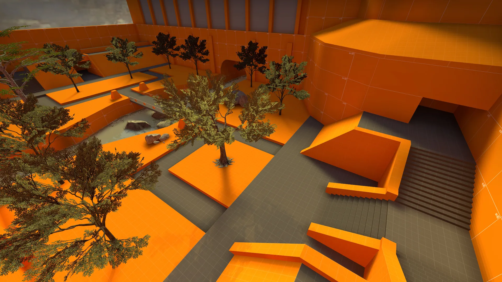
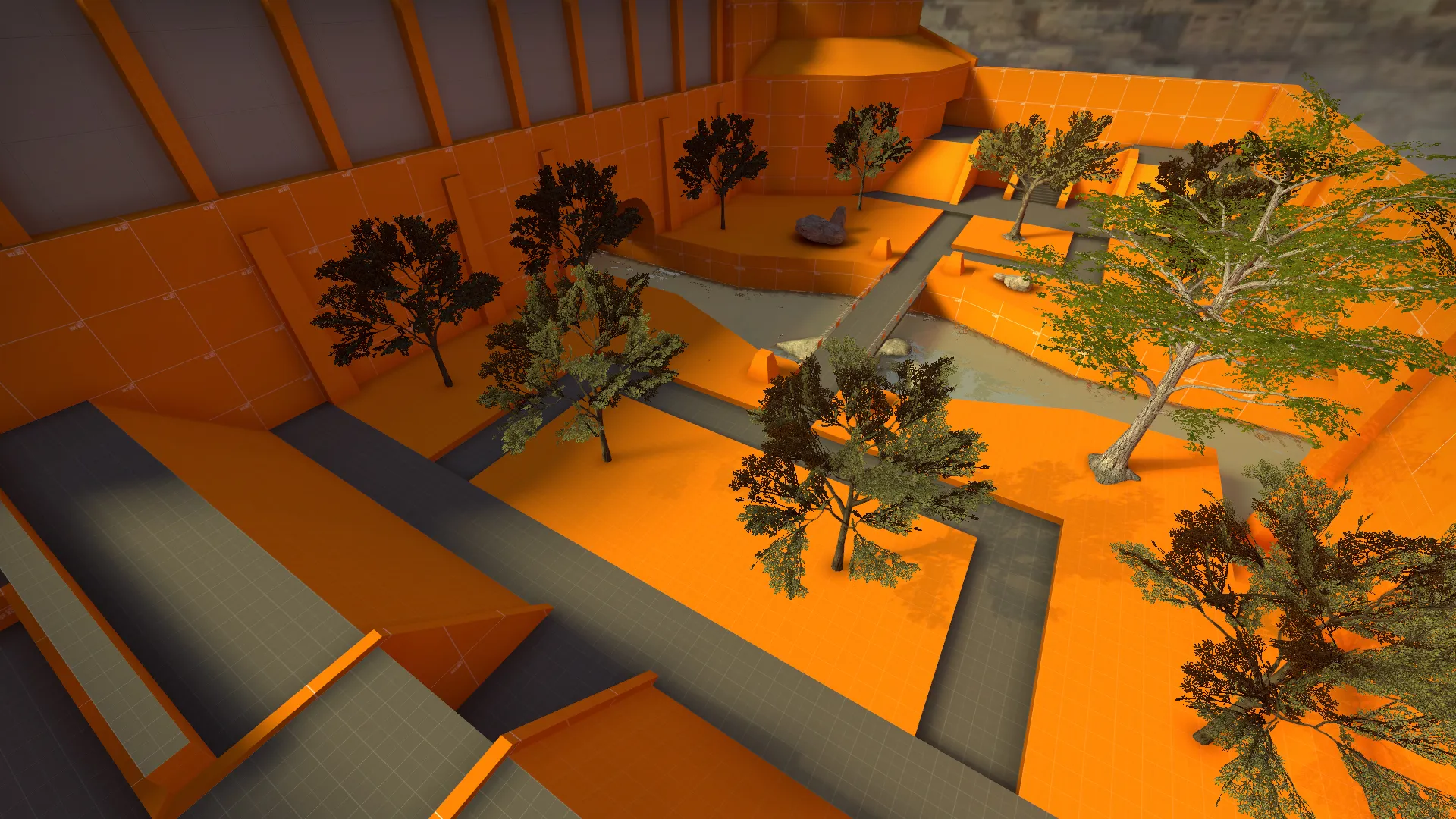
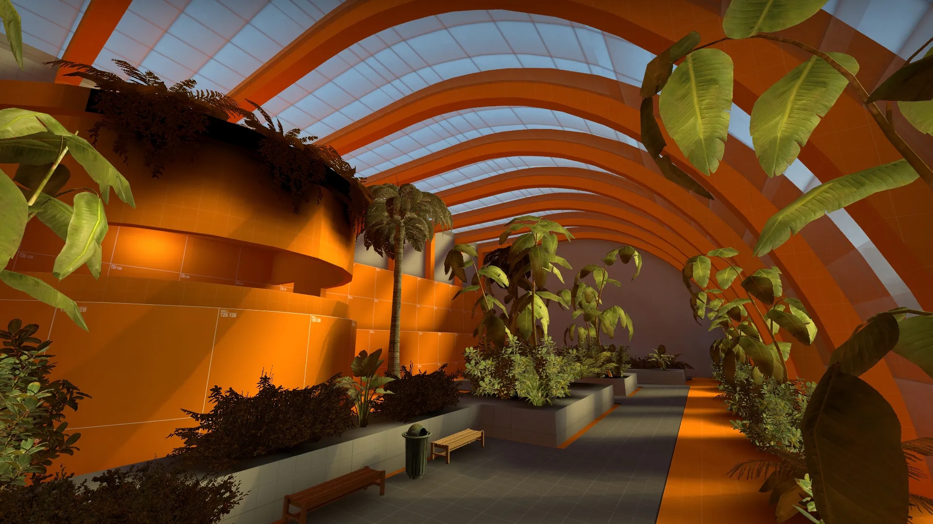
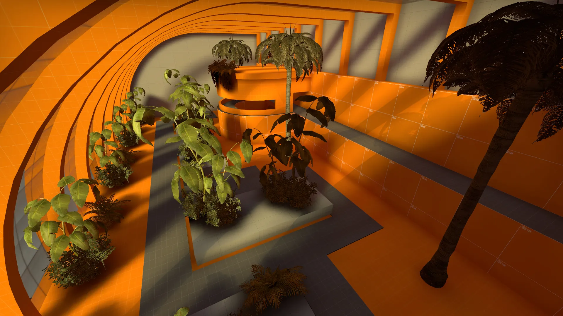
Botanical Gardens WIP. The meshes in the indoor area aren't lighting very well at the moment...
Indoor area is a little bit too small. Both shown areas have too many straight lines along the edge of the map, needs a lot of breaking the lines/symmetry. Each of the two areas built in a day. One day spent sketching layouts on graph paper. The layout is changing a lot as I build and find ways to break symmetry by overlapping rooms/areas and to avoid "room hall room" syndrome.
I still have 4+ more smaller areas to build. A rear loading, storage and seedling greenhouse area, front entrance and parking, possibly a gift shop. So maybe by next week it'll be ready for testing and start the art process.
-
Hey all! Here is a quick update! [Blocked Image: http://georgehulm.files.wordpress.com/2013/07/slumstoscrapers21.jpg?w=700&h=][Blocked Image: http://georgehulm.files.wordpress.com/2013/07/holygratesbatman.jpg?w=700&h=][Blocked Image: http://georgehulm.files.wordpress.com/2013/07/hmmthisisfamiliar.jpg?w=700&h=][Blocked Image: http://georgehulm.files.wordpress.com/2013/07/redflag1.jpg?w=700&h=] I flew to Greece this morning and I am currently sitting on a veranda overlooking the Agean Sea! Unfortunately these screenshots represent the last work I will be able to do on Despos until august, so no more updates relating to that for a while. But more on that in a weeks time, meanwhile, I’m just going to enjoy my holiday! Oh, and here is a picture of Despos’ current layout, for your delight. [Blocked Image: http://georgehulm.files.wordpress.com/2013/07/desposlayout.jpg] George, Signing out!
-


Participate now!
Don’t have an account yet? Register yourself now and be a part of our community!