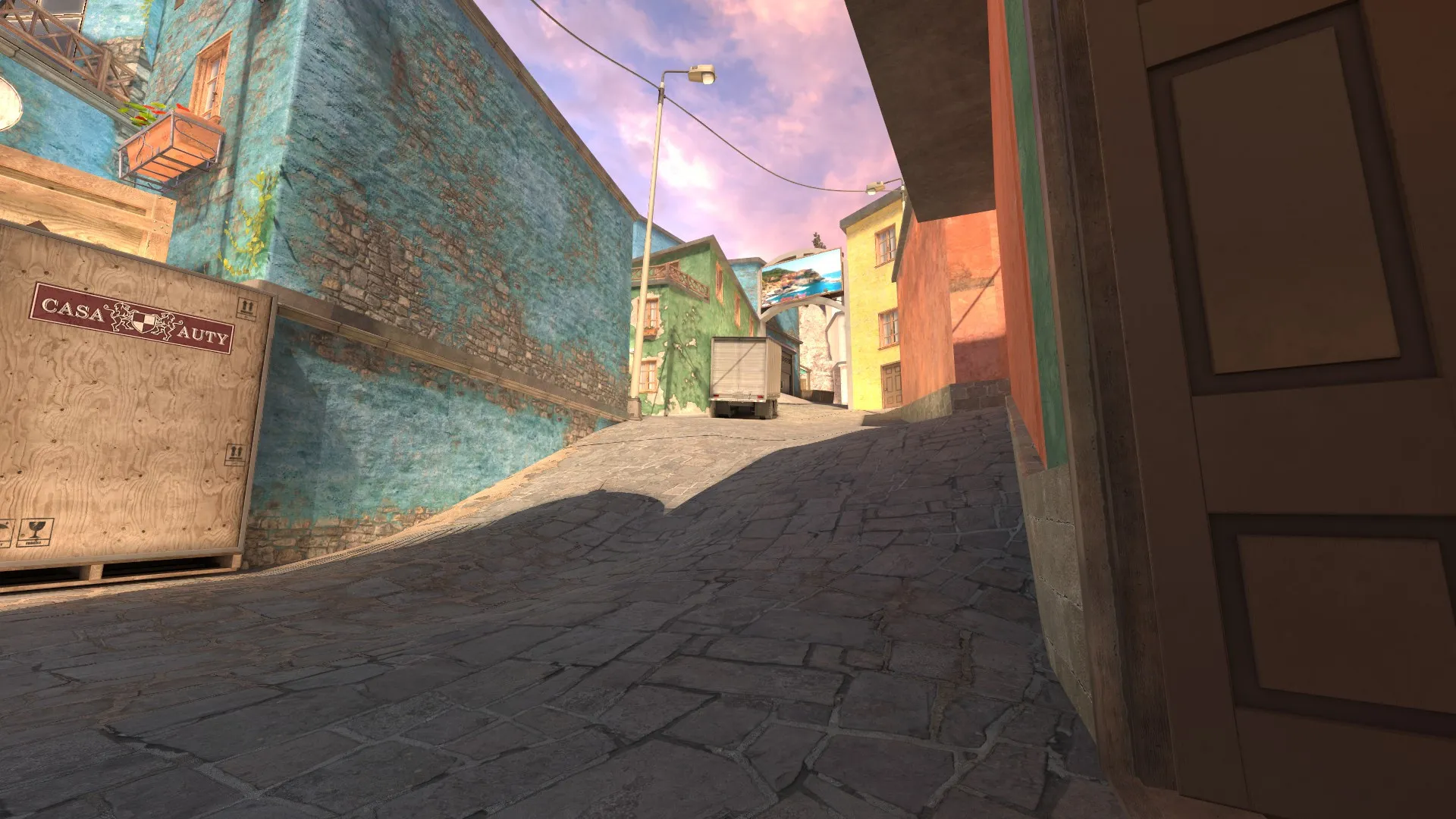
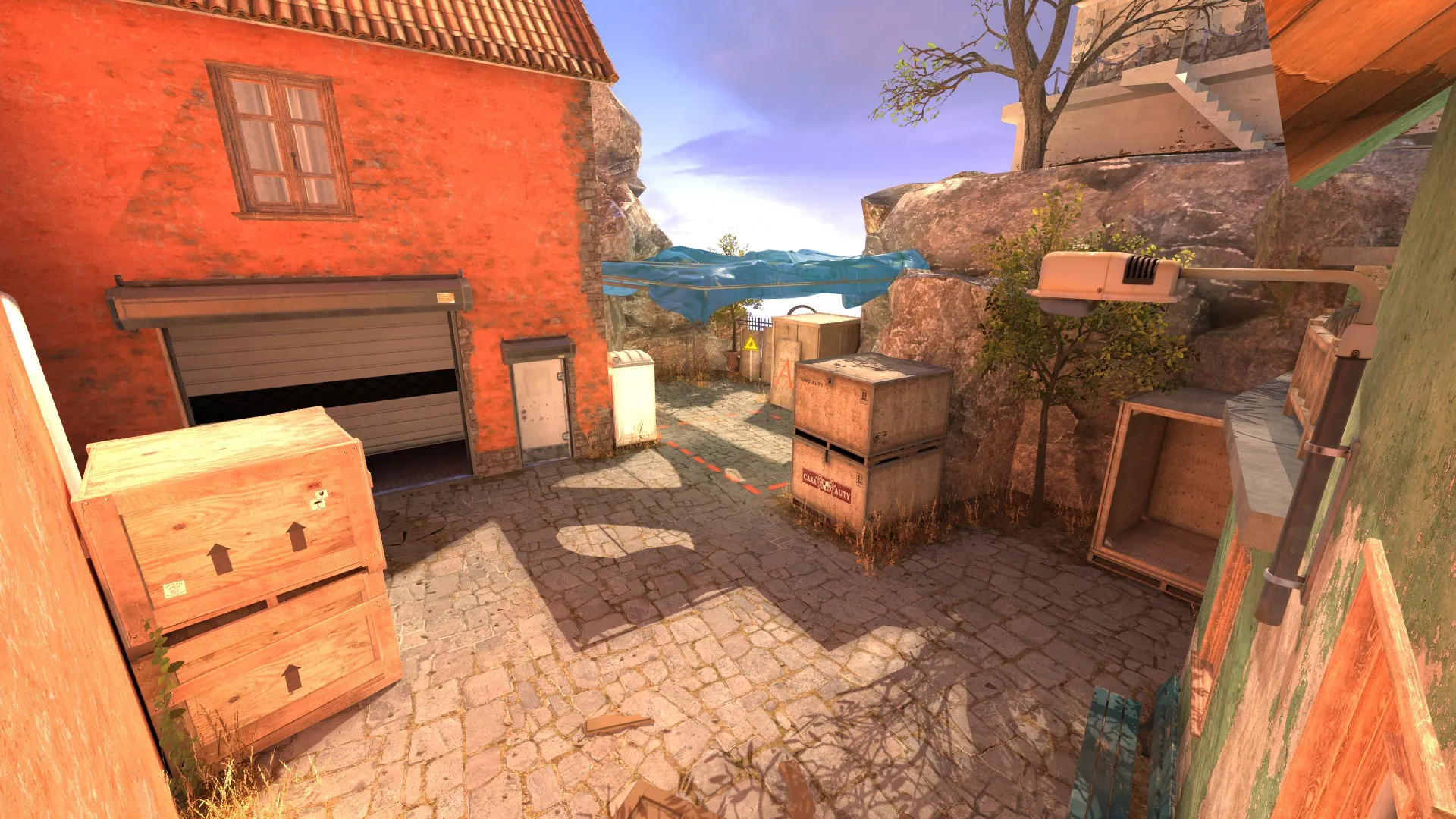
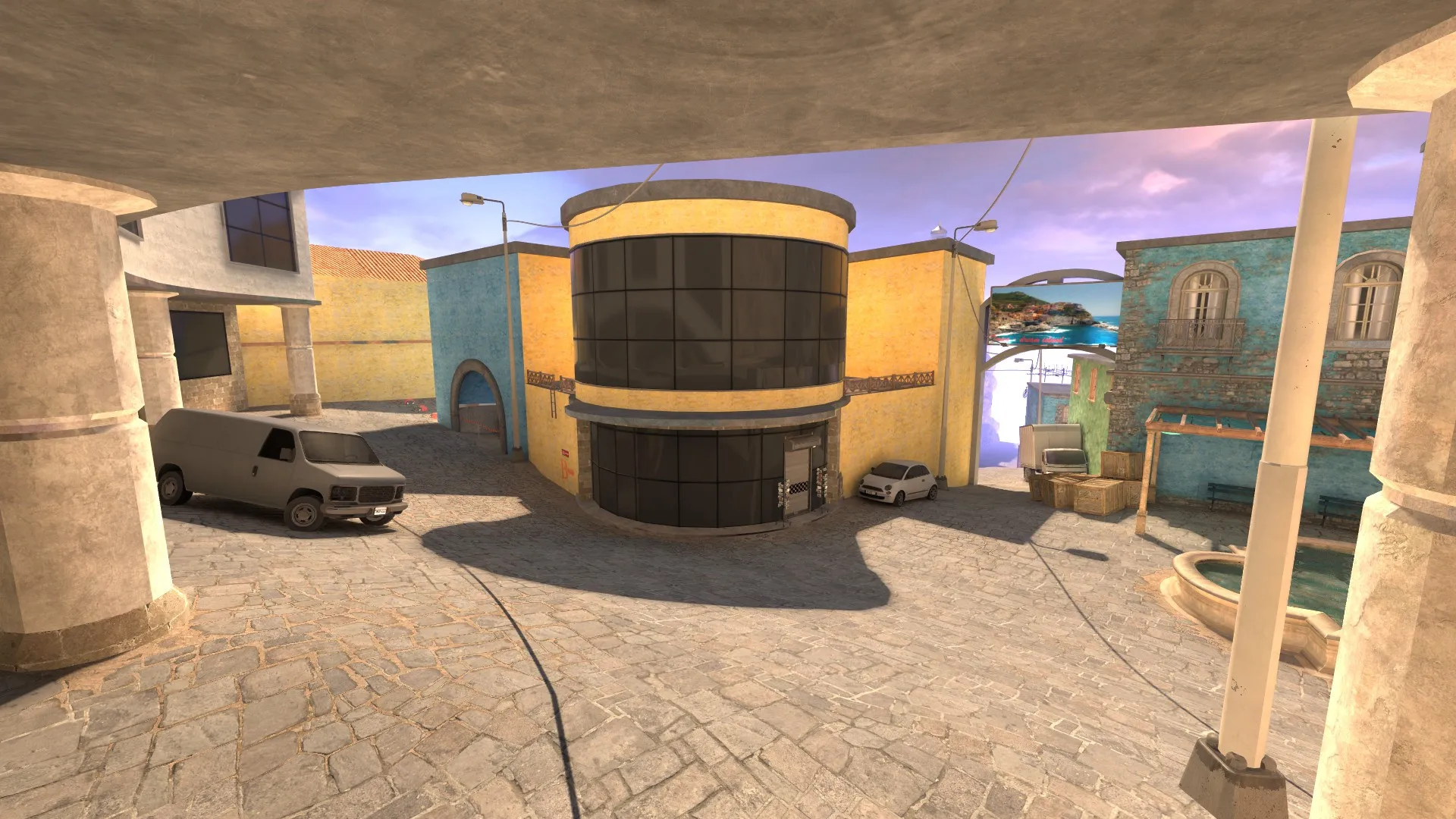
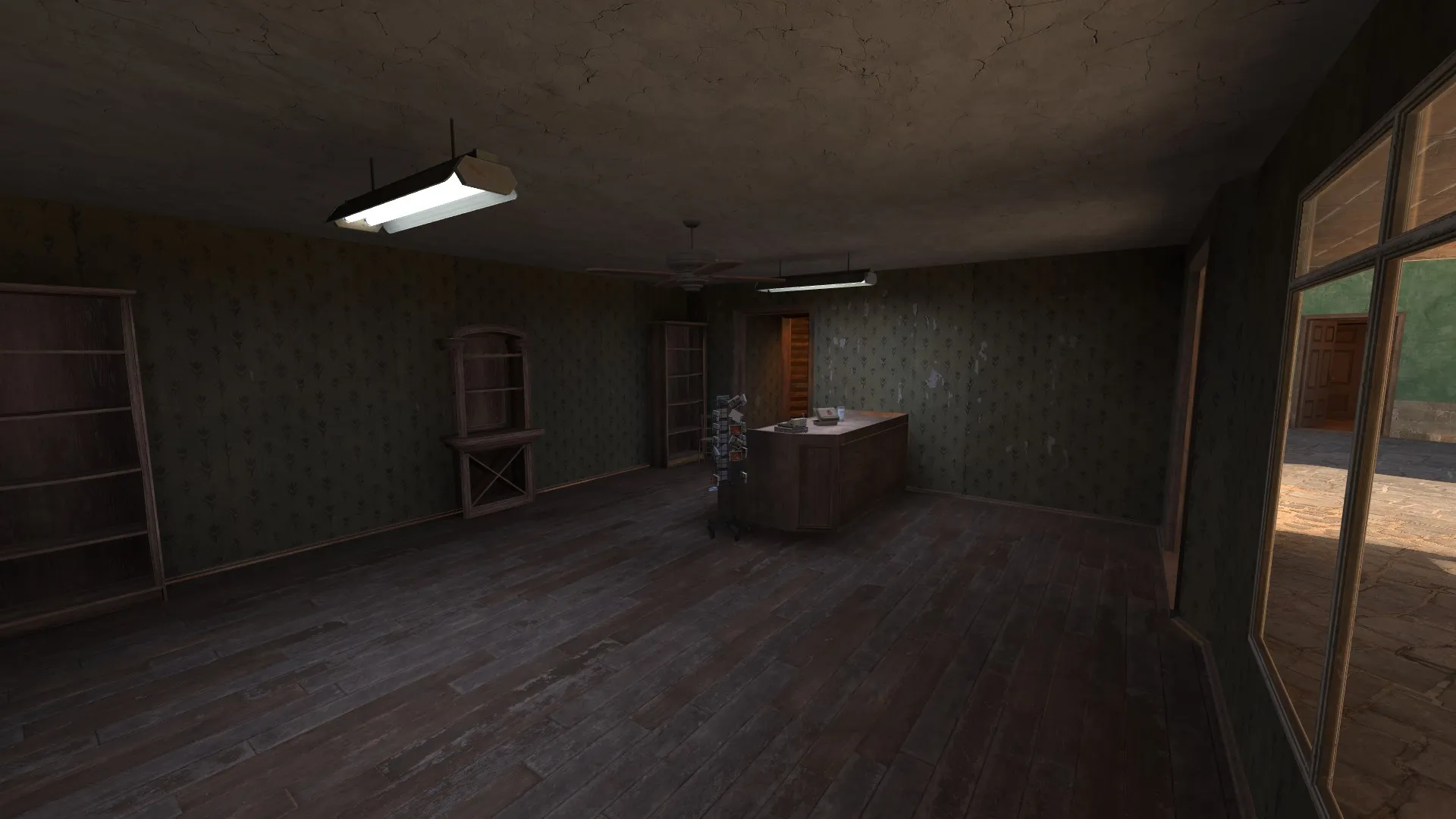
Posts by Weinn
-
-
 Quote from Huplet333
37 minutes ago, Huplet333 said: add graffiti on the walls, or parallax effects, and the job is the best and highest quality of all
it's just in development and I think it will be ready by July, thanks for the feedback!
-
-
-
 Quote from NikiOo
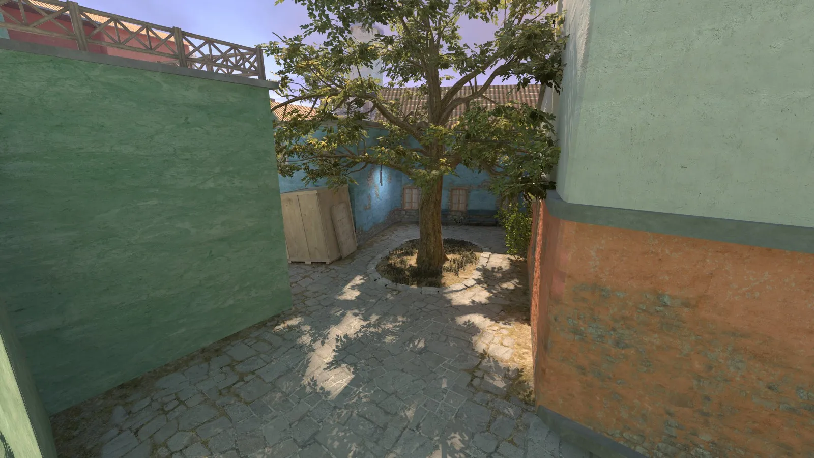
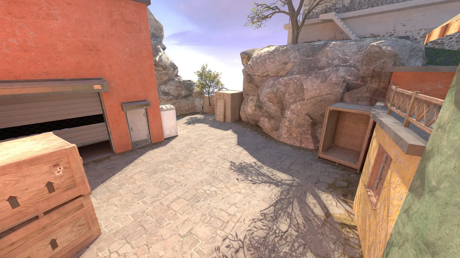
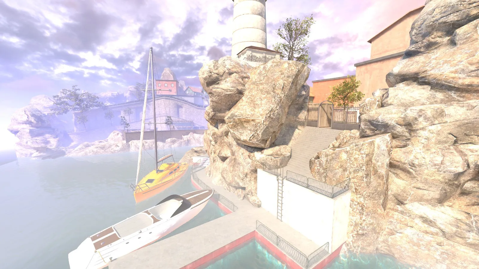
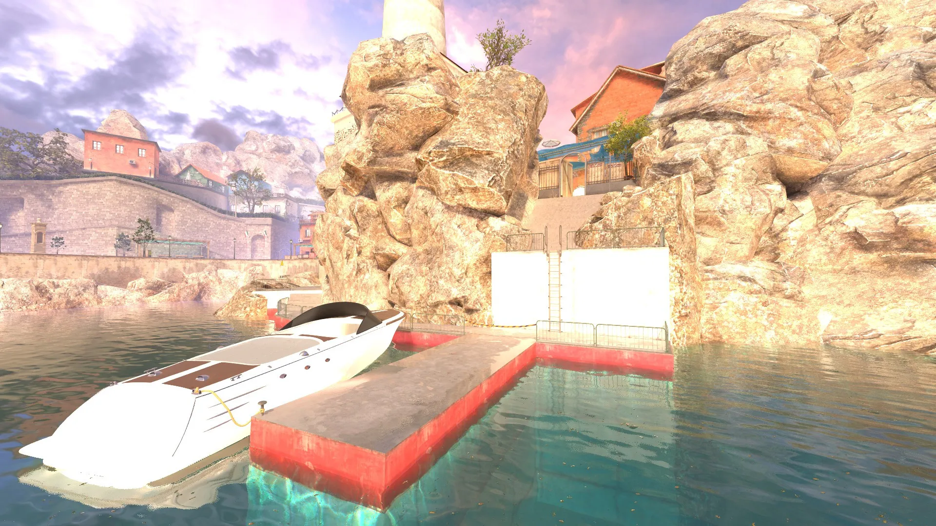
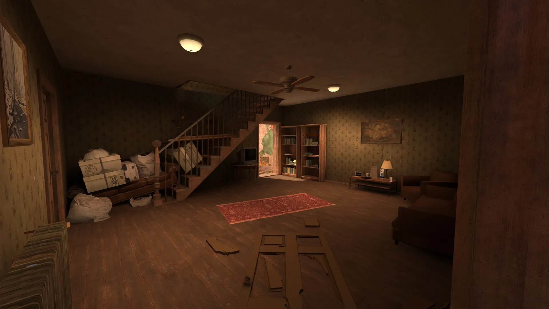
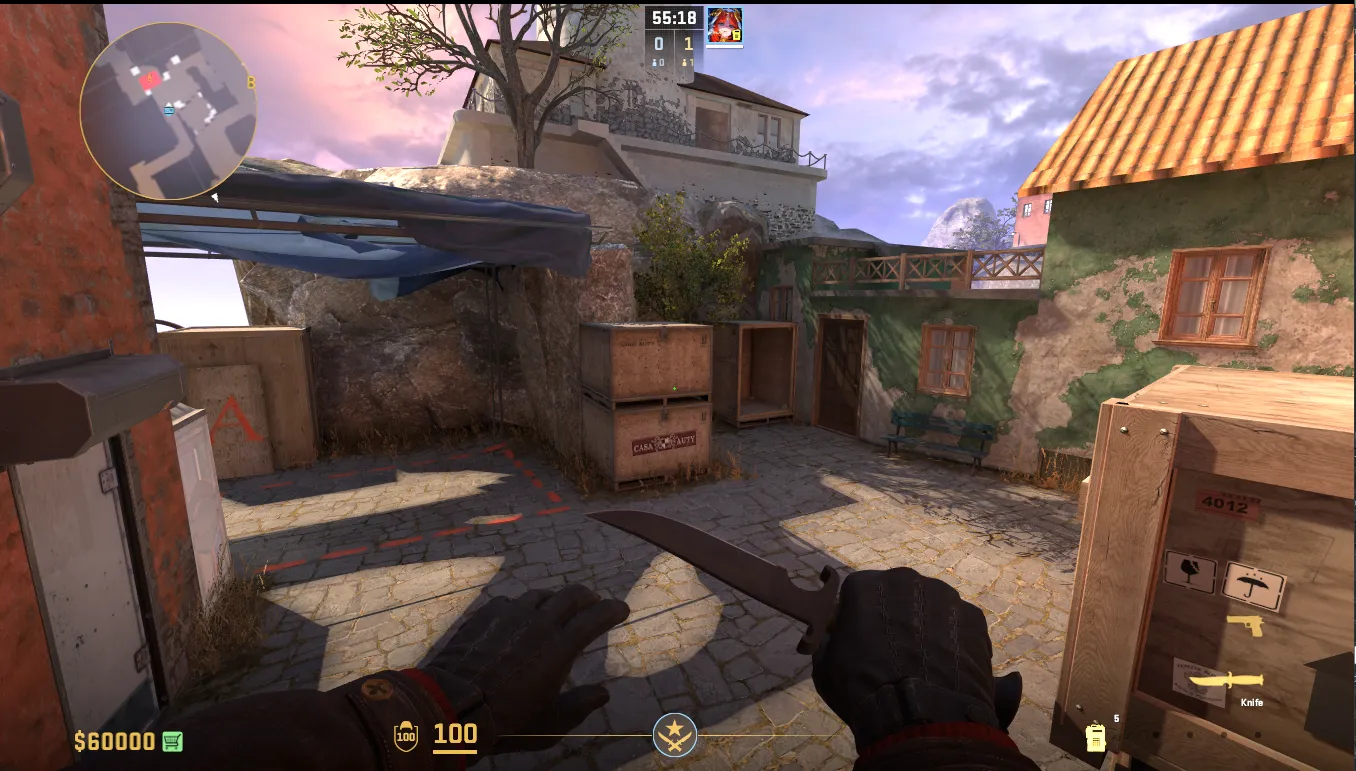
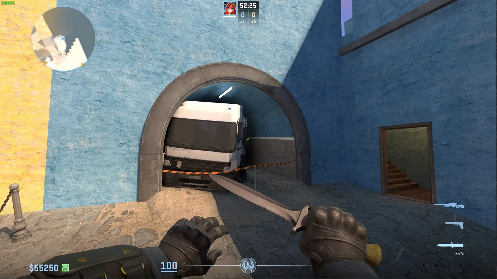
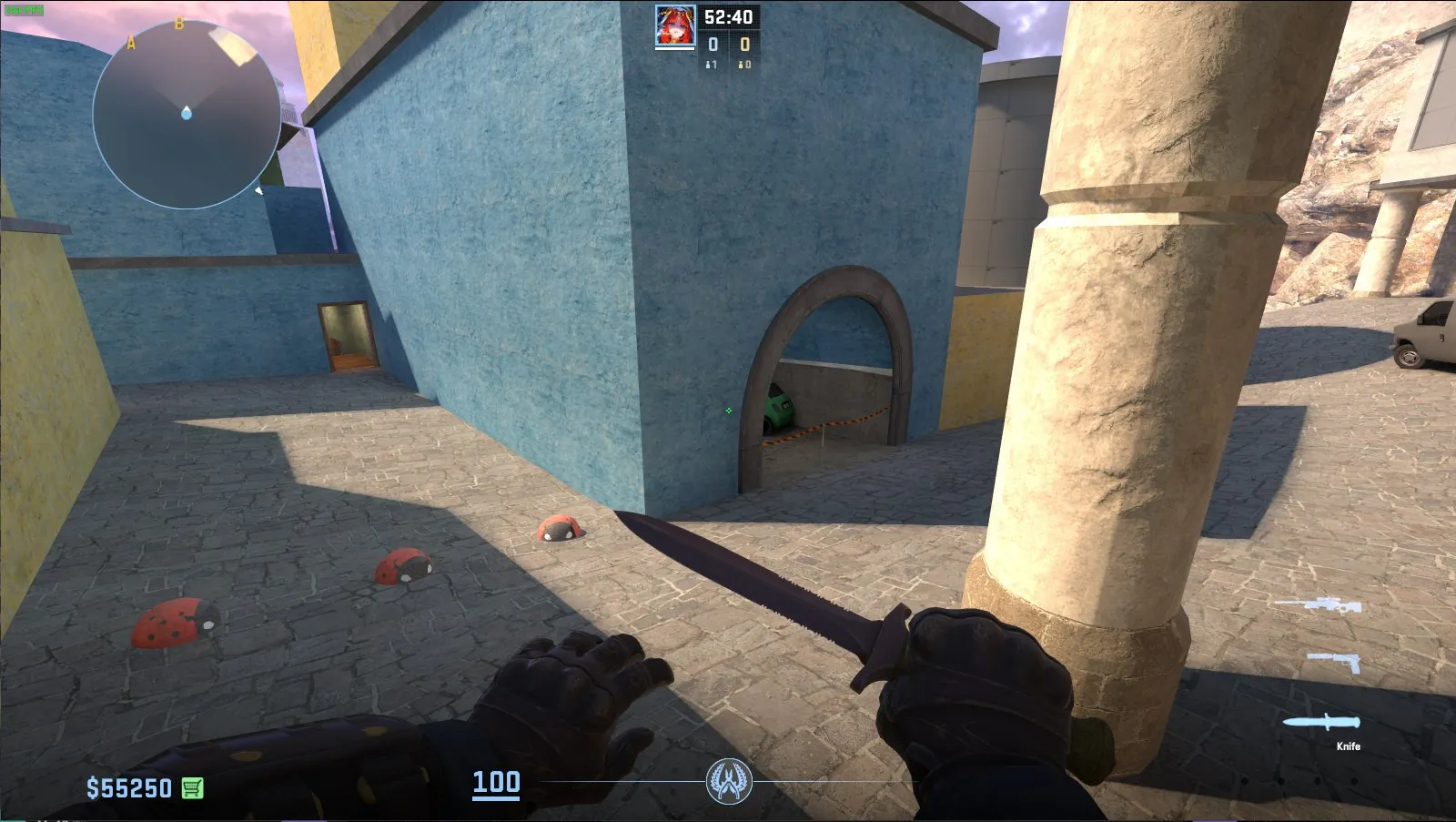
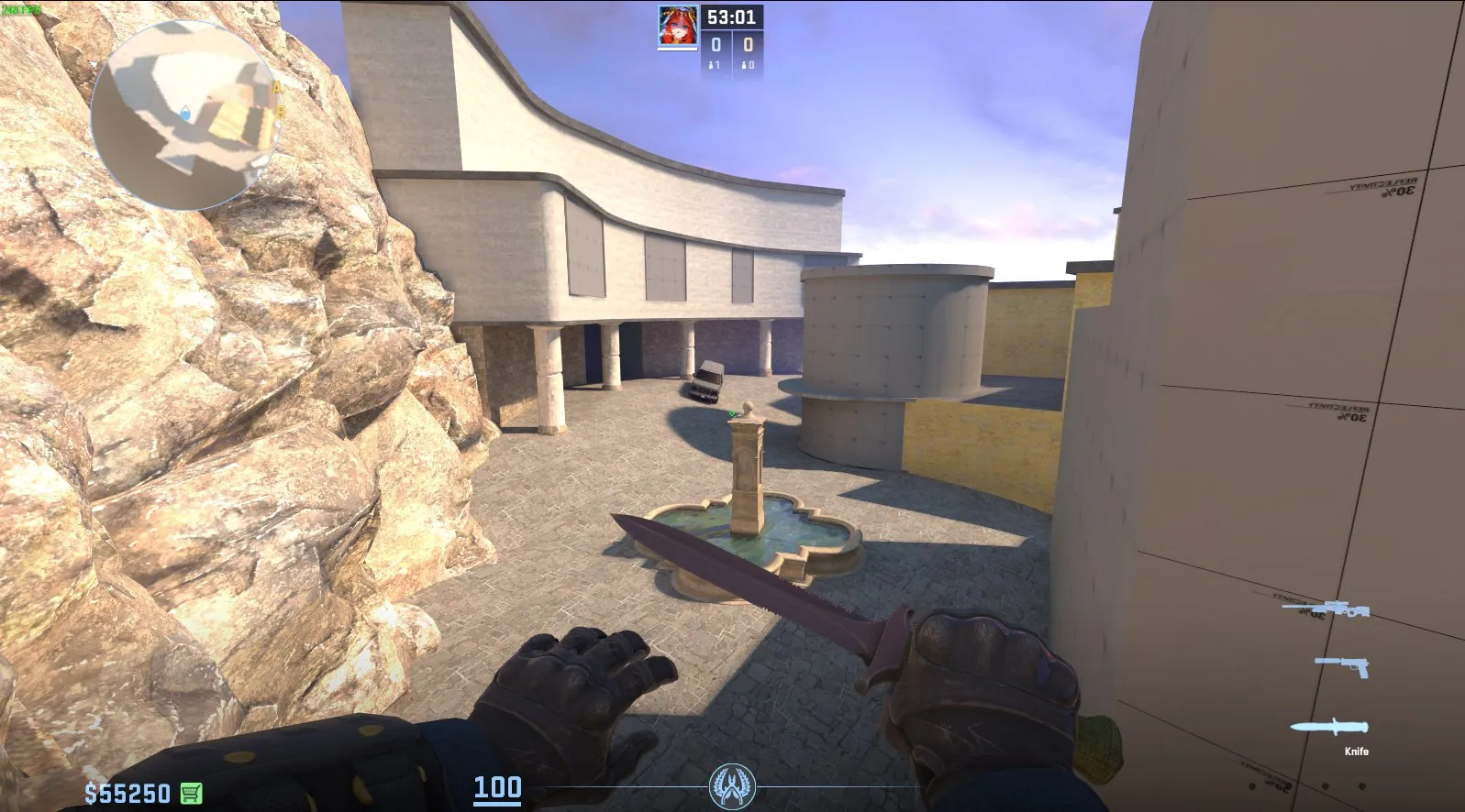
6 hours ago, NikiOo said: I think the best thing you can do to improve the look is to focus on the wall textures. They're too noisy and too saturated and too homogenous. If you look at any real photo of this city, you'll notice:
- A lot of buildings have soft, desaturated colors.
- There is often a lot of color in the window details -- the frames, the awnings, the shutters.
- Newly painted buildings next to buildings with old, weathered paint.
- Paint aging in different ways. Sometimes paint peels smoothly, sometimes it peels sharply -- I think sharp blending might look better with more saturated colors.
- Sometimes underneath the paint there is cobblestone wall, sometimes there is white plaster, sometimes there is brick, sometimes there is mud.
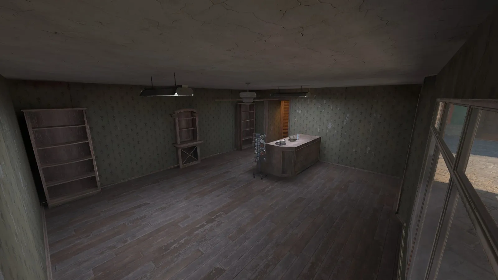
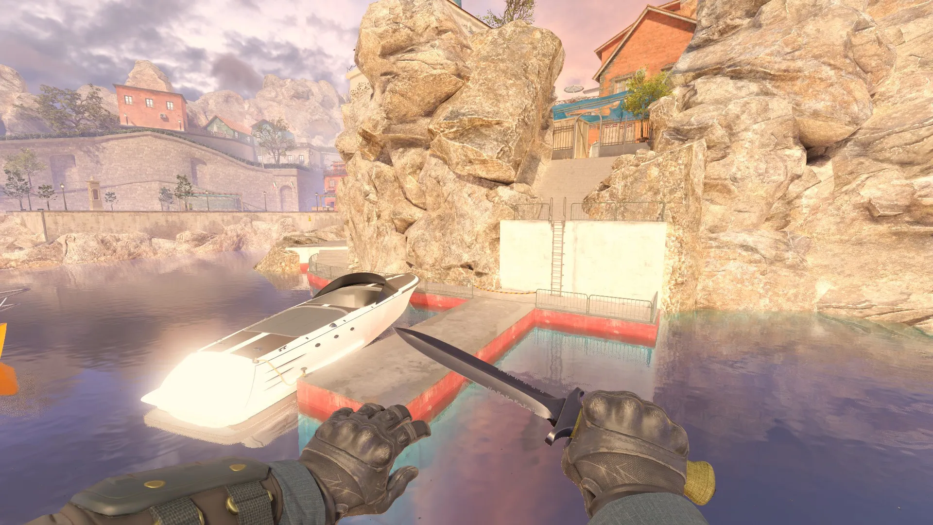
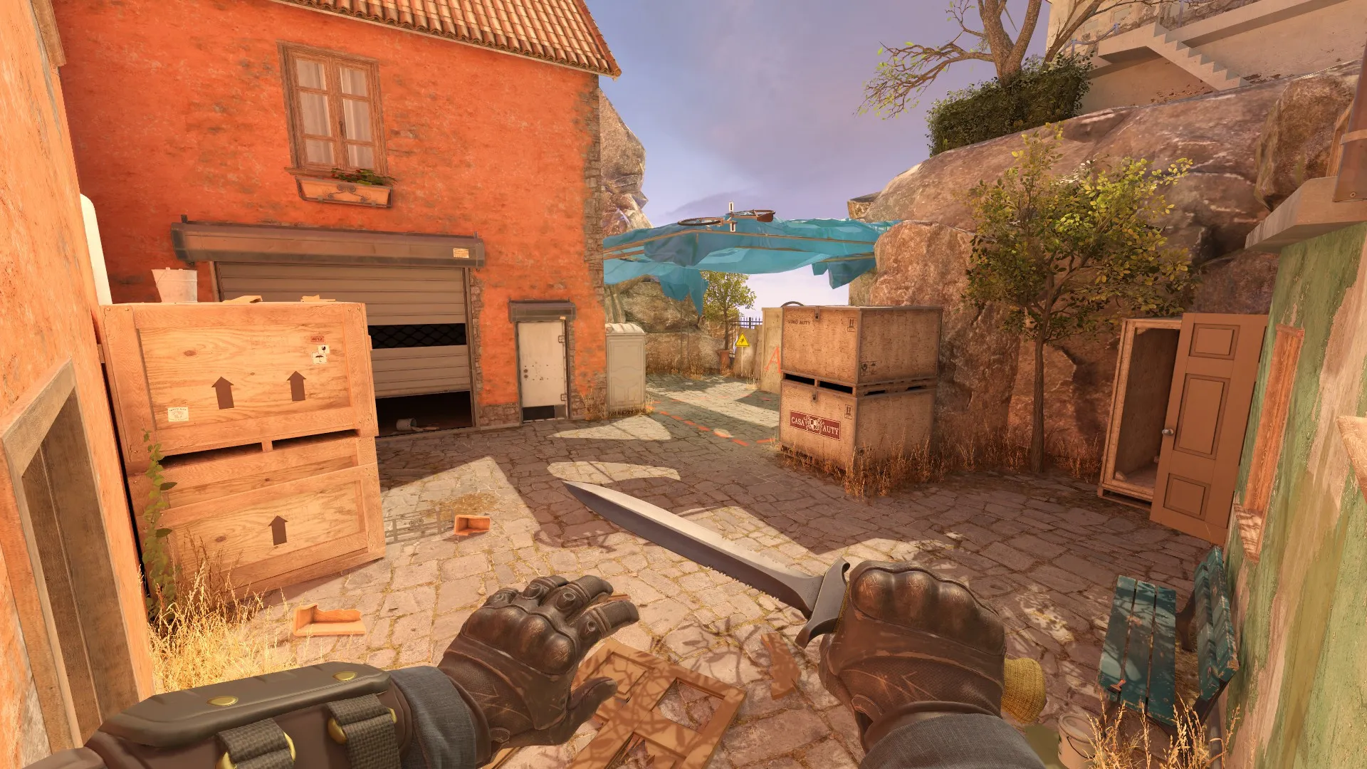
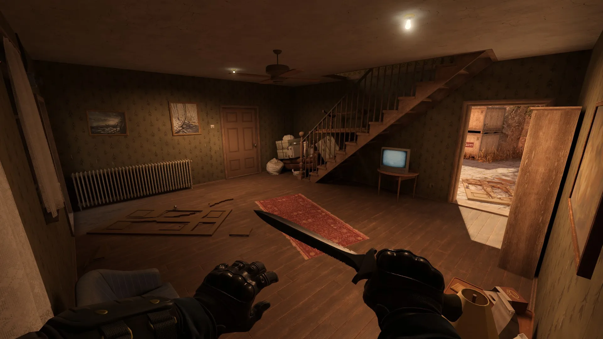
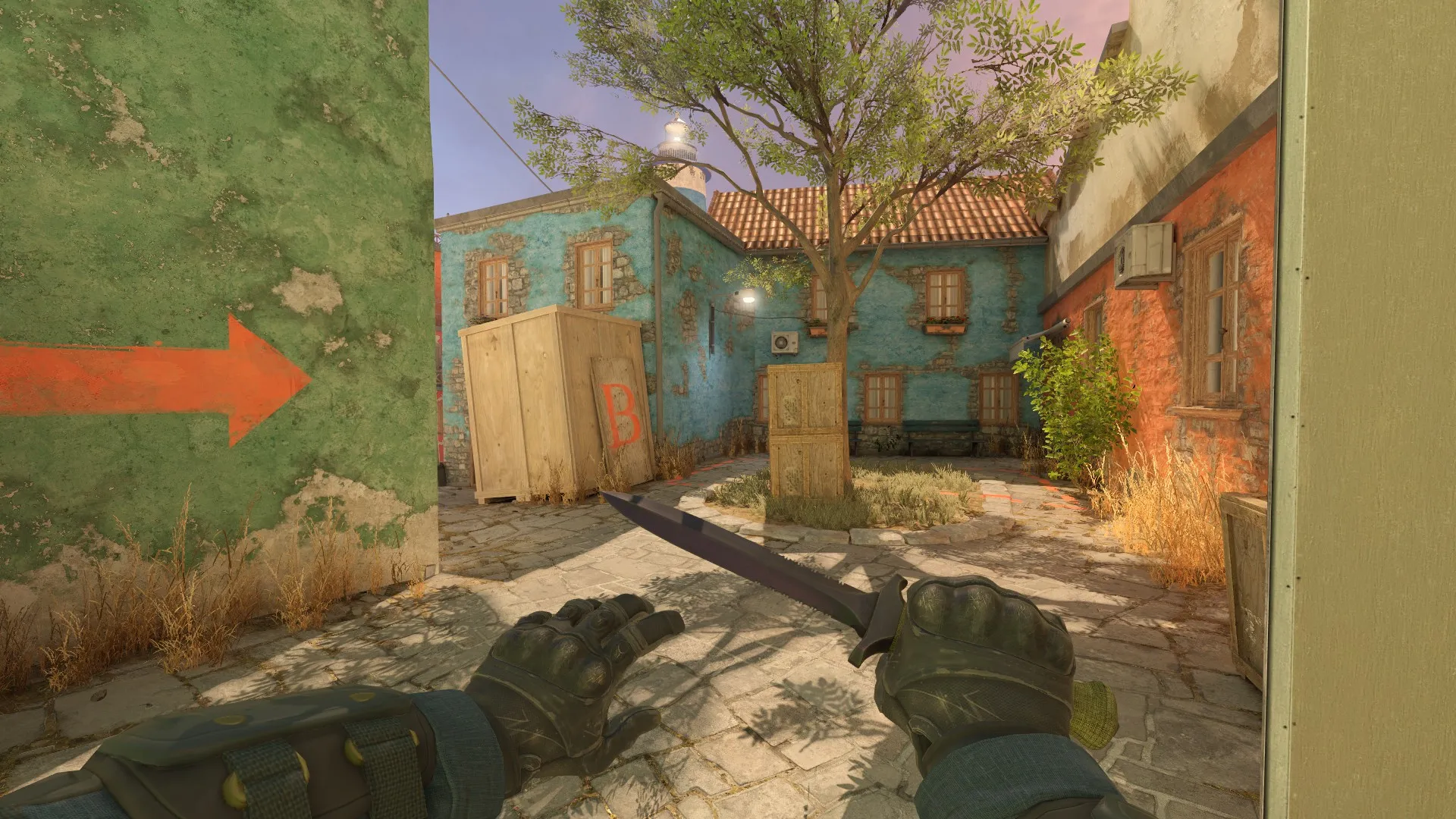
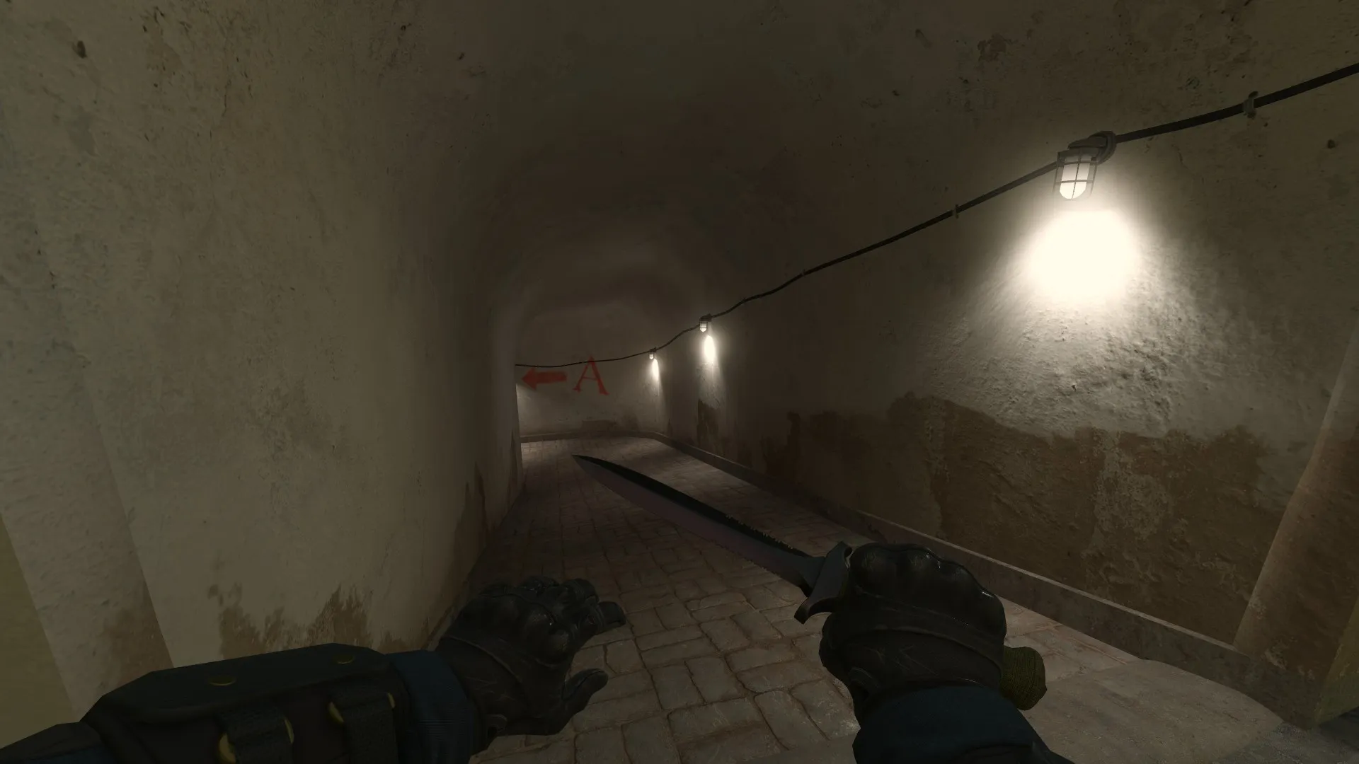
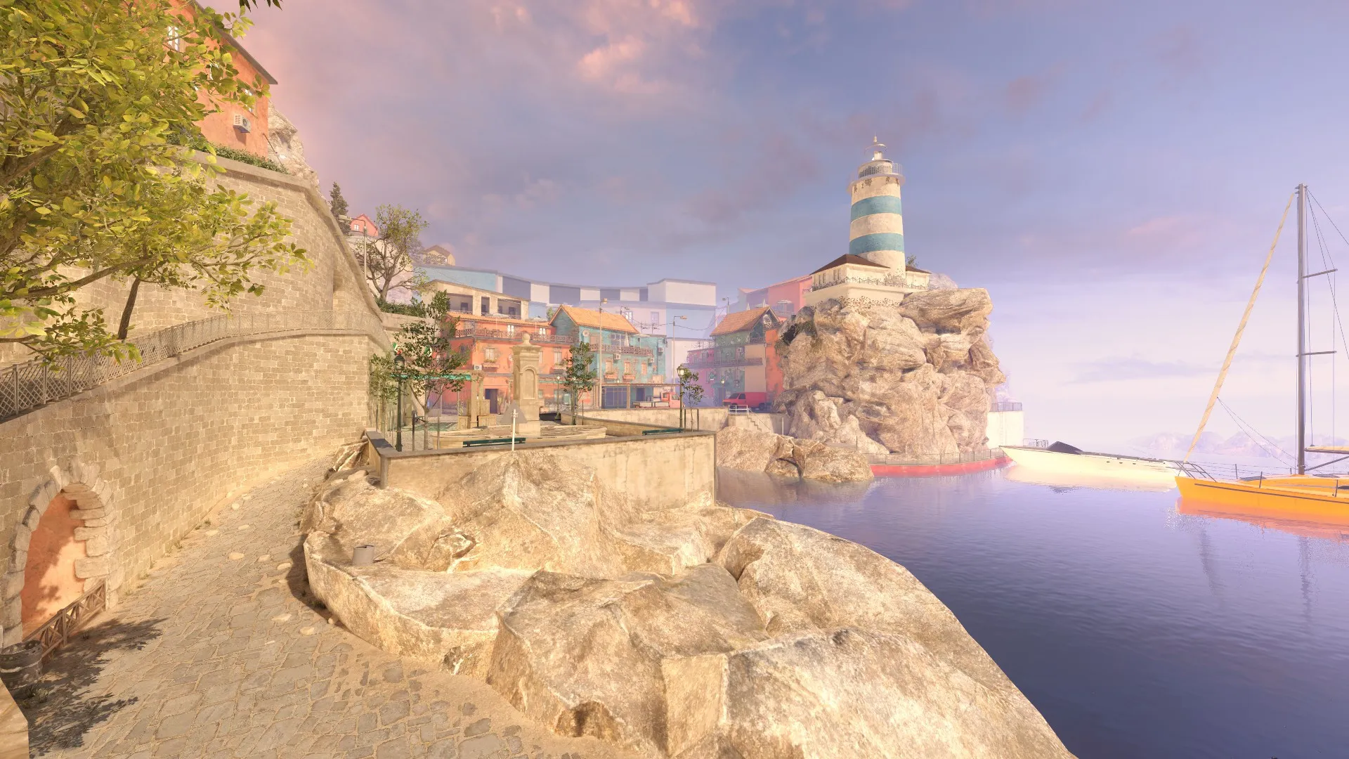
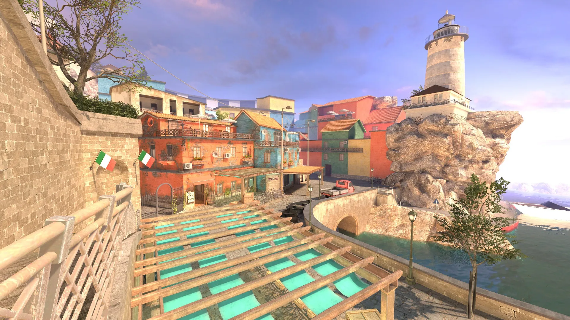
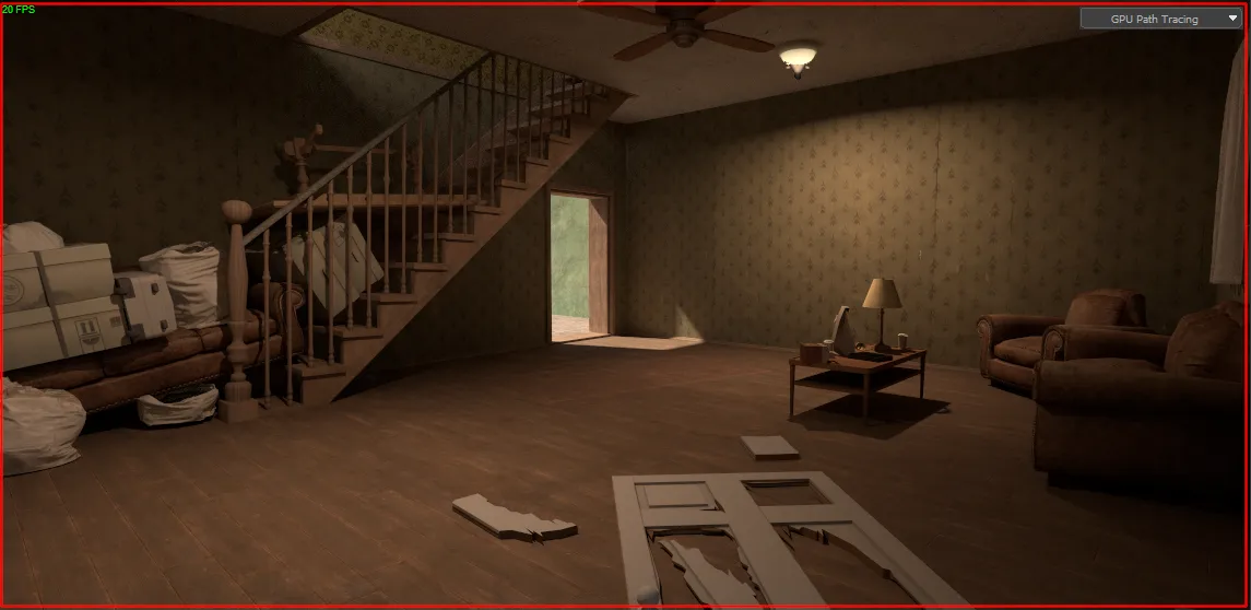
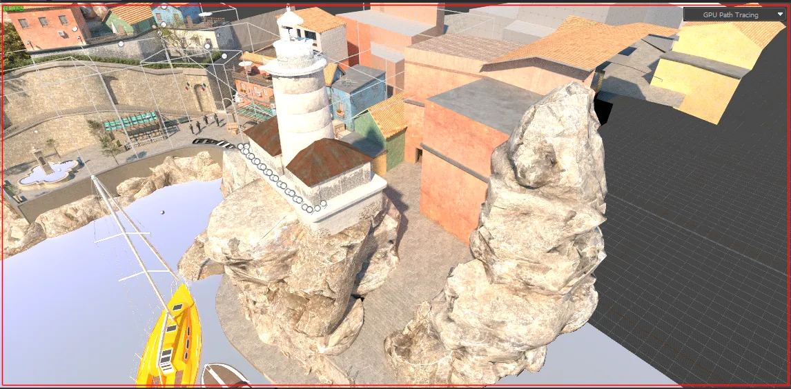
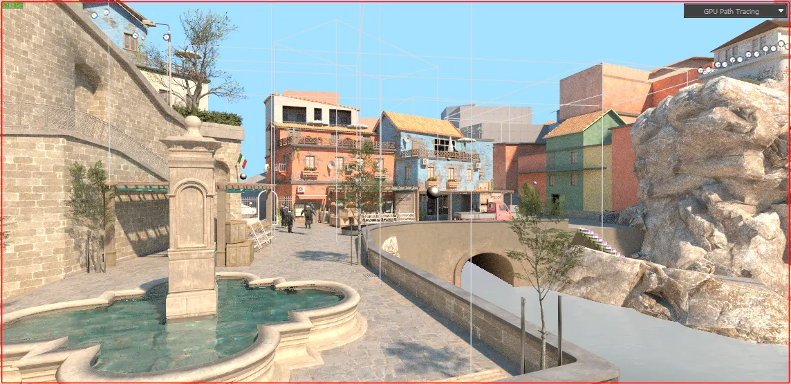
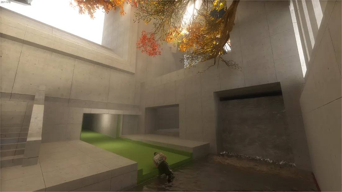
The interiors look really nice, they look like a real place. The exteriors don't -- except for the left one-third of the last photo.
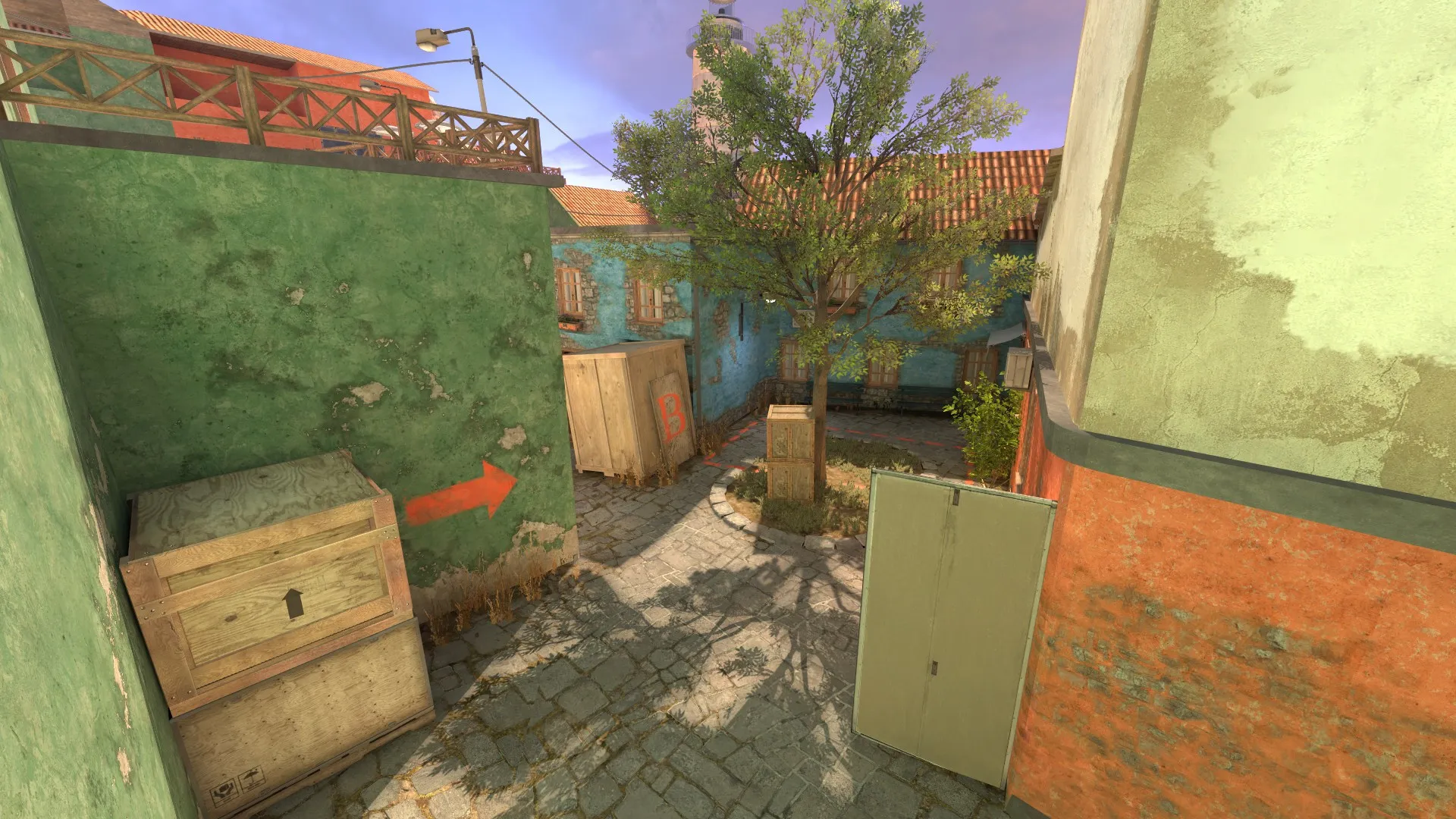
I think also mixing four different kinds of grass and three different kinds of crate in a single scene makes it look very surreal. Each asset is stylized in its own way and when all the assets are stylized in the same way, you don't notice it, but when they're not, it stands out a lot.
thank you very much for your help, I understand that the textures of the buildings are very noisy, the textures of the buildings will change more than once, but what about the boxes, I’ll make my own boxes and they won’t stand out, thanks again!
-
-
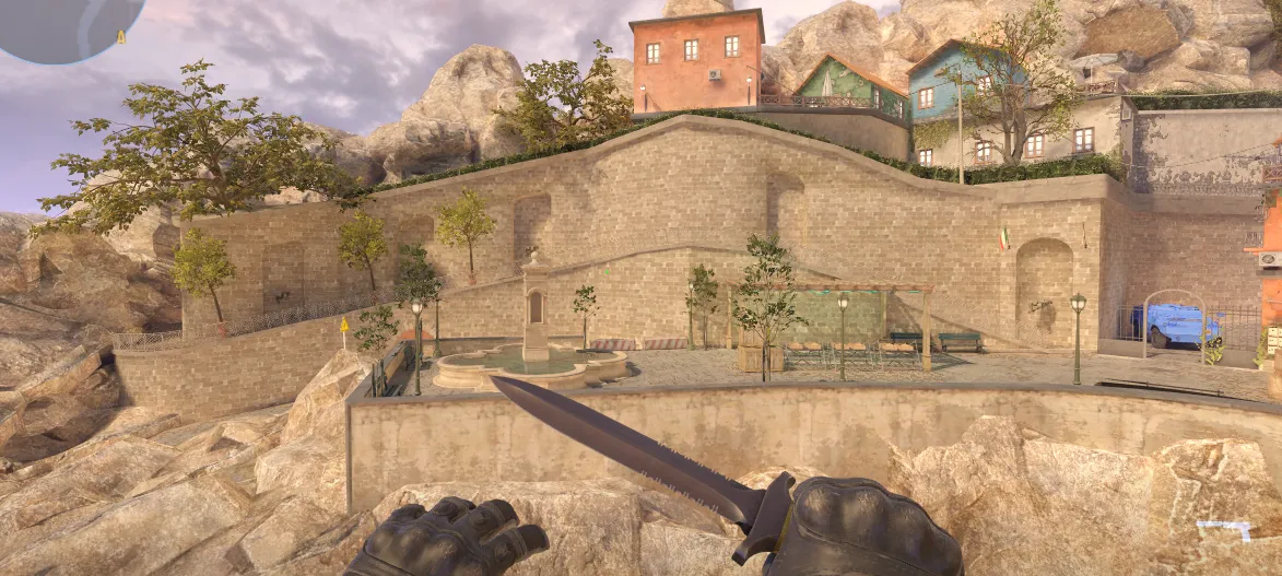
the card is ready to be accepted by faceit
-
-
-
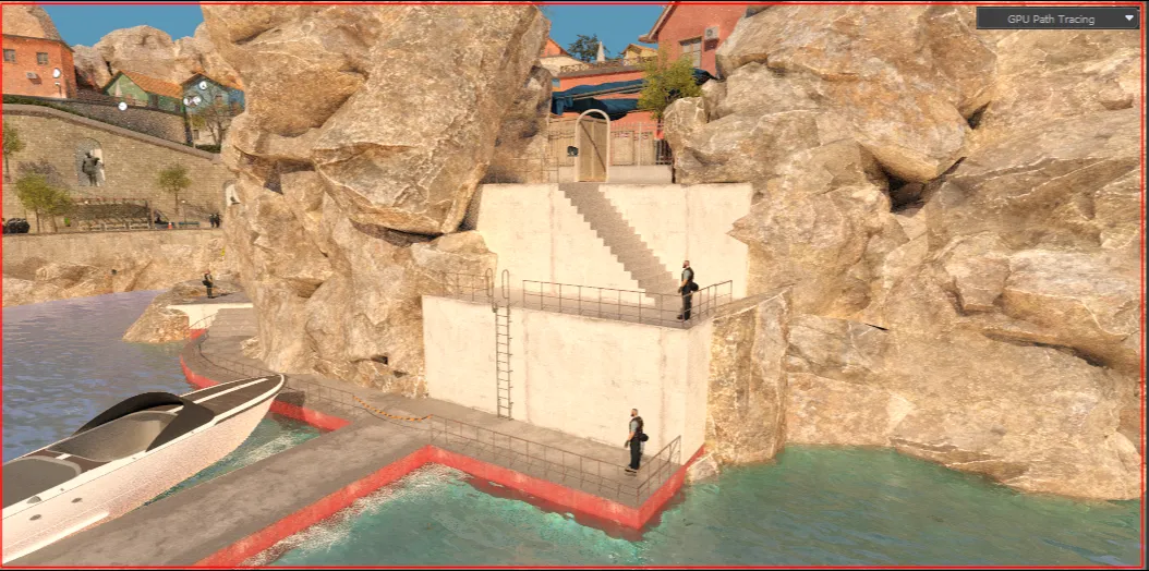
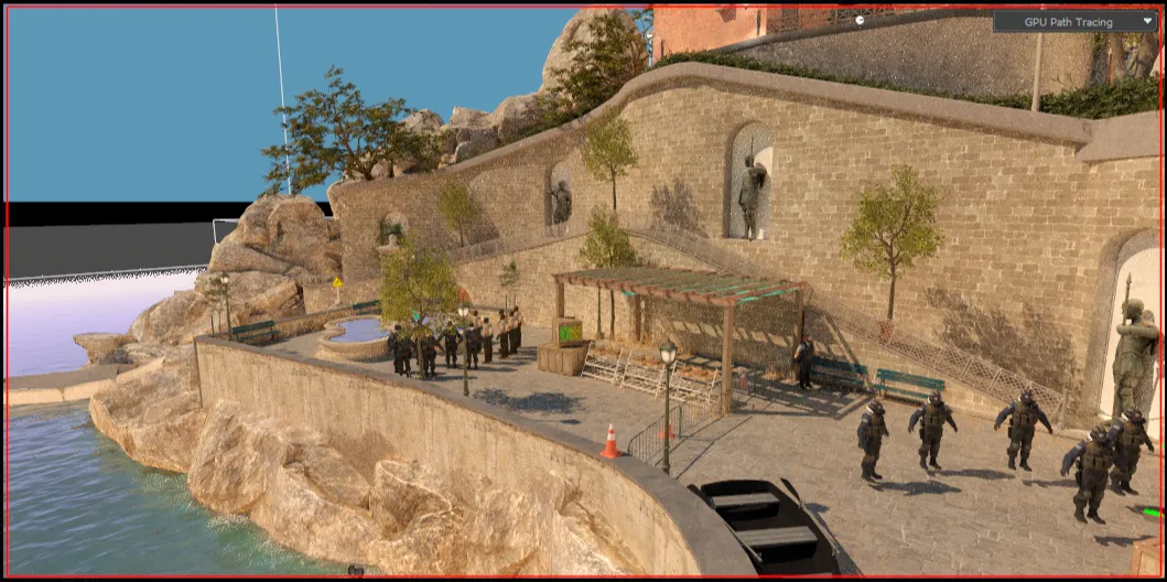
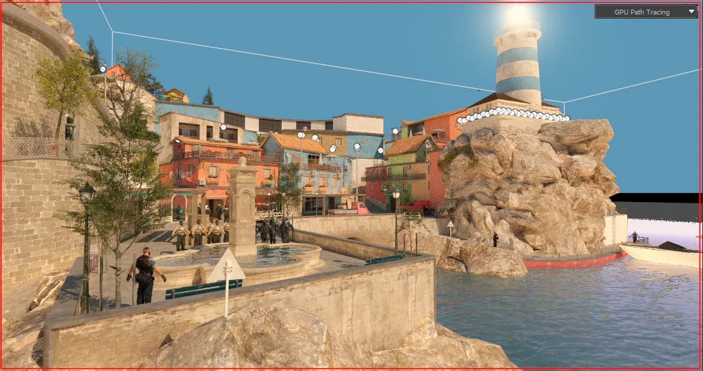
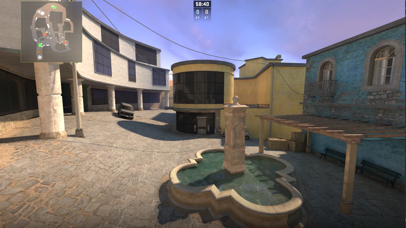
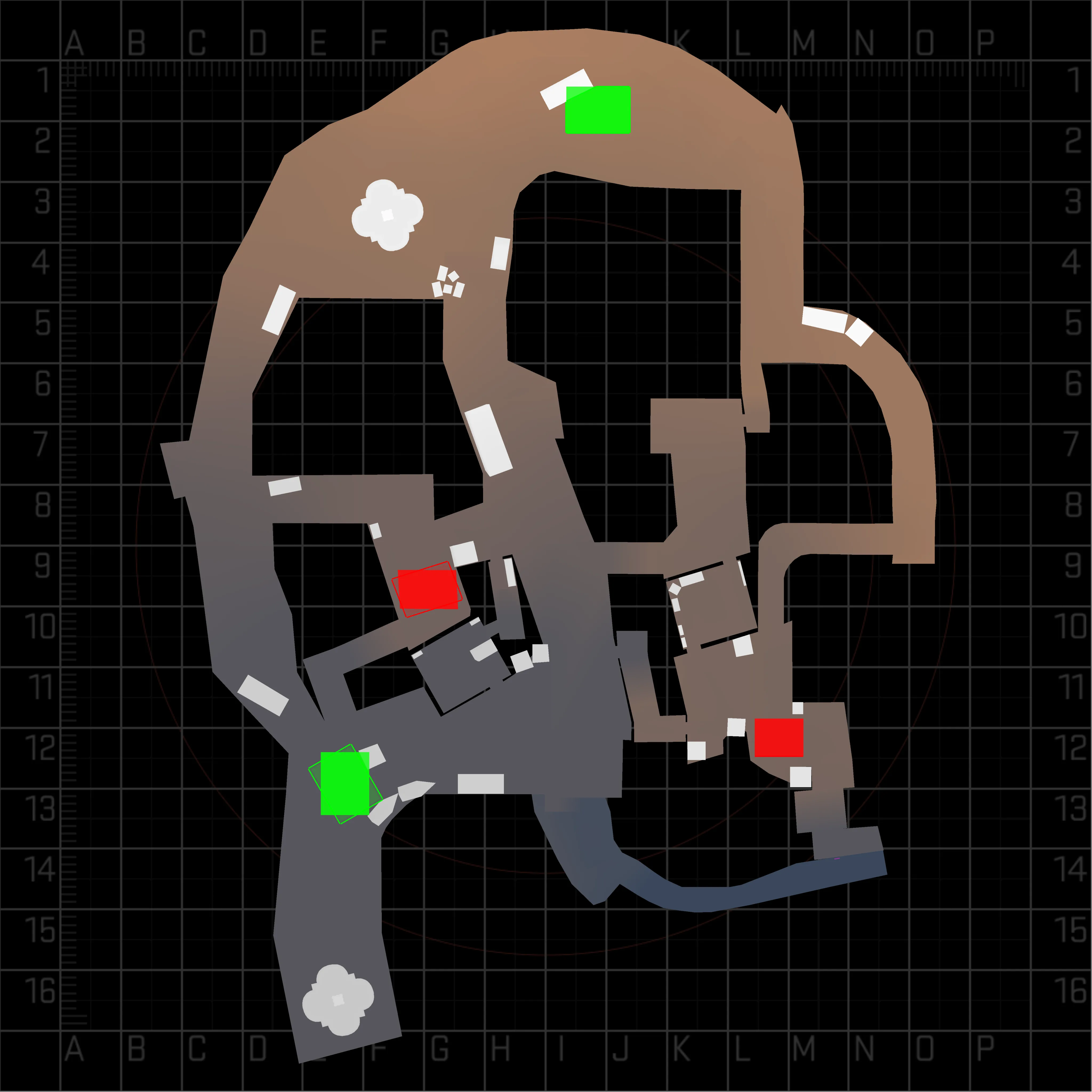
I continue to make a map
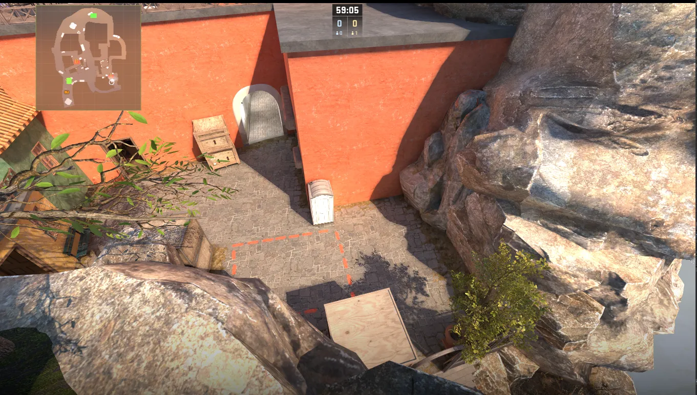
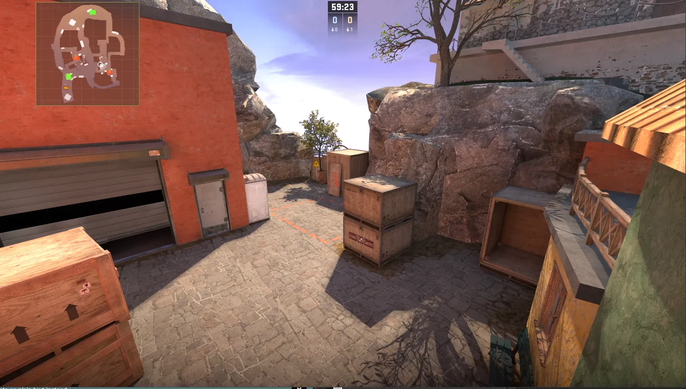
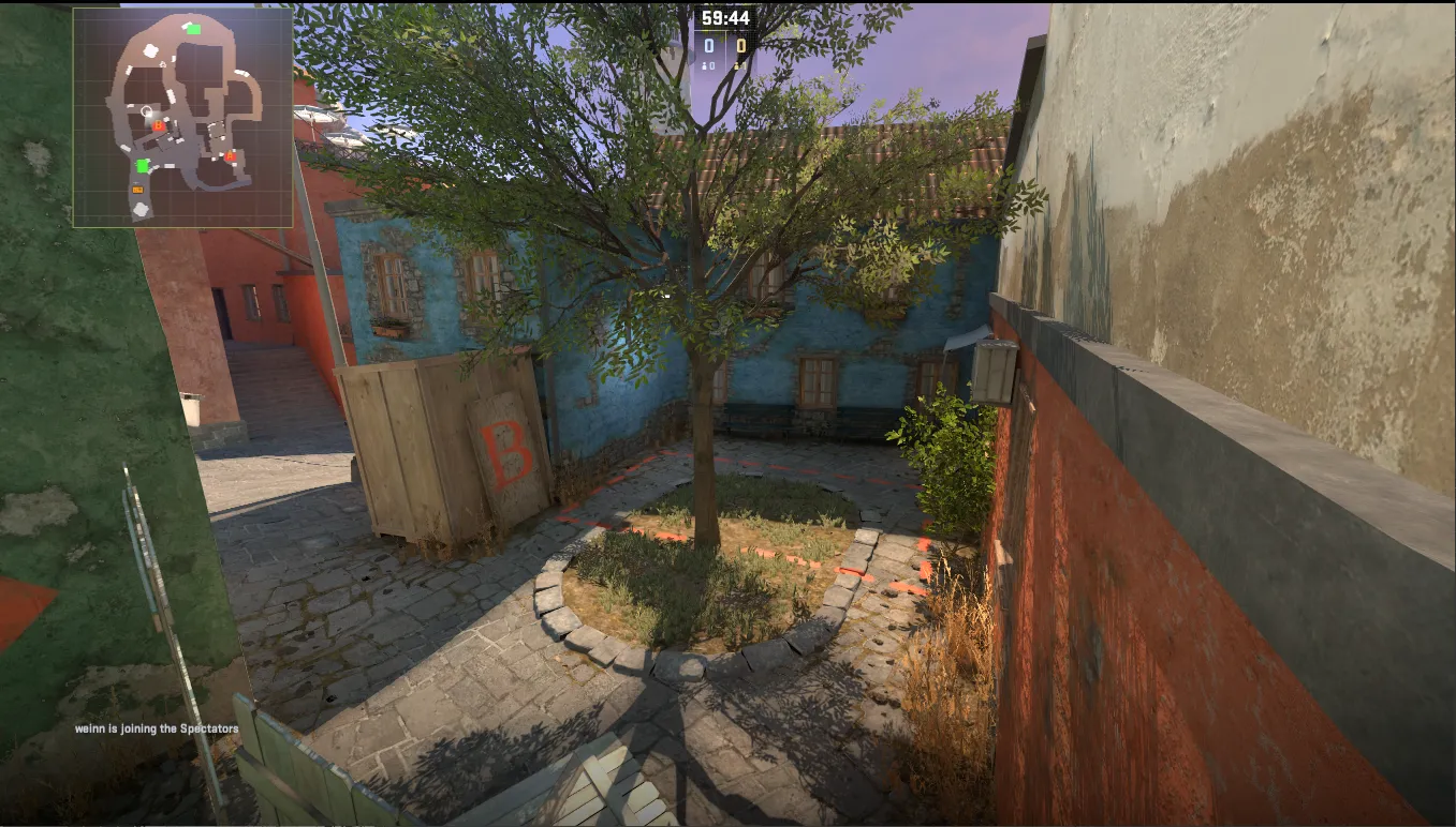
-
-
T spawn continues to be created
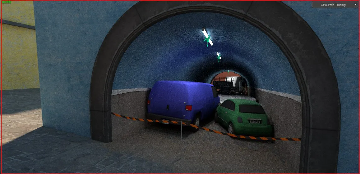
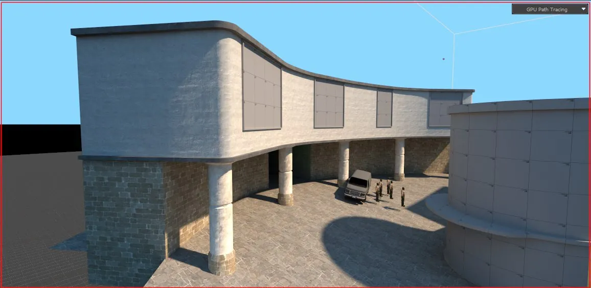
-
-
Update: March 2 at 15:50 Created teria.
-
write, say what to fix, what to add, what to complete, what to redo
steam link: https://steamcommunity.com/sharedfiles/fi…/?id=3231465169