1. Forums
  2. Discord
  3. About Mapcore
  4. Patreon Supporters
  • Login
  • Register
  • Search
Everywhere
  • Everywhere
  • Articles
  • Pages
  • Forum
  • More Options
  1. Mapcore
  2. Members
  3. fewseb

Posts by fewseb

  • [WIP] Touristas (now) de_xenos

    • fewseb
    • December 7, 2019 at 2:28 AM
    Quote from Donskioni

    54 minutes ago, Donskioni said: Hey guys! if anyone knows the best way to trouble shoot problems lmk please!!! Ill start here... Big progress has been made on my map and i am very excited for the deadline..... but, I got to "too many t junctions" To start, im not completely sure what a t junction is. I thought it was func detail intersecting world brushes... but I dont think that is it... and then I thought it was func detial touching world blocks ... but I dont think that is it either. looked over reddit ect..... I have tried deleting different things to see how my number fluctuates.... 65547 of em atm. but this has only confused me more because the changes are not consistent. The thing that I thought was weird, was that if I hid all hint brushes I wouldn't get the problem and could compile normally. If I delete the largest hint brush... (across whole map cutting across a bunch of world blocks ) it would only remove 6 t junctions from my list. - on another note I have some no draw on some displacements .... and a couple props with the wrong prop type.... but I dont think these would be the problem and am saving them for later. Ill send a prayer to gaben, but if anyone can help! please! ? Then i will post some new screen shots lol

    Im guessing you just have too many func_details at this point, back when I first got into mapping I ran into this problem alot. For me it wasnt so much how many func_details were touching world geometry it was just that I had so many to begin with. the quick solution (though may be not the most acceptable one) would be to use propper to turn the most complex ones into props. Alternatively if you know how to model you could try and just make some high poly replacements for some of those func_details.

  • de_grotto [WIP]

    • fewseb
    • December 3, 2019 at 5:24 AM
    Quote from Wintrius

    1 hour ago, Wintrius said: Anyway, Waldo does have a point here. A map with so many corridors doesn't stand out very well and doesn't typically play very well. If I were you, I'd limit myself to one, if not zero corridors. Try opening some of them up, and I don't just mean make them wider. Change the shape of these areas... unless you really want to take a jab at claustrophobic individuals.

    Now remember, I'm not telling you to make these changes, I'm just showing you from first glance how to open areas up. I'll give you an example of some things you can do here: 

    Hey thanks for the feedback, I do agree that in the beta version of the map it does get claustrophobic. Being that much of the B area is set in caves I am somewhat limited in what I can do to reduce the corridor feel. However I have mostly been extensively working on the B side and it doesnt much resemble the beta version anymore. I agree that that areas you highlighted on A should be more open but I have not worked on that area much.

  • Feast

    • fewseb
    • December 2, 2019 at 11:37 PM

    The screenshots youve shown have really nice lighting and it looks to be a very interesting theme, I hope this map gets done in time.

  • de_grotto [WIP]

    • fewseb
    • December 2, 2019 at 9:07 AM

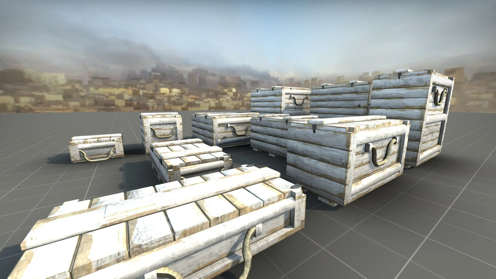
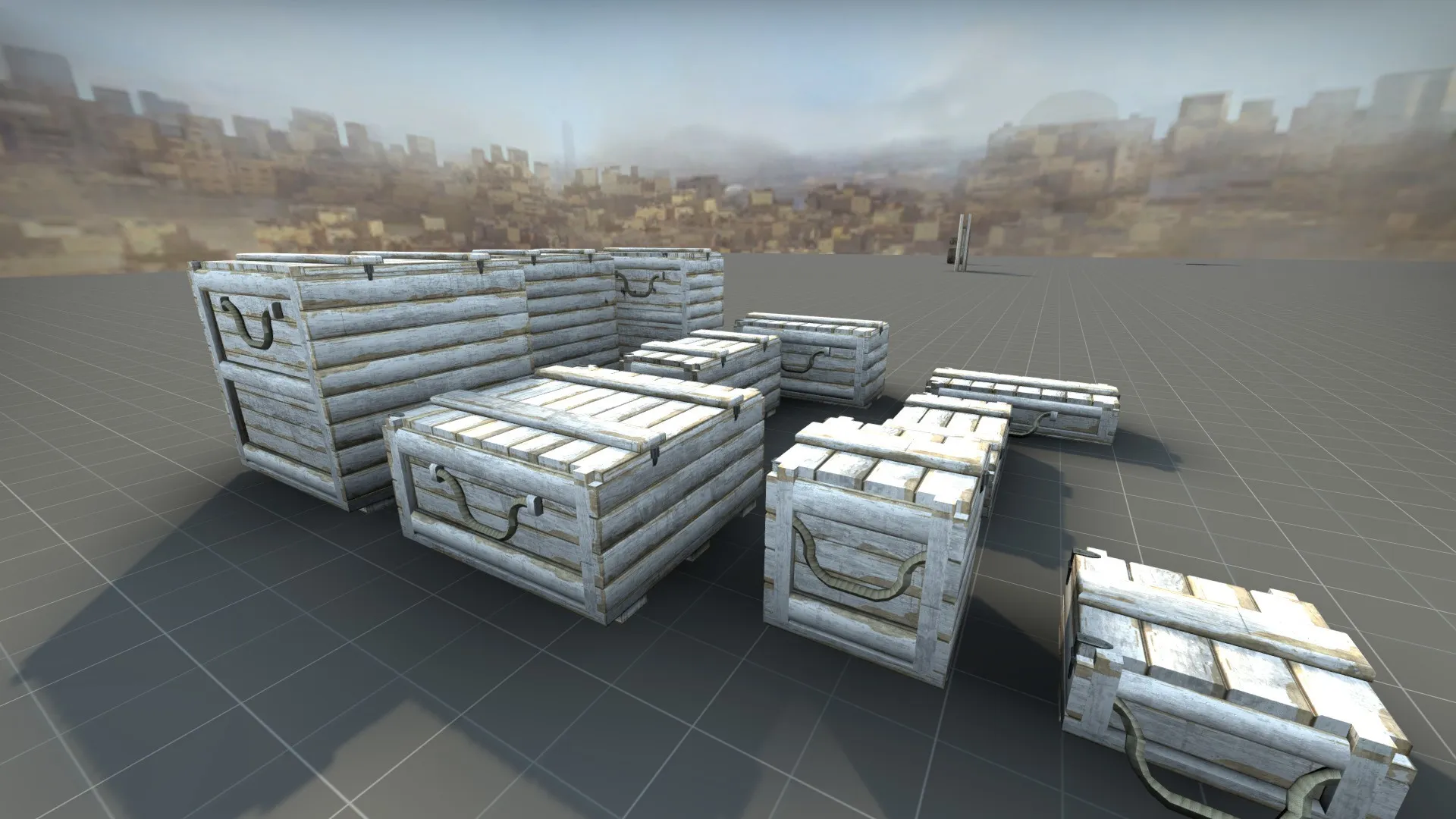
    Small update, I spent most of today working on this set of modular crates for use around the map. I hope to have a larger update soon.


  • [WIP][DE] Antiquity

    • fewseb
    • November 26, 2019 at 11:07 PM
    Quote from Tynnyri

    2 hours ago, Tynnyri said: This guy has awesome project going on and it always pains me when someone tries to do some "le epic roast"

    Your comments consist entirely of wannabe roasts, if you dont want people "corrupting" this guys project, dont be such a bell-end to him in the first place.


    Quote from Tynnyri

    2 hours ago, Tynnyri said: BTW did you notice this awesome building on A site?http:///monthly_2019_11/image.png.c47cecfa81c586a6ba560eb1f137e5d9.png

    Yes its very nice, too bad you didnt mention how much you liked it when you were spitting on this guys WIP screenshots.

  • [WIP][DE] Antiquity

    • fewseb
    • November 26, 2019 at 7:59 PM
    Quote from Tynnyri

    1 hour ago, Tynnyri said: When taking single screenshots, your FPS doesn't matter. Just crank the game to full settings, getting a low fps doesn't matter because it doesn't translate to the still images. I really can't tell if you're using CS:S textures and models or high quality ones. Other than the screenshots, the map is way too bright for the skybox. The shadows in the map are brighter than the sky. Usually in real life the opposite is true. Do you have a wrong sun position as well? I can literally see the sun in the skybox in many images but no light being cast to the buildings? Also the street lamps are WAY too intensive. Use wide-angle spotlights with low-intensity lights next to them to get the look of a lamp without making nuclear explosion to every surface near them. The reason the lights look underwhelming when less powerful is because even in shadow, the whole map is already lit up. But don't get discouraged, the theme and brushwork are awesome, even in low resolution.

    Why is your first instinct when replying to someone is to be as mean spirited and spiteful as possible. You know normally people dont lay into someone when all they're showing is low quality WIP screenshots. Maybe you dont mean it to come off that way, but it does. You never post anything nice, you never say you like something which is fine normally but when you talk about what you dont like your immediately turn it up to an 11 and start blasting them like their some life long enemy thats deserves a good put down. Nearly every single reply youve ever written is just mean spirited criticism of WIP lighting and props.


    Right here this how youre "feedback" reads

    Spoiler

    -Your screenshots are bad, I cant tell if this css or not, do it better.

    -Lighting sucks, do it over

    -Skybox isnt right, do it over

    -Your streetlamps lighting looks like ass do it my way.

    -Oh its all ok though keep trying, even though your using low restextures Im sure someday youll get somewhere near my level


    Heres how most people would have wrote your criticism

    Spoiler

    -Hey when your taking screenshots, make sure to turn up all the video setting sot high so we can see the image clearer. You might also want to disable the hud and view model

    -Youre shadows are looking slightly off, seems like they might be brighter then the sky color. Usually shadows are darker then the current color of the sky. You might want to look into some real life examples of lighting to get it better.

    -Your current skybox texture doesnt match the sun angle, you might want to look into that before you move on to further lighting.

    -The lighting entities for most of the wall lights seem to be a bit intense for the theme of the map, you might want to tone down the brightness and tint the color a little. You might also want to try a light_spot with a wider angle to make them look more like lamps.

    -Overall though the theme is pretty good and you seem to be improving rapidly, I hope to see how well this turns out.


    and even then half of that is just nothing feedback. Of course the lighting is going to be off when the map is still early in its art pass. The skybox doesnt have to line up when there are still dev textures and lighting experiments going on. Point being be a little more concise and less abrasive when giving feedback to someone.

    Spoiler But don't get discouraged, your comments and criticism are wanted, even if they're not very good.

  • [CS:GO] dz_junglety (Danger Zone)

    • fewseb
    • November 26, 2019 at 3:48 AM

    Im really sorry man, but I got to be honest this map just isnt very good. I saw the first screenshots and I thought yeah that looks a little odd. I never got around to actually check the map out until now with the operation. Let me just say right off the bat lighting makes or breaks a map and it really broke yours. It looks hot and gross which I get goes with the theme but its too hot and gross, it doesnt feel like it would actually exist. Especially right next to bright blue water. It just looks like someones mod for the original farcry.

    Its also just awful to play. There are some many large tower structures and scaffolding that anyone can be on any part of. Its like you saw the water tower on blacksite and said yeah lets do like 5 of those. The map is filled with steep cliffs that are sometimes able to be climbed, sometimes not. All of these tiny rocks have collisions and get in your way. The amount of less then waste high wire fences hidden in tall grass is just irritating. The buildings are clunky to navigate do to a lack of clipping. All of the props seem to have incorrect collisions models. The amount of grenades ive thrown that somehow get snagged in thin air is just ridiculous.

    This map is filled with custom assets and none of them look up to par with anything. Overly detailed detail layers low res base textures, too much repetition. That giant crane looks like its straight out of gta 3. Complete with stair case you cant use but it still accessible why? Cars without their glass props, turret crates without their label card and a radar that looks like it was made by flying high in the air and taking a screenshot just makes it seem like you dont know what your doing but it seems like you do?

    You put a lot of effort into this for sure but I dont feel like this map is up to scratch with regular maps. Its just not fun and doesnt look good. Not good enough even to justify the awful frame rate. Youve been rewarded for youre effort but we have all been inadvertently punished as a result. Normally if I dont like a map I just dont play it, but because valve is forcing everyone to play this map every 10 minutes and there are missions that require us to play danger zone im forced to waste my time zipping around at 6 FPS before I get killed by a guy who is blending in with the sand because the atrocious HDR settings let the orange jumpsuits blend into the environment.

    I dont like that I have to say this but please do something, anything to make this map run better and not look so nauseating. The only reason this got in the game was because it was the first community danger zone map completed, not by merit of gameplay or look and now that its there and we all are forced to play it, it needs heavy work.

  • Counter-Strike: Global Offensive

    • fewseb
    • November 25, 2019 at 5:45 AM
    Quote from FMPONE

    1 hour ago, FMPONE said: It should not have come as a huge shock that literally adding camouflaged guys to CS would, uhm, make seeing them more difficult

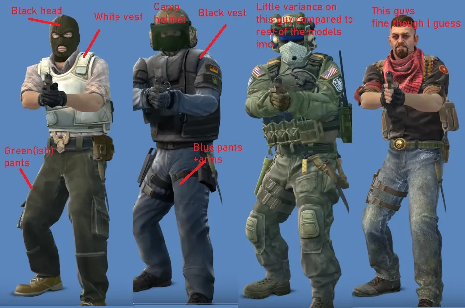
    I mean its not like camo'd models wernt already in the game, they just were done right. The phoenix have urban camo pants but those are off set by bright colored vests and shirts. The pirates have green camo pants but have bright head-wear and white shirts and shoes to make them stick out. The current seal team models have black equipment, hands and boots that both allows for their core-face to to be highlighted but also counters the camo. The new seal team models have almost no contrast which by it self is bad, but then they also have camo with no contrast which results in them blending in.


    The worst part is Valve already learned this lesson early on in the game. Back at the early launch of the game, Seal Team 6 had tan bags and helmets along with clear visors which made them blend in easily. This was especially apparent on aztec. Valve updated this tan gear to be black and for the visors to either be black or have a bright color (yellow or orange). One of the anarchist models used to have yellow highlights that got switched to blue because the yellow made it blend in with some areas of office. The elite crew had headwear that matched their shirts making their heads hard to find. All of this was fixed by Valve early on.

    and yet now it seems like this whole operation was handled by new people to the cs team. The player skins are such a bizarre mishap that could have been done right.

  • Counter-Strike: Global Offensive

    • fewseb
    • November 24, 2019 at 10:32 PM
    Quote from mtchromatic

    1 hour ago, mtchromatic said: The new CT skins in general are just less compatible with maps. Skins having a variance of colors will let them have something to make them stand out, regardless of environment.

    This is because the grand majority of CSGO player models are designed to contrast the differnt areas of the body. The body is separated into a chest, arms, hands, legs, feet, head and core face.


    In that phoenix model for instance, Tan arms blend with the pink shirt while it contrasts with the white vest. The black mask allows for the core face to stick out. His legs are dark and contrast with the vest but his feet are light.

    Of course you have models like the pirates which dont separate hands from arms very good or the anarchists whose feet legs and chest all blend together, but most of them follow the above system.


    Now you look at the phoenix Enforcer skin and it just gets ruined. Dark tan boots meld in with dark brown mud on the grey pants which then go into a dark grey body followed up by a dark grey head. The only thing that breaks this up is a light grey phoenix symbol on the chest and the exposed skin.


    Of all the new seal skins only the two Times mccoy one has any contrast. All the other skins are various shades of green camos with dark tan or green vests and pouches McCoy has light blue elements that break up his head from his chest and his arms from his chest but thats it. The old seal team models had black equipment to contrast their camo uniform.

  • [CS:GO] de_sonora

    • fewseb
    • November 24, 2019 at 7:54 AM

    Quick update, after waiting a month ive decided to reupload the map since the Bot downvotes haven't gone away. This new version includes what I hope to improved FPS. I say this because I could not adequately test the FPS on my end. I believe my video card is dying so there severe FPS spikes on every map I play. All I can say for certain is that in certain areas the old version my FPS would get about 80 before dying down to 60, in this new version I seemed to obtain FPS in 120s before that died down to 60 again. This was consistent in my testing.

    So if anybody is willing, please down load the new version on the workshop and tell me if your FPS has improved, stayed the same or become worse.


    New Workshop Page

  • Counter-Strike: Global Offensive

    • fewseb
    • November 24, 2019 at 1:41 AM
    Quote from DMU222

    6 minutes ago, DMU222 said: Imagine, every single pair of players in DZ has a color assigned to them, allowing you to easily distinguish who is on who's team.

    They can already do that, in the DZ showmatch 2 majors ago every team had a unique colored jumpsuit, that just doesnt work for gameplay since the bright orange is needed to actually see the enemy which id argue is more is more important then being able to tell who is together.


    Quote from DMU222

    8 minutes ago, DMU222 said: Valve needs players to be jealous of the skins other players have

    You know I keep seeing this get petaled around, but when has anyone ever actually been "jealous" of skins that arnt the ultra rare red tier from obscure collections. Valve has also already lost any chance of Agent skins being valued do to their implementation. The highest priced one on the market isnt even 20 dollars and the free skins havnt even begun to be dropped yet. Me personally I dont buy skins to make other people jealous, I buy the ones I like to look at. The fact of the matter is by the time this operation is done, everyone will have at least 1 skin of each rarity and they will all be worth pennies. That also means everyone will have a skin equipped except for new players which just means this problem will get worse as time goes on.

  • Counter-Strike: Global Offensive

    • fewseb
    • November 23, 2019 at 11:07 PM
    Quote from DMU222

    8 minutes ago, DMU222 said: Personally I think Zool's solution is best, the color changing just has to be modified to not affect weapon skins.

    External Content www.youtube.com
    Content embedded from external sources will not be displayed without your consent.
    Through the activation of external content, you agree that personal data may be transferred to third party platforms. We have provided more information on this in our privacy policy.

    The player skin still looks 'cool' and allows players to show off, but it also keeps the game competitive, and adds an interesting new form of customization for community maps.

    Also, it means Valve can't be lazy with their skins by making recolors, each model can have something unique about it.

    I disagree, the point where we allow mappers to easily make Player Models atrociously bright colors is the point where we might as well give up and give enemy players a red inline. Besides that, every reworked set of player models has been brighter then their original versions. To me at least the easier solution would be to make a console command to disable enemy player skins as apposed to going through every single player model set and setting up certain materials to be tintable and then adding a parameter int he KV file for tinting them.


    Unpopular opinion here, but I prefer it if player models are at least somewhere in the realm of reason, Neon green and hot pink are not colors either side would wear.

  • Half-Life Alyx

    • fewseb
    • November 23, 2019 at 5:41 PM
    Quote from Vaya

    10 hours ago, Vaya said: Can you not just play outside? you live in florida anyway so no one will bat an eye

    Florida man sparks revolution against the government thinking he was playing a "VR" game. He now says he forgot to plug in the headset and thought what he was seeing was the game. Authorities were unable to apprehend the man for several hours.

  • Counter-Strike: Global Offensive

    • fewseb
    • November 23, 2019 at 1:16 AM
    Quote from MikeGon

    35 minutes ago, MikeGon said: and btw this guy looks like a fckin furby lol:

    Dont talk about Johnny Depp like that, hes sensitive

  • Counter-Strike: Global Offensive

    • fewseb
    • November 20, 2019 at 4:45 AM

    Hey im currently running a poll about the addition of player model skins, if anyone has time could you please fill it out. I believe gathering concrete data could help Valve make proper changes to how and when player model skins are seen.

    Poll

  • Counter-Strike: Global Offensive

    • fewseb
    • November 19, 2019 at 7:49 AM
    Quote from Furiosa

    29 minutes ago, Furiosa said: I think Valve will release a coop map that set in a night time, in this Operation. Found this image in csgo folder, that pointing to coop map.

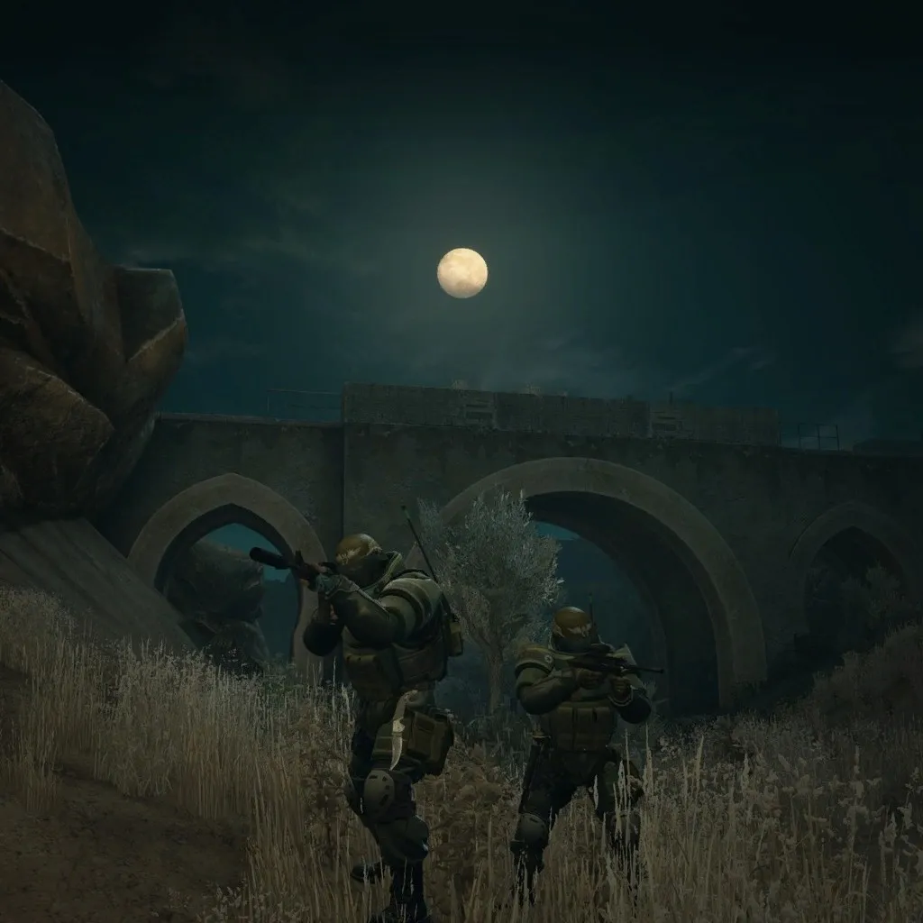
    Its literally the first mission on the mission list lol. All it is really, is dz_sirocco edited to be nighttime and with some new barriers and deco placed around for the mission.

  • Counter-Strike: Global Offensive

    • fewseb
    • November 19, 2019 at 1:42 AM
    Quote from Squad

    41 minutes ago, Squad said: Who would have thought there would be another operation ...

    Who would have thought there would ever be another Half Life game

  • de_grotto [WIP]

    • fewseb
    • November 18, 2019 at 8:13 AM

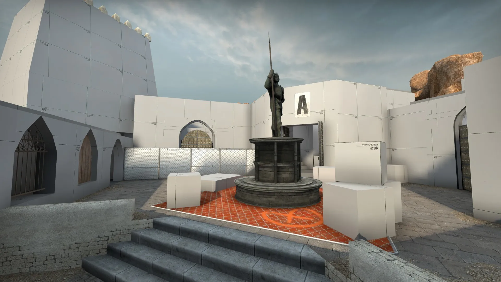
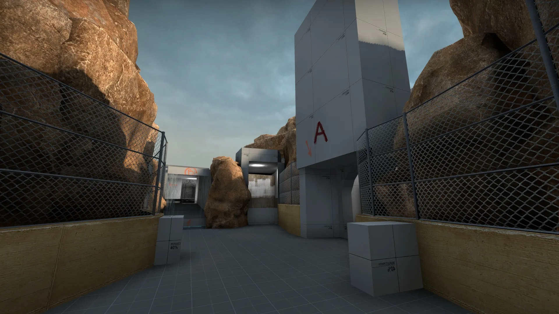
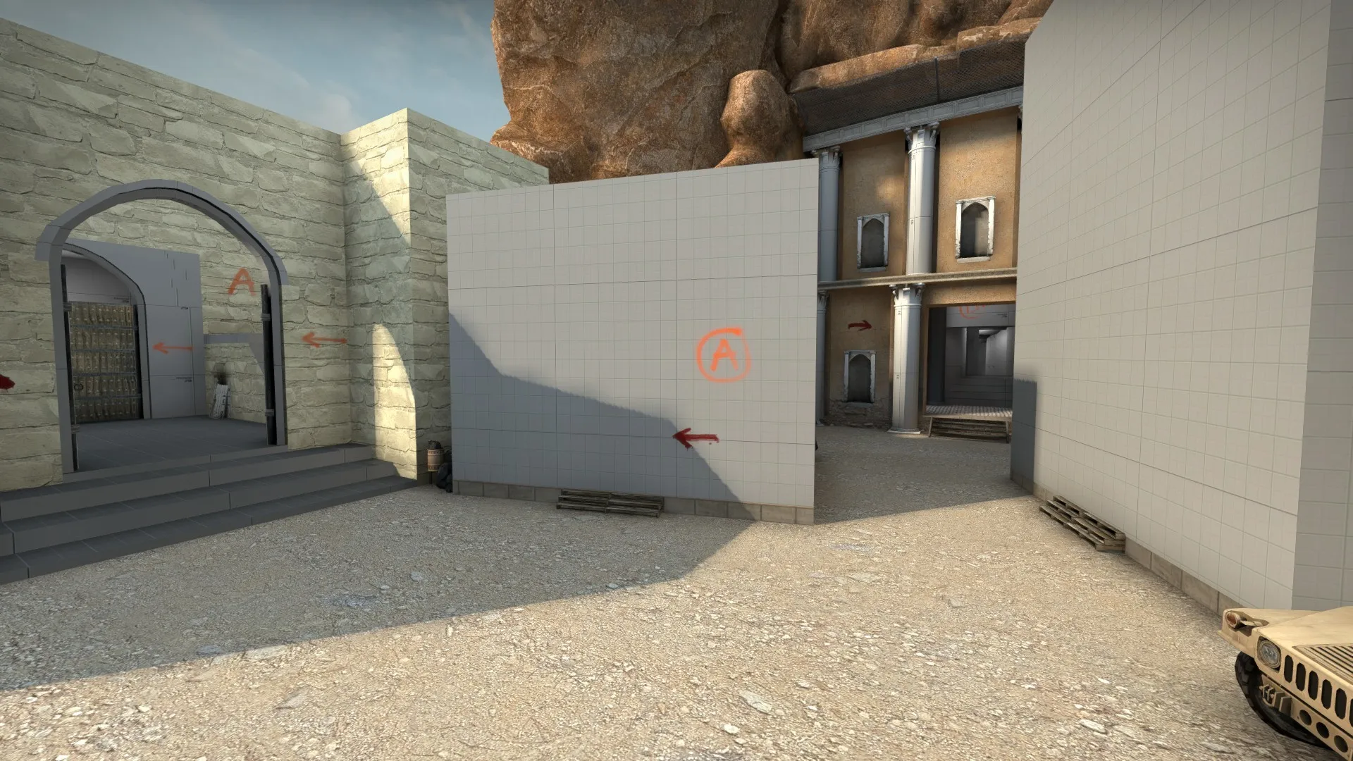
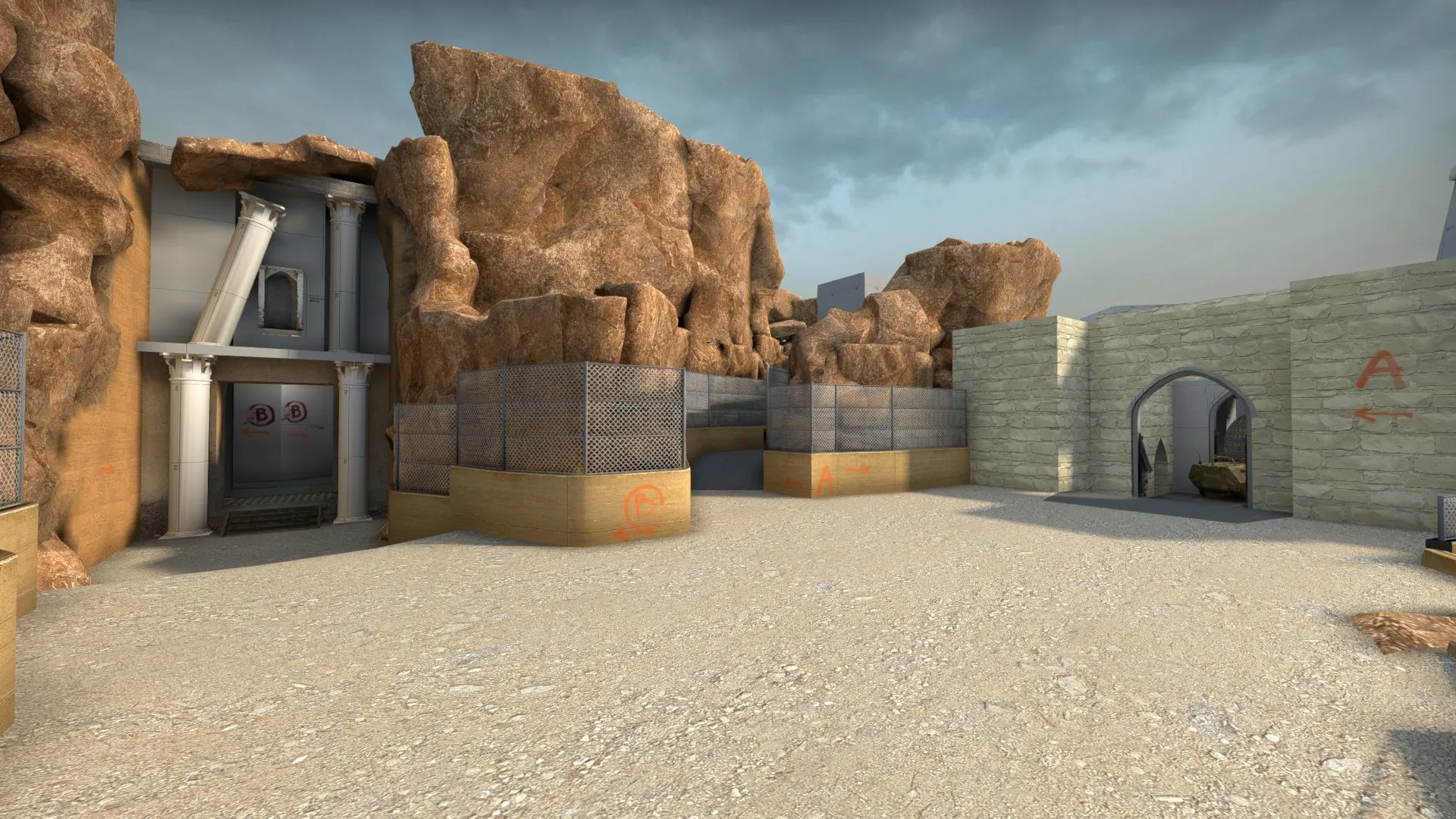
    Beta version of the map is now up on the workshop and there is a playtest scheduled for thursday


    https://steamcommunity.com/sharedfiles/fi…/?id=1915402320


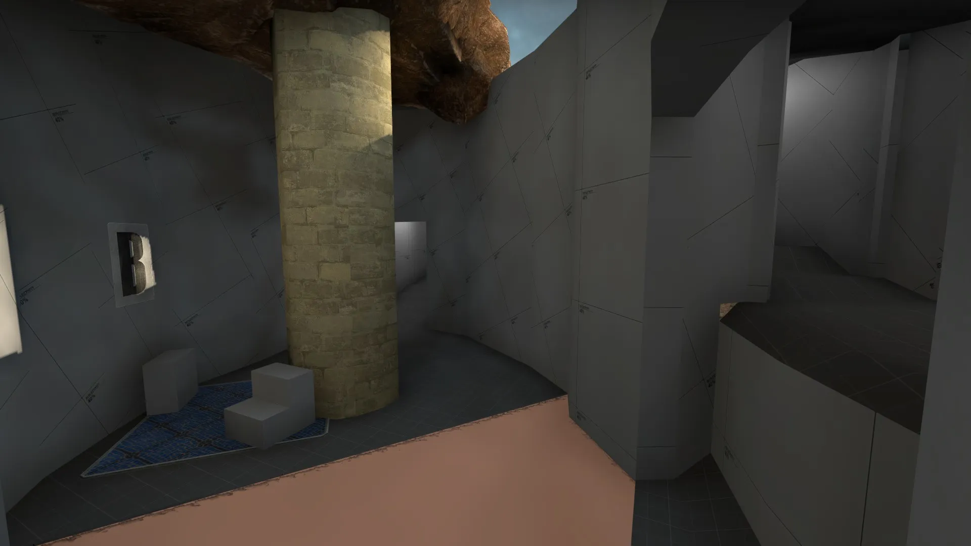
    Here are a few screenshots


    Bombsite B

    Bombsite A

    Middle

    CT spawn

    T Spawn


    Please let me known what you think of the layout if you test it

  • de_grotto [WIP]

    • fewseb
    • November 17, 2019 at 9:02 AM

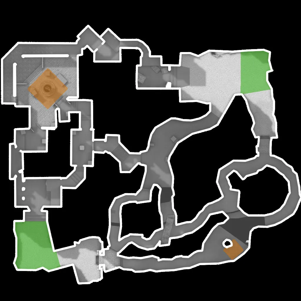
    Heres a quick radar for the upcoming playtest version, I believe I have finally come up with an interesting mid that has real value to hold/take. My previous problem with mid was how to make it worth it for Ts to want but also make CTs able to counter a mid take form either T path.

    With the original layout (seen in the first port of this topic), mid was essentially worthless and sucked to play since it was a flat lane essentially, Ts had no reason to take it because all of their alternate paths were already avaible.

    With the first major overhaul (seen in the second post) Ts had a reason to want to take mid but the gameplay was still dull because of the mostly flat lane and no cover. The a path was over complicated with 2 different spiral stairs and an open room that cts had to sit in and bore them selves to death waiting for a possible attack. The b mid path was harder to take but not really worth it since the ct mid path offered essentially the same thing and the mid player could just rotate back and guard the one way drop while Ts had no choices for attack.

    Now mid is something to fight for.

    The a path is easier to take but is more risky. The ts are faced with a one way drop into a large room with some cover. No more spiral stairs taking up time, simple pathways that allow the ct players to stop contemplating suicide if the Ts dont go mid. Once in the large room Ts can go down the stairs to a or circle to b through ct spawn, but can not go back mid. They still have choice but are limited.

    the B path is now worth taking, the T players now have a bridge going over the secondary ct path allowing them to flush out ct players and throw more grenades. Players can still turn back when they are on the bridge but once they drop down they must either go to their secondary b entrance but without having to worry about guarding cts or can back around and go down the primary ct path which offers them a third entry into the bombsite, they can also go through ct to A or even go back down the ct mid path and go back to mid. There is now value to the B-mid path.

    Gameplay in mid is now more exciting, the ct mid path now leads to a snipers nest that can not be reached without a boost form the Ts, there is cover for the Ts to use and cts can try risky counters by boosting players one either 1 way drop from the a and b mid paths.


    Overall I am excited to see how the new middle plays out in a real 5 v 5 match in an upcoming playtest

  • de_grotto [WIP]

    • fewseb
    • November 16, 2019 at 9:27 AM

    Another quick update, I believe I have found a good solution to middle and I think I will have a playtest-beta version out in the next few days

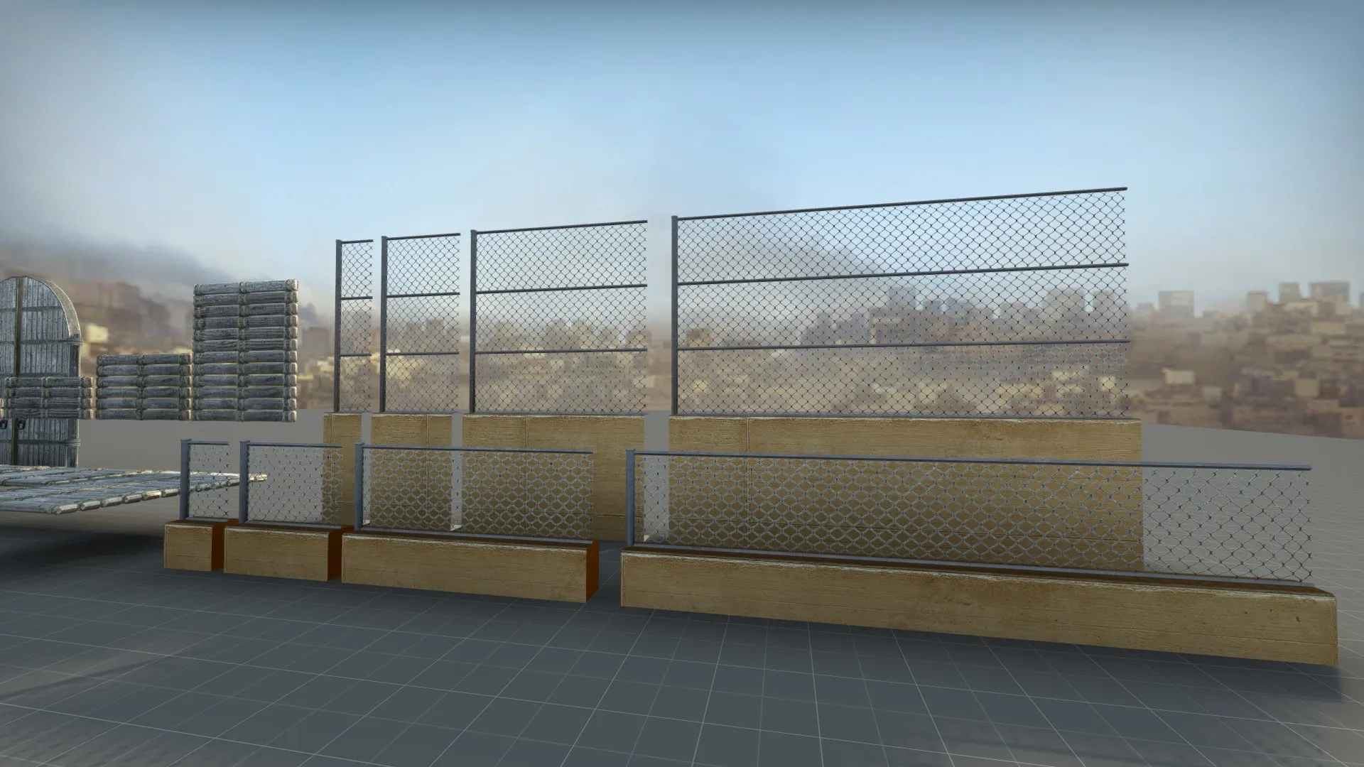
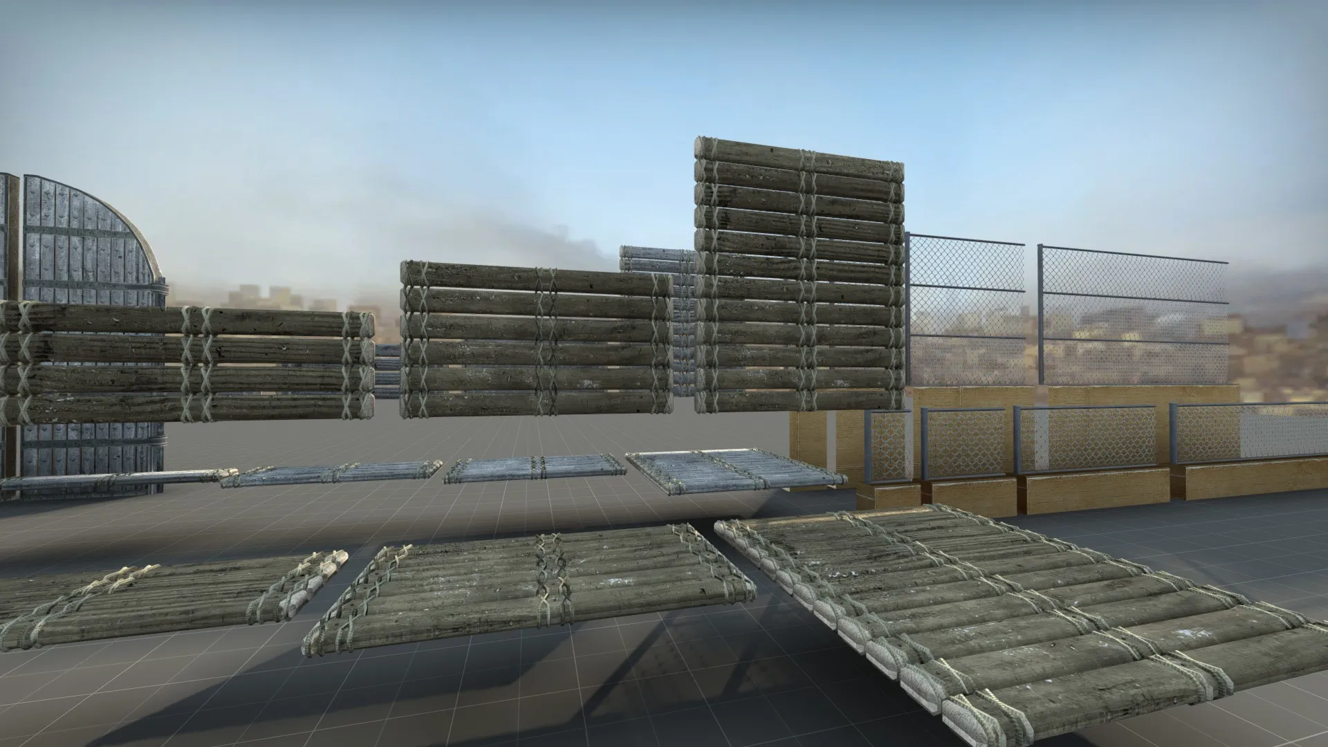
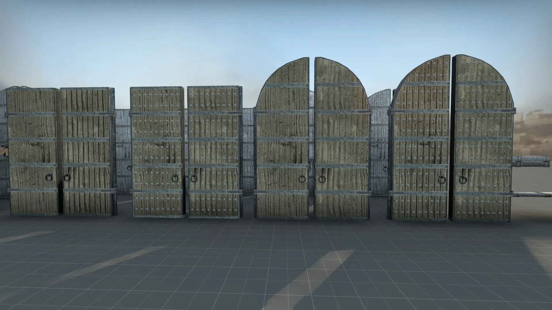
    Until then here are some assets I have been working on for the map

    Rock Catch fencing as previously shown

    Wooden Bridge paneling, shadows are messed up do a shader error

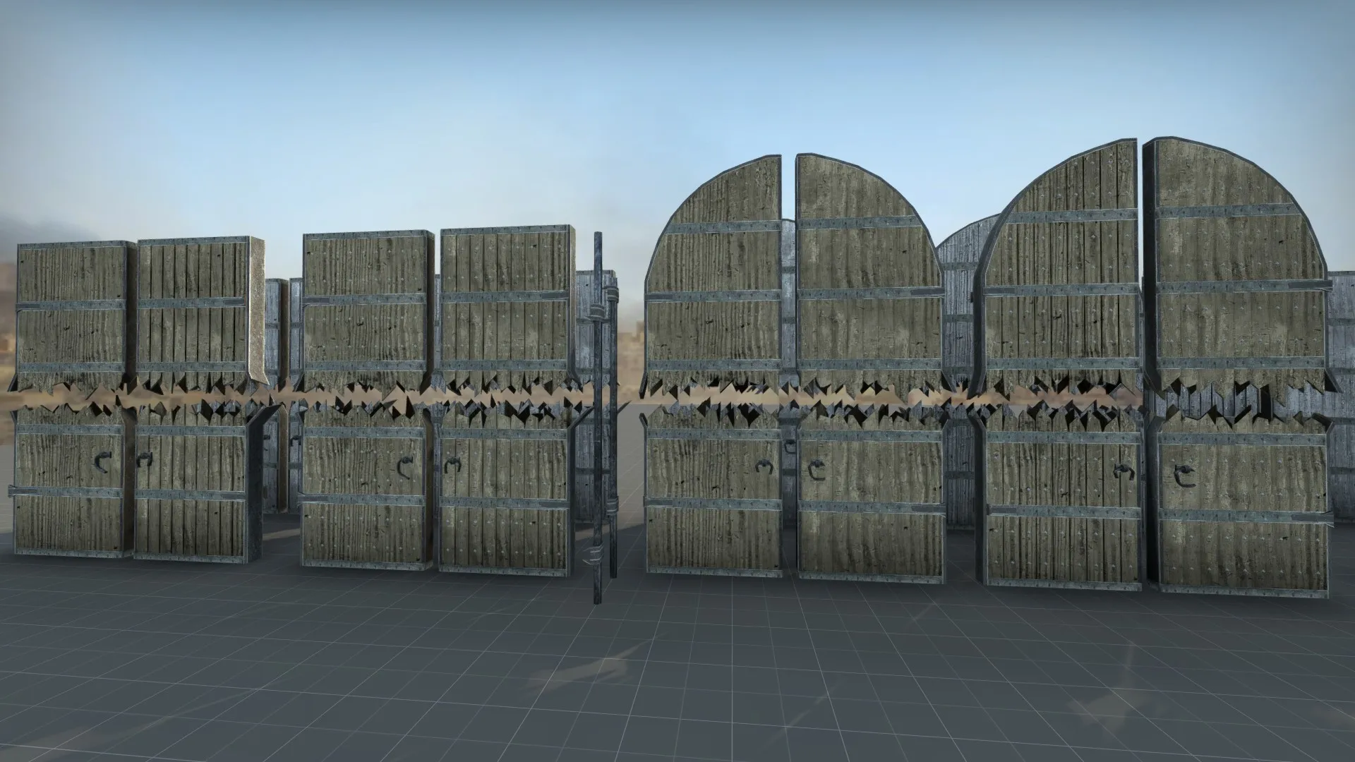
    2 kinds of large wooden doors with and without studding to replace the previous stock dust2 doors


    WIP Broken Version of above doors, I dont currently have a broken splintered wood texture for the core and the separate hinges are still pretty basic

Discord

The Mapcore Discord is our lively IRC channel of the 2000s reborn. Chat about level design, gaming, and more.

Latest Posts

  1. Tangerine

    Harry Poster
    July 18, 2026 at 11:10 AM
  2. Any of the old guard still around? D:

    Warby
    July 12, 2026 at 8:23 PM
  3. About our archived forums

    Thrik
    June 30, 2026 at 2:12 PM
  4. Mapcore Discord

    mason_fan123
    June 24, 2026 at 8:52 PM
  5. [CS2] Valley

    Serialmapper
    June 22, 2026 at 11:56 AM
  6. Free Music / SFX Resource - Over 2500 Tracks

    Eric Matyas
    June 18, 2026 at 12:32 PM
  7. Pango [WIP]

    Elowen
    June 11, 2026 at 10:13 AM
  8. [CS2] Dvina

    Jeremy Rivera
    June 11, 2026 at 10:03 AM
  9. Bridges 2.0 by NEXSIDE, MAP SHOWCASE. ( Steam Workshop )

    MrTrane18
    June 1, 2026 at 7:46 PM
  10. Classic Maps Reborn For CS2

    SillySpaceCat
    May 31, 2026 at 10:33 PM
  1. Privacy Policy
  2. Contact
Powered by WoltLab Suite™