


So you've scrapped the mine idea?
Or are you just using placeholder assets from Dust2 to set the atmosphere?
So you've scrapped the mine idea?
Or are you just using placeholder assets from Dust2 to set the atmosphere?
So I evened out the ground in middle, which makes areas such as T plat and CT balcony (I just made up those names) easier to access, and angles are better ?
[Blocked Image: https://i.imgur.com/01mLzYt.jpg]
And a complete rework of the cover on A:
[Blocked Image: https://i.imgur.com/b8lqKVK.jpg]
The goal was to get rid of this long angle that allowed CTs a very advantageous angle from CT straight to A main:
[Blocked Image: https://i.imgur.com/nQeIRo8.jpg]
So this position isn't nearly as viable as it used to be, but there are more positions in the back of the site with good cover to defend both A main and heaven:
[Blocked Image: https://i.imgur.com/mvhibt4.jpg]
So right now this site is much more close range than it is potentially going to be much easier to take on pistol rounds, however there are more positions to check and if the Ts are too slow they are risking getting flanked from middle.
You know what, it would be nice if you could mark it somehow where the bomb zone starts and ends on top of the bridge. For example, with light poles so that it can be seen from underneath.
Spoiler
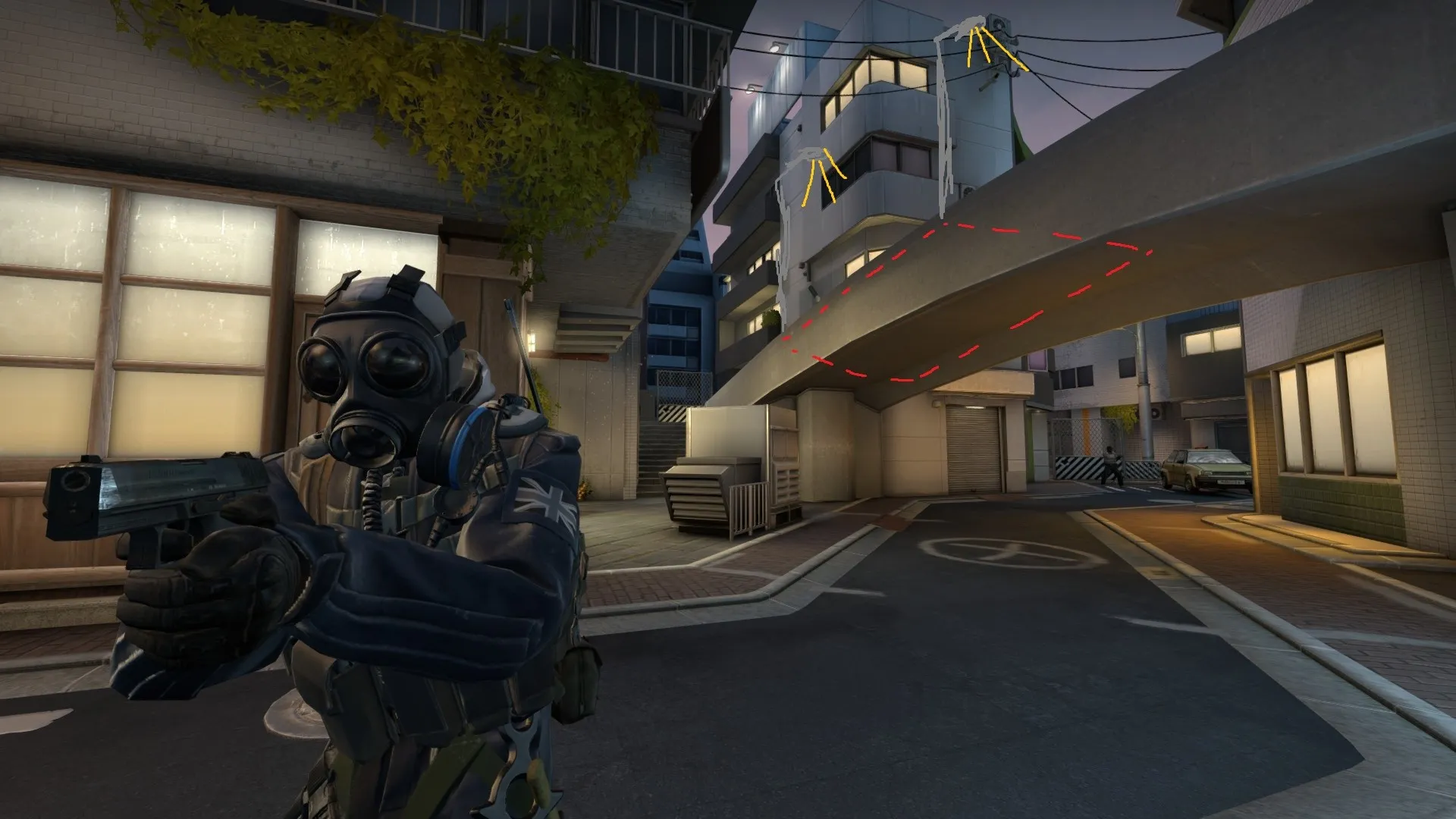
Otherwise if you've planted the bomb on top, CTs can just smoke it and it's very difficult to tell where you've planted the bomb if you're on the lower level or at long. There are different situations where this could be useful, or maybe you want it to be this way so that it's very difficult to defuse without a smoke, whereas, with a smoke it's much easier, idk.
Otherwise it's starting to look really sick visually, you're almost there.
 Quote from Andre Valera
2 hours ago, Andre Valera said: I like the direction you took the map, what are your plans to differentiate each of the sites thematically? (unless of course... that's top secret information)
Well for starters, A site is inside a warehouse, while B is entirely open. There are going to be a lot more natural hills and cliffs surrounding B site and a lot of orange and green. For A site I'm thinking I might add some blue lights as it's one of the few interior areas in the map so it's gonna have orange and blue.
Also on B site one of the hands of the statue is sitting there, while the other one in B is still being assembled. Here's one of my references for B:
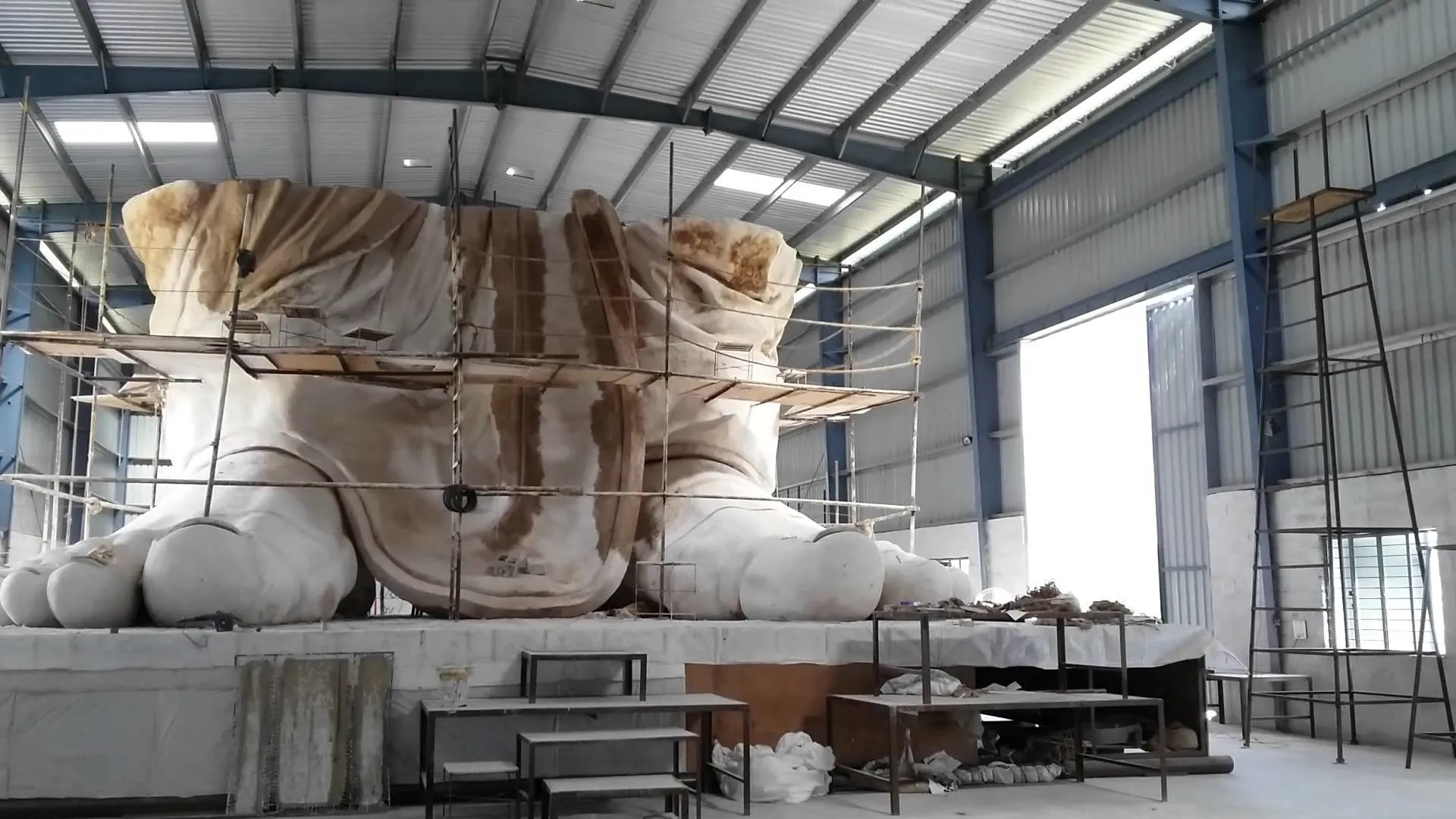
I don't know what the statue is gonna be made of yet. Gonna have to do some more research into it.
I'm definitely gonna try and make them look as distinct as possible.
Made some more changes to the approach path to B site:
Before:
[Blocked Image: https://i.imgur.com/wgnWiku.png]
After:
[Blocked Image: https://i.imgur.com/Ufz4WNT.png]
Basically I've extended the warehouse more towards the site and I've moved the connector between the two areas closer to the site.
Firstly this shortens the long sight line of the lower entrance to the site, which now makes it more viable for pistol rounds and rushing with SMGs.
The upper path is pretty much more suitable for long range weapons, while the lower one is better for pistols, SMGs and a tad bit of shotgun.
It also makes it a little easier to defend by 2 CTs, while the lower path also gives them a good option for pushing up for information.
On top of that, this deals with the bunch of bad angles, both inside and outside the warehouse, shifting the crossroad to 2 triroads.
Some more screenshots of the changes:
Spoiler [Blocked Image: https://i.imgur.com/6rkrrur.jpg]
[Blocked Image: https://i.imgur.com/DrYfcNH.jpg]
[Blocked Image: https://i.imgur.com/hrh9q7x.jpg]
[Blocked Image: https://i.imgur.com/FHbB2yX.jpg]
[Blocked Image: https://i.imgur.com/uMBjtEx.jpg]
Also added this wooden stuff so it's not as viable to play under the crates as CT:
[Blocked Image: https://i.imgur.com/WzrEgrp.jpg]
And now some quality of life improvements on A site:
[Blocked Image: https://i.imgur.com/aPbt4B5.jpg]
[Blocked Image: https://i.imgur.com/w3oB3qL.jpg]
[Blocked Image: https://i.imgur.com/ycRsFoq.jpg]
[Blocked Image: https://i.imgur.com/nPszx6n.jpg]
The back of the site is now slightly elevated, rather than lowered, lowering the height difference, especially towards uppers. It also makes it much easier to clear as T, and feels better playing behind the statue.
Here's the full overview:
[Blocked Image: https://i.imgur.com/hg2yrKb.png]
I'm stepping up my radar game with the gradient background.?
I recently discovered that I can insert images from Imgur, as I'd already reached my MapCore Attachments limit, so I'm gonna be flooding you with more of these. Better prep yourselves.
Damn, I'd forgotten I've made a topic about this and I was almost gonna make a new one.
So here's the new overview of the latest update:
[Blocked Image: https://i.imgur.com/xrqy4Za.png]
I believe I've dealt with most of the issues that were brought up in the last playtest, mainly the middle area. I've previously fallen into the trap of ignoring the feedback completely reworking areas instead of fixing what's wrong with the current ones, but this time I had to do some big changes to mid. It was overly complicated and very long to rotate through so I've simplified it a lot. Changing middle also required me to rework the entrance to A site, and I also had to get rid of the upper area that was outside the warehouse because I couldn't justify it's existence thematically.
I've also changed the color theme of the map, as I've put into use some of my own textures and models. The reference was more grayish and had cyan green, which I tried but I've come to the conclusion that it's not very good on the eyes, or at least it doesn't look good with the construction theme. Instead I've gone with more warmer colors: yellow and yellowish green. The rocks are also placeholders and will be replaced with more high quality models and materials.
I've shortened the travel times to choke points overall, even as far putting the CT spawn in a quite awkward position, which was necessary due to the long distance between the sites and the choke points being too far from the CTs.
So here's T spawn:
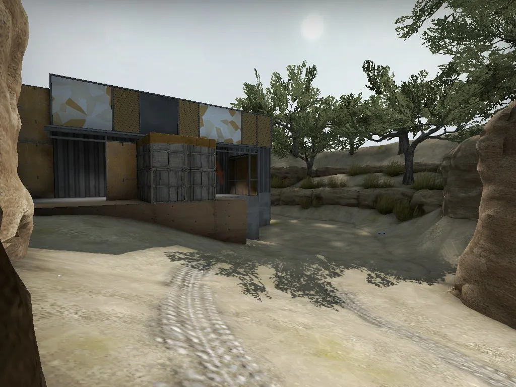
Only thematic changes. I had get rid if the large cliffs.
Here's B Long:
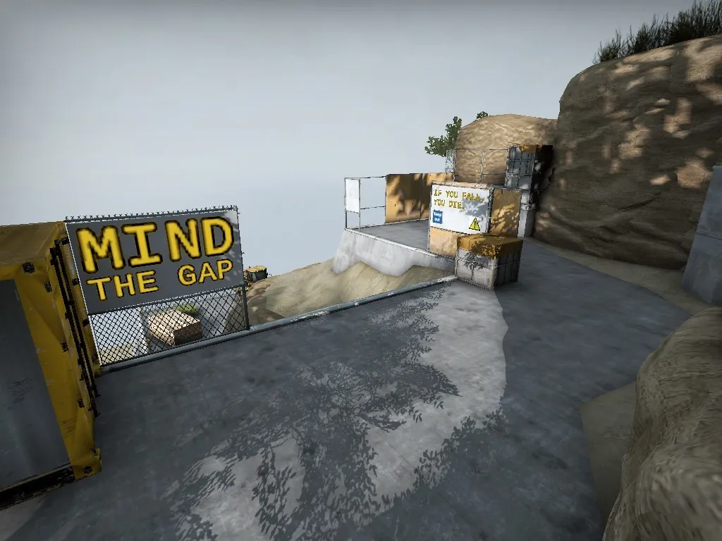
I've done some more detailing on the outside and I'm working on making it more obvious that jumping down is going to kill you. I don't want to block it off completely, since I think it takes away from the gameplay, and I hate it when people complain about this with no justification.
Since I got rid of the crane in T spawn, I decided to move it here:
[Blocked Image: https://i.imgur.com/mbIW3dn.jpg]
And this is the area some people complained about in the previous versions:
[Blocked Image: https://i.imgur.com/TLuyzbs.jpg]
[Blocked Image: https://i.imgur.com/m4Pi0kU.jpg]
The problem with it was that CTs could run up to underneath the yellow containers and it was very difficult to clear. I didn't want to get rid of this one way, just for the sake of this one problem, so I did some other changes in an attempt to fix it. I've lowered the ground so that now if CTs drops down, they will make noise and with the new timings Ts should be able to hear it. There's also water for extra noise. I've also blocked off the corner in front of the containers so CTs can't hide there. I'm still thinking of how to make it easier for Ts to clear that spot under the crates just in case someone has snuck in, but I think overall the elevation change adds an interesting dynamic to the way this area is played.
And yes, you can still look through the crane.
This is the new middle area, looking from B connector:
[Blocked Image: https://i.imgur.com/Zf5hrsR.jpg]
[Blocked Image: https://i.imgur.com/IdZ0THR.jpg]
It might be difficult to understand from the screenshots but the building on the right at the second screenshot is basically upper A and it is controlled by the CTs. Ts also need a boost in order to get over that railing so they're gonna have to use the door most of the time. The direction they are coming from is the left side on the big concrete base for the legs of the statue.
Here is a screenshot from inside the door room:
[Blocked Image: https://i.imgur.com/dlv0XYP.jpg]
Looking into A site on the left.
[Blocked Image: https://i.imgur.com/k1mhrJE.jpg]
And there's also that boost spot where the blue tarp is. It requires a boost from both sides. I don't know how often this will be used but it could be used to surprise the CTs or from CTs themselves to make a peek for information into A main or go for an early frag. It also adds some treat for a CT playing door and so he needs to be more aware.
And this is where it comes out onto the site:
[Blocked Image: https://i.imgur.com/3FvQJOr.jpg]
Not many changes have been made to the site itself. I'm considering blocking off the big gap behind the site, but it's just more exciting when it gets chaotic with smokes and flashes everywhere and there's also the danger of falling to your death.
Now here is A main:
[Blocked Image: https://i.imgur.com/qRZfydw.jpg]
This is the choke point as it approaches the site. Changes were necessary because of the route to mid. It's not much different from the last version, it's only pushed back a little towards T spawn and the angles are a little different. You can also jump on the yawning roof of the building to the left. Probably gonna clip it off. Needs some more testing. But yeah, this way it's a little safer for CTs to push up if they so desire, because they have this hidey spot where the wood is leaning in the corner and the catwalk to mid is now halfway lowered so they don't need to do 90 degree flicks upwards.
Here it is from another angle:
[Blocked Image: https://i.imgur.com/ZWZqN5x.jpg]
You can see there's a ladder at the end and it leads to the main route to middle and also looks straight towards the boost.
And this is the T side of middle:
[Blocked Image: https://i.imgur.com/z1H31xn.jpg]
There's the boost to the right and to the left is the other entry. This boost could be very powerful for CTs but it's also very exposed. Might not be used very often due to how close it is to the main path to mid, but I still think it will have some interesting implications.
B site is still the same in terms of layout:
[Blocked Image: https://i.imgur.com/cffDnNo.jpg]
Am I posting too many screenshots? Probably not...
I'm gonna try to put it on the workshop by the end of the week.
It's very indoor-ish. Could definitely benefit from some windows and maybe even an outdoors area. Like, some more natural light. Otherwise it looks very dead. It doesn't look like a place that would be inhabited by people. It looks like a modernistic asylum. I would love to be able to look out the windows and see a nice plain field, or a forest. And maybe skylights too. So you can see the moon. It's just depressing.
But maybe you already an outside area and you are deliberately not showing it in any of the screenshots, then it's my fault for being too lazy to download it and see for myself.
Just saw black Panther, and it not super bad. The plot was a little shallow and predictable imo but it had some cool moments. Nothing spectacular, though. I even felt that the trailer was more badass thank the actual movie.
Felt like 75% CGI. Especially that last fight between black panther and yellow panther, or whatever his name is, that was like a video game cutscene.
So it's actually just a 2d concept art from halo? That's incredible how you managed to bring it to 3D.
Absolutely incredible! You are amazing at creating these city maps, catfood. I can keep running around the map for hours and I will always find new things. Amazing attention to detail. I've been following the development of this map since the first public greybox throughout all it's iterations and It's absolutely amazing how far it has come.
The Art looks fucking sick in the pictures and I believe you can make it look even more sick.
And the layout is more complex and interesting than it looks.
Looking forward to playtesting it.
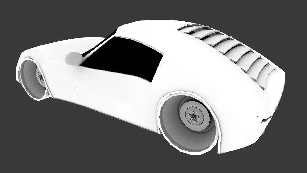
It's sporting some grillz.
Just a heads-up so you know I'm still working on this,
I started designing the car:
Not sure if I like how the front turned out. Maybe it's just the shape of the headlights that's turning me off.
Also this is the first car I've ever made so It probably looks like shit and I'm just not realizing it.
Other than that I have a cool idea for the layout that I'm experimenting with and hopefully I'll have something to show soon.
Redesigned A site:
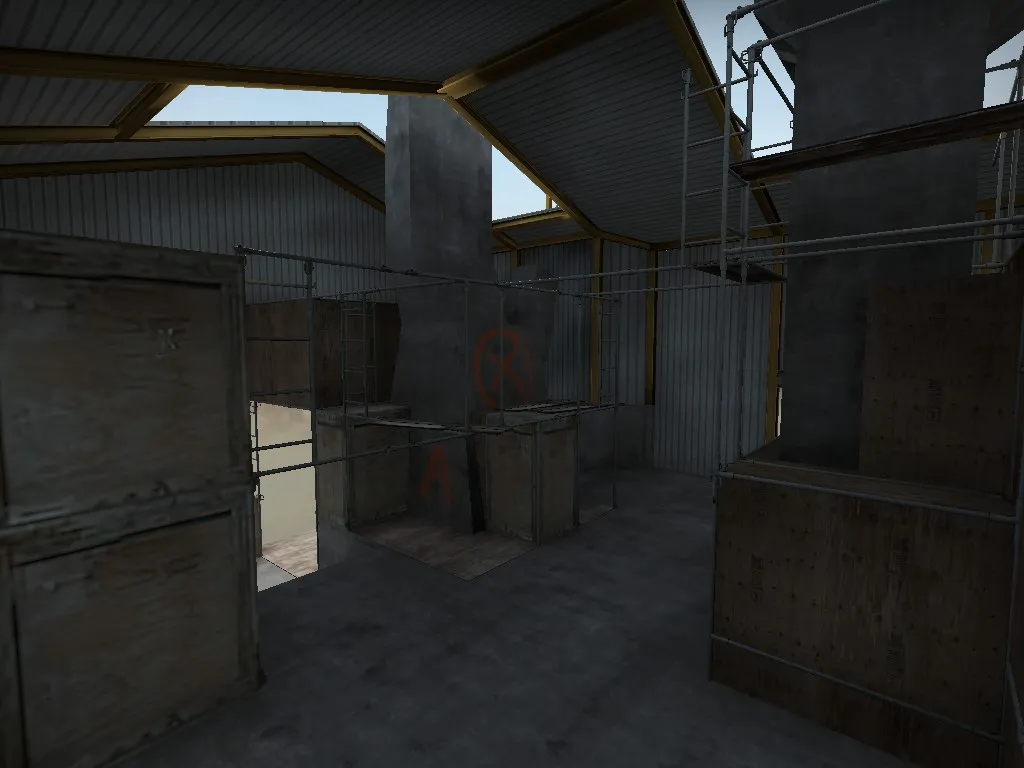
It is now a warehouse with a BigAssHand™ and something else.
Some other small changes.
Updated to the workshop:
It's an interesting layout. Bombsite A plantzone is kind of in the weird place. I feel it's gonna be quite difficult to defend for the CTs, but then again there's some pretty complex chokepoints so I couldn't test the timings very well on my own. One of the things I think could be a problem is the long sightline from the main T entrance to B, which can be seen through the windows all the way from outside the greenhouse.
Have you done a 5v5 test on the layout yet?
Did some texturework and added some custom shipping containers:
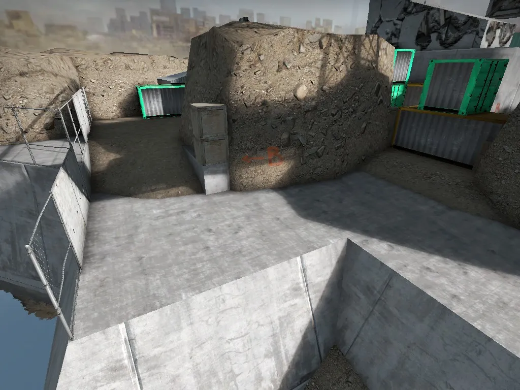
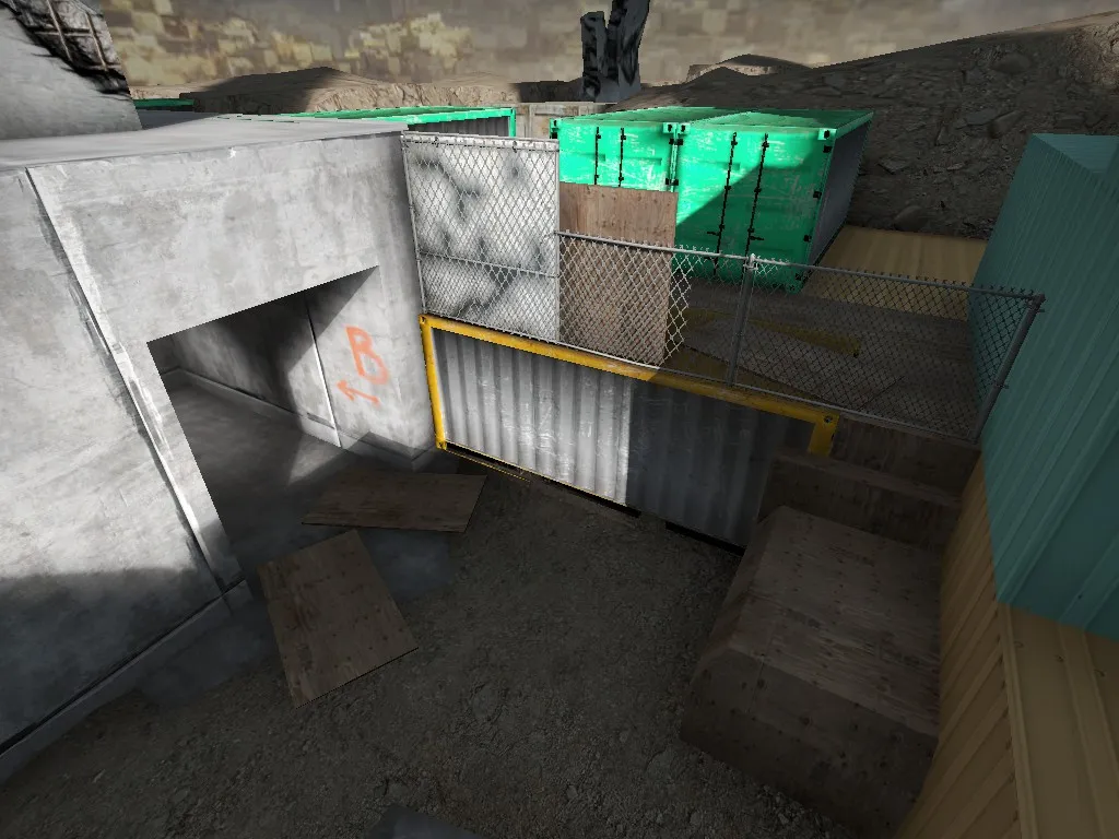
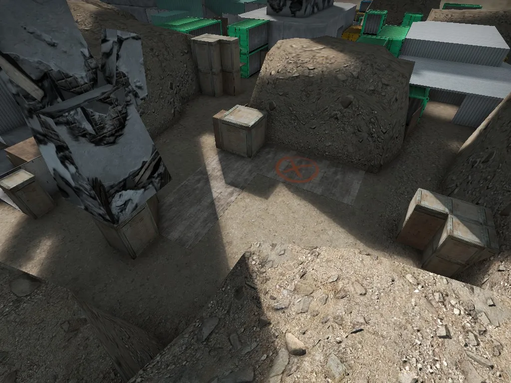
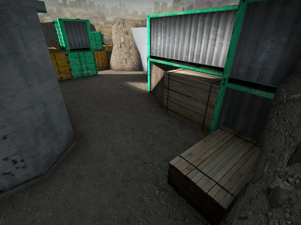
Most of the containers will be replaced with more interesting geometry. Working on some custom rocks and stuff.
Here is the reference:
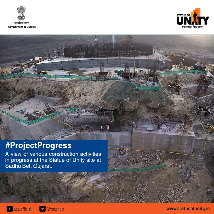
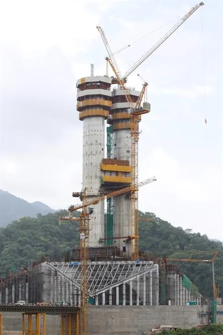
Update coming soon to the workshop.
 Quote from Vaya
On 3/14/2018 at 3:44 PM, Vaya said: I love these dev textures of yours
Thanks you, Vaya! I'll make sure to use them in all my maps.
A big ass statue is being constructed on an island in the middle of the ocean so it can be visible from 4 continents. A hostage has sneaked in...
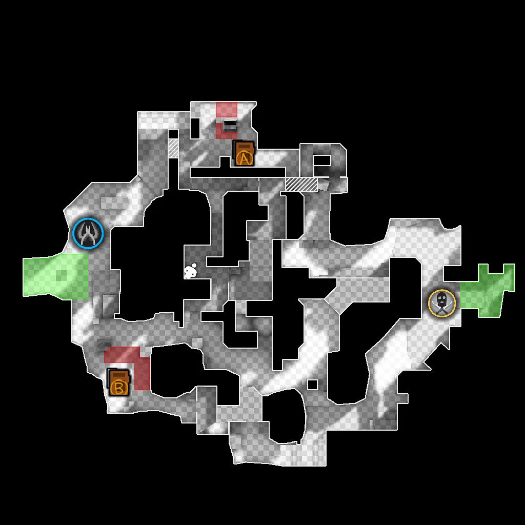
If you've taken part in the Mapcore playtest 3 weeks ago here are the changes I made since then:
Overall what I'm trying to do is encourage CTs to play more forward positions, instead of defending from the actual site itself. I don't want CTs to be staying in B site. I want them to play forward and only fall back if they get pushed by the Ts. Ts also now have more control over top side of Right Mid so they can work with that towards taking control of Middle overall. It's also easier now for Ts to hold their positions.
Again thanks to ZooL for the awesome dev texture!
BigAssStatue's layout is inspired by Overpass and it's actually not as big as it seems.
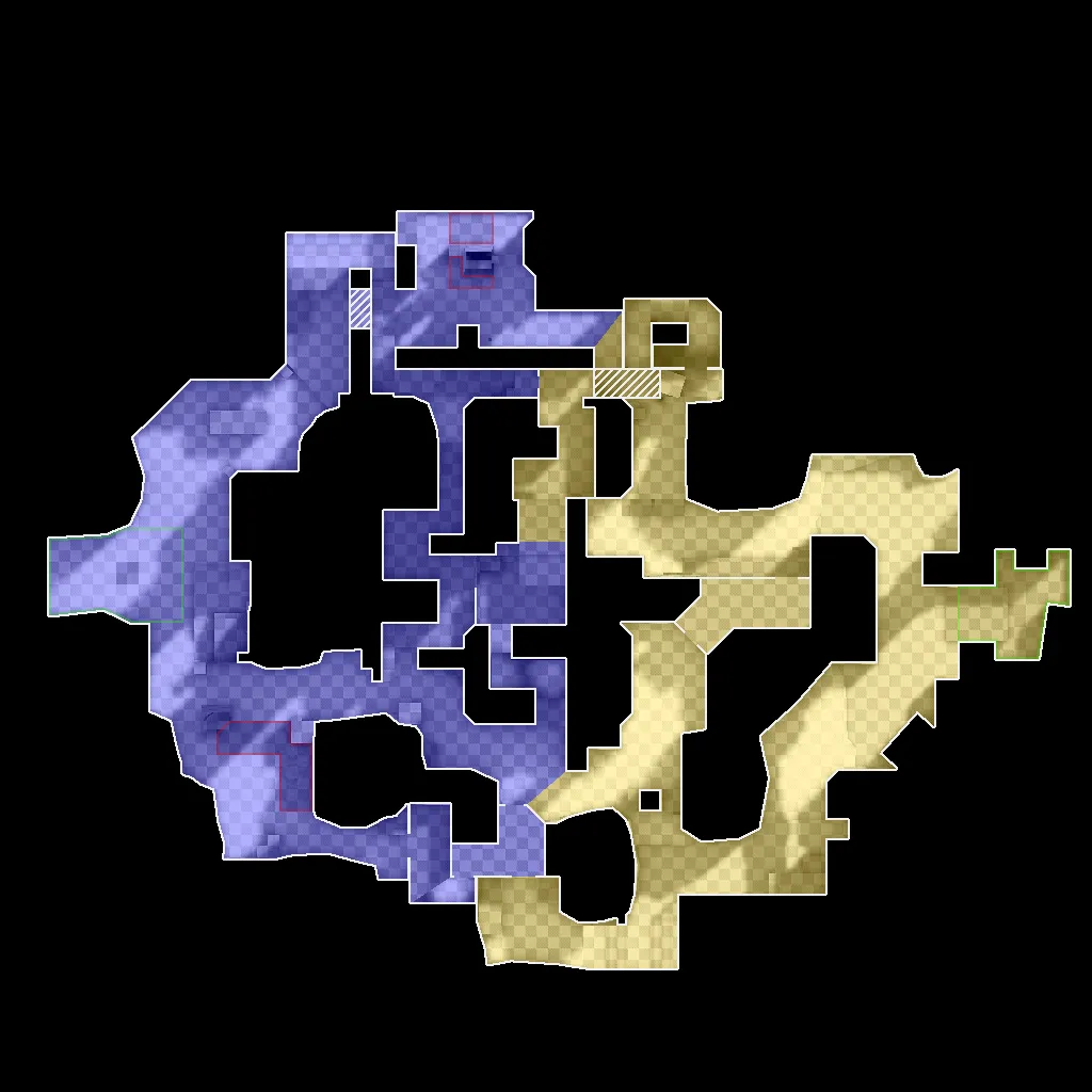
This is how map control is distributed at the beginning of the round:
http://steamcommunity.com/sharedfiles/fi…/?id=1297030515
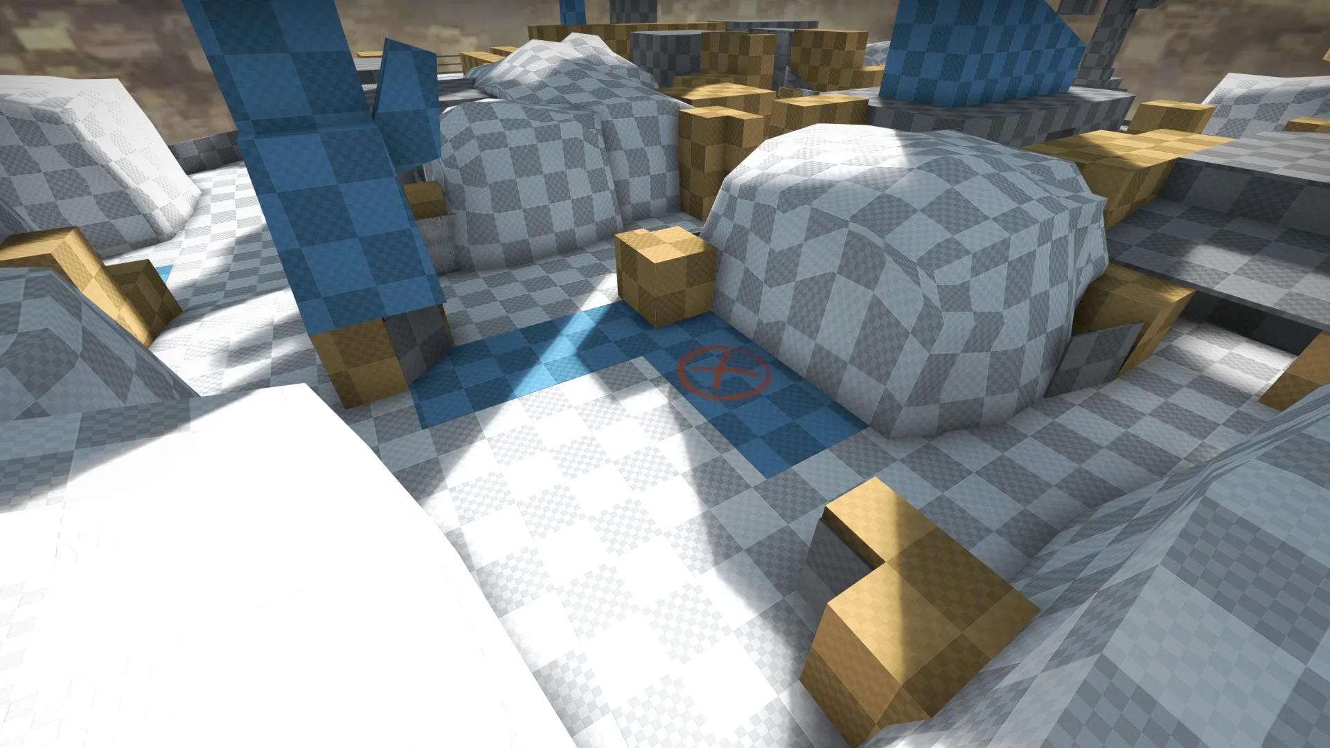
Some more screenshots:
Spoiler
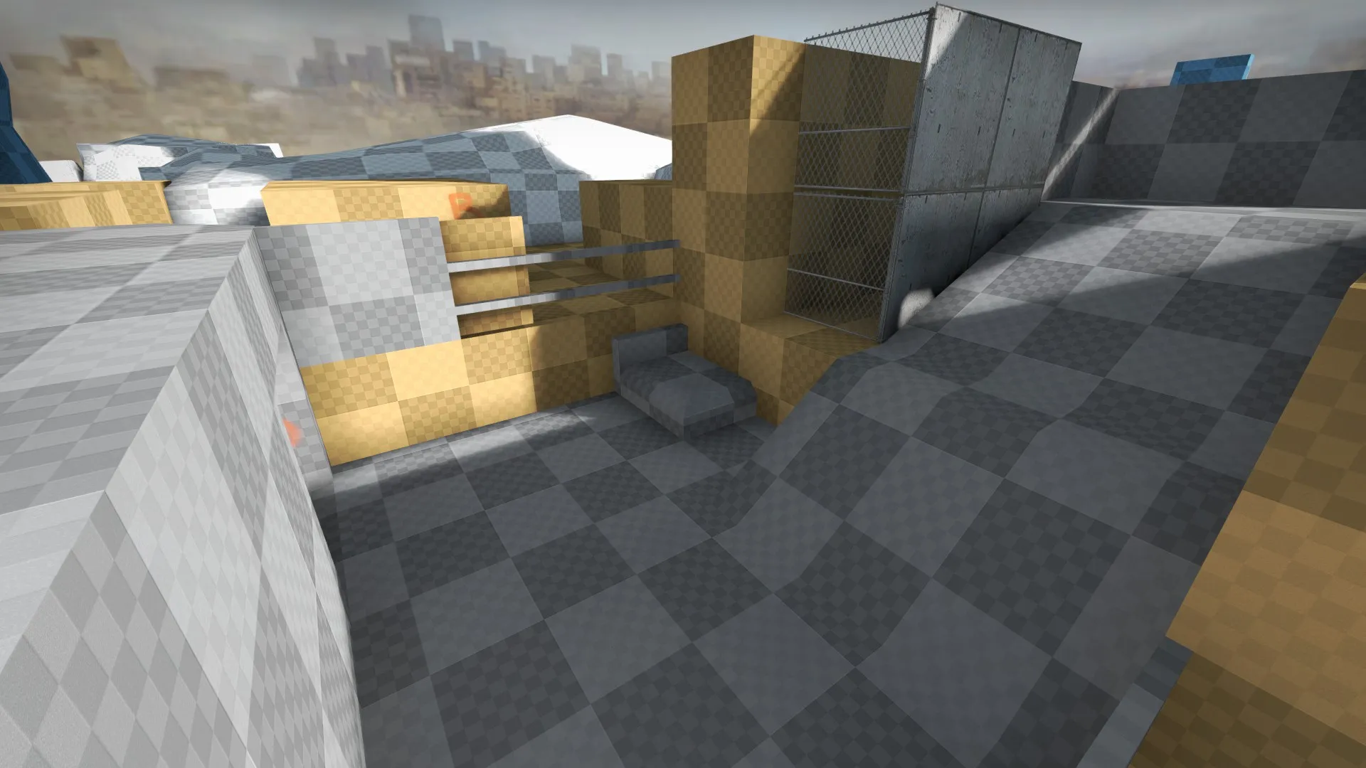
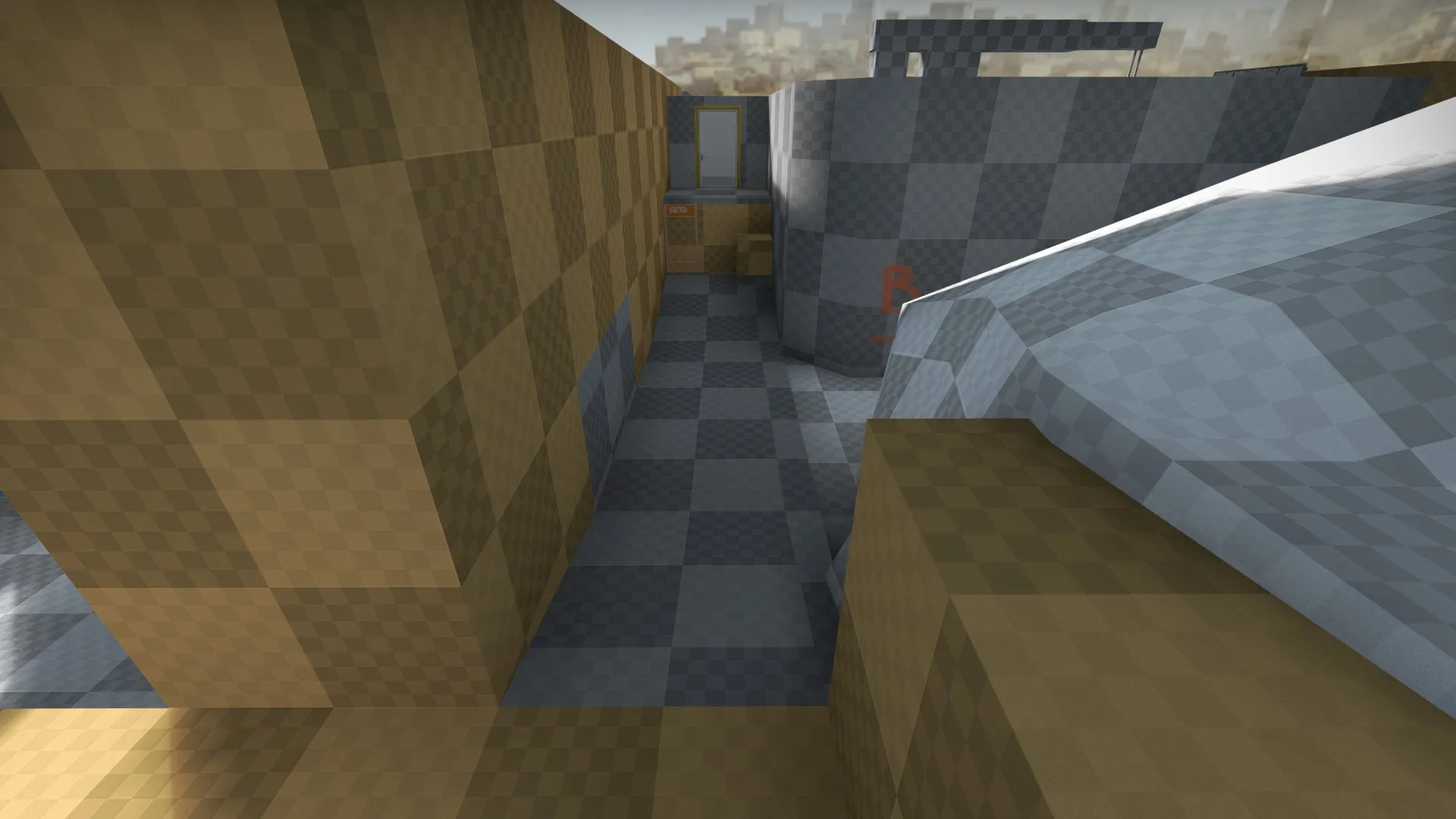
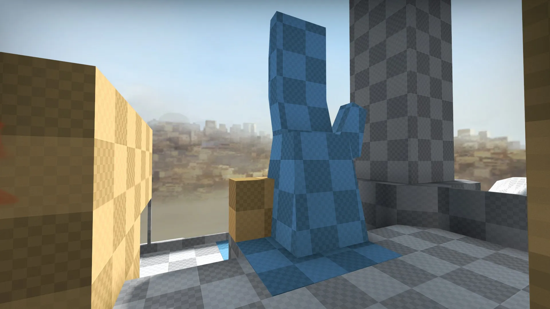
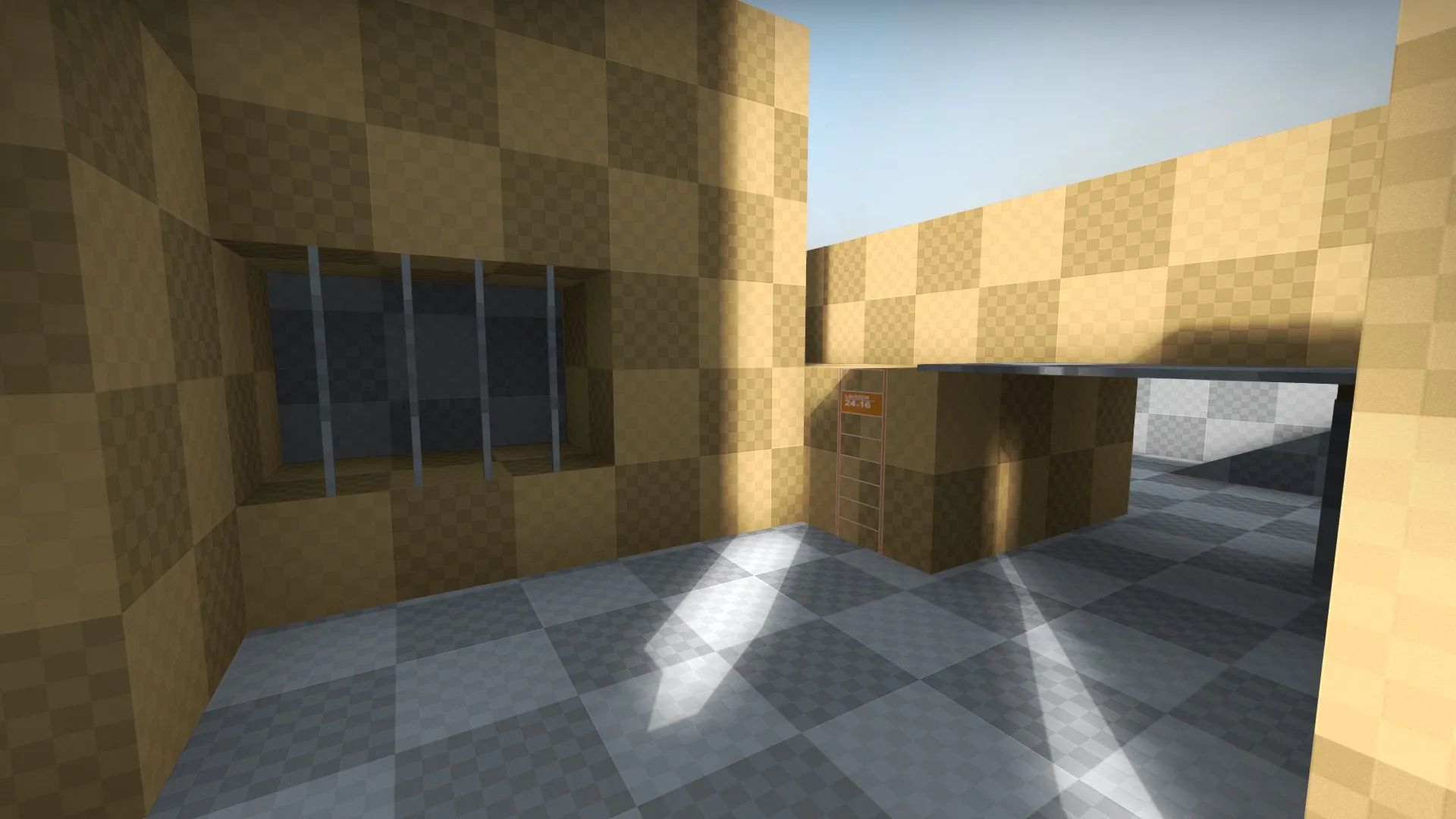
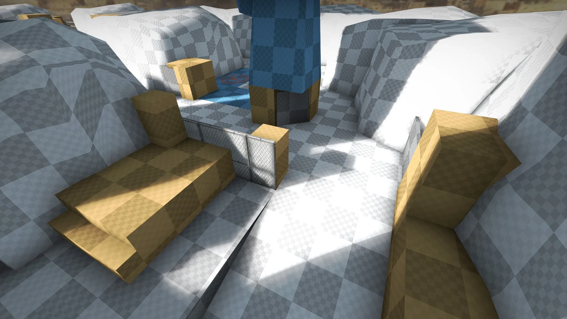
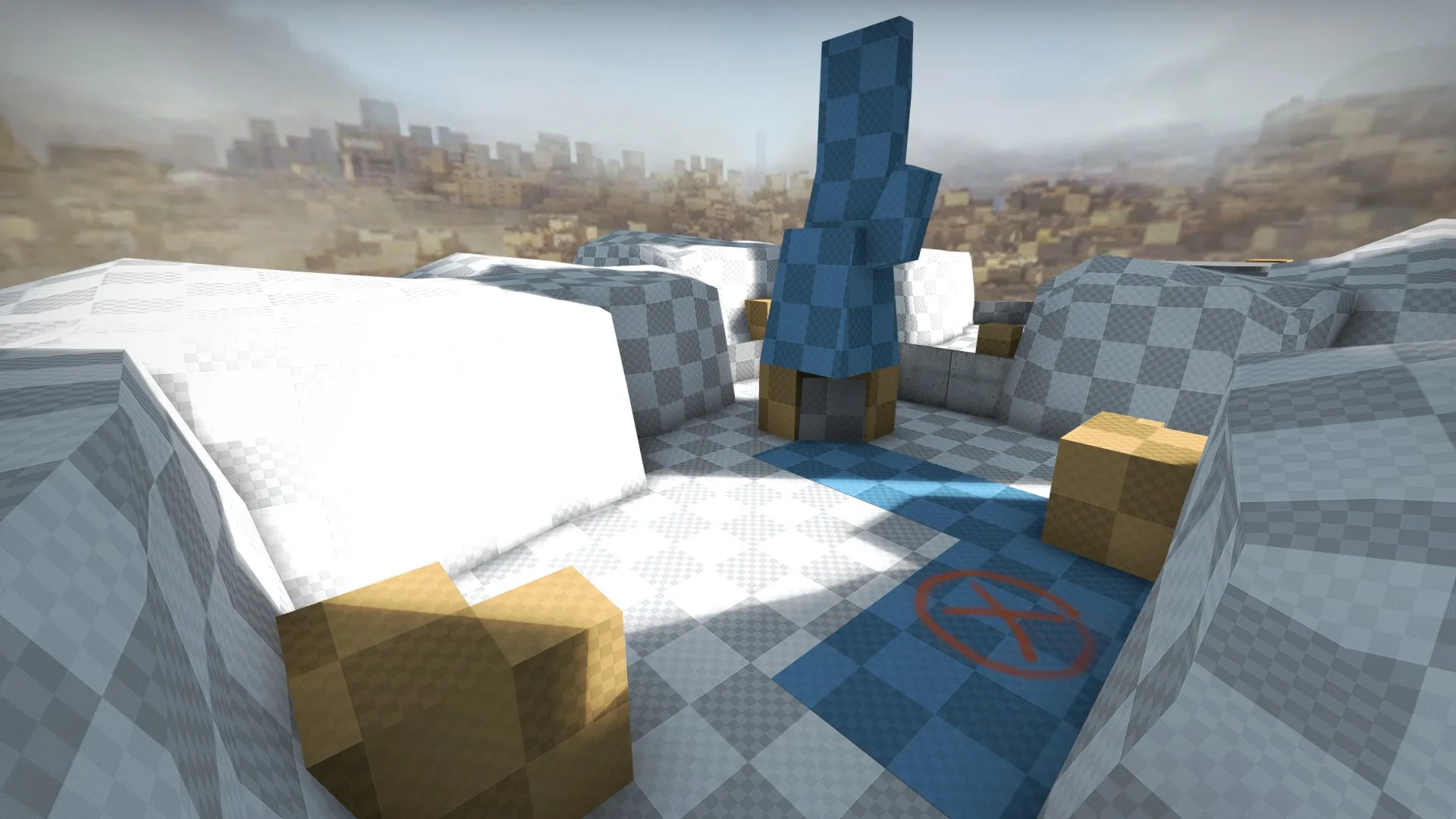
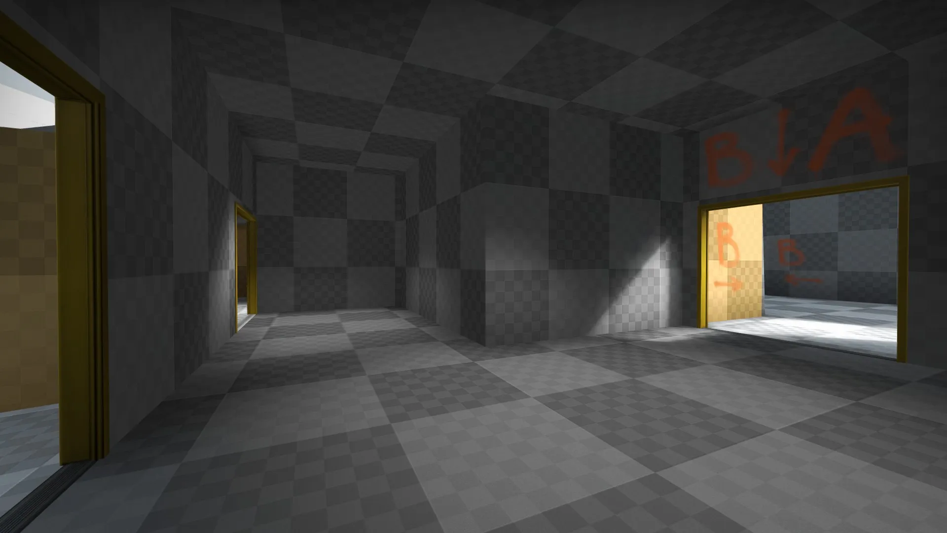
As for the other maps, De_Glace is on hold, I'm still working on De_Carfactory's layout, it requires a lot of research. And I'm hopping between this one and the other sever maps I'm working on, that you don't know about.
 Quote from TynnyriDisplay More
On 3/3/2018 at 7:33 PM, Tynnyri said: Hey! I made an imgur collection of weird bugs and visual problems. I hope these help.
On another note:
I would really reconsider the northern lights, sun placement and the skybox, which for anyone living around the artic circle seem very unrealistic. Hit me up if you'd like more info on why the northern lights make no sense. (Or, you know, don't use pictures as examples of northern lights because eye and camera show them very differently; Cameras show more of the lights and in more bright colors, which is complete opposite on how they really look.)
The sun is way too high up, too. Normally it would be impossible to spot northern lights right behind a sun (heck, even a half moon stops them) The map is clearly set in winter, (seen by the vegetation being on a wintery "preserve" state) which should make it impossible for the sun to raise this high even in the day, especially on artic circle.
Added into that, it should be impossible to spot any stars (especially the weaker ones) at such beutiful, sunny day. If you've ever noticed, stars are hard to spot on the day compared to at the night.
I think you can get away with the stars, at least. They are very useful for lining up smokes, and sacrificing realism for gameplay wouldn't be a problem on this occasion.
Apart from that I think the weakest area in the map in terms of Art is the T connector to B. It looks like something from Borderlands, because of the black trim textures, you use and some of the wear on the props, combined. It just doesn't look like Counter Strike to me.
