


A windmill! It will be part of the background on de_invade. All bruswork except the door  Next goal is to make a watermill and some farms with hay fields and some forrest.
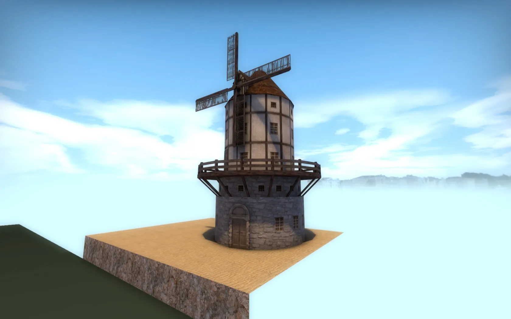
A windmill! It will be part of the background on de_invade. All bruswork except the door Next goal is to make a watermill and some farms with hay fields and some forrest.
I decided to make it more of a tourist place.
So a medieval city with this seight seing castle/palace place with gardens.
Workshop is up to date, feel free to walk arround!
Changed the name to Invade and uploaded it on a new workshop with the latest update: http://steamcommunity.com/sharedfiles/fi…s/?id=903916745
The definition of Acquisition was something else I thought it was so 
Edit: I googled 'Hazard' and noticed I went abit off-topic
So Yeah can't really name a game at the moment, but I agree that interaction with the enviorment is one of the things that could make a game much more interesting. I hope they will do more with this and also with choises/changes that will affect the future gameplay. Would be great to see a game where choises and game interaction would form the future gameplay/story during the progress. Like for an example a open world game where you have to make choises in interaction with others that will form your identity and relationships with others. Telltale games have this and The Witcher I think? But not just that, also the player behavior will effect the future gameplay. For an example something simple like leaving a light on in a room where you stole something will be getting noticed by the owner and because of he saw you arround that time in that building he find you suspicious and have less trust in you. This will have influence in your relation with the guy and etc. So you really have to think about what you do/say or don't do/say.
de_acquisition, I changed the stone/wood textures to something more medieval
Started to add some background details on T spawn, next will be the background of the main path to A bombsite as these areas most likely won't change alot. I am kinda experimenting with what I want with the 'feeling' of the map. What do you guys think of this?
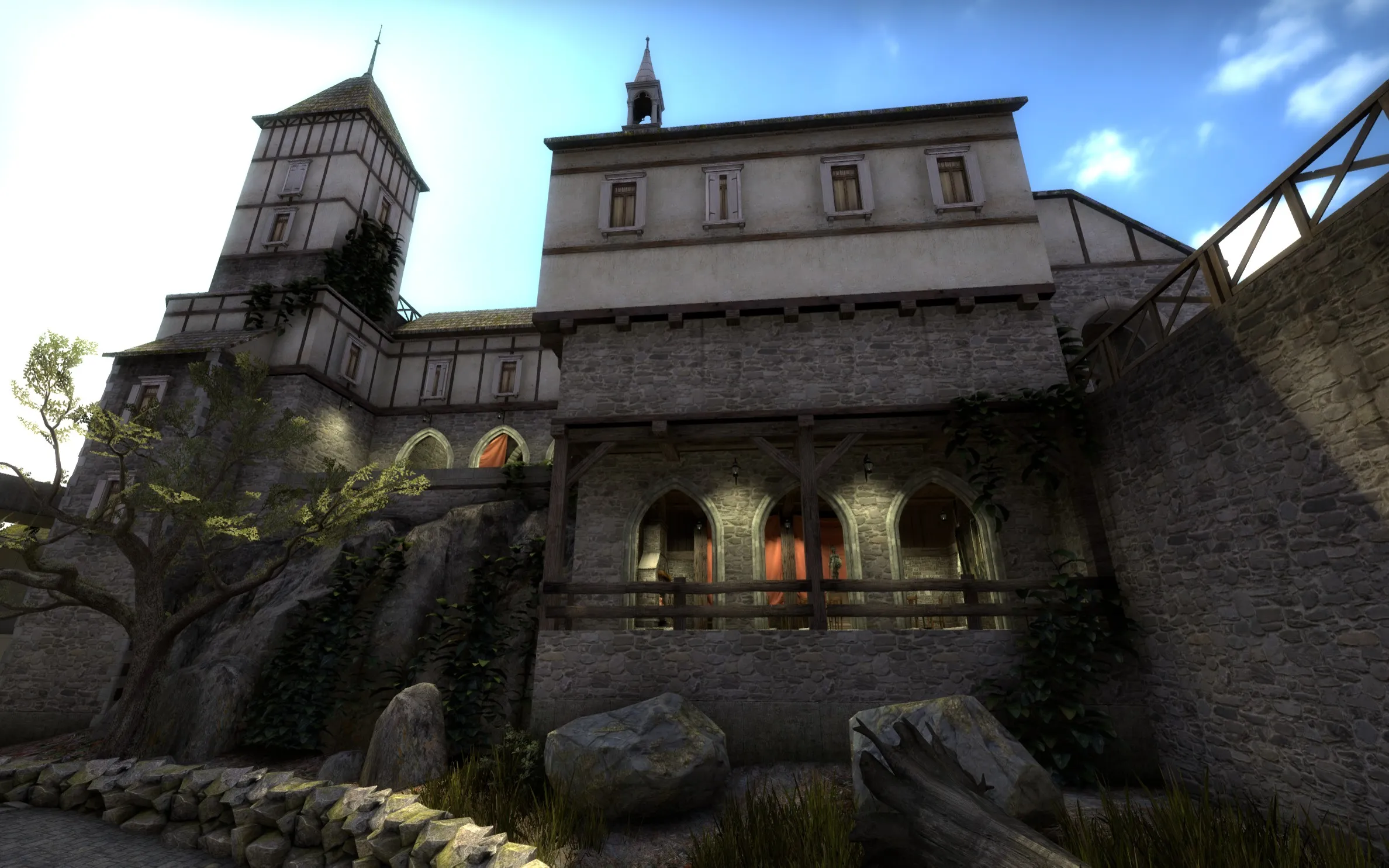
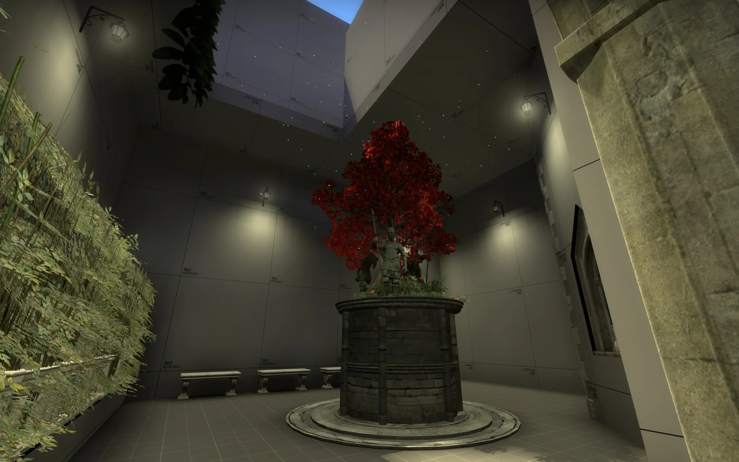
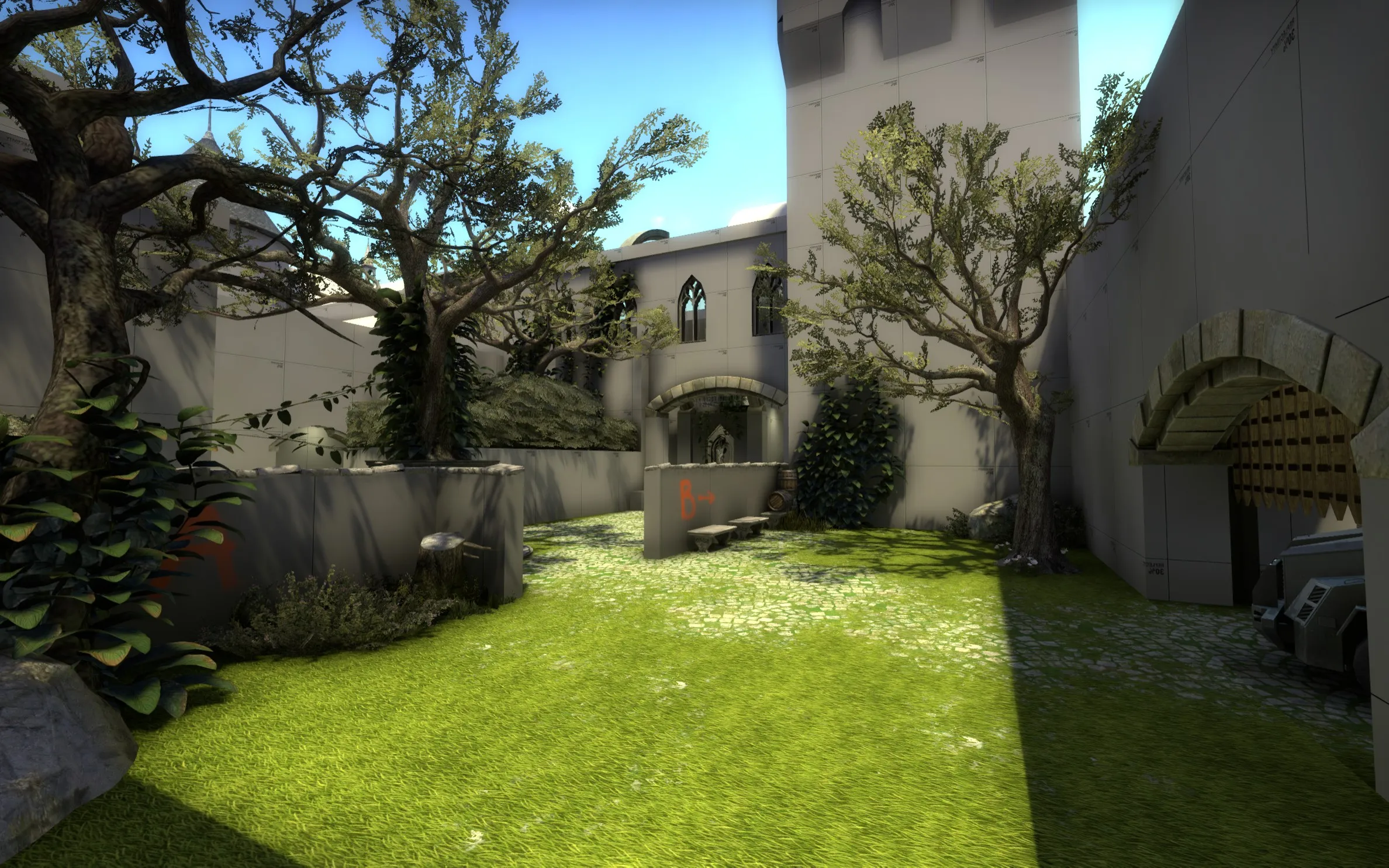
I Hope to recieve some feedback on what I could improve. Right now it's not fully detailed but it's close to what I want. The playable area of the map will mostly be made from stone structures and the background will be more made out of woden structures/houses and this part shown in the screenshots will be in between where a more royal building fades into a woden bottem down village. And ofcourse plants taking all over the place! I have to do some more on that part, but too bad there are not many good climbing plants to use
EDIT: Some small changes:
Hey welcome to Mapcore,
I think playtesting your map would be a good idea but before that it could use some more work. First I should test the rough timings with friends, maybe test some cover spots and such and make sure the layout is alright. It feels to me some of the cover spots are randomly placed, while they should be placed tactticly to provide some nice gameplay.
I noticed all your brush faces have dev textures? Did you work with nodraw texture and are you known with them? If yes, then skip my explanation: Nodraw textures can be placed on the brush faces that are not shown, so you only texture the sides of the brush you can see ingame. Once you compile the map the nodraw wont be rendered, its good for optimising your map. I always create brushes with the nodraw texture selected and then just texture the side you can see ingame. An example of a path/floor has 6 brush faces. I only texture the upper brush face where you walk on, since you cant see the other brush faces ingame. There are lots of tutorials on youtube.
If you want to test your map you should have a working radar. There are lots of tutorials on youtube.
Your map can use some more work to tell us more about the theme. I have no idea where this map is located, if its modern or old, city or industrial or in space or nature? You can simply work some more on your brush work. If its a village you can add roofs to the blocks that should be houses for an example. You shouldnt put too much time into that now but just a litle more. Because surely your first layout will change alot during the progress.
Also you can variate in the dev textures a litle. The paths has the same color grey as the walls. Would be better to give some contrast there for a better view.
I dont know if you thought about it, but you should use the clip texture to block things to prevent players and the bomb to get on places you dont want them to be and use playerclip to smoothen your map like for an example on stairs. Also there are tutorials about clipping.
A last thing, look at original maps and learn from them. Your layout can use alot of work. Just go and see what the official defusal maps look like. What is the size of the map? So how long are the rotations from bombsite to bombsite? How much time CT gets before T arrived at the bombsite? How much options does T have to attack each bombsite and how much entrances they have to defend once they planted the bomb and etc. The current layouts do work for a competetive defusal game so yeah you can learn/use alot from existing maps.
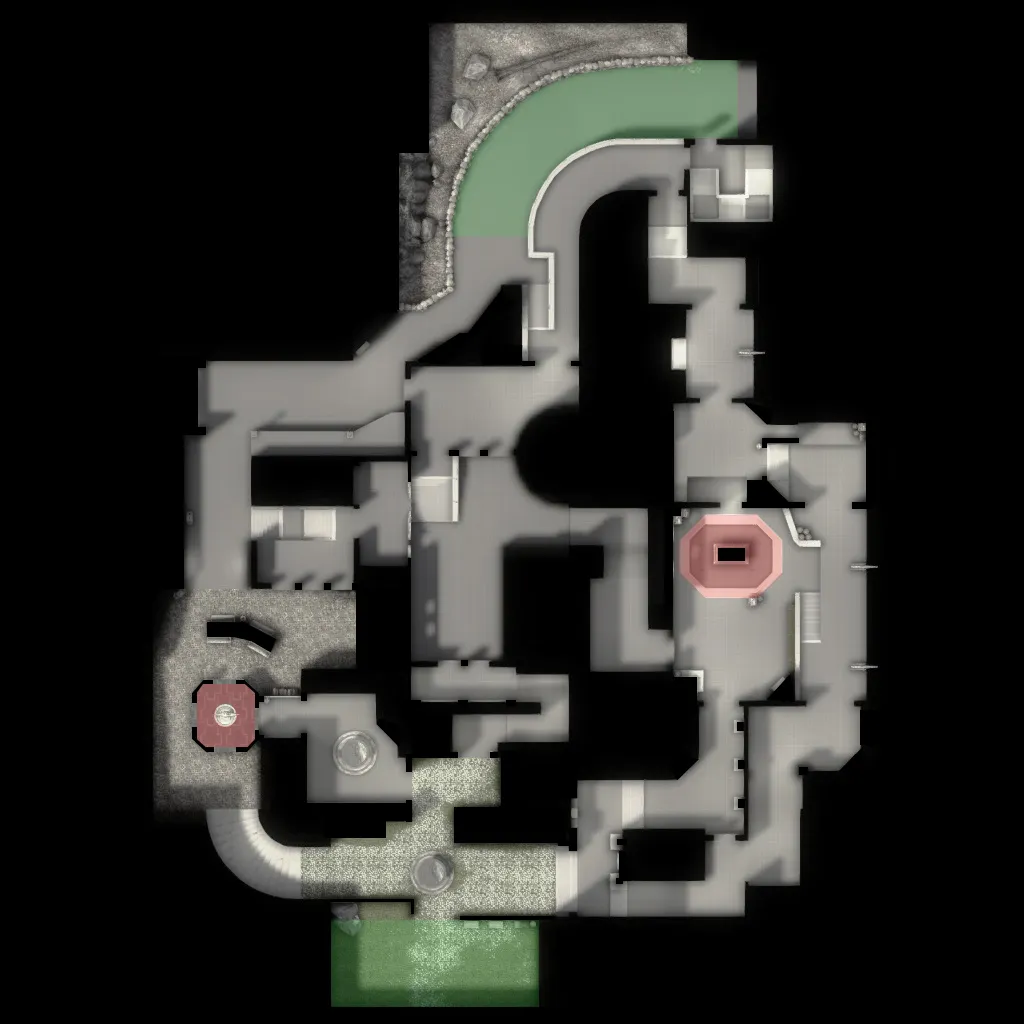
I have had a 5 vs 5 competetive playtest with friends.Based on this playtest I changed some minor things troughout the map: filled up B main a litle, extended midle in length, made the A main entrances thinner and closed up alot of view seights on A connector. Besides the litle changes I completly changed A bombsite.
Hey Serial,
I know this map is made with a casual gameplay in mind but I think it can also serve as a good competetive map. I walked arround your map and I must say the layout is pretty much interresting. I love the tunnel that connects the bombsites! U did a neat job there. I like how the terrorists needs to use both options to attack a bombsite. Overal some stuff seems abit complicated and could be simplyfied a litle I think.
For an example the entrance from CT to A bombsite. When you rotate trough CT there are so many angles to check. You got the hay car on your left, orange pickup truck and a pillar on your right. I would suggest to remove the orange pickup as CT has the hay car to defend arround and to put the entrance more to the left, where those double windows are.
[Blocked Image: http://i.imgur.com/jhYmvfR.jpg]
I can't really explain why, but this area feels so compressed. There are the woden doors that narrow the entrance alot and then on the left and right you got these walls sticking out towards the door alot. I don't know exactly what it is, but this part feels not right.
[Blocked Image: http://i.imgur.com/453NypX.jpg]
Overall midle feels really complicated. But it's hard to say how it would play.. It's abit of a deviant midle which could be interresting, I would atleast widen up this entrance a litle bit to the right.
[Blocked Image: http://i.imgur.com/xOF7m8W.jpg]
This window feels to be really OP for CT rotation as you have a great overview on A bombsite. Also this window model requires two jumps because of the litle edge, that's pretty annoying. This window feels more interresting for CT then it is for T, but idk how that will be on a real 5 vs 5 playtest?
[Blocked Image: http://i.imgur.com/Y7IUKQp.jpg]
I love this part going to B bombsite, but also connecting with midle. This window makes it a litle of a risk to get to the midle window. It's cool to play arround the window/door to peek on B. The multipy jump thing to get here from B bombsite could be smoothen up a litle, I think I had to perform like 4 jumps? Also in this room there is this clauset that has a bad prop fade distance. Looking from that balcony I am aiming on, the clauset will be invissible.
[Blocked Image: http://i.imgur.com/XwNDqxA.jpg]
I suggest to lower the opacity of the beam lights since they disturb the view and have a negative effect on the visuals/gameplay. Last thing is this spot. I think it will be good to remove the barrels on the crate, so this CT player is vulnerable by the Terrorist that comes from the midle path. Also entering B main seems to be hard. Once you enter you have a 180 degrees view you have to check at once. You could think of changing the prop I am aiming on to something thinner. So it provides cover from the CT balcony and you can have a save peak on this spot first.
[Blocked Image: http://i.imgur.com/WHXhWEi.jpg]
I have had a quick look, really interesting changes!
The connector from midle to A is for both teams very interesting as T's have a nice different angle into the site with a ramp that provides a nice peek and also for CT's, when they push the connector from A, they can have a nice peek into midle, because of the ramp/stair.
I like the open area at the sqeakey door to A for grenades and stuff. You should give the door rotation some more speed, I suggest 200 speed. I think right now it's standard 100?
From T spawn to A there is a dark place, I would like to see some nice lighting over there. But yeah interresting layout! Would be nice to have a 5 vs 5 competetive test on this one.
Looking good already yeah! Just a litle too blocky and squarish at the moment. Some curves/diagnol shapes would make it more interesting!
And I should consider a other mapname
Oh man I am so dissapointed.
I read the title and espected to see something more like this:

PS: ignore my PS skills
Anyways to stay on topic. The maps looks pretty much empty.. If the tests were succesfull and the gameplay works, then I should start on some detailing. Make sure the rooms have there own unique theme so it's easier to navigate and call out to your teammates. I do not have a compas with me all the time so yeah no idea when someone calls "I am in the West room' where the F he is So yeah make sure each room get a to distinguished theme
Well yeah ofcourse work with placeholders.. you need it there to see a whole picture and let the gameplay work succesfully.
When you decide to extend the midle then you can make a more direct path from CT to the drop instead of the stair arround it and stuff, it will fix your timings. Or well many solutions are there since this theme provides alot of variety in architecture... not everything has to fit, because it's in construction so yeah lot's of options.
Edit: u said "i dont know if I have to put T spawn even more back". My 1th thought looking at the overview was like what?? It feld like everything should be turned 90 degrees. Most of the time the range between the spawns is longer then the range between the sites or its about even. U got the opposite. I think moving T spawn back will be positive in every way, but a playtest should tell!
Goodluck on your playtest! I hope you will get some nice feedback.
Hey Nohns,
I walked arround your map. Overal I like the brushwork. The theme is there, it's believable, it works.
The map seems interresting. I like both bombsites, mostly B bombsite. The sizes are good, don't bother. I like how you used the elivation on B for the CT's. On A you can put some more work into that. Maybe you can also think of some elivation for T's to have a different approach into the bombsite. Well you used the tunnel but the tunnel isn't really attractive for T's, only for CT's rotation.
Anyway my feedback. Overall, please fix the places where it seems obvious you can jump on, but for gameplay reasons, which is good, you clipped it off. Just put a prop or brush or something obvious that tells you, you can't go there.
On bombsite B, you can think of a more interresting target then a container. I love the connector from midle to B, also the fact it's the place for CT's to hold midle.
For midle, it's a litle too small in length. It doesn't really feel like a mid. Also there are alot of small brush walls where T's can boost over and have a peek into mid from alot of random places. I should rework some on mid. Put the T entrances abit more back and maybe simplify it a litle. The connector from midle to A is pure shit xD It's not attractive for T's as they have two better and saver options already.
For A bombsite. There are no good spots for CT to defend. Well, defending A main would do, but there is another safe route for T's to come from, which is for them completly safe and I think OP as it's a huge entrance from another angle AND they got the underground connector thing from midle. I think you should make a choise there, keep one of them two OR make the side path to A a squeeky door or something and make the connector more interresting. I hope you get what I mean, kinda hard to explain like this.
Something you can think off is swapping the paths at A. So let underground be the 2nd save route for T's and let the more powerfull side entrance be connected to midle.
Some general things. Watch out with unused, unnessecary, nasty spots in your map. Corners like this should not be there for gameplay reasons:
[Blocked Image: http://i.imgur.com/NkzSbCh.jpg]
[Blocked Image: http://i.imgur.com/ptFB0jW.jpg]
And watch out for long seightlines like these, I think u can just increase the size of the pillar. Not only for fixing this seightline from A to T spawn, but also for giving T's some to play arround as cover
[Blocked Image: http://i.imgur.com/QvgD4xe.jpg]
 Quote from will2k
2 hours ago, will2k said: Thanks guys
I'll definitely make the windmill's double-sided sails longer in the next iteration
Well those sails are designed to catch the sleightest wind so I dont think there is a problem with them. Just when you make the building taller and the propellor higher, the sails would logicly have more chance to catch the wind. I think u can easyly find info about it on the internet. But yea for proporsion it could be needed you also increase the sails
Looking good @will2k
Though the windmill is looking really small to me. You got that from a reference? In Holland, the heaven of windmills, they are mostly way bigger then the houses. So thats my reference
 Quote from [N]awbie
7 minutes ago, [N]awbie said:
Hey Nawbie
Just a few things I noticed. The bombsite seems abit small, but I don't know how it feels ingame? The map could use some more lighting, maybe if you place them higher at the ceiling it will provide more light? The shutter infront of the stairs seems a litle misplaced. I would defenitly stumble over it while walking down the stairs xD Anyway just some minor stuff. Overall the brushwork looks interresting
Ohh close to LA. I espected it to be North of America or Canada
Wauw beautifull! Where are you from? Its a lovely enviorment
