1. Forums
  2. Discord
  3. About Mapcore
  4. Patreon Supporters
  • Login
  • Register
  • Search
Everywhere
  • Everywhere
  • Articles
  • Pages
  • Forum
  • More Options
  1. Mapcore
  2. Trashbang

Posts by Trashbang

  • [CS:GO] de_nocredit

    • Trashbang
    • May 9, 2016 at 5:13 AM

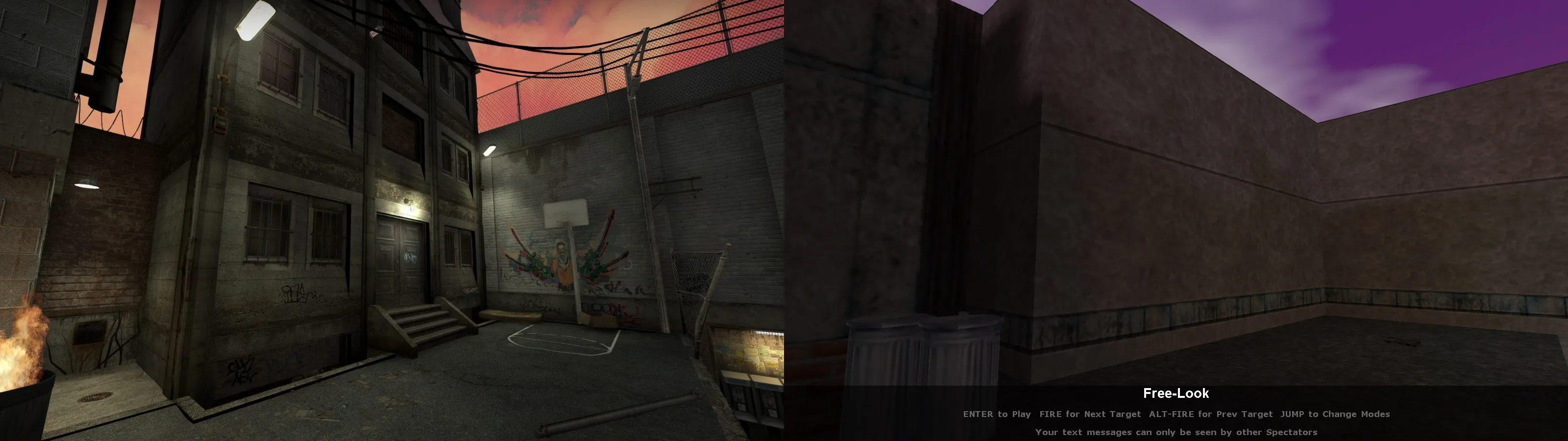
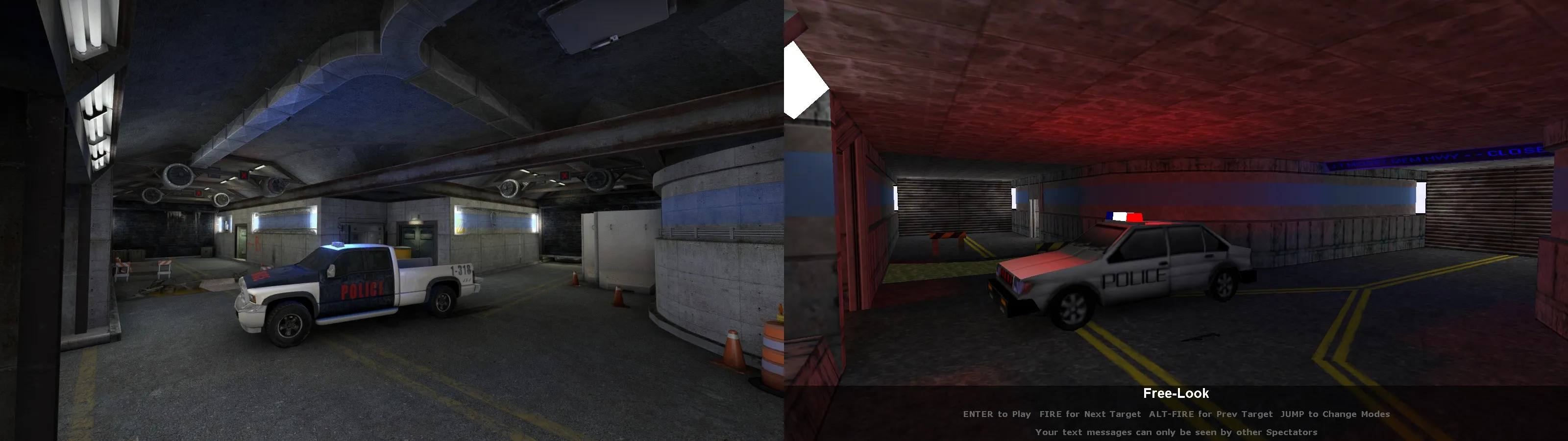
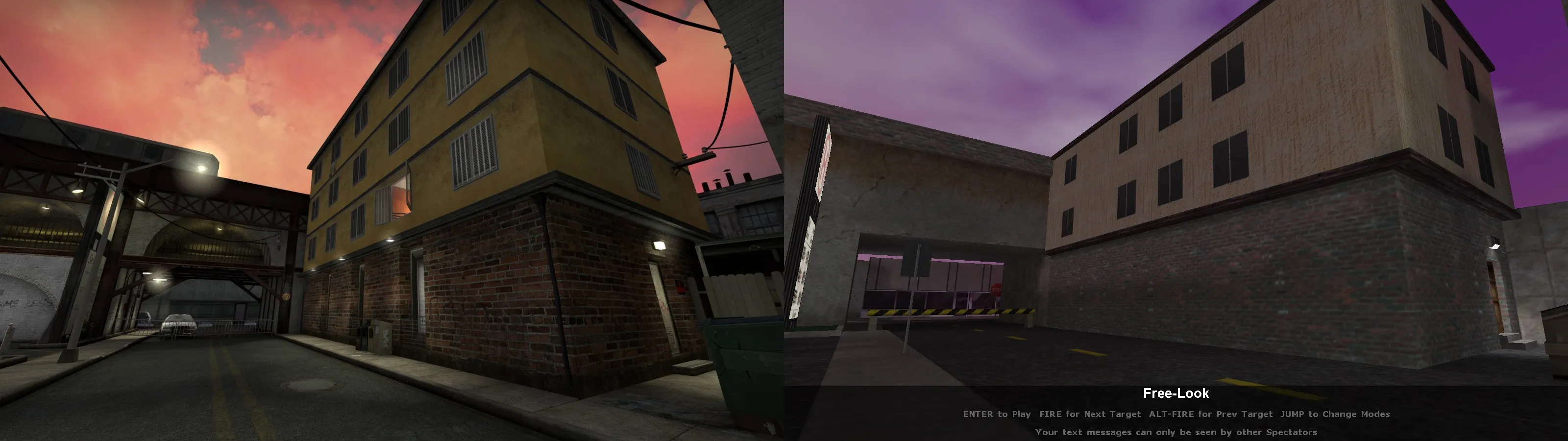
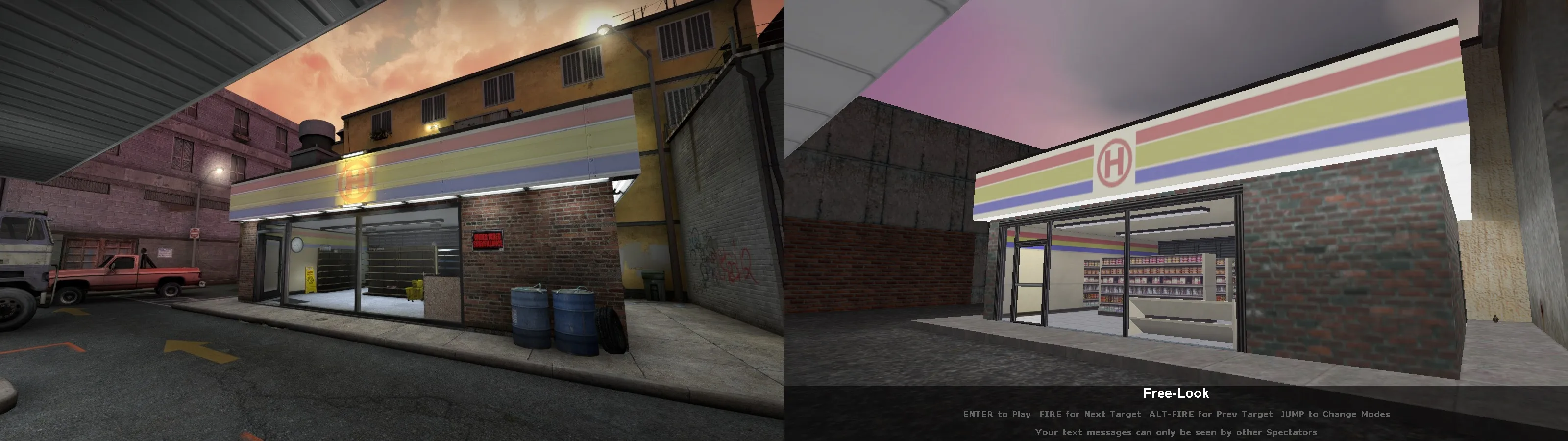
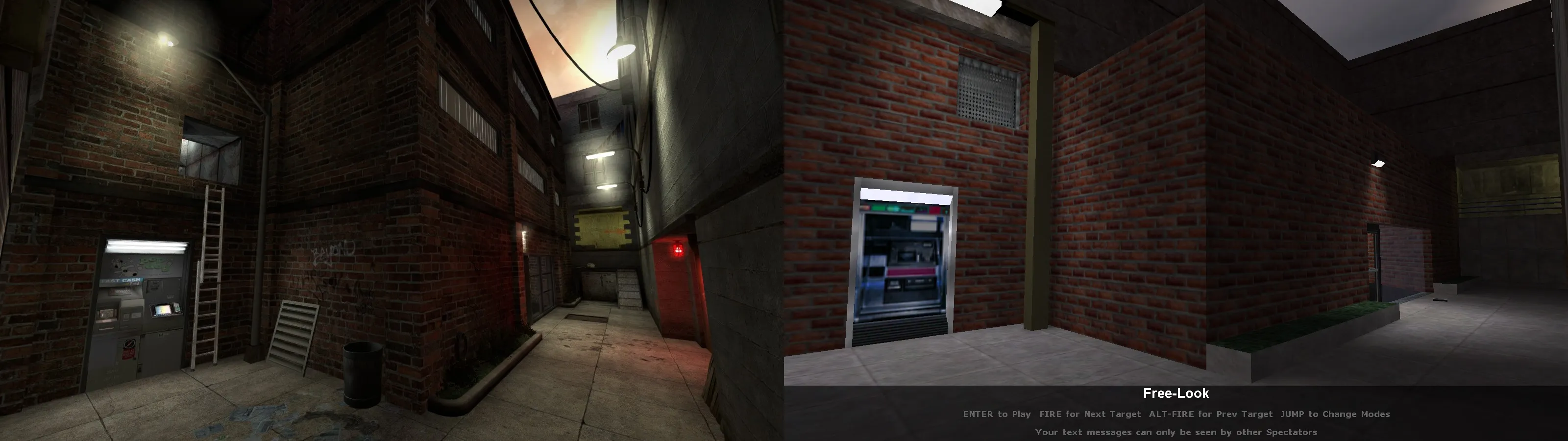
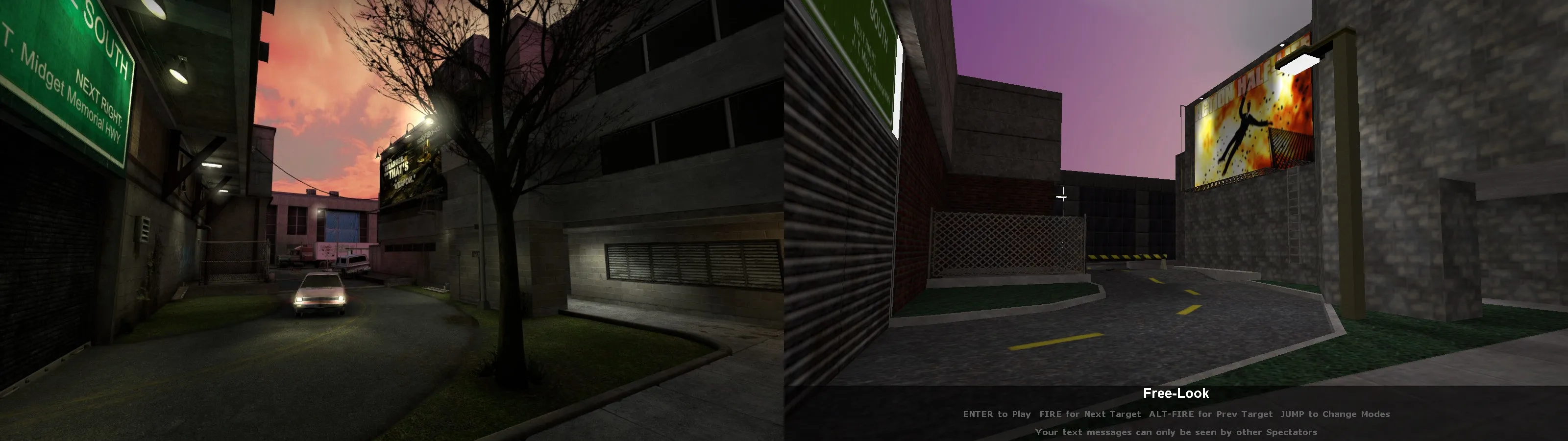
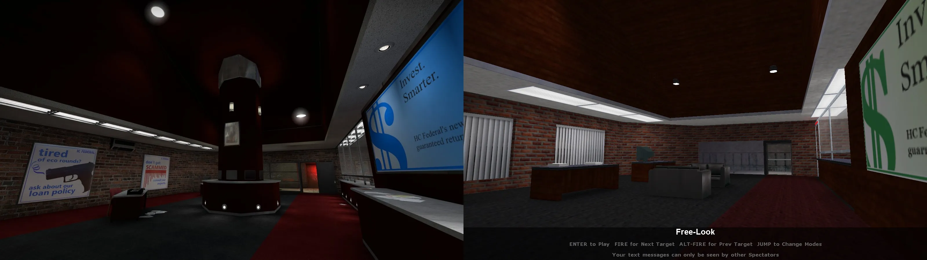
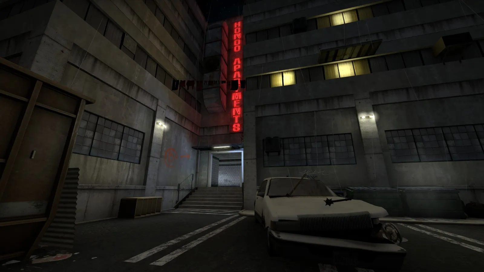
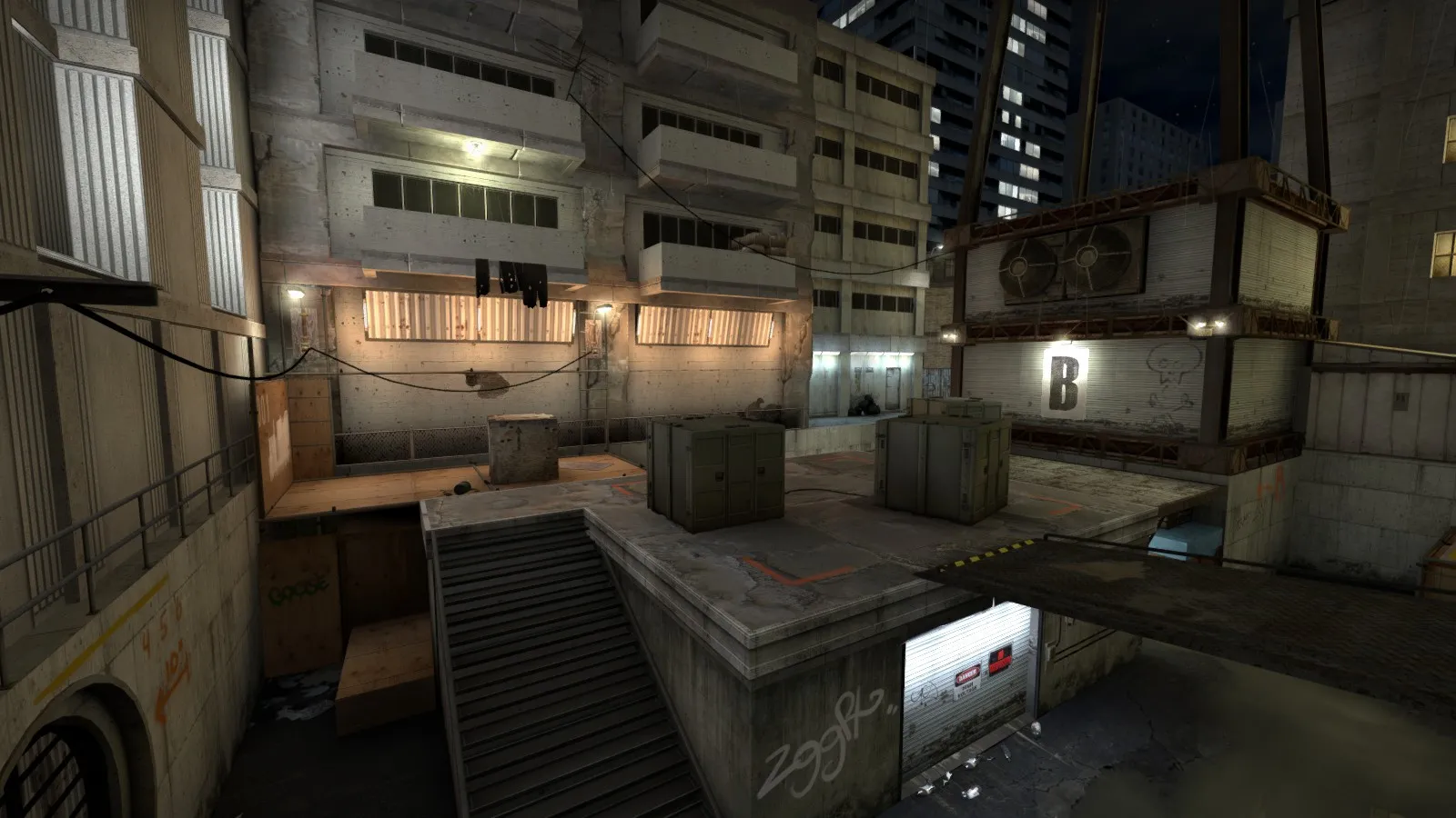
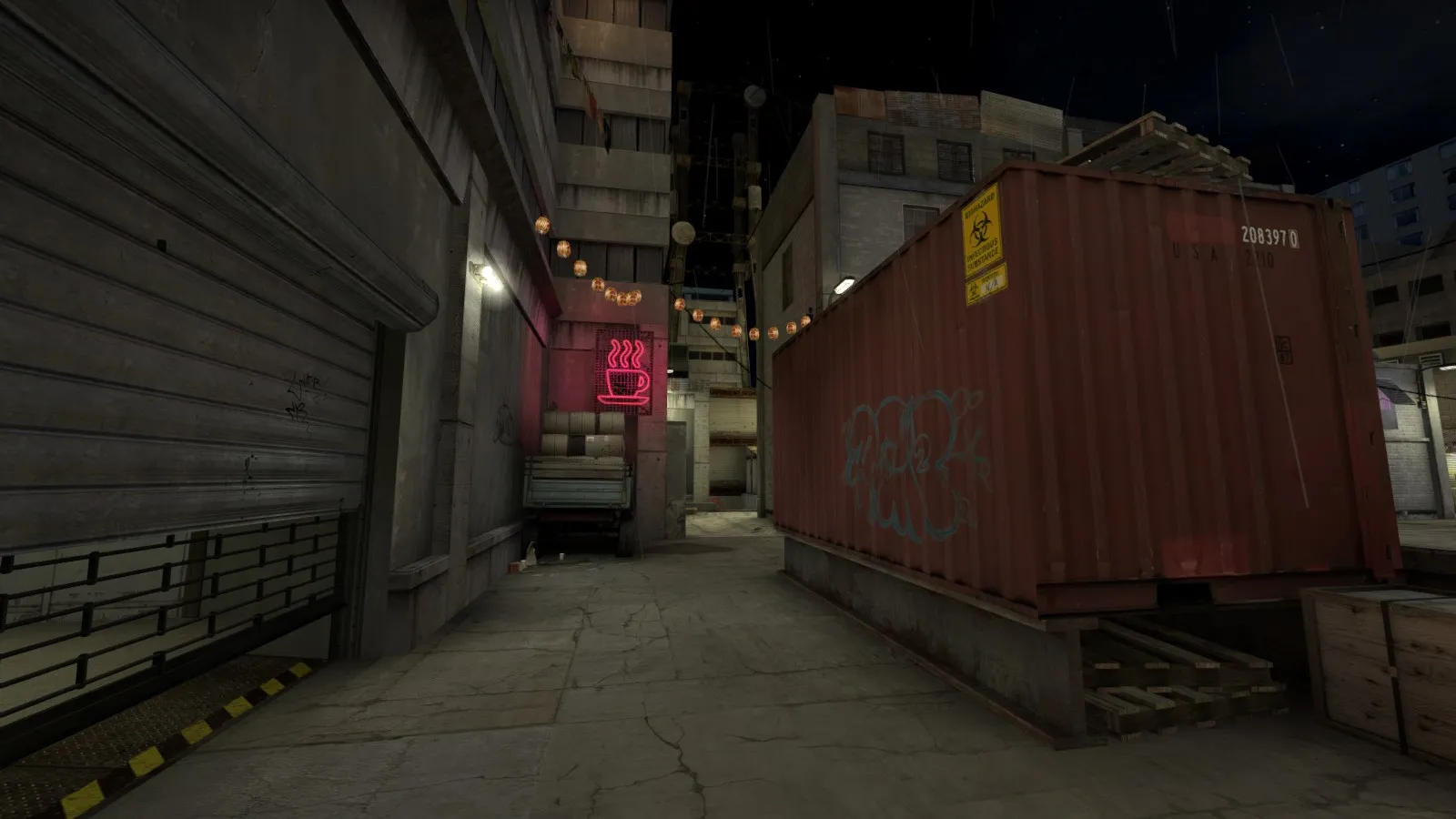
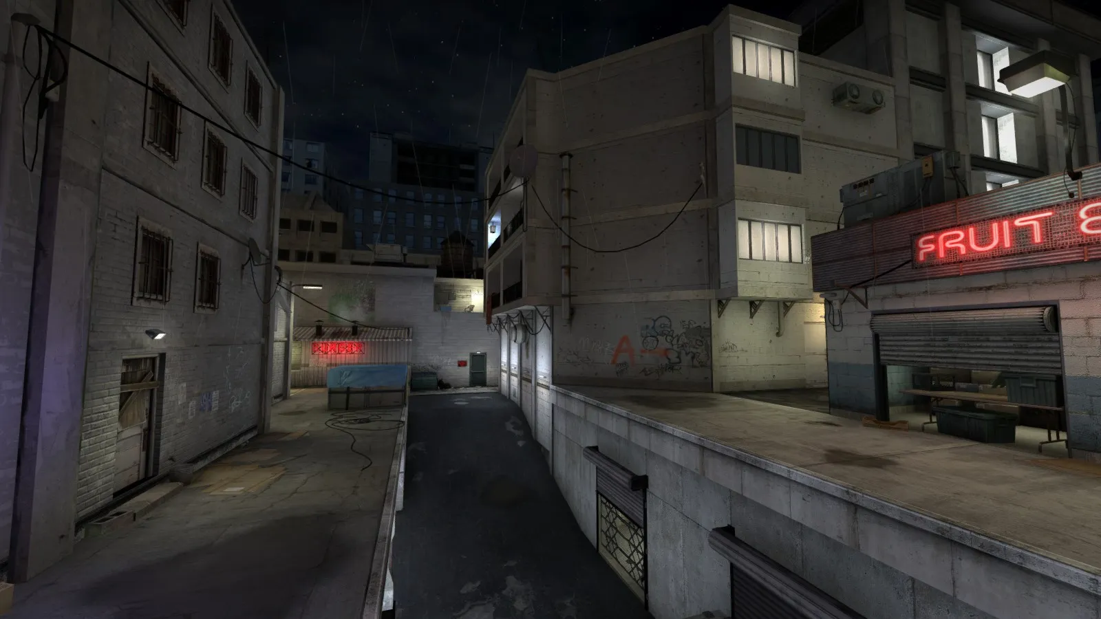
    Hullo again! Thought you guys might be interested in this one; I started it off as a bit of a joke project to see if I could adapt another map's geometry to CS:GO's defusal gamemode, and ended up with... well, something a bit unconventional. It's a full-on remake of Action Half-Life's ahl_nocredit map with a couple of modifications and reinterpretations where appropriate. Unfortunately it was well into development before I released de_coredump, so I'm afraid a lot of the things I've learned don't show up (building facades are still mostly visleaf nightmares, sorry) but I'm still pretty happy with how it turned out. Doesn't play great either, but hey, what can you do?

    Anyway, have some comparison shots.
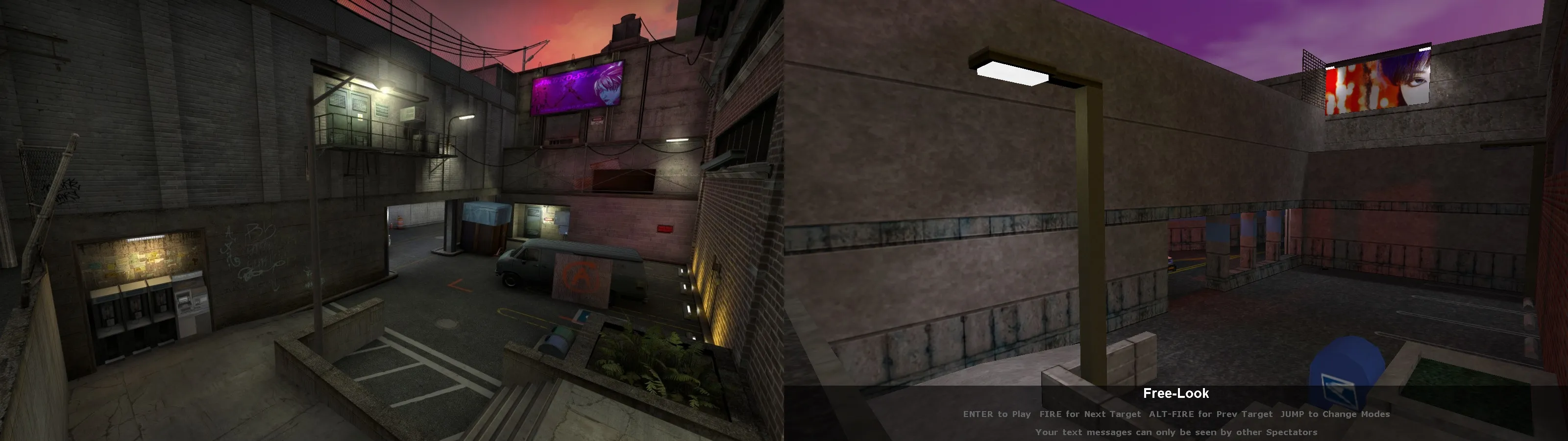

    If you'd like a try, the workshop page is here

  • [CS:GO] de_coredump

    • Trashbang
    • May 4, 2016 at 5:20 AM
    Quote from spa

    On 4/25/2016 at 3:29 PM, spa said: I like the idea of a rainy nighttime level a whole lot Its too bad the rain solution in source is so limited. I think you could sell the rainy feel alot better with low reflection on the ground and high reflection on puddles. And add distance fog! I know its always a tricky balance between play ability and art when it comes to competitive levels but its so tempting to take it slightly further with this one =)

    Yeah, rain is tricky and I agonised a fair bit over how dense I could take it without obstructing visibility. Ideally I'd also like to make custom soundscapes so it sounds muted indoors, but I'd have to research that first. I'll definitely experiment with reflectivity when I get around to updating it, though again, that's something that I'm new to.

    Unfortunately I have another tricky mapping project that I need to get around to releasing ASAP, so most of the suggestions in this thread haven't been implemented yet, but I'll certainly be touching it up a bit when the time comes :)

  • [CS:GO] de_coredump

    • Trashbang
    • March 31, 2016 at 2:31 PM

    Hey, thanks @will2k. Unfortunately I didn't pick up much from those articles that I wasn't already aware of by the end of making this map (apart from vvis's exact calculation methods, which were always something of a black box to me) but stressing the importance of horizontal leaves has certainly spurred me to go back and see if I can't work a few more in somewhere. I'll definitely peruse Man vs Engine when I get the chance, too.

    Quote from will2k

    37 minutes ago, will2k said: Unless the extra visleaves are practically empty (such as upper skybox leaves), additional visleaves means more content to render, therefore in general, lower fps.

    Do additional visleafs still matter if the amount of content rendered is the same either way, though? Obviously a more complex PVS of the same size will take longer to compile, but would it adversely affect in-game performance? @Vaya's criticism was that I wasn't func_detailing the facades of my buildings, and I'll absolutely agree that it's bad practice to have all those indents everywhere, but I don't see how it changes the amount of content in the PVS.

  • [CS:GO] de_coredump

    • Trashbang
    • March 31, 2016 at 10:47 AM
    Quote from Vaya

    10 minutes ago, Vaya said: I love the theme on this map and I think I've worked out your optimisation problems

    Theme - strong deusEx vibes which I like!

    Haha, thanks. I didn't want to go overboard on the cyberpunk aesthetic because I still wanted it to make a believable contemporary setting, but I'm glad the primary inspiration still shines through. I hope the references weren't too heavy-handed.

    Quote

    10 minutes ago, Vaya said: optimisation - as a first point of call you quite simply you need to func_detail a lot more of your building facades. Lots of messy visleafs being made because building fronts aren't flush cubes.

    This is something I struggled with a lot, mostly because I wasn't sure what was the 'right' approach. I assumed that the extra visleafs wouldn't matter too much as long as I closed them off with a hint surface. It'll be tricky to refactor the geometry, but probably worth it.

    Quote

    10 minutes ago, Vaya said: Texturing - a little mushy with the same colours used too much/ Obviously the levels theme means too much variation would look out of place but some detailing is being lost due to this- for example the balconies beside B. I also noticed in one place you're using a texture as a trim right beside somewhere else where you're using as a floor. I think adding a little colour (limited pallet of course) would help differentiate areas.

    [Blocked Image: http://i.imgur.com/rpn1FJy.jpg]

    Also - some textures have been stretched to point of blurliness - like the crate on A site. It might add to the deusEx look a little but plz no..:P

    I can actually remember joking while making this map that I never wanted to see another concrete texture as long as I lived :P. You're right, the theme makes variation difficult. I tried to combat this by altering architectural styles from building to building, but obviously there's only so much that can do. I was also a little unsure and apprehensive about making a night-themed map, so I hesitated to experiment with darker or more colourful surfaces in case they hurt readability too much. I'll give it another shot.

    Interestingly, the two surfaces in your screenshot really are two different textures (milwall004 and tilefloor009a), but I can see how their similarity in close proximity might look pretty sloppy. I was never really happy with the crate on site A, but I had to make it out of brushes and there aren't many good 'crate' textures to choose from (since they're mostly props these days anyway).

    Quote

    10 minutes ago, Vaya said: CT spawn is a good example of what needs fixing. I would replace the dead car with an alive one (with headlights pointed at the wall) at an off angle. Easy way of making the area lighting more intresting..

    I think it's less about visibility and more about guiding the players - just now you have super illuminated areas where I can't tell where the lighting is coming from and then you have kinda-muddy dark areas that could benefit from more overhead lighting. Maybe add a couple street lamps etc- just to guide the players eyes more. For example - maybe in the screenshot below replace the lamps with more head duty ones and bump up their brightness.


    sorry for paint annotations :)

    Sounds good to me. I felt like I was going a bit overboard on streetlamps at times, but maybe I just need to make the edges of their spotlight cones more narrow/distinct so all the light sources don't bleed together. Your paint annotations were helpful, don't sweat it!

    Newbie question: if I go ahead and implement some of the suggested fixes (not likely in the near future, I have uni work and another map to finish) would it still be okay to post updates in this thread? I know that this board is for more or less 'complete' works—and in my defense, I thought it was—but it's evident that I still have a lot of work to do.

    Again, thanks for the feedback.

  • [CS:GO] de_coredump

    • Trashbang
    • March 31, 2016 at 1:44 AM
    Quote from Vaya

    16 hours ago, Vaya said: Cool, you signed up!

    I'll try to remind myself to check it out ingame tonight.

    From the screenshots I'd suggest more player-level lighting as there a few patchy-dark areas and other areas look bland due to this.

    Yeah, having more interesting lighting is definitely something I need to practice at. When I recognise that a part of the map is visually dull I tend to reflexively try to populate it with more props/overlays/brushwork without considering other options. In terms of readability I thought everything was more or less sufficiently illuminated though. Anywhere in particular you feel is too dark?

    Quote from Vaya

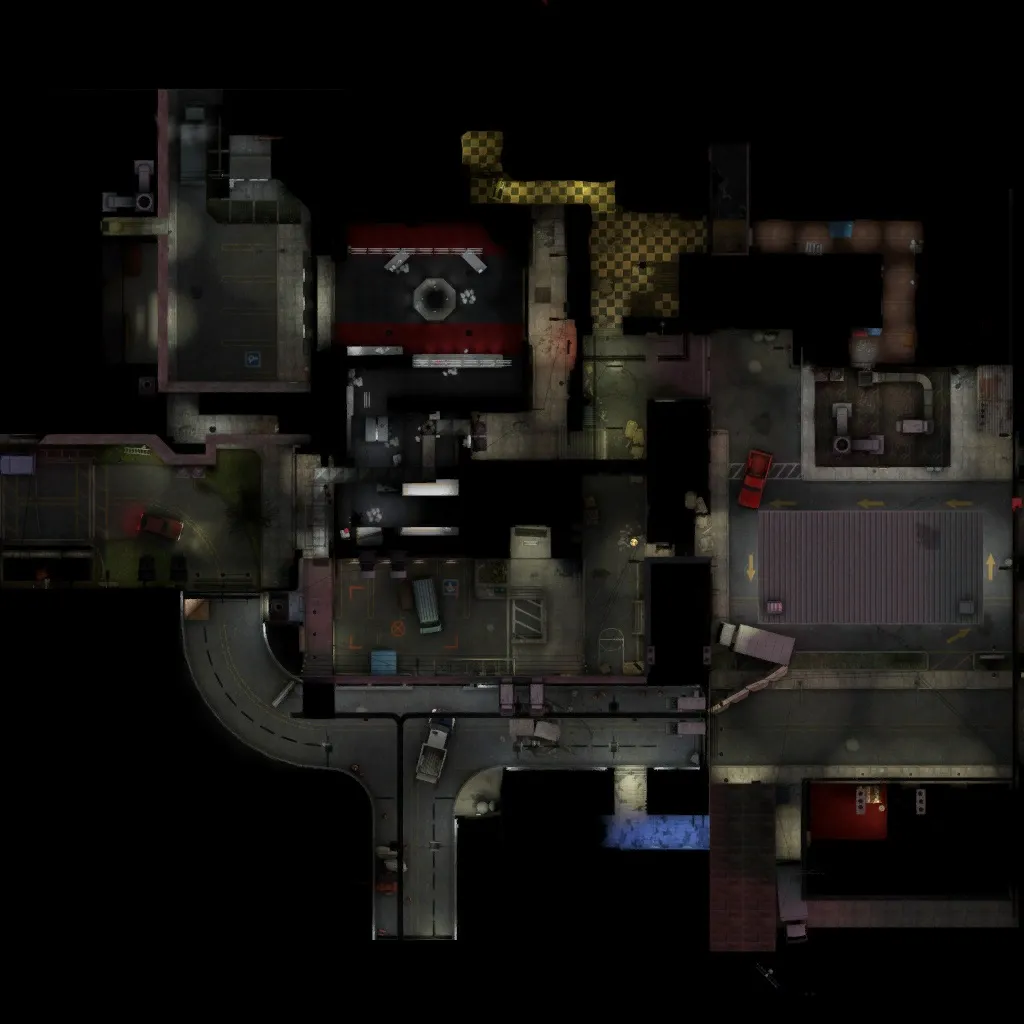
    16 hours ago, Vaya said: P.s - minor point but I'd have the overview in the workshop screenshots. People like when that's done..

    Ooh, good call. Unfortunately the overview is a bit scrappy at the moment (some areas don't show up properly/at all) but I've chucked it up into the image rotation for now. Should give people at least some idea of what they're in for.

  • [CS:GO] de_coredump

    • Trashbang
    • March 30, 2016 at 6:05 AM

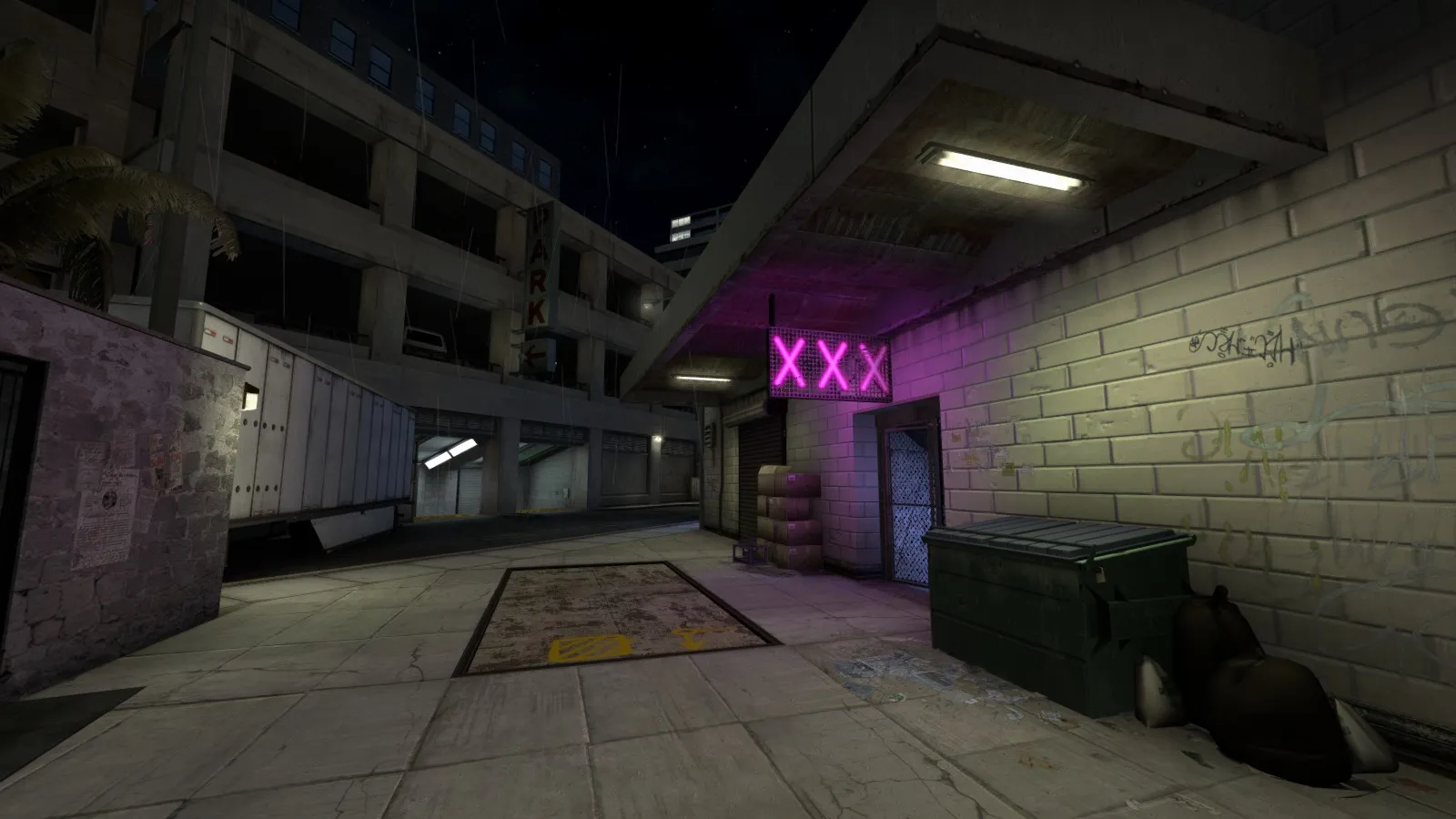
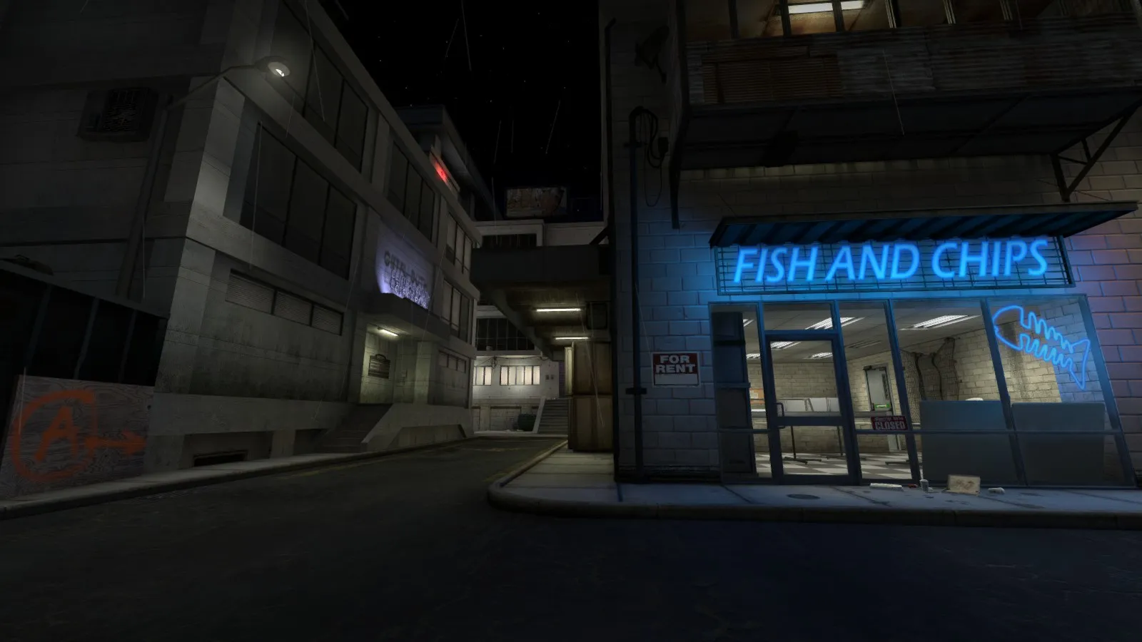
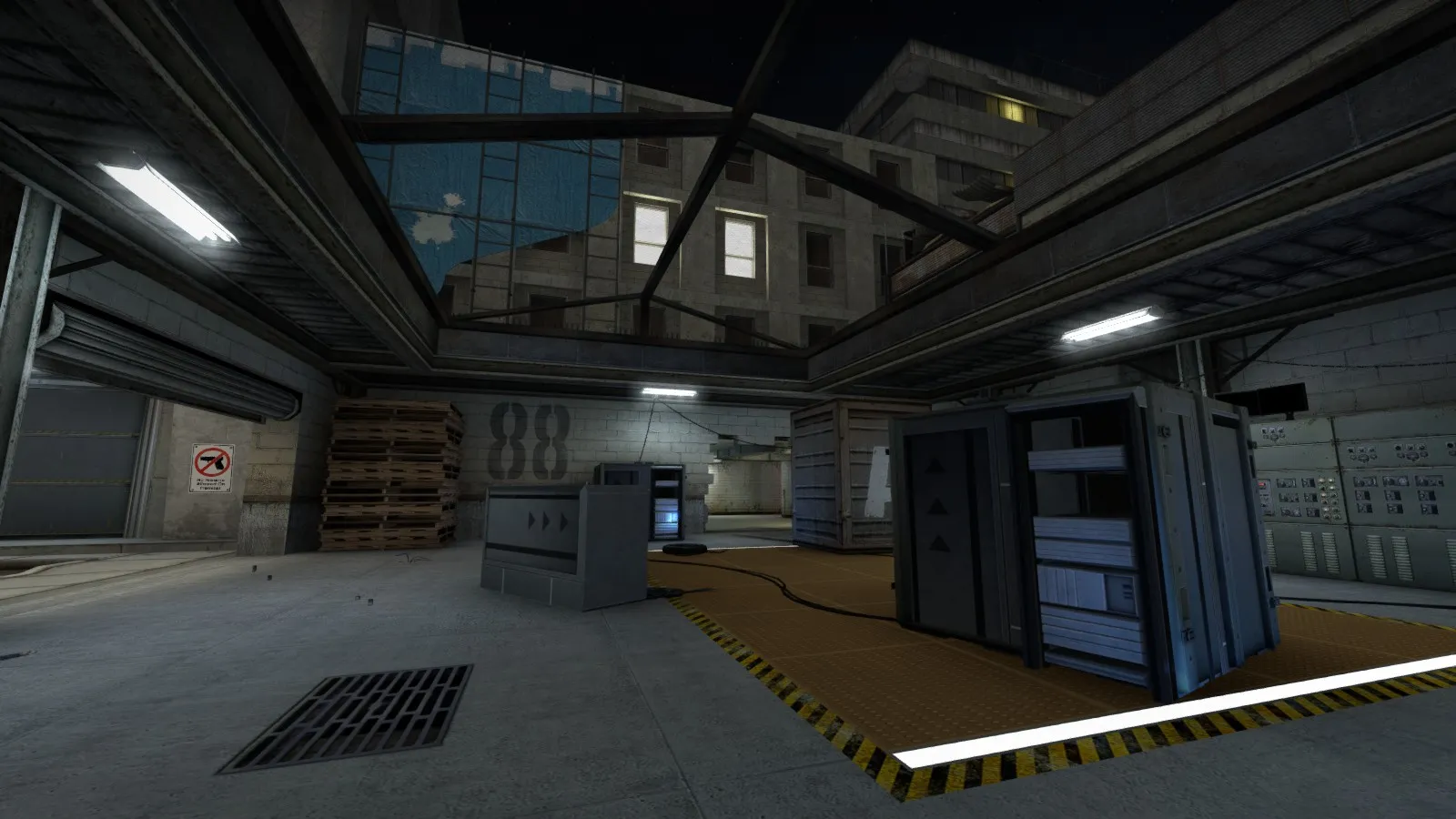
    Hey all. I've been mapping on and off since ~2011 but this is the first time I've deemed one of my maps "good enough for release" (i.e. I can't stand the sight of it any more). I've never been to Mapcore before either, but this froody dude on Twitter suggested it as a good way to get feedback, which (as you can probably guess) I'm in dire need of. I'll try not to be 'that guy' who shows up, plugs his stuff, and leaves forever.

    So, Core Dump. Most of my earlier maps had disastrously poorly thought-out layouts, so for this one I tried to dial things back and went for a safer, Mirage-y layout, albeit with a few twists that I hope go down well. I wanted to go for a kind of original aesthetic (well, original in the sense that I've yet to see a map that does it) but I can't make textures or models to save my life, so I was working with whatever I could pilfer from royalty-free sources or slap together in Paint.NET. It's also terribly optimised, because... well, I don't really know what I'm doing. This map languished almost-finished in my folder for a few months—hence the lack of Newke assets—before I finally decided to just put it out there and accept its shortcomings. I've moved on a bit since making this, but I'll still treasure any and all feedback.

    Anyway, pics.

    If you fancy a runaround, you can find it on the Workshop here.

  • [CS:GO] de_slate

    • Trashbang
    • March 30, 2016 at 3:18 AM

    I actually kinda dig the monochromatic look. There's enough interplay between the light and the geometry to make even really big flat surfaces visually interesting, and there's plenty of foliage to spruce things up where that isn't the case. The texture quality is beautiful and the choice of theme also works really well with your geometry style; lots of nice quirky angles that would feel forced in any other setting.

    I guess my only real objection is that it's all a bit samey? There are plenty of distinct details (love the floor windows, by the way) but the end results still sort of blur together. There are lots of areas that I didn't even recognise at first because I entered them from a different direction than before, and while I appreciate that you've labelled each area, in a pinch I'm far more likely to yell out something like "he's behind the concrete planter!" or "he's by the sculpture!", which is hardly enough information when there are so many of both.

    Other things I really like:

    - Being able to platform your way across B from sniper's nest.

    - Not a crate in sight

    - Stairs you can hide under without just getting a free kill on whoever is walking down them

    - Sexy curved concrete tentacles looming over the entire map

Discord

The Mapcore Discord is our lively IRC channel of the 2000s reborn. Chat about level design, gaming, and more.

Latest Posts

  1. Any of the old guard still around? D:

    Warby
    July 12, 2026 at 8:23 PM
  2. About our archived forums

    Thrik
    June 30, 2026 at 2:12 PM
  3. Mapcore Discord

    mason_fan123
    June 24, 2026 at 8:52 PM
  4. [CS2] Valley

    Serialmapper
    June 22, 2026 at 11:56 AM
  5. Free Music / SFX Resource - Over 2500 Tracks

    Eric Matyas
    June 18, 2026 at 12:32 PM
  6. Pango [WIP]

    Elowen
    June 11, 2026 at 10:13 AM
  7. [CS2] Dvina

    Jeremy Rivera
    June 11, 2026 at 10:03 AM
  8. Bridges 2.0 by NEXSIDE, MAP SHOWCASE. ( Steam Workshop )

    MrTrane18
    June 1, 2026 at 7:46 PM
  9. Classic Maps Reborn For CS2

    SillySpaceCat
    May 31, 2026 at 10:33 PM
  10. [CS2] Dvina

    Pulbusha
    May 29, 2026 at 5:54 PM
  1. Privacy Policy
  2. Contact
Powered by WoltLab Suite™