
1. Forums
  2. Discord
  3. About Mapcore
  4. Patreon Supporters
  • Login
  • Register
  • Search
Everywhere
  • Everywhere
  • Articles
  • Pages
  • Forum
  • More Options
  1. Mapcore
  2. King Skizzy

Posts by King Skizzy

  • [WIP] de_Dublin

    • King Skizzy
    • July 22, 2017 at 10:56 AM
    Quote from Kaizo

    10 hours ago, Kaizo said: It'd be nice if you focused on anything other than the stairs

    I did mention other things but you didn't acknowledge any of what I said in my first post so I said it again because you continued to work on something not important instead of fixing that basic problem.

    "Also I would like to see some more variation in height on the bombsites to make them more interesting and they are slightly on the small side as well"... If you don't want to listen to my feedback that's fine.

  • [WIP] de_Dublin

    • King Skizzy
    • July 21, 2017 at 8:26 AM
    Quote from Kaizo

    8 hours ago, Kaizo said: I decided to detail part of Bombsite B to get a better feel for the atmosphere of de_Dublin. I'm sure i'm heading in the right direction. I will be working on making my own props to enhance the theme. Is there anything I should improve in this?

    Screenshots:

    http://# Hide contents

    The stairs are too step... you need to get that basic thing correct first before starting to textue it even if you are experimenting.

  • de_templar [WIP]

    • King Skizzy
    • July 20, 2017 at 12:09 AM

    Quick look at some changes from the radar... will be quite hard to see them from the radar but will post screenshots of changes soon!

    Bombsites and spawns haven't been marked out but are the same as the older versions.

  • de_templar [WIP]

    • King Skizzy
    • July 19, 2017 at 7:28 PM
    Quote from Roald

    37 minutes ago, Roald said: Hey man I walked arround as promised. I see u got a old version on ur workshop? Still I give u some feedback on that one.

    The maps to be less chaotic ingame indeed! It's quite alright. It could use some better movement flow but it's quite good already. Your paths seems to be well placed and you thought well about where to place cover. There are no crazy seightlines I saw so far. I find midle a clear simple mid that should work well. Bombsites are alright aswell but they could use some more work. You could try adding some more elivation in your map. Like the drop from T side to midle, that's cool. Maybe add some elivation on the bombsite(s) aswell. I created some feedback on a overview for you, I hope u understand what I mean. Mainly what bothers me are some double corners to check and some empty unessecary rooms that should be gone. And I am wondering how CT rotation will go? it feels they do not have many options when T's push CT spawn just a litle bit.

    - Entering the upper bombsite as a T, there is this doorway with deep angles on both sides. Create a door with like 45 degree rotation so one angle (I should go for the left one) is gone.

    - Entering the upper bombsite from mid connector as a T exposes you to so many angles. I would atleast get rid of the deep left angle.

    - Entering the lower bombsite as a T also exposes you to multiply angles. I would cut off the outer part so you only have these double corners on the left and the bombsite it's self to check.

    Display More

    Thanks for your feedback! I have already started working on another version of the map that moved the upper site further from mid and I will include lots of your ideas into the new version as well.

    With the areas the you marked yellow in T spawn and CT I don't think is completely necessary to remove those because no action will happen there (more like saving spots I guess...) but I do agree with where u have placed them on other parts of the map. With the room you marked as purple on the upper site did you know that the brush inside the window is breakable? Just wondering out of curiosity to see whether that would change your opinion on that room.

    Also, with the lower site where you suggested moving the bombsite to the green area I think that would make the bombsite feel really cramped and wouldn't work well for after plant positioning... remind me slightly of de_canals A site. I will see how it plays out in a playtest to know whether it needs changing or not.

    With regards to the purple area on the lower site I wanted to add an area that was wallbangable and was an experimental idea that was just thrown in. I can understand why you don't like it, should I put a box there instead or just leave that area open or keep it but just close the entrance? I feel as though when pushing the lower site as a group of 4/5 Ts it would be quite hard to hold the site as a CT.

    When you commented above saying that you would look around my map I instantly updated the workshop version so I'm not sure how you would've got a outdated version, I will check again to make sure its up to date.

  • [WIP] de_Dublin

    • King Skizzy
    • July 16, 2017 at 3:35 PM

    I really like the brushwork!

    But the stairs are very steep... you made them 8x8 units but they should actually be 16x8. 16 wide, 8 tall. Also I would like to see some more variation in height on the bombsites to make them more interesting and they are slightly on the small side as well.

  • [Released] Fiorina

    • King Skizzy
    • July 16, 2017 at 3:33 PM

    I'm assuming you are using cl_leveloverview x. If you want to make a clear radar make sure you nodraw roofs that cover playable areas underneath. Its very hard to see what the map looks like.

    Watch the start of this video to know what commands you need:

    External Content www.youtube.com
    Content embedded from external sources will not be displayed without your consent.
    Through the activation of external content, you agree that personal data may be transferred to third party platforms. We have provided more information on this in our privacy policy.
    Texturing is looking very good!

  • de_templar [WIP]

    • King Skizzy
    • July 15, 2017 at 1:09 AM
    Quote from Roald

    1 hour ago, Roald said: Ey man I see u do alot of work on creating a layout for your map, but I think you should make things more simple.

    My feedback is based on your overview so it might not be accurate, so dont blame me for that :D.

    Its just your map seem to have so many tight corridors, so many corners, so many angles and so many paths that is feels like a labirint to me. U can compare it to these noodles:

    https://goo.gl/images/ukFYtg


    The map feels to be so chaotic to me. If I were you I should rework your layout to the most easy simple geometry you could possibly do and also think about what exactly you want. Sometimes it helps to have some good reference and decide where in the map u create this reference. It could help u on designing the layout, but it should not restrict your layout! And u could learn alot from watching the overviews of official competetive maps.

    when u got a basic layout with the main paths you could think of creating more interresting shapes.

    Display More

    I completely agree with you that the map looks very confusing from looking at the layout but I think that it is mainly down to the many door frames and 90 degree angles in the map making it look complicated. When I play it ingame it doesn't seem confusing whatsoever... that might be because I made it. It reminds me of cache B site where the layout looks confusing but is actually very simple. I will update the workshop soon and I would be grateful if you could have a run around to confirm if it is actually confusing to play. Thanks for your feedback!

    I removed thin walls, made walls flat, removed unecessary boxes, removed door frames and removed some 90 degree angled pathways. To me it looks extremely more simple than before.

  • de_templar [WIP]

    • King Skizzy
    • July 14, 2017 at 5:05 PM

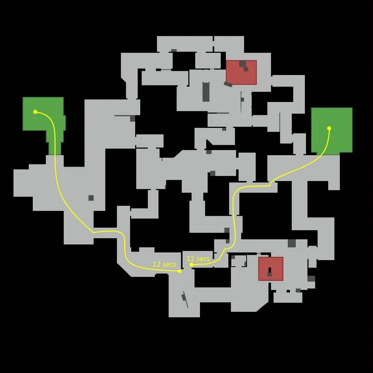
    I found a problem with timings that I hadn't noticed:

    So I made a change:

    However, going through the bombsite takes the same amount of time so my question is should I remove the other pathway?

    By this I mean:

  • de_templar [WIP]

    • King Skizzy
    • July 14, 2017 at 12:59 PM

    The map above shows the places where both CT and T will be able to see each other.

    Update:

    - Opened up pathways

    - Moved T spawn to fix timings

    - Re-worked T entrance to B site

    - Re-worked second T entrance to A site

    - Made mid longer

    - Changed the cover on B site

    - Added a balcony in mid T side which needs to be boosted into or has the other option of a skill jump

  • [WIP] De_Glace

    • King Skizzy
    • July 13, 2017 at 3:31 PM

    I just looked around and here are some things that I noticed:

    It would be nice to see the entrance on the right become a window so that it adds some height variety as well as being able to contest the platform on CT side more easily.

    A terrorist could easily smoke off the cross and make their way to B uncontested which I think is a problem because I already think that the sites are hard for CTs to hold. Having another entrance onto site for free would most likely result in a successful bombsite take everytime because CTs will be overwhelmed.

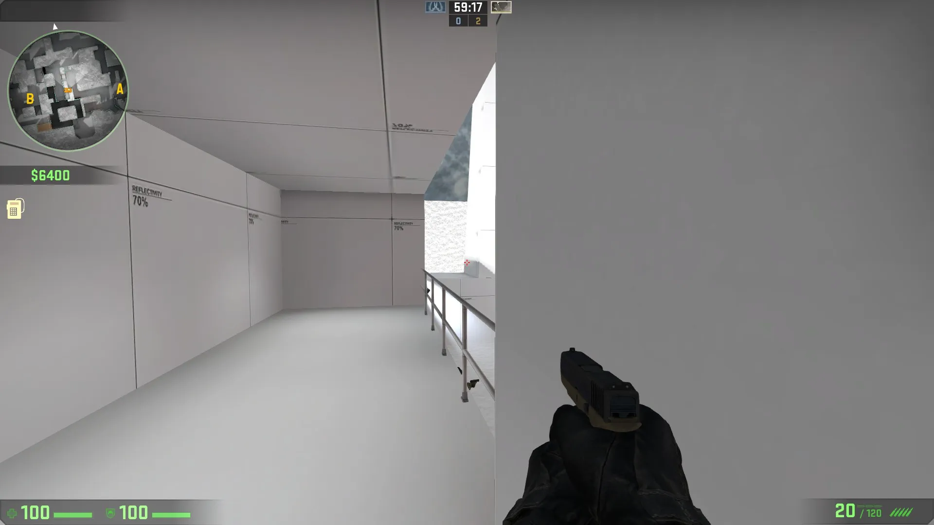
    I had a bot stand right next to the wall below and as you can see they are barely visible even when standing forwards. No player in their right mind would stand any deeper into the balcony as a CT so it gives every possibility that a T could slip past onto site. This is a problem because like I said before I think that it is very hard to hold site as a CT and with an additional entrance onto site for free it is even more difficult to hold. I think this problem of it being hard to hold a site comes down to the size of your bombsites being a bit small so there are not many places to watch areas from all of which can be easily smoked off or burning CTs out of their position.

    Also, what is the size of your map in units?

  • [WIP] de_biome

    • King Skizzy
    • July 4, 2017 at 2:44 PM
    Quote from jd40

    1 minute ago, jd40 said: The one with connector is the new one :)

    Oh ok... didn't realise. Maybe add some text on the gif to make it a bit obvious.

  • [WIP] de_biome

    • King Skizzy
    • July 4, 2017 at 1:54 PM

    Just looking at the gif showing the changes I can instantly see a potential problem.You have removed the connector on T side that links both paths to the sites and as a result the rotate times for T are extremely long. Adding the connector back in would add a risk/reward idea because you have a quick rotate between each site at the cost of passing through mid which could be hard if you do not have mid control, or you could take the longer safer route through T spawn area.

  • de_templar [WIP]

    • King Skizzy
    • July 4, 2017 at 1:48 PM

    Quick comparison of the changes I have made - I will post a more detailed update once I have refined my ideas slightly more (new on the right):

    Changes made:

    - Changed T side entrances into B site to make them feel less cramped and easier to move through

    - Added some experimental cover onto B site

    - Made mid longer by about 160 units

    - Attempted to make A site less open and play better (experimental)

    - Removed awkward line of sights

    - Starting to move CT back to delay their arrival at both sites and mid

  • de_templar [WIP]

    • King Skizzy
    • July 1, 2017 at 7:11 PM

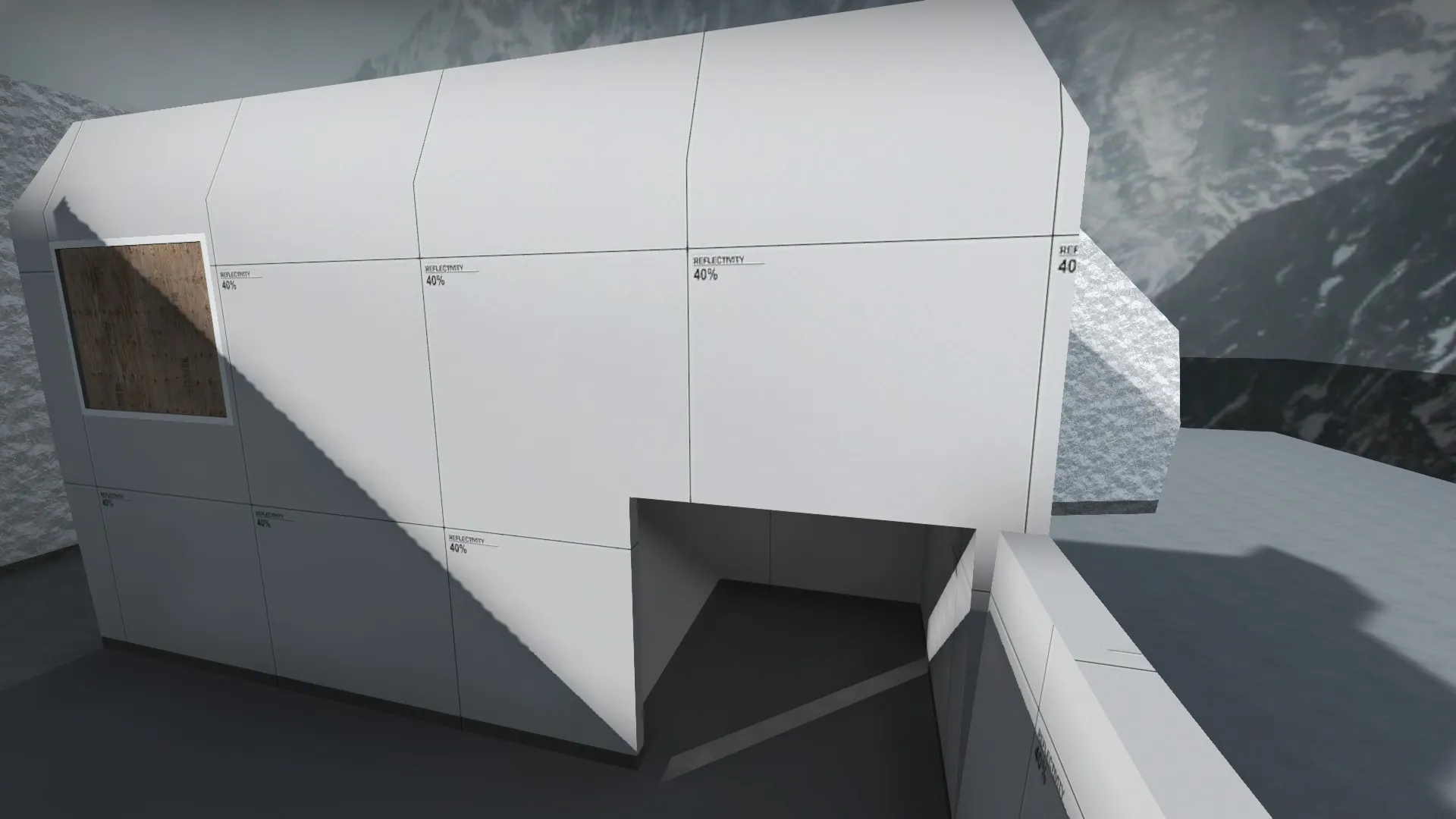
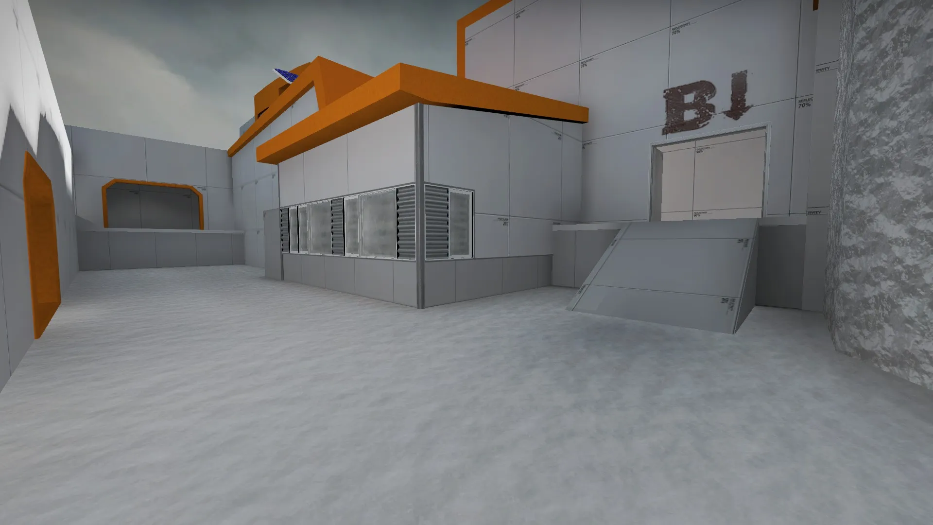
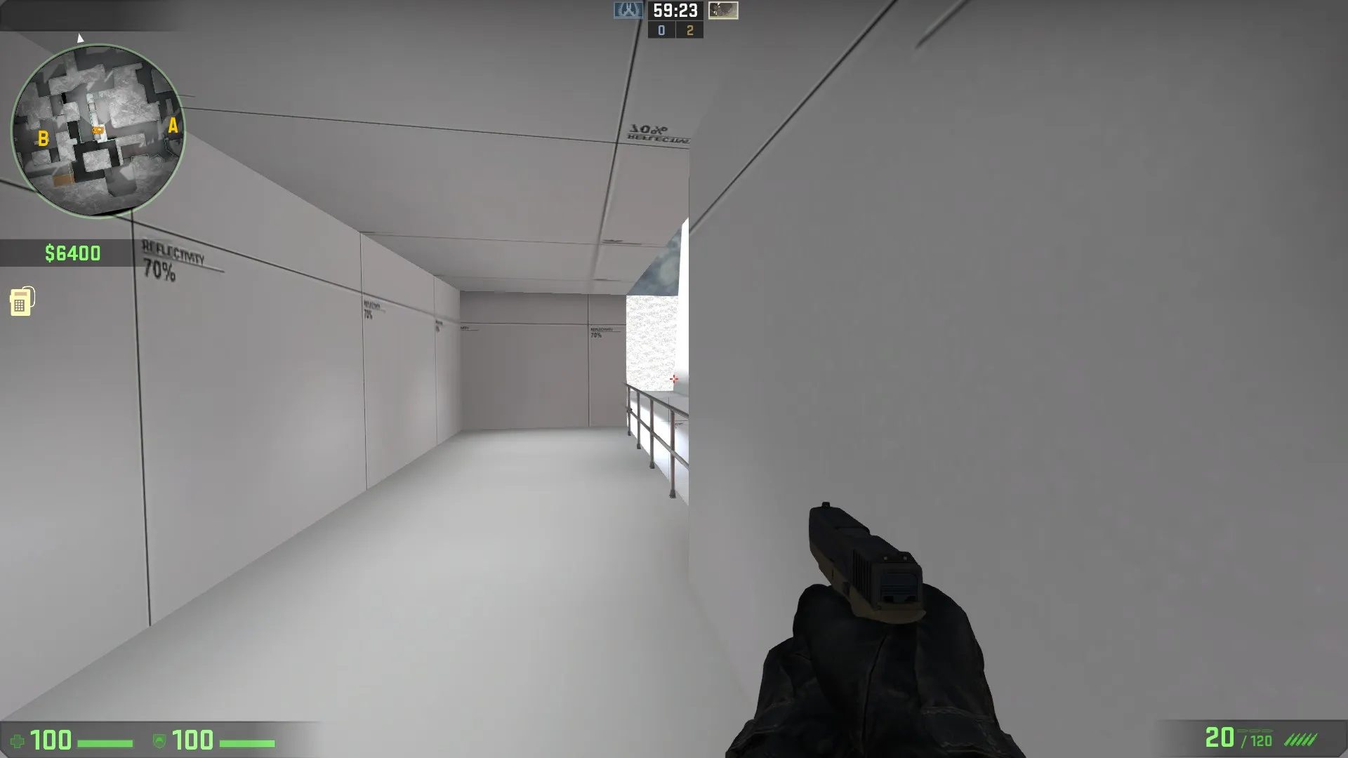
    I have attempted to make a couple maps in the past but gave up so here is another attempt! The theme I am aiming for is a castle set in a snowy mountainous area (original :D). I have not started texturing yet and I think that it would be quite unrealistic to finish texturing the entire map by the deadline. My purpose of posting my map here is to help get some feedback on the layout and make it very good before starting to texture it. If I do not have a layout that I am totally satisified with within a couple of weeks I will most likely not bother texturing it but continue to work on it until next year and texture the map then. Feel free to have look around the map and all feedback is appreciated.

    Workshop link:

    http://steamcommunity.com/sharedfiles/fi…s/?id=939137872

    Layout:

    Screenshots:

    Some issues I think I have with the map so far:

    - Mid is quite short

    - Hard to retake sites after the bomb has been planted

    - Lack of vertical height on bombsites - bombsites feel very open

Discord

The Mapcore Discord is our lively IRC channel of the 2000s reborn. Chat about level design, gaming, and more.

Latest Posts

  1. Any of the old guard still around? D:

    Warby
    July 12, 2026 at 8:23 PM
  2. About our archived forums

    Thrik
    June 30, 2026 at 2:12 PM
  3. Mapcore Discord

    mason_fan123
    June 24, 2026 at 8:52 PM
  4. [CS2] Valley

    Serialmapper
    June 22, 2026 at 11:56 AM
  5. Free Music / SFX Resource - Over 2500 Tracks

    Eric Matyas
    June 18, 2026 at 12:32 PM
  6. Pango [WIP]

    Elowen
    June 11, 2026 at 10:13 AM
  7. [CS2] Dvina

    Jeremy Rivera
    June 11, 2026 at 10:03 AM
  8. Bridges 2.0 by NEXSIDE, MAP SHOWCASE. ( Steam Workshop )

    MrTrane18
    June 1, 2026 at 7:46 PM
  9. Classic Maps Reborn For CS2

    SillySpaceCat
    May 31, 2026 at 10:33 PM
  10. [CS2] Dvina

    Pulbusha
    May 29, 2026 at 5:54 PM
  1. Privacy Policy
  2. Contact
Powered by WoltLab Suite™