

I would but it may be a bit of a shot in the dark.
Posts by Quotingmc
-
-
New theme is far more interesting and stands out more than the old generic theme. If you want any help getting it detailed or with some custom signs then just message me

-
I see this in several places and is a super easy fix. A lot of the stone textures don't align over different brushes. A clear example is the picture of the round tower in the imgur album.
-
Sorry to say but I think that this map is dead.

-
Looking cool! I wish more people would take interest in Demolition/Arms Race maps. I was thinking of trying to release a good one.
-
I saw that you decided to discontinue de_grace. Would you by any chance release a .vmf? I love the look and would like to look at it in more detail.
-
I would suggest making it a more generic metro rather than London underground as the station bears little resemblance to any London Underground station I have ever been to.
-
I agree with Idolon, I would try adding a connector to allow for T's to rotate.
-
Already looking cool. Great use of custom props. Please post a minimap!
-
wow, cool!
-
 Quote from Grillet
Agreed. Going to change it as soon as I come up with something.
Ok, try and get it done quick though as names will start to stick and be associated as people see screenshots.
-
Looks awesome but the name could be a little more catchy

-
New Update:
Nothing is final and there are many unclipped areas. There may also be some lighting bugs. This version is not currently on the workshop.
Added a section to B site to enclose it a little and add some cover for both teams.
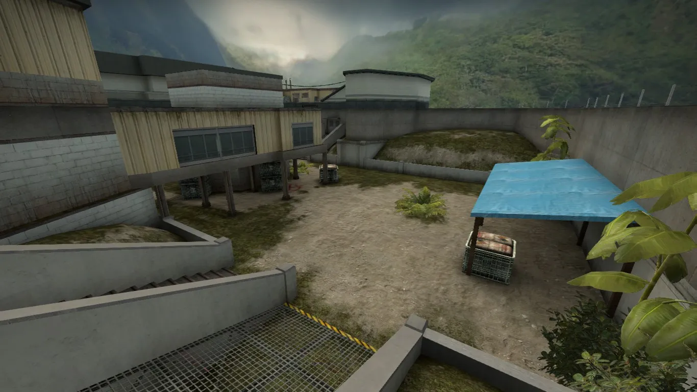
Added a fence to close off one side of fence. Should allow for an easier T take and hold with less long angles.
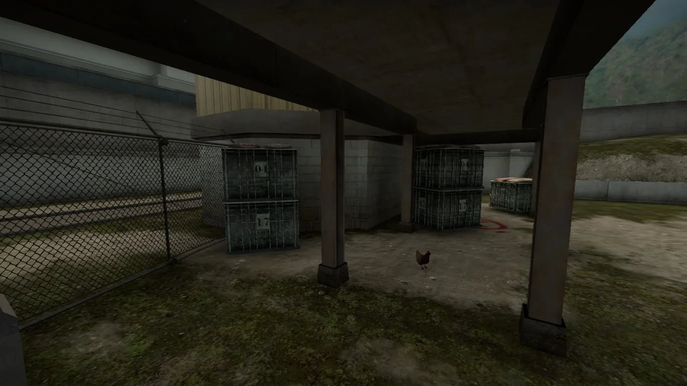
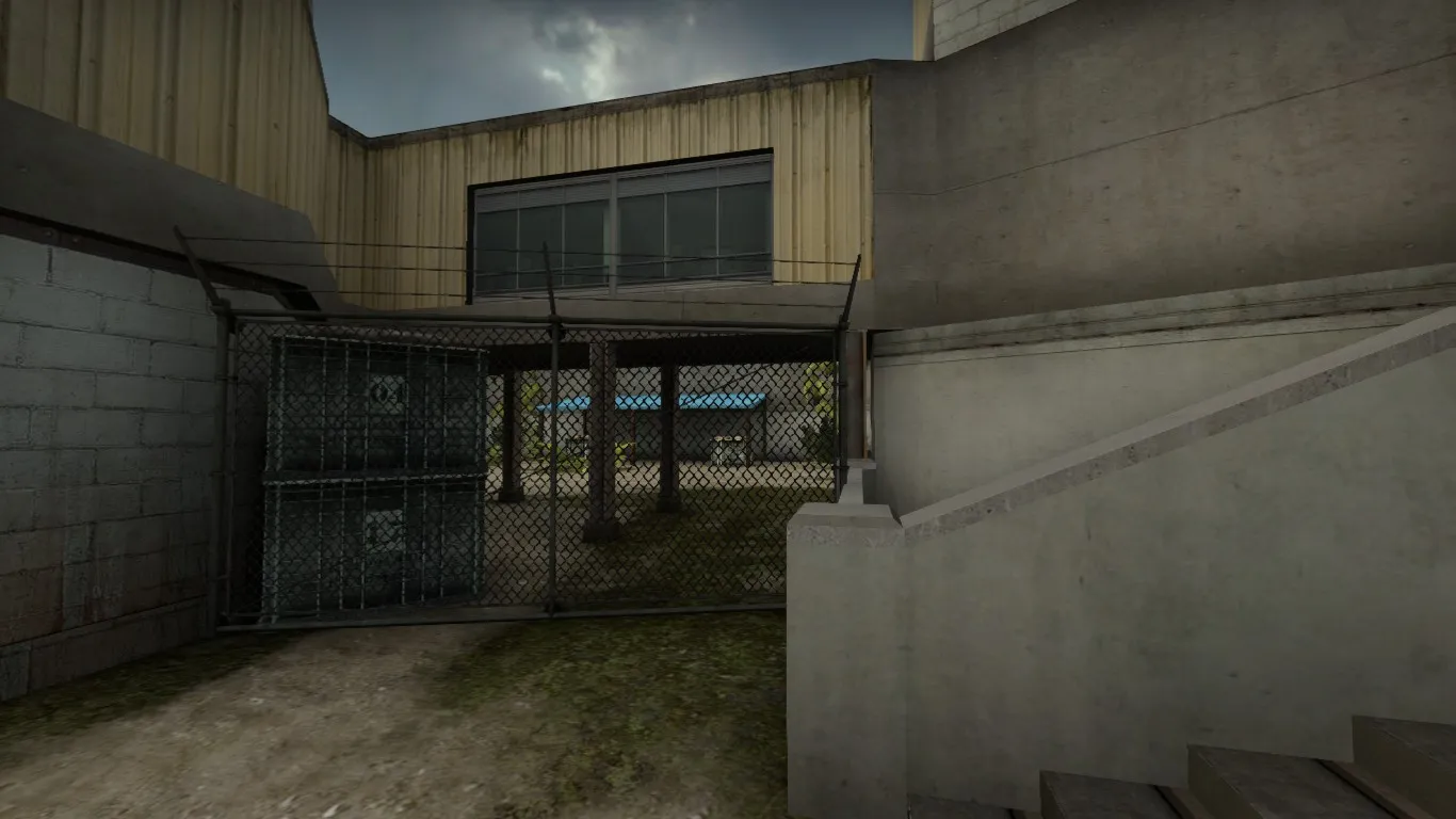
Main entrance to B for T's has also been reworked slightly.
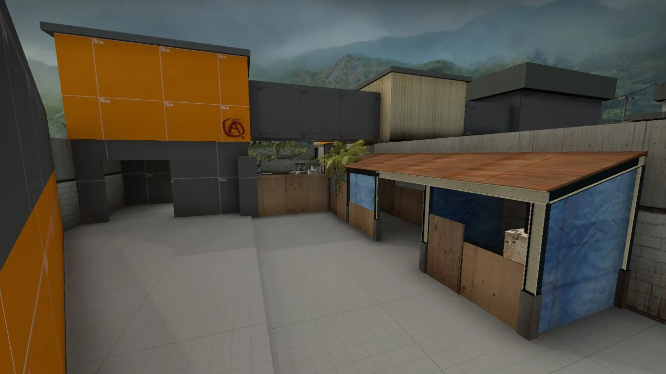
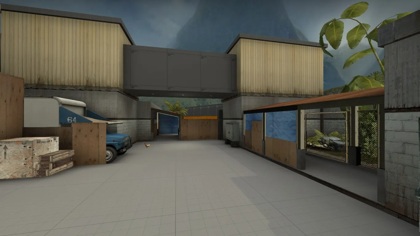
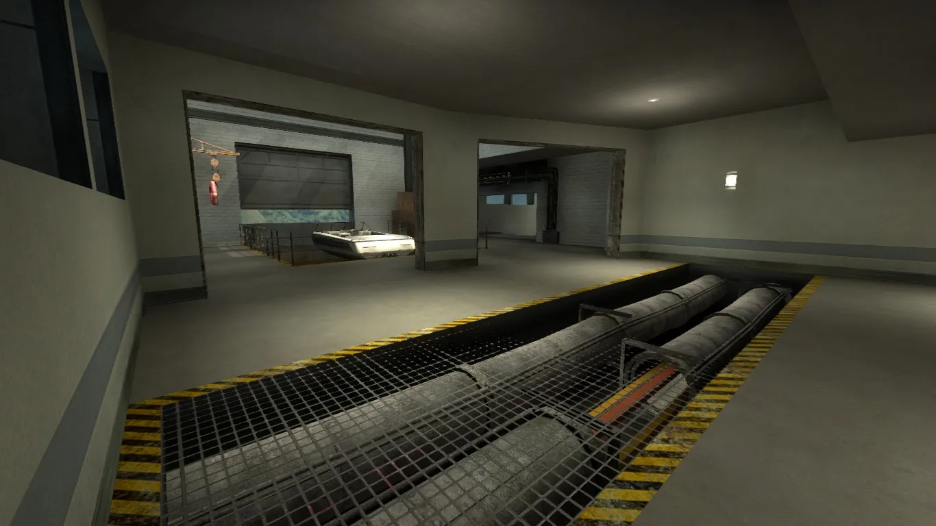
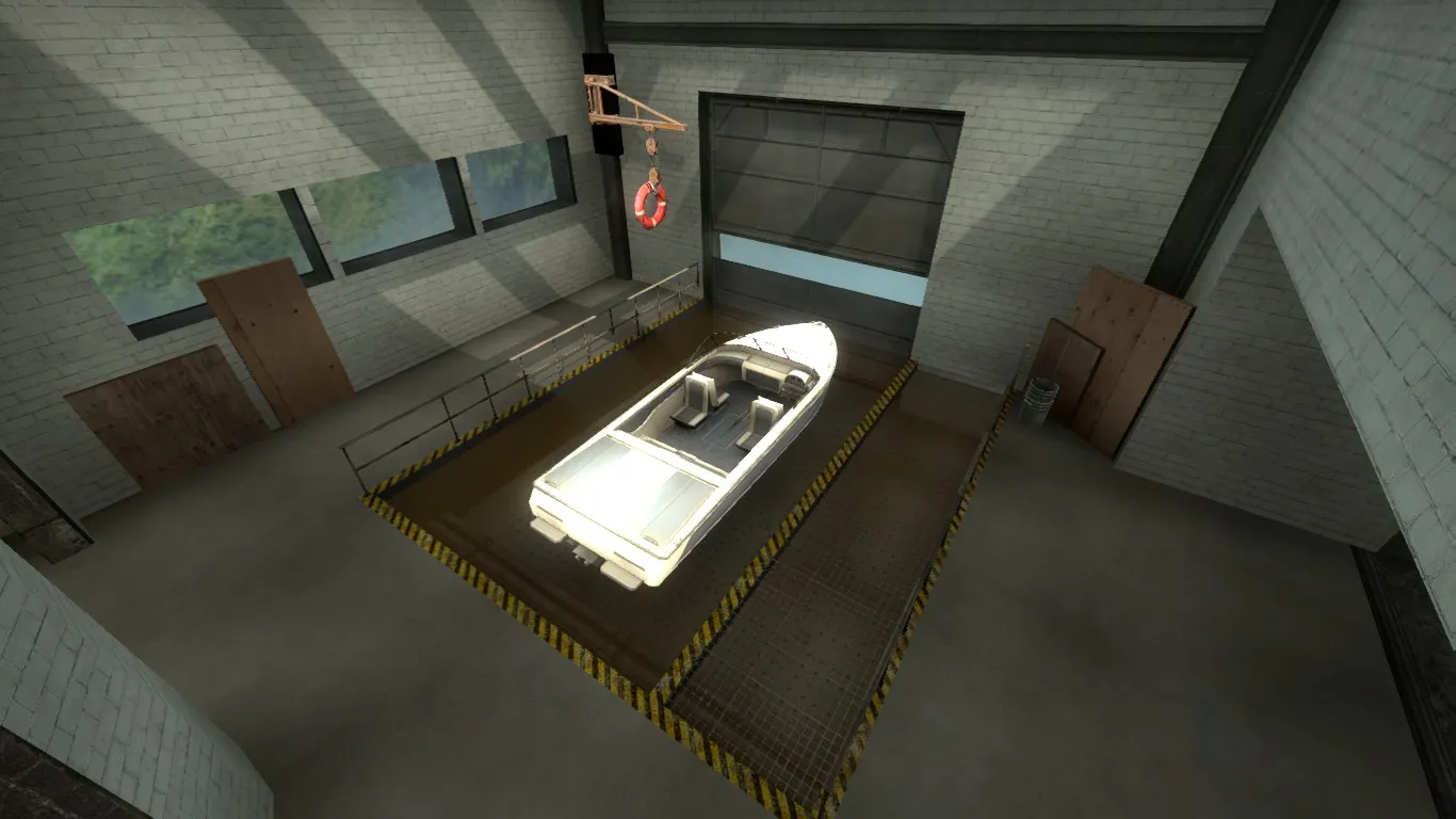
Added a garage at the back of site to add some new details
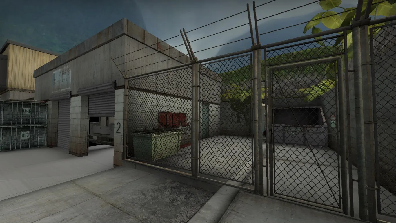
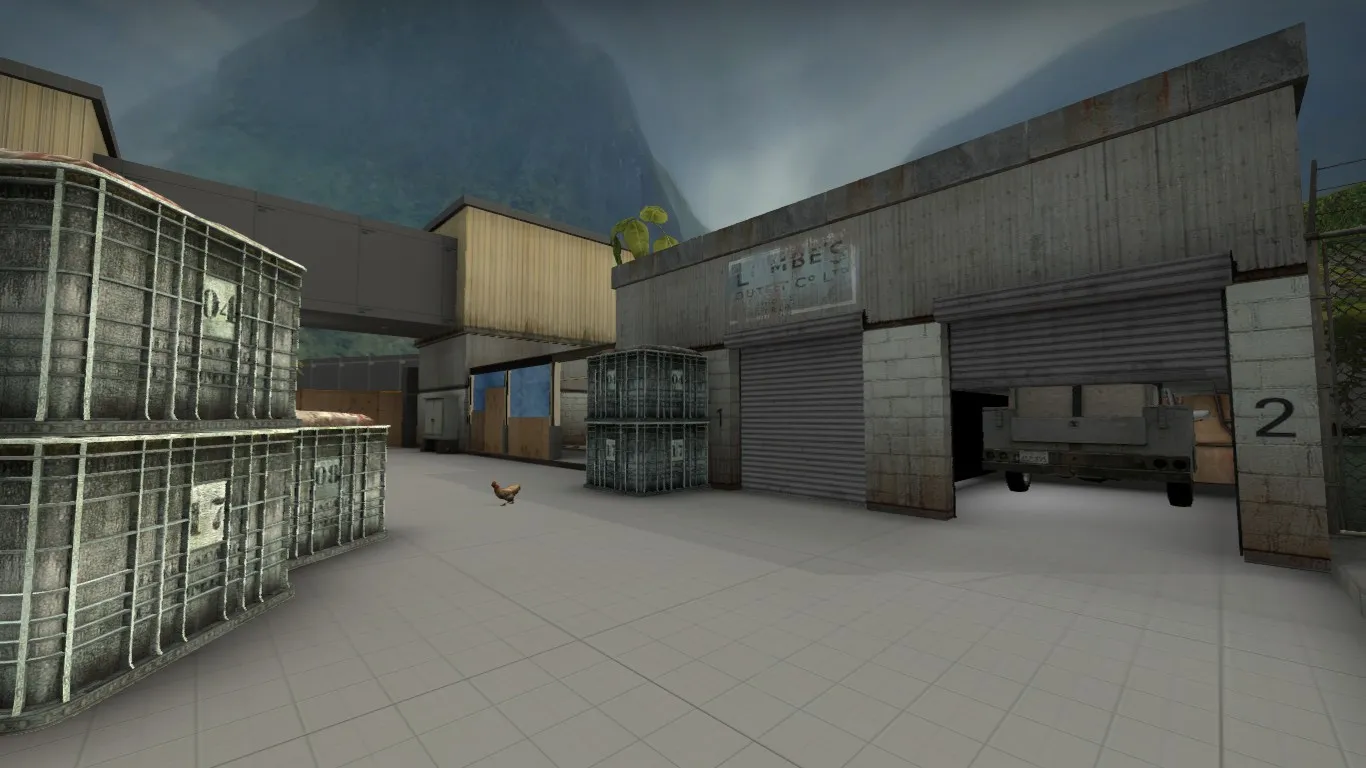
Routes into site. (Top for T is via mid)
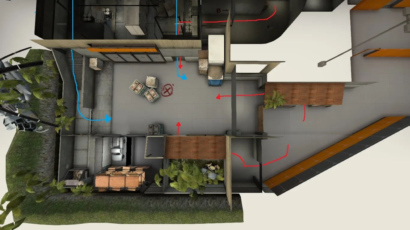
NOTE: The map seems a lot darker in these screenshots than in-game.
-
 Quote from jackophant
I'd avoid putting vegetation in the middle of an area by itself. CSGO tends to play better when foliage is on the fringes of gameplay. If you actually want cover there, but a box down first and then have the plant next to it if you must have it at all.
Vegetation is very easy to overdo (de_orion), and use imporoperly, so be careful.
I have had a look in game and it in no way reduces visibility, you can easily see the player and standing in the middle is fairly dumb anyway. I will look into moving it elsewhere though
-
New update coming later today with new site design to allow T's a chance and with less long AWP angles.
-
Just saw it, looks great!
-
Looks great! I think the big warehouse with all the box shelves gets a bit crazy at times but I like the overall layout.
-
I personally think that cs_mass isn't the greatest name. I understand the religious reference to mass but it doesn't scream church to me. I think you should possibly consider some other names
-

The lighting seems completely off, did you set it to fast?
-
Huge Update!
A Site is nearing completion with cover ready to be fully tested.
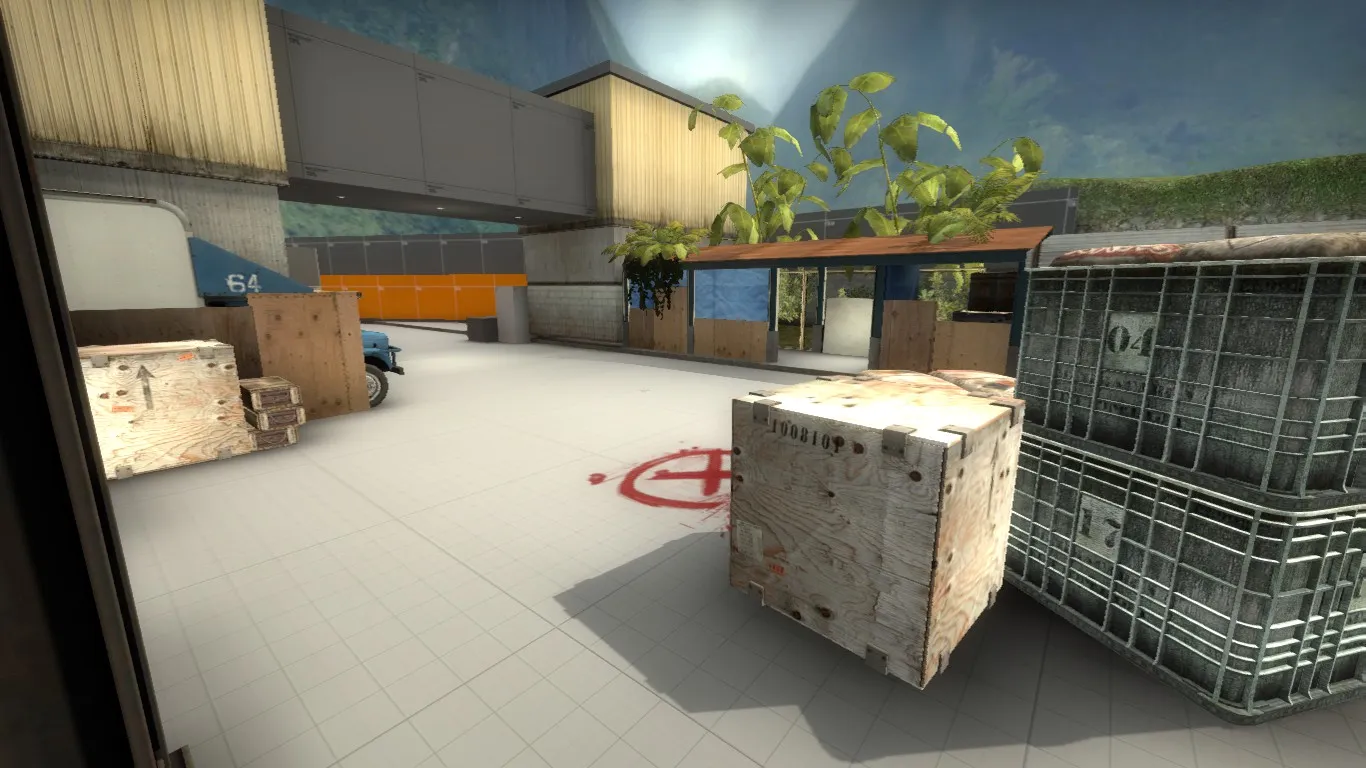
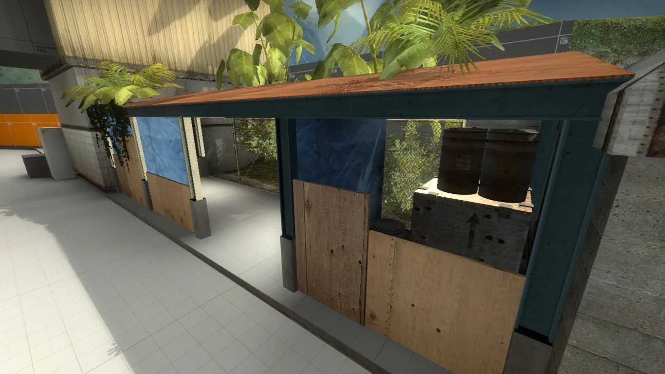
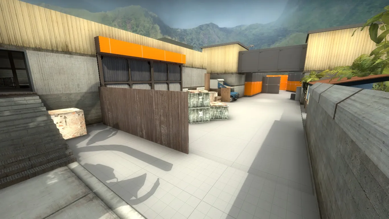
T to A is now planned out.
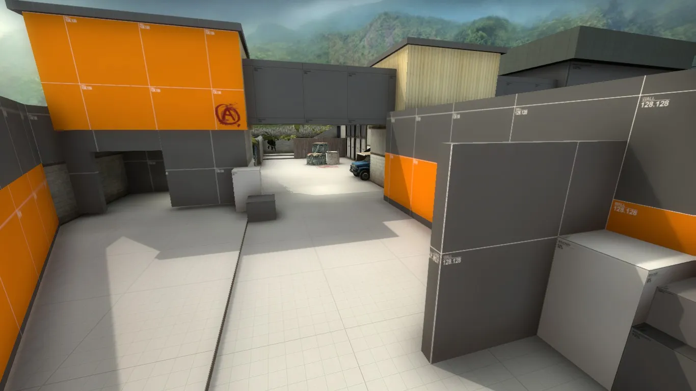
On the other side of the map, B is now far more like a jungle and the site has been given its first cover.
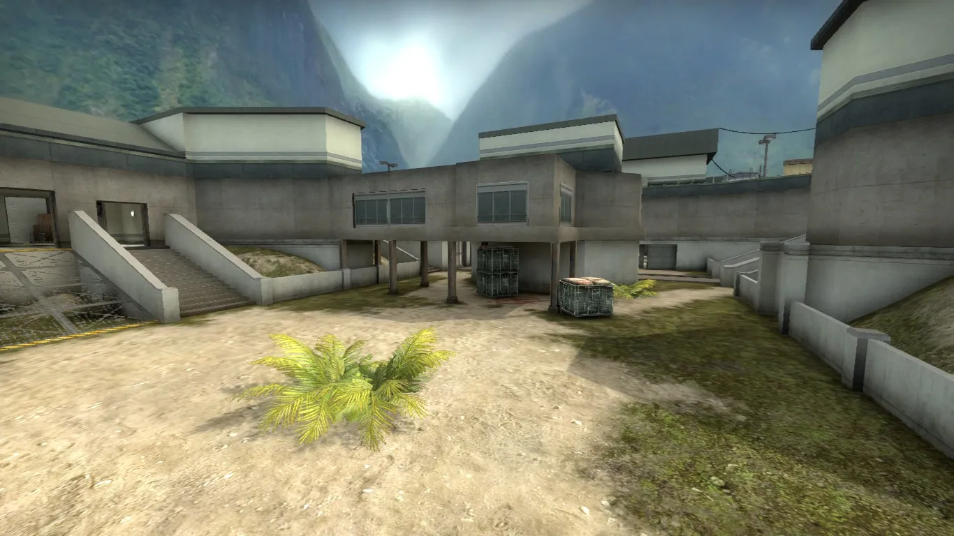
T to B has had some small changes, again to remove the ice and bring in the jungle.
Workshop link is now also in the thread so why not try it out! Any feedback welcome.