


Why would we blame you for posting updates in your own thread?
Also I agree with spa .you should really playtest this before going ahead.
Why would we blame you for posting updates in your own thread?
Also I agree with spa .you should really playtest this before going ahead.
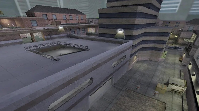
These two were definitely always my favorite maps! Makes a lot of sense too because both are hella imbalanced :D. Uptown
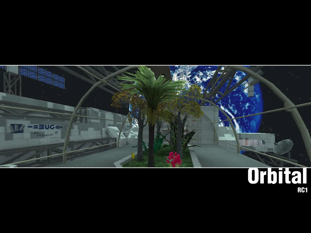
... and Orbital
Hey man, I love the work you're doing on this, the entire map is very clearly a labor of love! Maybe be careful though, with how many details you add. When I ran around the map I was a little overwhelmed by the amount of props everywhere, even in what seemed to be key gameplay areas. I found some parts to be visually confusing (many different patterns, shapes and colors in close proximity) and sometimes would even get stuck on props. Maybe focus your use of props more on individual hero props (like your awesome skybox balloons) to provide the atmosphere and focal points for entire areas. Because while your current approach might be more true to life, it is possibly not the best for gameplay. Congrats on the honorable mention and I hope you keep working on Cappadocia :)!
I actually liked the first one better. At least in the setting of a video game. These games we are mapping for are somewhat supposed to take you away from reality, so I liked seeing the different proprtions. In my opinion it's a lot to do with the lighting, but if you want to keep the celestial lighting from the first bunch of pictures, I suggest you could very slightly bring in the outer walls, leaving everything else the same.
Maybe I am judging this wrong, but the left site seems quite easy to take and then hold down. All CT side entrances are quite narrow, Ts are given the high ground and maybe an entrance too much I feel? But maybe the flank threat from CTs on the right side is higher than I think right now, since I don't know the exact timings and LoS.
Anyway, liking the idea.
To anyone familiar with Warhammer 40k at all it is also kinda weird. but actually I don't mind :shrug: .
Looks interesting, but I am a bit confused where the connections are. I can spot some but probably not all. A workshop link would help to see it for ourselves and give better feedback on the layout.
I also really enjoyed walking around the map! Nailing the use of rocks and foliage all over. However found some weird things here or there:
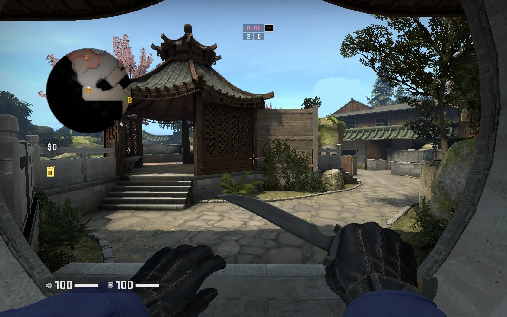
opinion: To me the temple looks a little visually confusing. It has many different very dark colors and is not particularly well lit. For this reason to me it wasn't very appealing as a path and also quite hard to know where encounters with the enemy might be in terms of depth (lack of shadows because dark) (probably relevant for retakes). A simple light in the temple should fix this.
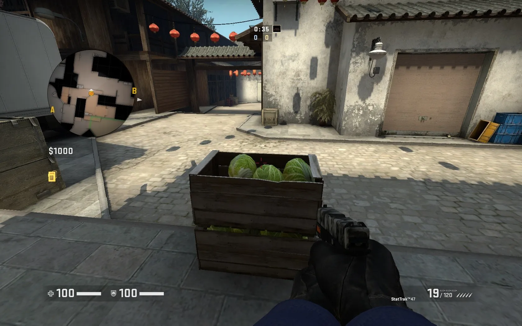
When running into this cratestack it bumps you up onto the lower of the two crates. Maybe just make nonsolid and use clip brushes?
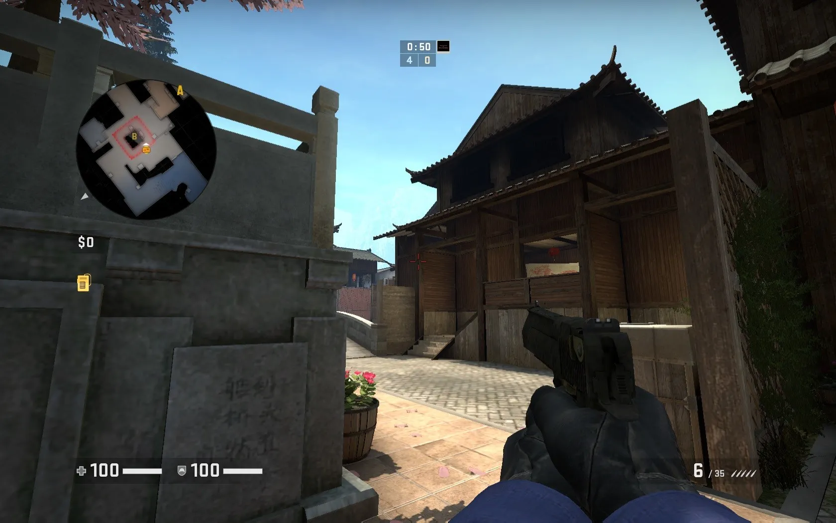
The window is really hard to see. Hard to imagine a CT's head will stand out very well against that background. Might also be frustrating to players who don't know the level that well, because it is in a sort of unexpected spot.
Hey man, I like the look! Did you take these pictures in a full-compile version of your map?
Really love it! But I believe those radomes are lacking bottoms 
 Quote from mr.P
6 hours ago, mr.P said:
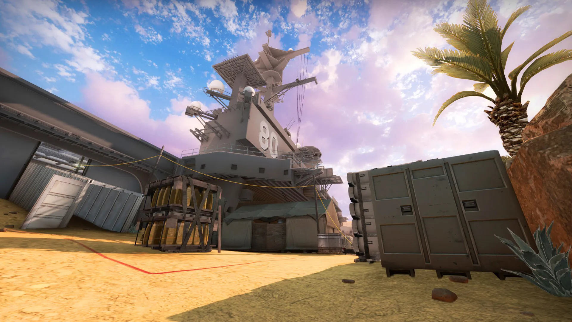
Still not dead. A new version is pending workshop verification, I will add the link once it's done on the workshop right now! Let's get to the screenshots and I will explain what changed:
Workshop link! https://steamcommunity.com/sharedfiles/fi…/?id=1693753275
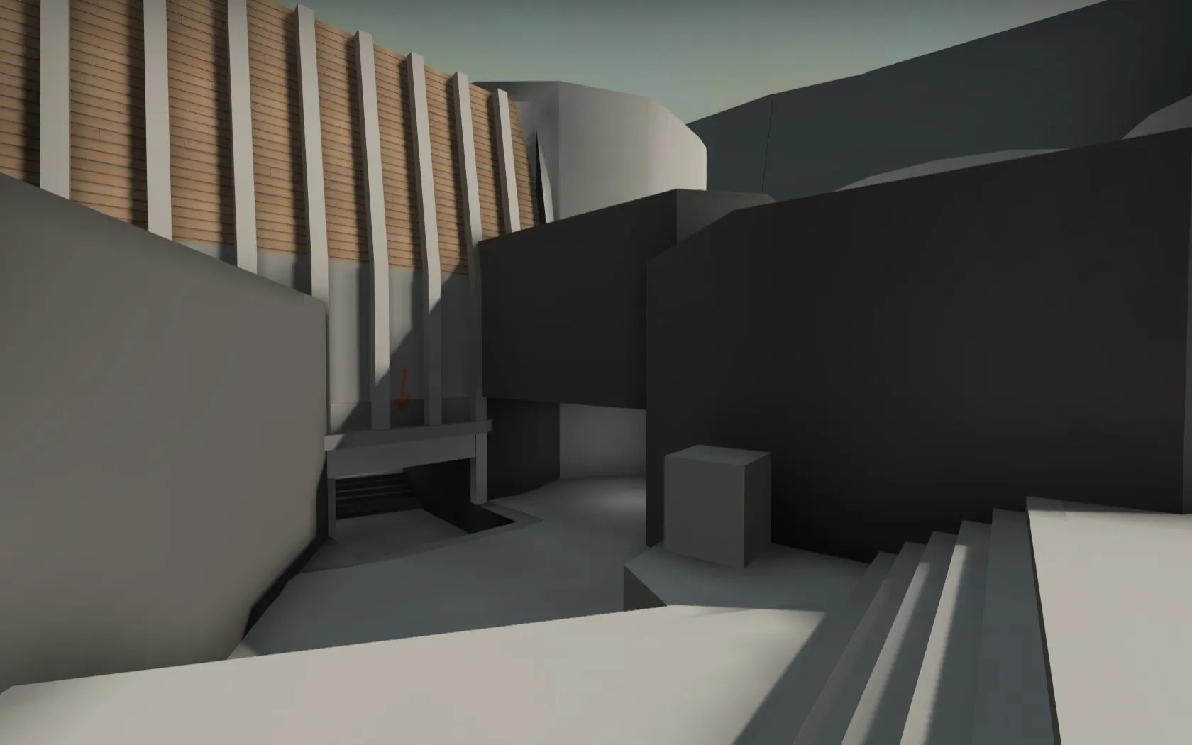
PLEASE NOTE: This is all very clearly a WIP! My main purpose right now is to get a layout down (after about 4 years now ^^).
First up: The radar
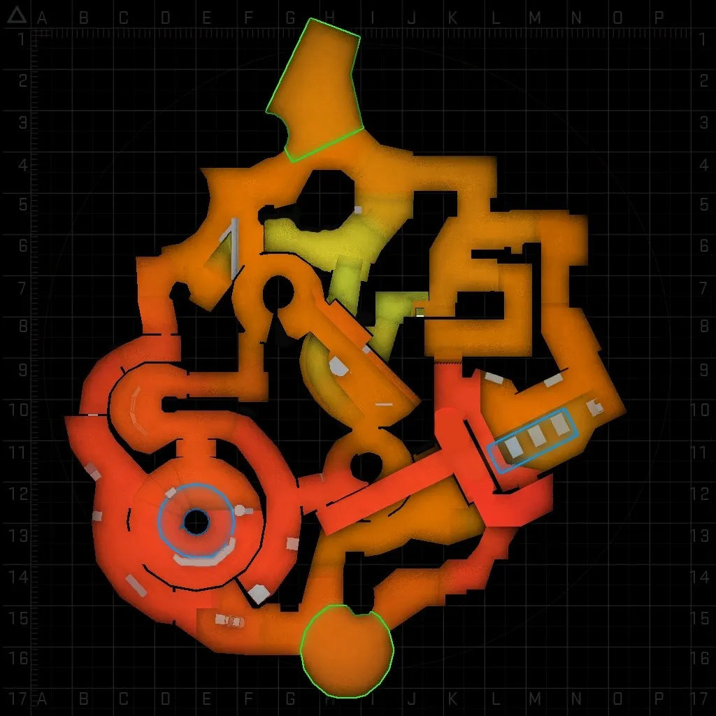
I know this looks very complex. But if you think about it, it is actually just a clover layout with two major additions. A) The skywalk connecting the two bombsites creates an incredibly potent, direct rotate option where normally there is none. This exists, because defenders on this map are already very spread out, and the more complex geometry of the main paths is a big obstacle to clear for efficient rotations. Skywalk alleviates a lot of this pressure for perfection from defending CTs and makes the gameplay a bit faster pace, which I also enjoy. B) The lower middle area on T-side. This plays to a similar point as skywalk, where the level geometry is very unforgiving for being on the wrong side of the map. Additionally, the lower mid area is essentially supposed to make movement feel more fluid and free across the level.
The bombsites:
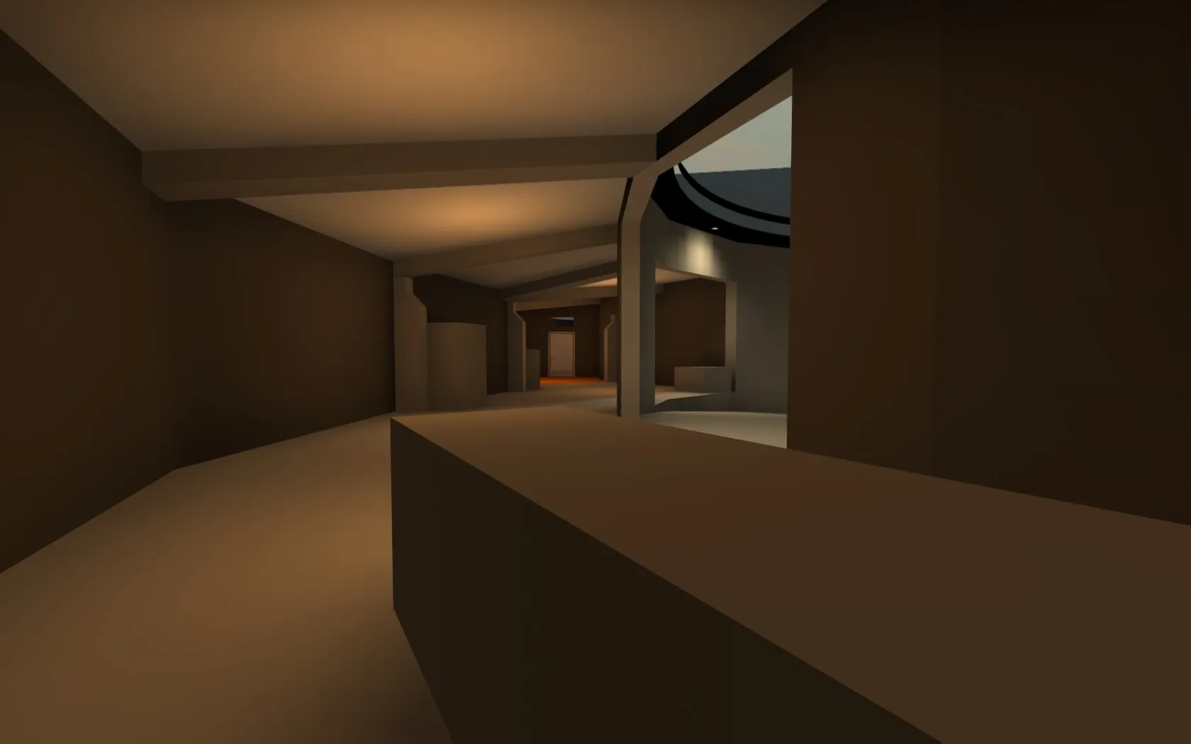
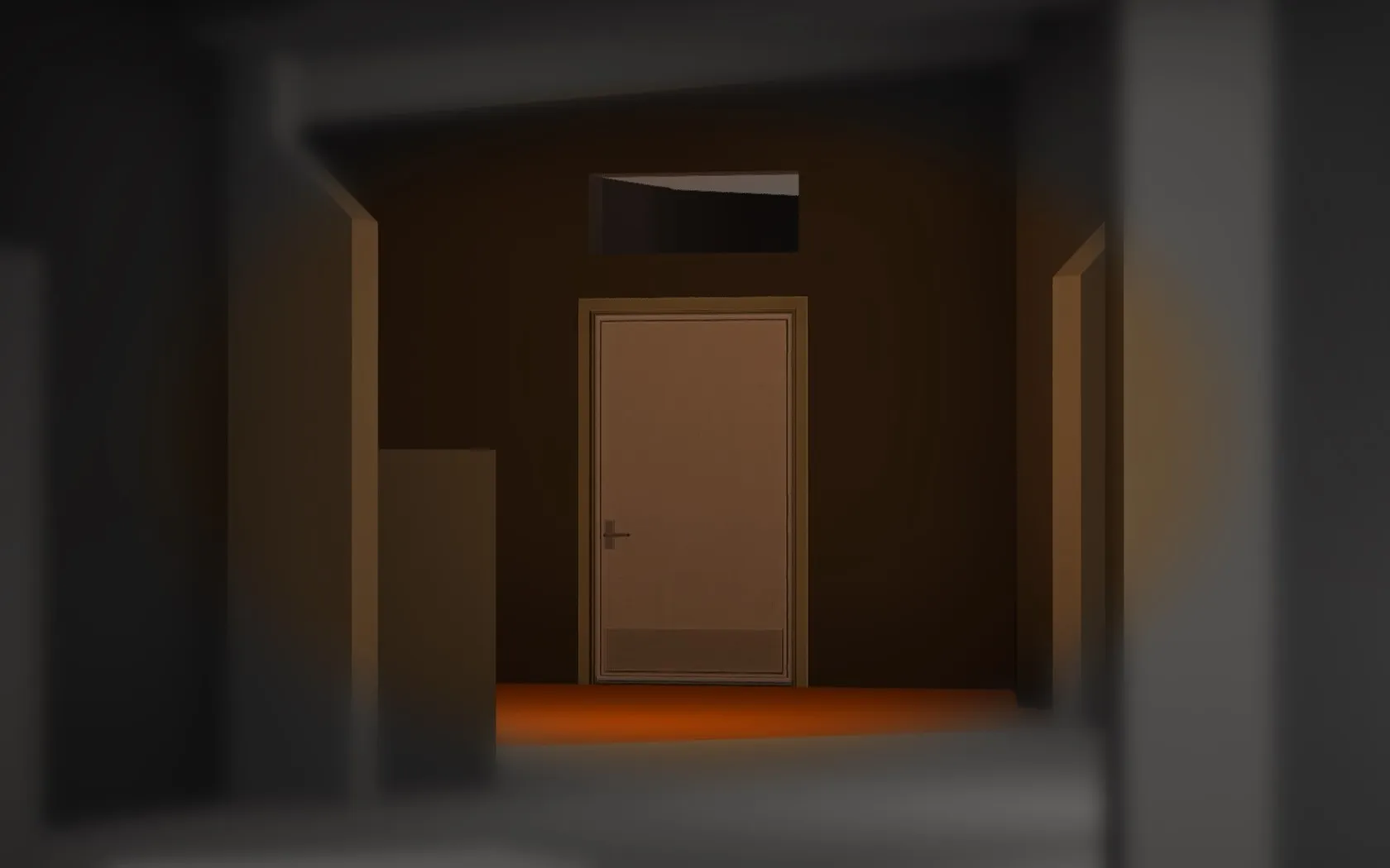
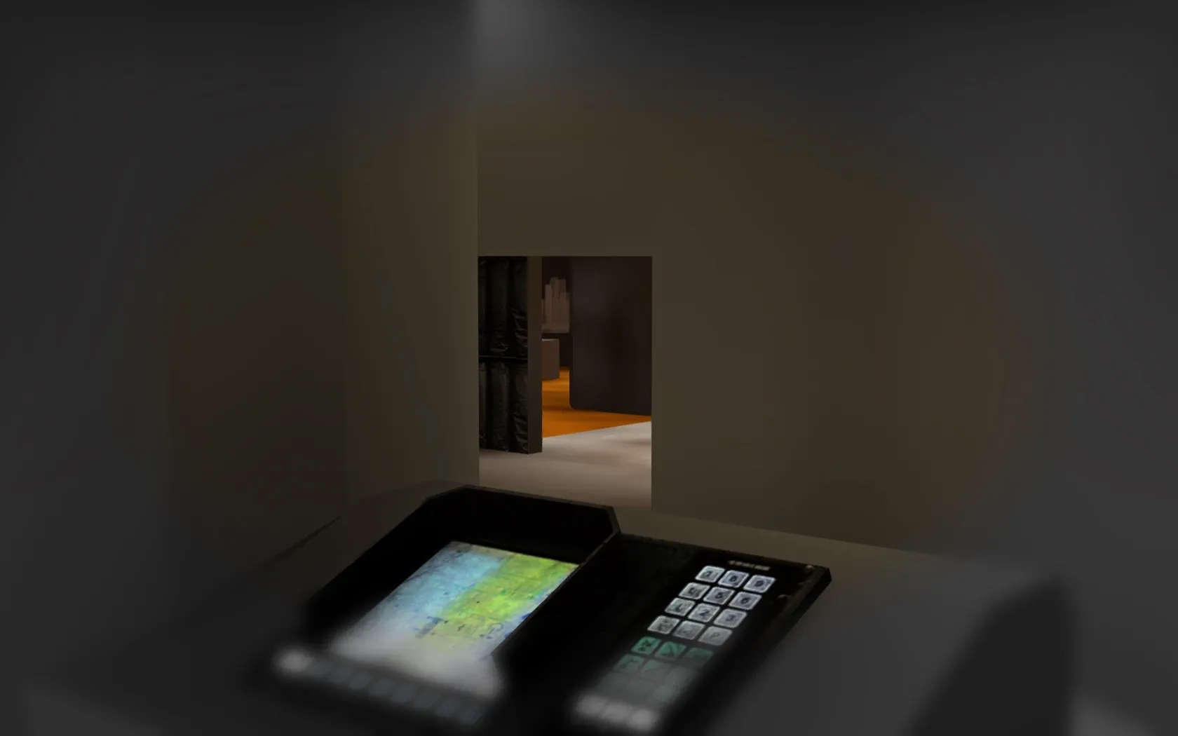
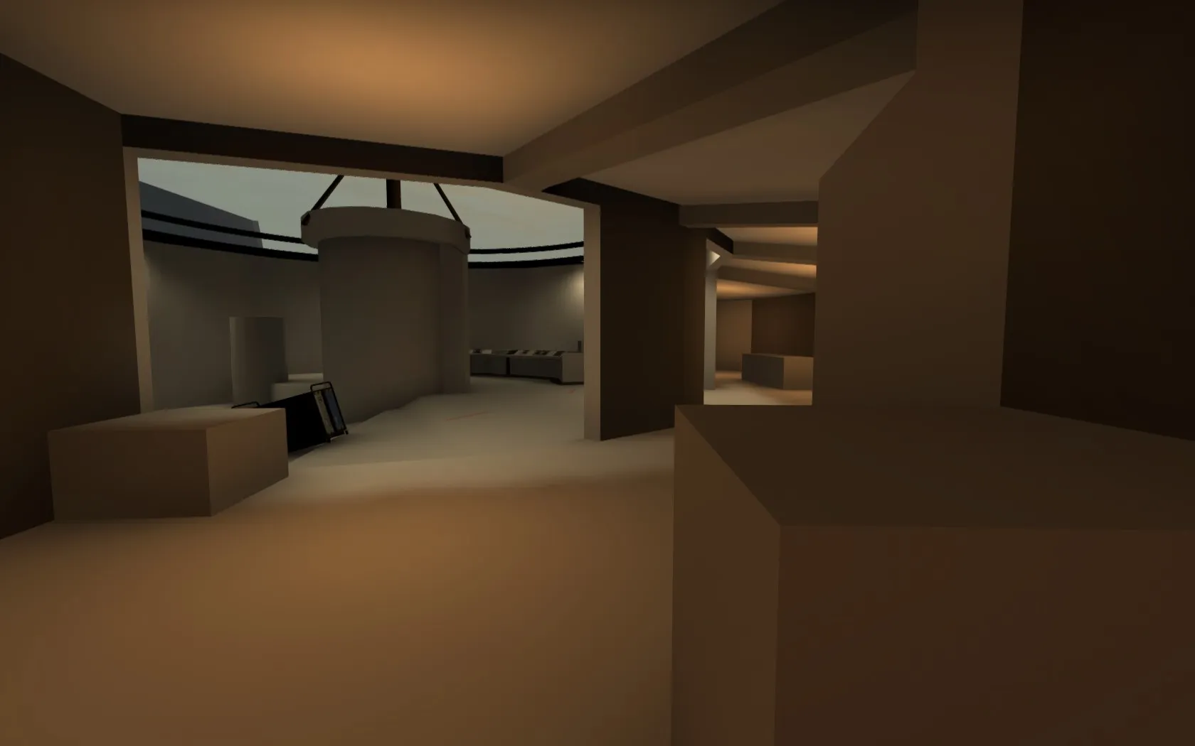
I widened A (as per Logic and others' feedback) and thought about how to make the door in Long A integrate better into the site, making it a more comfortable approach for the Ts. The solution is what you see above. The door is now nested in what is an appendix to the circular site itself, with a better initial angle for dueling the defending CT, as well as a small area shielded from view behind the curve of the wall (which is however openly visible to the main defense spots inside the site). In the playtest a lot of you also commented on how contrived and bad the entire A Main structure and approach felt, so I changed it. Above you can see the main defense angle for an early warning on an A-Main push. This is also clearly visible when rifling. As seen in the last picture, I also changed around the position and size of the semicircle desk and removed other clutter from the site.
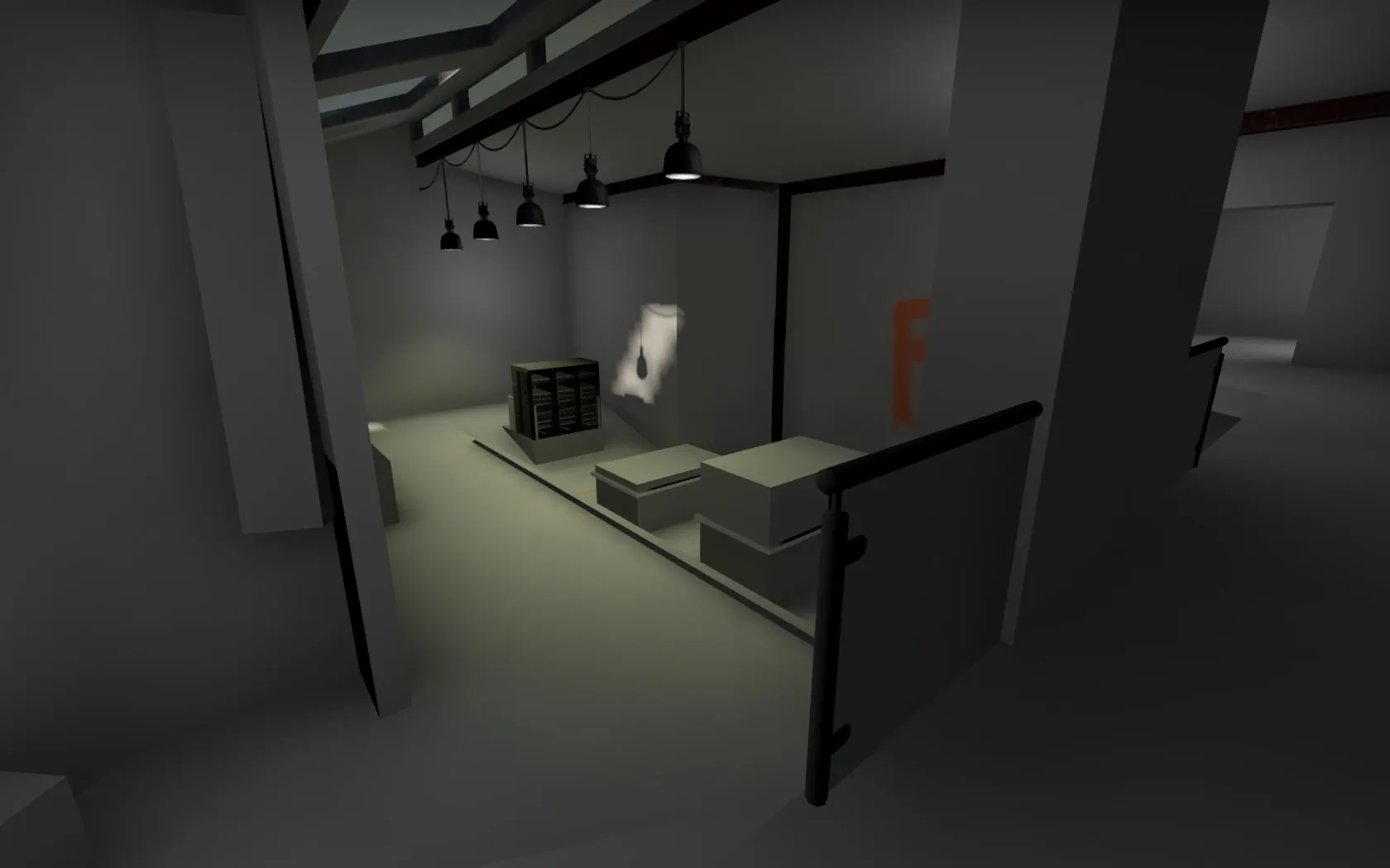
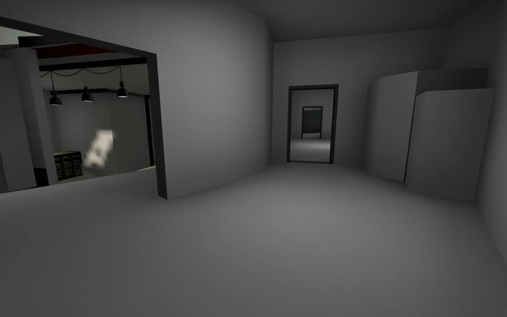
In B I opened up the space above the B Main entrance to site, using this opportunity to further expand the balcony running along the backwall. Over B Main it meets up with the new additional, elevated entrance into the site. Ts can reach this position by jumping on the boxes visible in the bottom left corner in the first picture, three jumps required. Further I added the server defense position visible in the back of both pictures, specifically with afterplant scenarios in mind, but if you are feeling yourself as a CT you can use it to risk a peek into Long B (timings are really tight and you're exposed on the exit). Actually forgot to take pictures of lower B tunnels area (might add later), that changed a little bit as well. but in general I moved the CT-side lower entrance from under skywalk to the end of the tunnel (under heaven). This again makes the angles much more pleasant for both sides, enabling cleaner sweeps both for takes and retakes (so from both sides, north and south). Also there is now a cool dueling line from heaven into the area where Ts enter B Main. T-side smokes can fairly effectively eliminate angles of defense, forcing CTs to play smart or adjust their position.
Thirdly, the connectors:
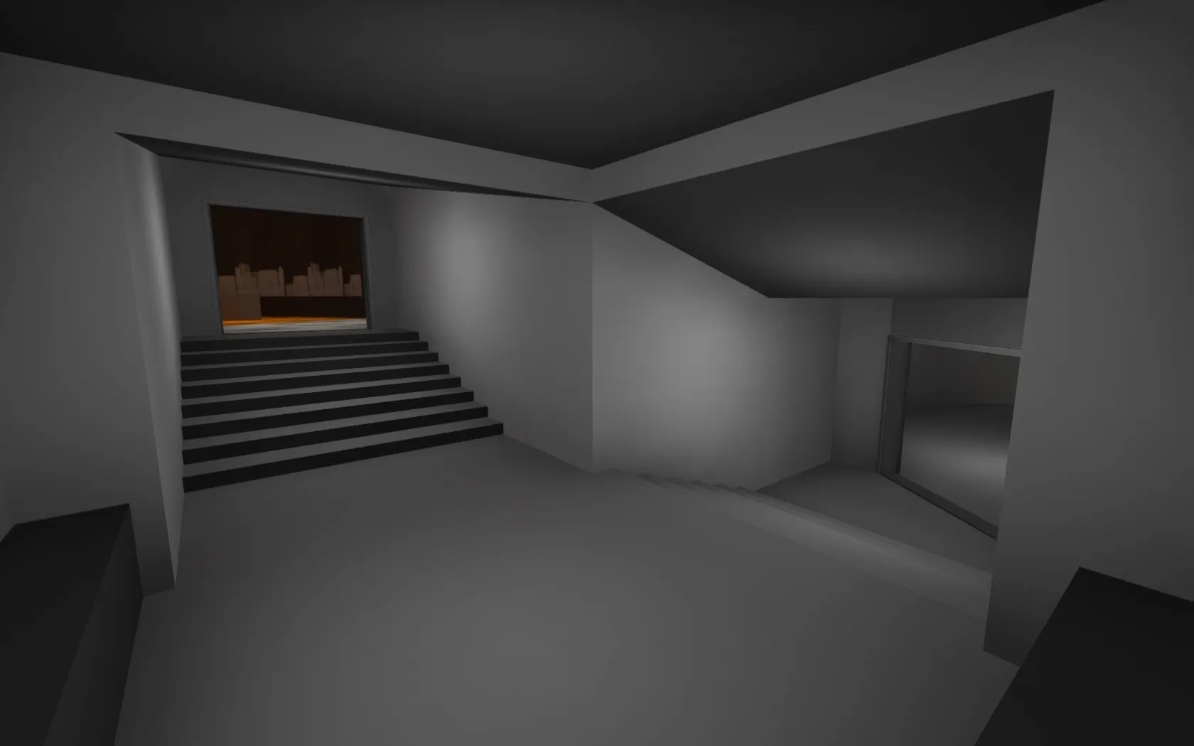
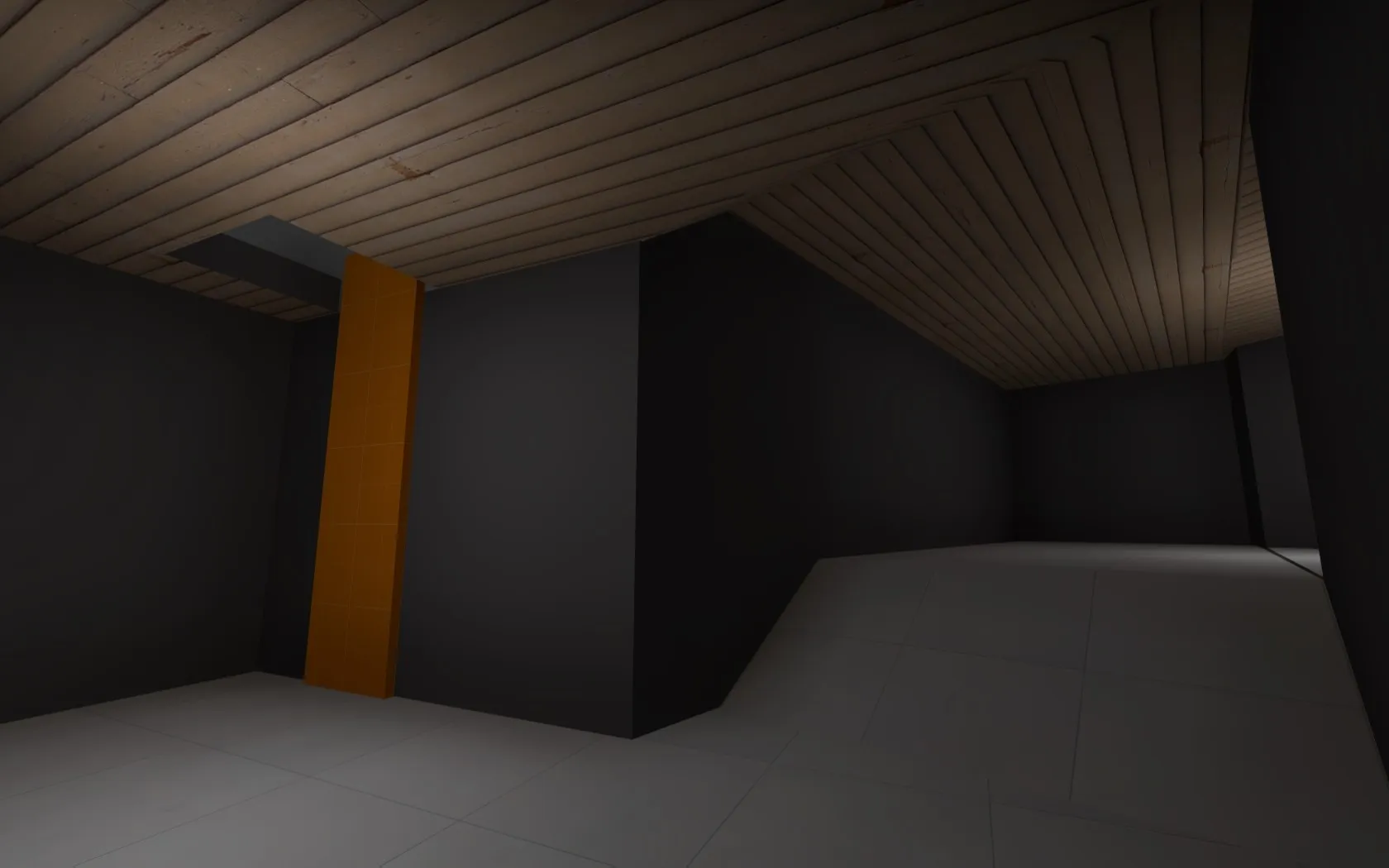
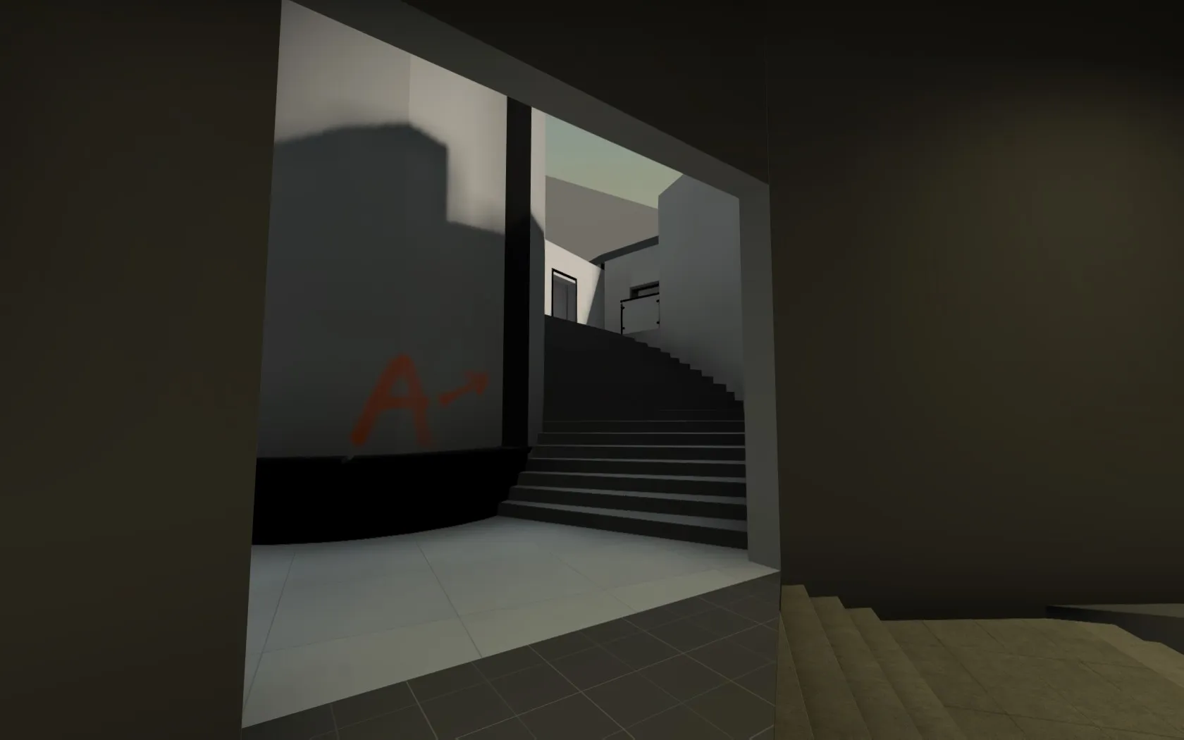
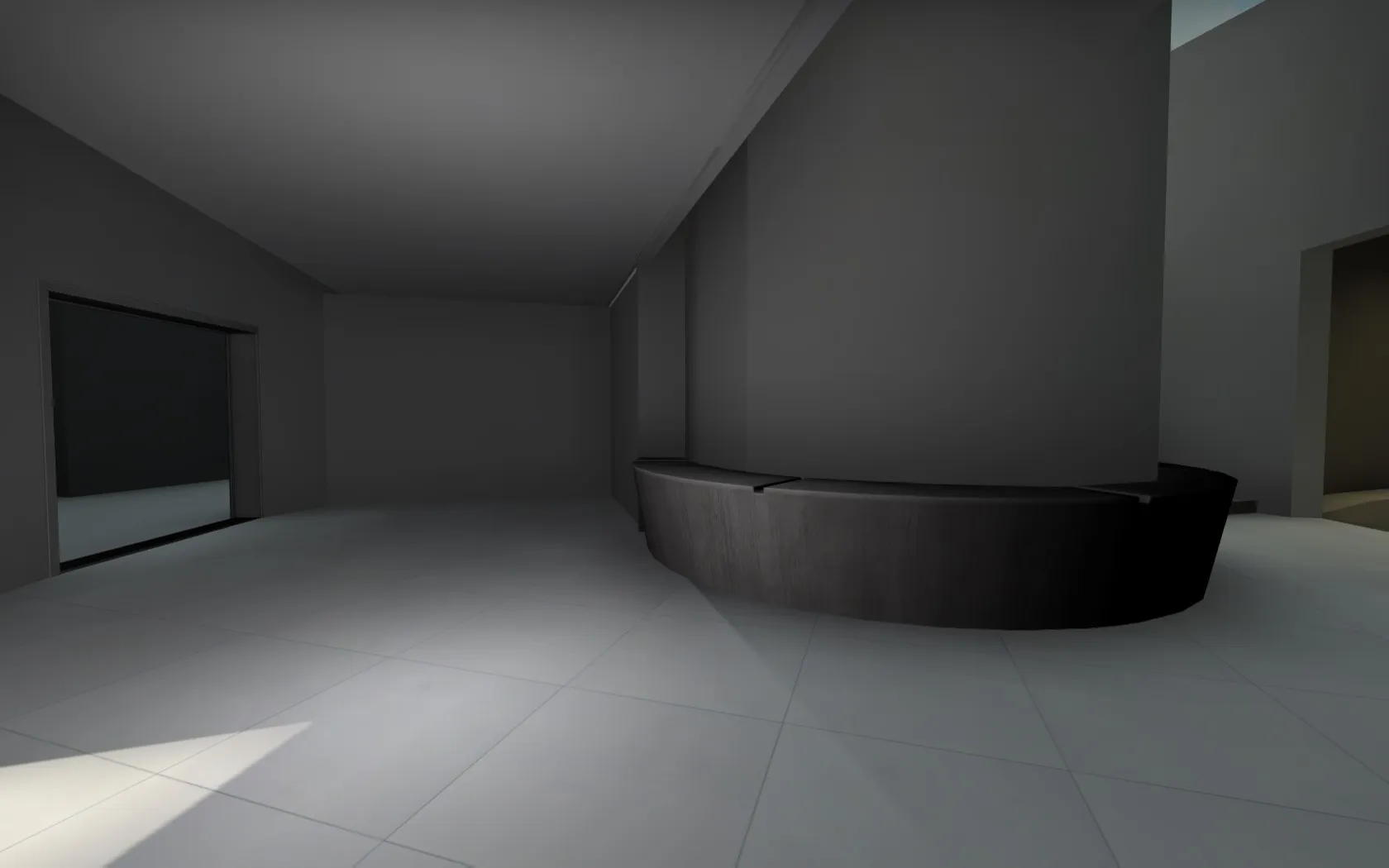
1): A Main connector into T topmid. Kind of uninspired (also the shape is much too square for A side, but better than everything else I could come up with). Hoping to make this one a tube, if it keeps its current layout. 2): Lower mid ladder into T-controlled B side. As said before really helps rotations, also a high risk high reward push for CTs who bu*rush mid. Geometry down here feels too complex, but not sure, so I want to test it with you guys ^^. But I already have a plan for simplification in mind, in case we need it. Might actually solve the issues I have with the feeling and sightlines of lowermid, so anything is possible. 3) and 4): the new connector into A Short from mid. As also visible in pic 4) I closed the left side of the ring-around-the-pillar, instead placing a spiral stairway inside a cylinder there. This change allows Ts to direct their focus toward the window and solitary floor-level defense position, instead of the overwhelming three spots they had to keep tabs on before. It also streamlines the mid for defending CTs, who can push and reclaim mid with much less fear of being shot in the back of the head now than before. It also involves the player playing skywalk in a more direct manner by providing another angle, if he gets smoked out or forced back. Lastly in this constellation there is a direct nade line (however not sightline!) for kobes, smokes or popflashes thrown by the A player into mid, or for Ts to gain control of A Short with a smoke from a pushed up position in mid.
Rest:
CT Spawn
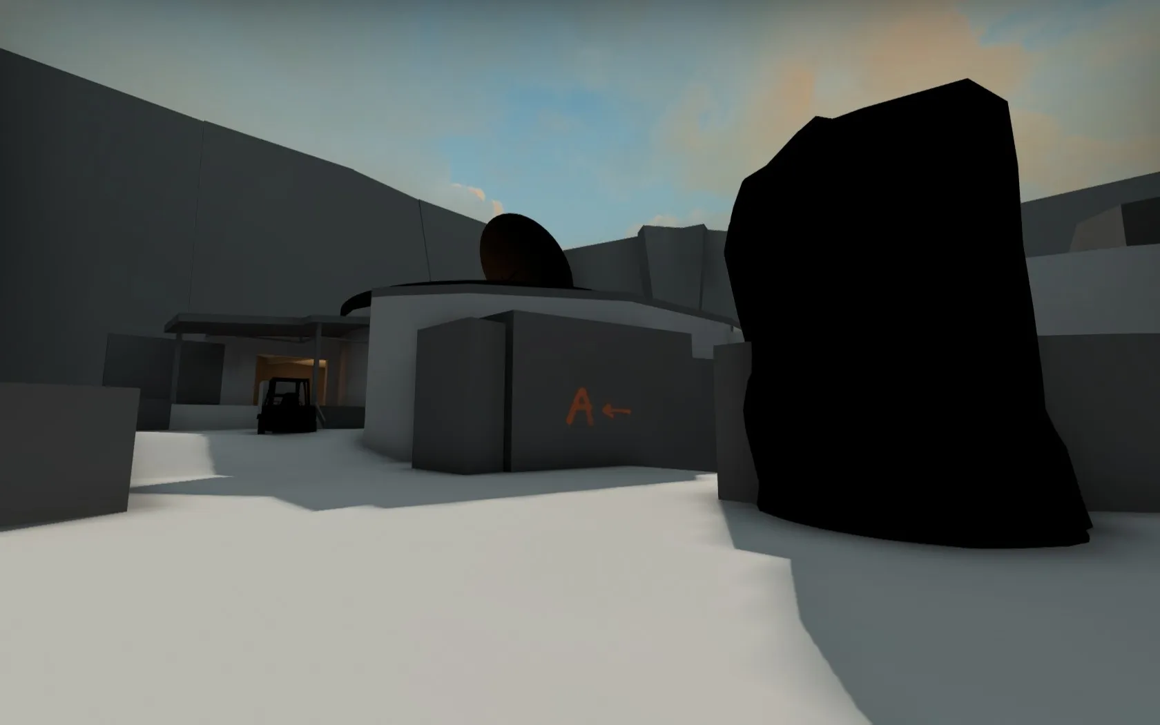
Just because I think it's pretty  (There is also a few more out of date but nice pictures in the general WIP thread, if you want to see more.)
Visual and optimization notes: I use a 3d skybox, but the entire surrounding is a mockup. Probably the mountains would be lower to let in more light and allow a better view of the skybox colors. Also keep in mind that I didn't figure out any of the visuals yet (I have different ideas, but didn't decide). So you are more than welcome to comment on what you might like or dislike about current visuals on the map! Outside I will still be going for an Indian Summer look.
Hope you all enjoyed! Please check the level out in game (once the workshop is up), there is a bunch I didn't cover here.
The workshop link is an error for me. Maybe has to be fixed.
 Quote from Radu
On 1/19/2020 at 8:47 PM, Radu said: Never doing a spiral stairways inside cylinder for a competitive game EVER AGAIN
By god, I feel you. Good luck with finishing up the rest of the level!
I just crested 1000 hours in CSGO SDK. - you'd think that's enough time to finish a map? Apparently not 

I just figured out that my SDK actually works again, so I figure I should start updating again . Three evenings worth of progress on Oakwood. (fast compile, protect your eyes!)
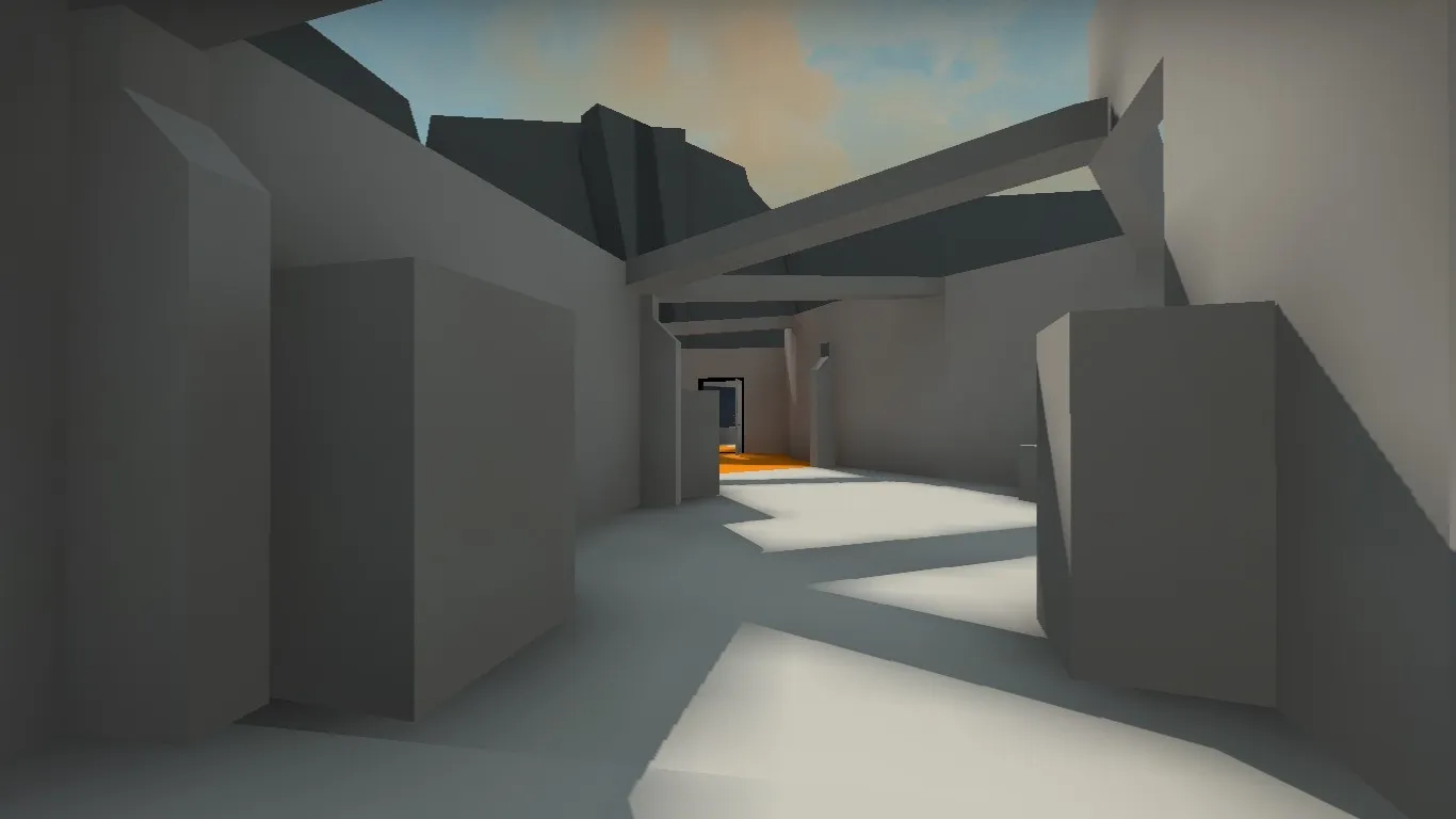
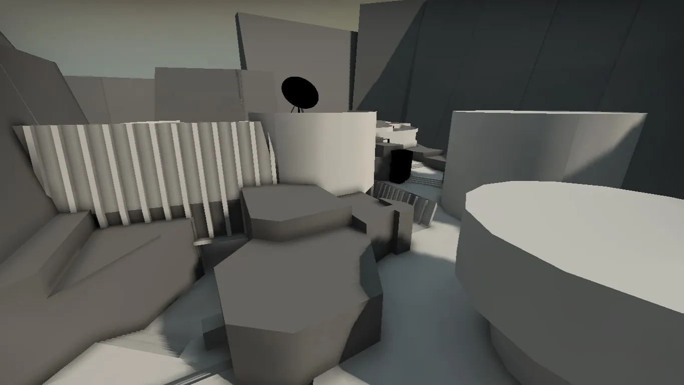
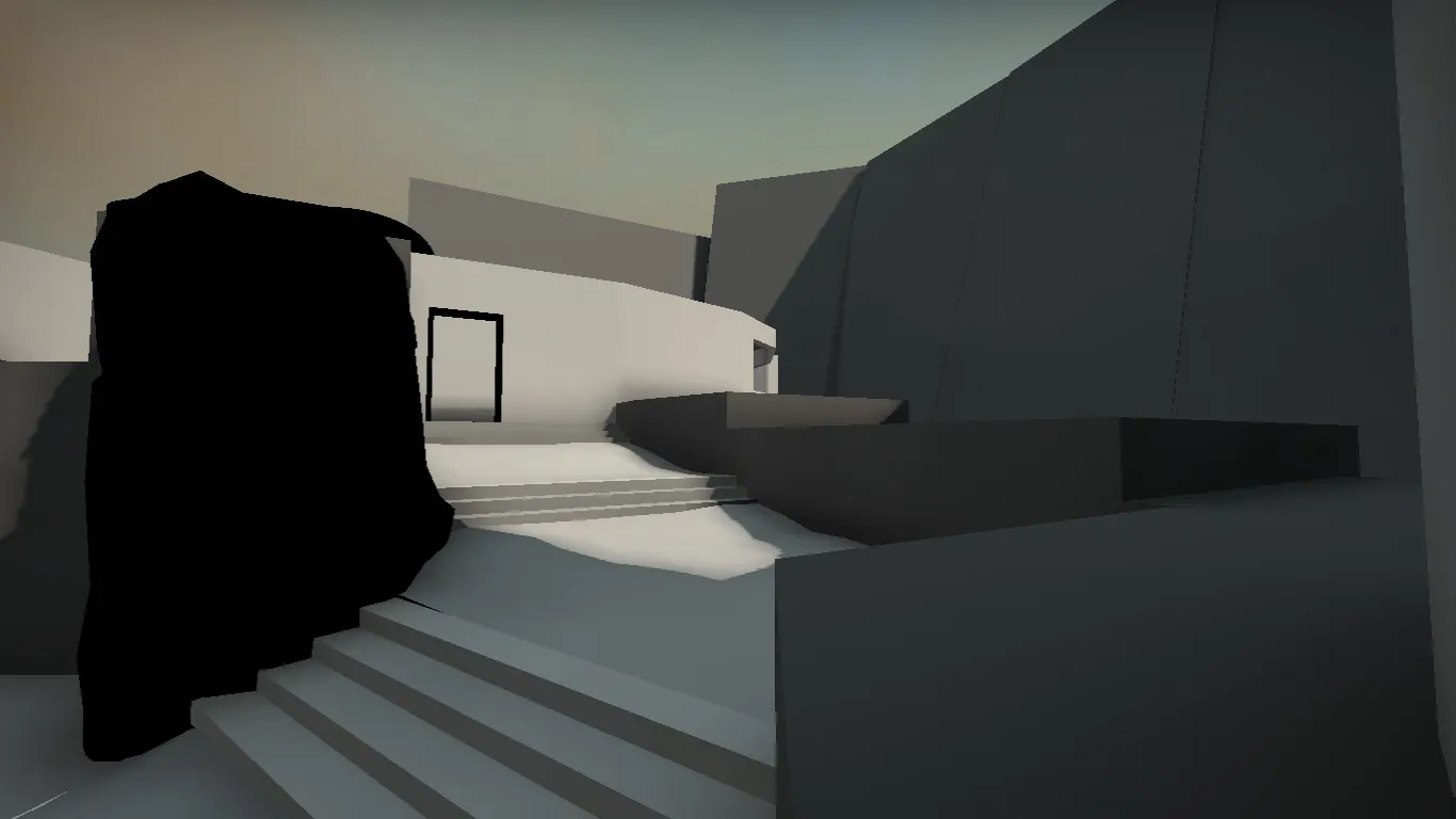
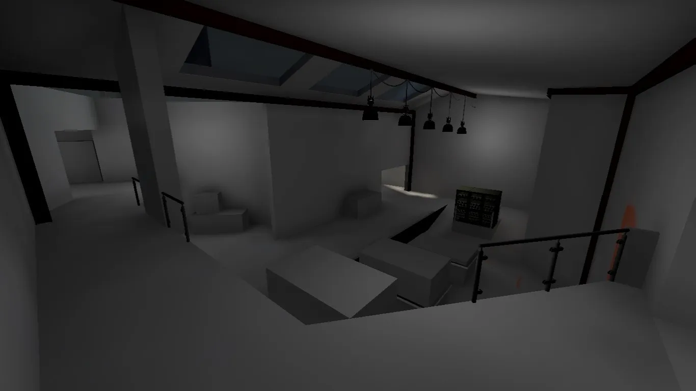
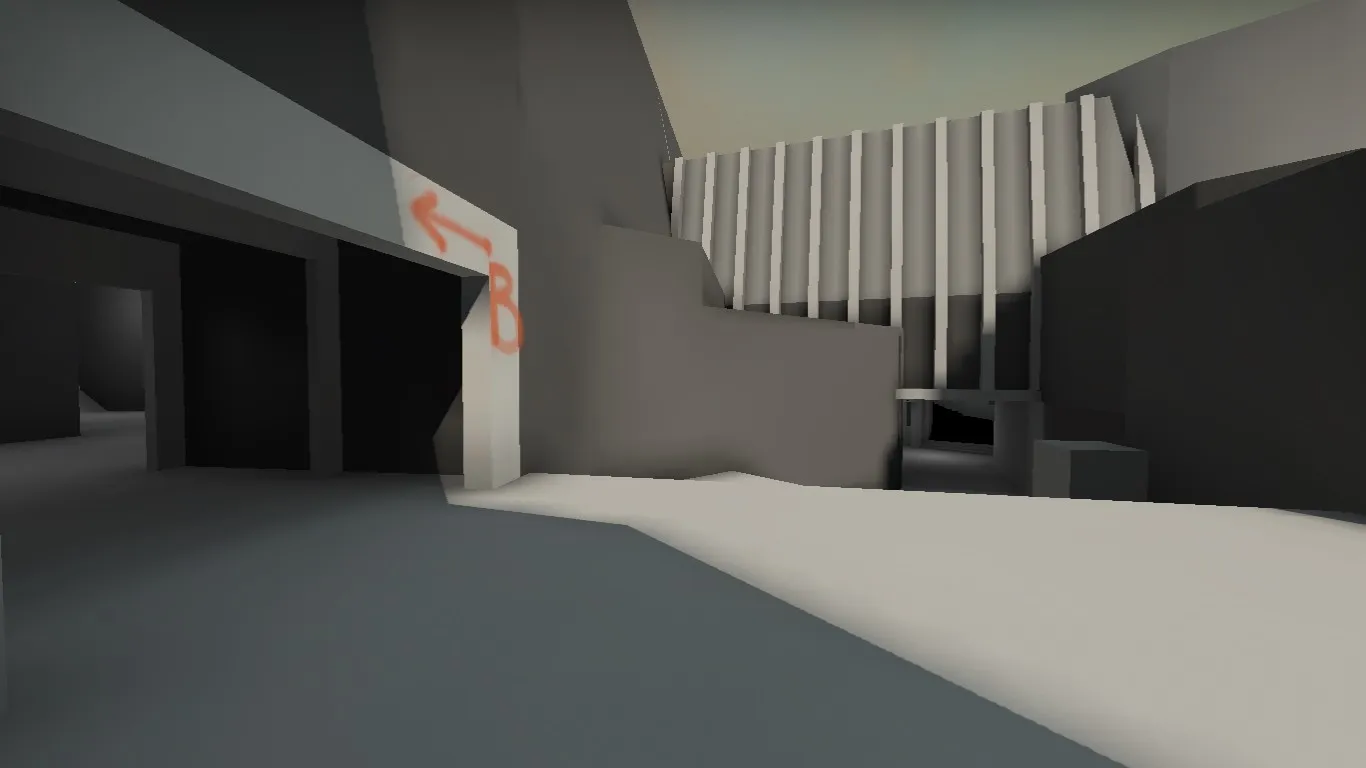
Why the hostility  ?
?
I entirely agree with Vaya, this is an unusual approach, but if it is more comfortable for the mapper, let him do what he believes is best. That applies to the layout as well. A layout doesn't have to be a "normal" clover to play well. Follow the core gameplay rules of CS and anything can be fun.
I am personally really excited about maps like these. It tells me here comes a mapper with a powerful vision of what he wants his level to be. And a map with a vision, those are the ones that will stick out and around even after the end of this contest. How about we stop shutting these people down with negativity or by forcing them into our conventions. I really want to celebrate their ideas instead.
So you do you man, I am excited for this one.
On a game play note, once you ported to Hammer, a new overview would really help to understand the layout we're looking at. It is a bit confusing right now.
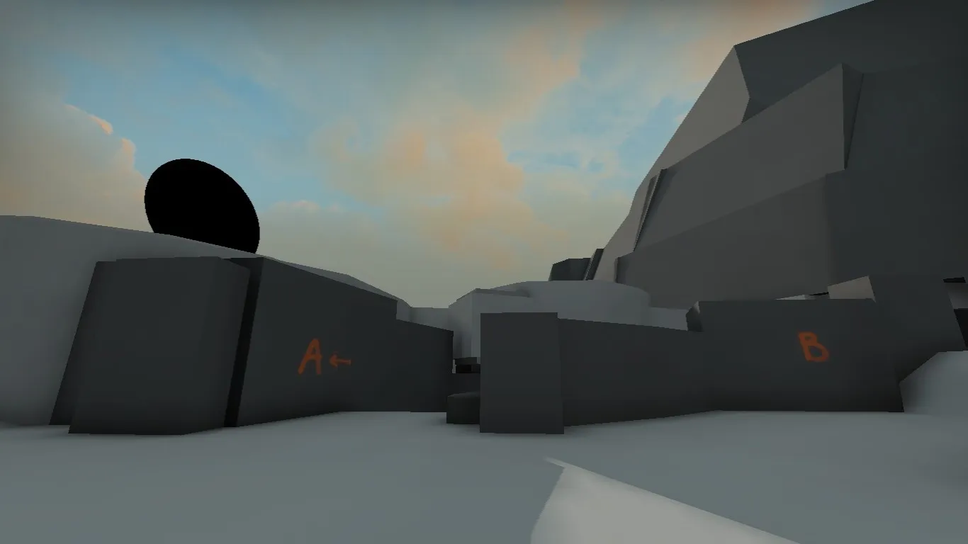
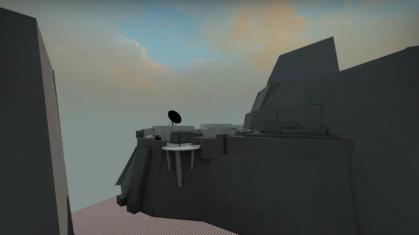
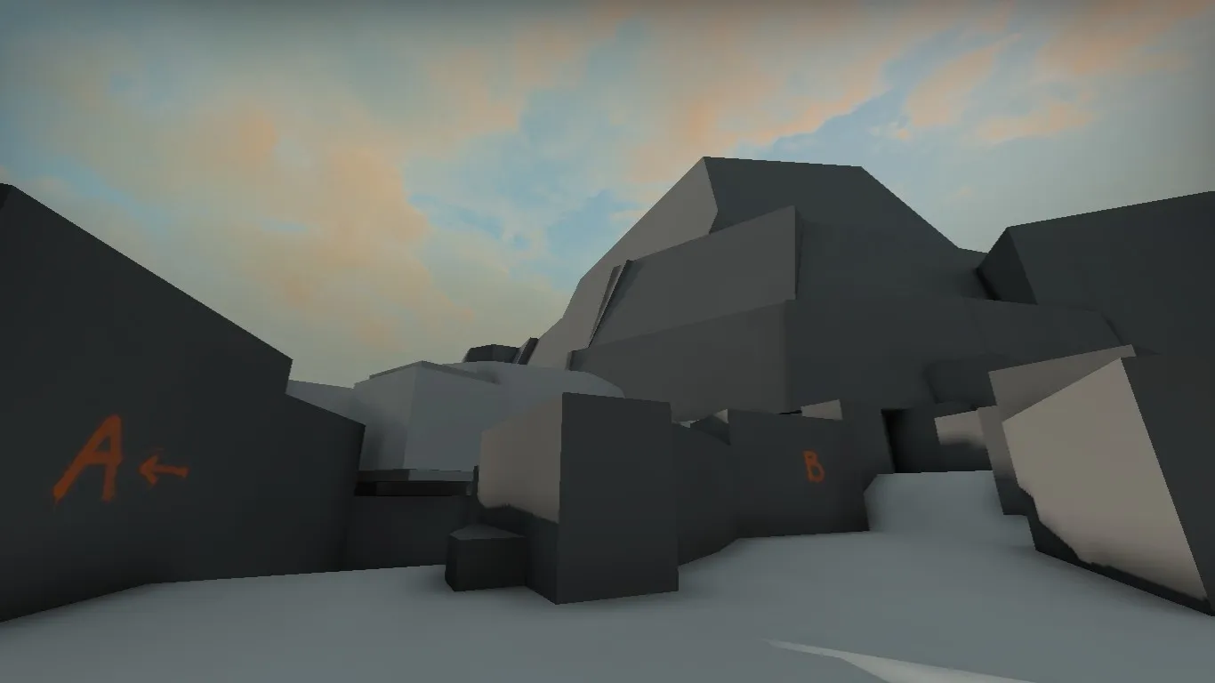
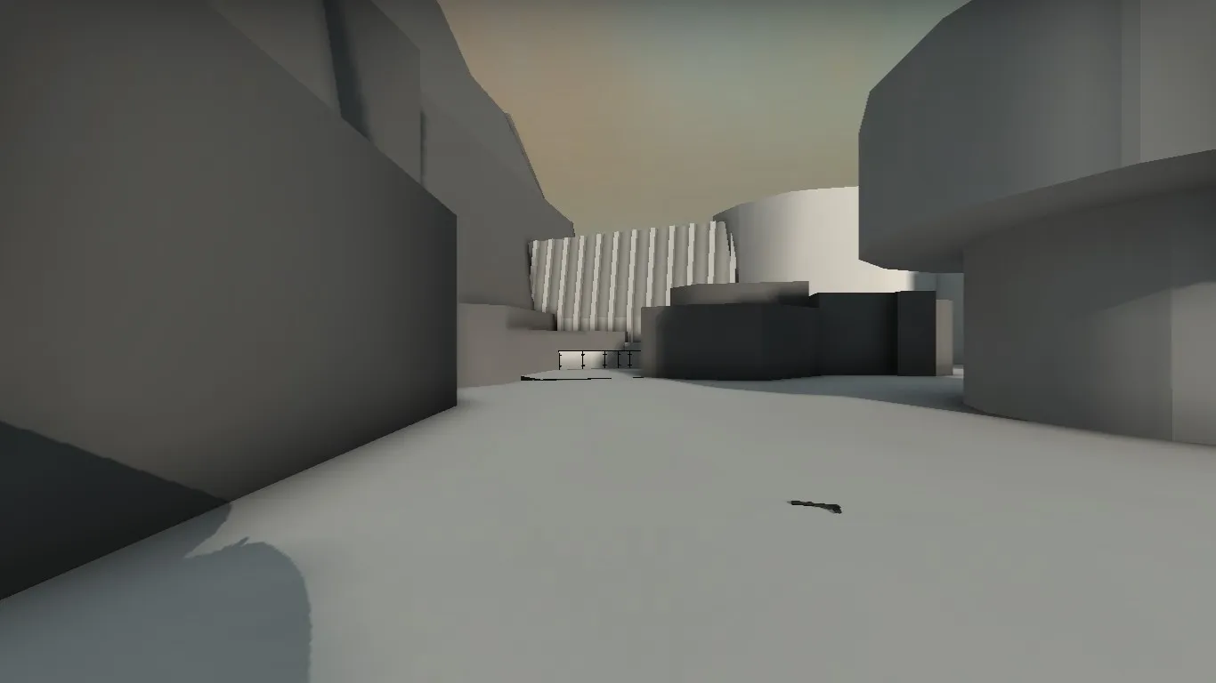
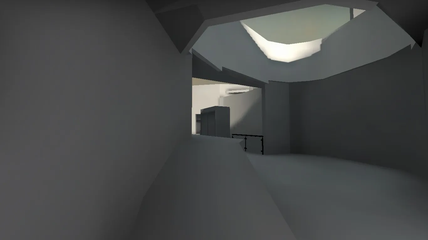
Just to let you know... work is going on (all Fast compile and lowest graphics, because my laptop is a toaster).
 Quote from Lefty
16 hours ago, Lefty said: Some Chinese lanterns for a csgo map
The content cannot be displayed because it is no longer available.
The content cannot be displayed because it is no longer available.
I ... love them . Maybe a bit low poly though? Especially on the smaller ones the edges are very noticeable! So if they are meant to go inside the playable area, I feel like they might need a few more polys .
Correct me if I am wrong, but didn't I already see this in FMPONE's custom map review? Not sure about how rule 4 applies here (whether your current blockout already counts as having "art" done seems debatable (no offense  , it looks great!).
11 hours ago, OPzy said: Thanks for the feedback tho, I probably won't make two versions right now, but maybe along the line at some point. As I said, I'll try not to let the wacky stuff get too in the way, but more add to the gameplay experience.
I really like the idea of different gravities (although to be fair my favorite shooter is one with walljumps, ledgegrabs and powerslides  ) . What I am not sold on is the button sort of stuff. I think that is a bit too outlandish for CSGO players to have to interact with their environment. But then again, I would love to see a playable version to further comment on this!