


I'd love to participate in some playtesting 
dis sexy map gif plox now!
I'd love to participate in some playtesting
dis sexy map gif plox now!
Since the talk is about BG right now, i'd like to share my thoughts about the map. Imho one of the keyfeatures a map should have, is the balance between both teams. As far as i can say, BG has it. The competitive MM matches i had on the map (~10) were more or less very balanced. Some matches ended up high for CTs and some other matches ended up high for the T side. The rest of the matches had a close end.
This leads me directly to the layout. I just can't say it's bad, if you look at the balance. Since this is what defines the balance for the biggest part. Personally, i think the layout is quite simple, as you already mentioned. And i like simple layouts.
Talking about the layout, i think the map is fairly small. To make it feel not that small, there is the 2nd floor which adds some variation to the routes. Vertical Gameplay may be not the most popular game feature about Counter Strike, but the map handles it pretty good.
But i also have to offer some criticism. Imho the key problem of the map is the readibility. There is almost an unlimited amount of pipes and railings which make it extremely hard to see the enemies. It doesn't help, that almost all containers and pipes are yellow. The most frustrating moments i had, was when i got killed by someone i din't even see. If you look at the most popular maps right now, there's Dust2, Inferno and Cache. All of these maps have a very good readibility which makes them really pleasant to play on.
I don't want to be mean, but i think that the map needed some criticism.
When i'm playing BG in Casual or Deathmatch, it does make a lot of fun. Because of the 2nd floor, you can be a sneaky beaky like ninja assassin 
BTW: How long did you both work on the map? It looked like extremely time consuming when i had a "detail walk" around the map. 
what the actual fuck, this game was pure madness
Idk what i'm doing wrong. Connecting with this:
connect 195.4.107.94:27015; password binnen
doesn't work for me 
€: now it worked
€2: Alright, now my personal feedback:
-the line of sight from CT spawn to the windows (catwalk?) should be nerfed. maybe some kind of walls in the top of the arch? feels op for CT snipers. also some breakable windows at the catwalk would be nice.
-round stairs to B are too small. especially for the ones with a low dpi is it a pain. either should it be widened or changed to "normal" stairs imho.
-clipping issues on A roof, also clips on stairs would be nice.
-there are lots of cars& buses in the mid, maybe something else than cars would be nice, but we'll see.
-you can surf on A roof. (actually really fun  made a video of it)
-it's not possible to walk next to the window on top of a. i kinda missed that. this would add some more vertical gameplay. but maybe it was op, idk. it was my first playtest on this map. (suggestion: make the glass breakable, but add some metal to prevent jumping down.)
2 things you already know:
-cars are floating
-buses are too high. (you can see under them from CT spawn.)
anyways, the map was very fun to play and has a good layout so far. good job that you're doing guys.
Definitely nice looking. Altough i'm not really a fan of cs maps.
What about cs_stadium or cs_dome as mapname?
Awesone, thank you for the textures! They'll will be heavily used in my WIP maps
Very nice! Keep your motivation BTW: I need those red dev textures, i can't find them in Hammer They look so smooth.
Kind of a minor issue, but i can't unsee it The angle of the sun(Skybox) does not fit to the shadows. It looks a bit unrealistic with the wings of the plane. But i can understand you. Such GREAT Skyboxes by Mr.Chop but always with a low sun. Anyways: Optics are really good, but i haven't tested it yet.
I just began creating the first decoration building on my map. Reference for these are old german half-timbered houses (I hope this is the correct englisch word for them ) like these:
[Blocked Image: http://abload.de/img/2014-06-23_00026qzj1t.jpg]
German Old Towns with those buildings look really idyllic and that's the target for the map. I hope i'll be able to show more of them soon. There's a lot to do.
Screenshot-Time
[Blocked Image: http://abload.de/img/overview_logo90s8v.png]
[Blocked Image: http://abload.de/thumb/2014-06-23_00002p2sy5.jpg] [Blocked Image: http://abload.de/thumb/2014-06-23_00005vzscm.jpg] [Blocked Image: http://abload.de/thumb/2014-06-23_00008fjs1y.jpg] [Blocked Image: http://abload.de/thumb/2014-06-23_00010l2sli.jpg] [Blocked Image: http://abload.de/thumb/2014-06-23_000121sso8.jpg]
[Blocked Image: http://abload.de/thumb/2014-06-23_0001332sbc.jpg] [Blocked Image: http://abload.de/thumb/2014-06-23_00017pbsui.jpg] [Blocked Image: http://abload.de/thumb/2014-06-23_00018p5sev.jpg] [Blocked Image: http://abload.de/thumb/2014-06-23_00020c5scf.jpg] [Blocked Image: http://abload.de/thumb/2014-06-23_00022aus3e.jpg]
Petronas Towers - Kuala Lumpur

Due to some /r/ feedback i decided to make a short video about the timings to get to each spot. But i'm not yet happy with the timings to get to the mid. There will be some changes as soon as i know that to do.
I did again some changes to de_township. Have a look at them in the newest video:
Changelog v4:
-Moved wall at T-Spawn
-Added wall in front of A long
-Enlarged cover at A long
-Size of stairs at A spot decreased
-Barrel B plateau removed
-Size of B entrance decreased
-Underground/Trainstation made shorter
-Bus at mid removed - Gangway added
-Tree&Bushes in front of Café added
-Fence in front of Café made smaller
-Desks+chairs at Café moved - More space to walk
-Café entrance with window added
-Added Stairs from Café to appartments
-Changed angle of sunlight
If i shall stop doing new posts for new updates, just tell me.
This looks very good, can't wait to see the finished version in the workshop.
I updated a few things on de_township. Have a look at it in this short video:
Changelog:
-Truck near CT-Spawn turned 180°
-Added cover on B
-Added placeholder textures to buildings
-Added railings at B
-Added player clip at tunnel entrance in underpass
-Added ladder from tunnel to mid
-Added way from T-Spawn/B to mid
-Added Café/way from mid to A long
More things to come
this looks really interesting
So, the map is not called de_township anymore, since the art style changed by 180°. It's now called de_sirius and uses modern architecture as references.
I also started to create a devblog about the map, which can be found here: http://exodus-devblog.blogspot.de/
OLD post:
Hello folks,
i'm new to Mapcore and want to thank you in advance for any tips and suggestions you may give me.
Currently i'm working working on de_township. This map is designed for competitive gameplay in CS:GO. It's still very Pre-Alpha but i wanted to show the current state to experienced Mappers to get some thoughts and suggestions.
So far i'm mostly happy with the rough layout, except for the mid. Imho it's too open and too easy for the CT side to frag rushing T's. I don't have a solution for this issue yet. I really do hope, that you have some advice and ideas for that.
To show the map off, i made 2 gameplay videos and a editor-screenshot to show the rough layout. One video is a bit older (v1) and the other one (v2) is nearly the current state.
External Content www.youtube.comContent embedded from external sources will not be displayed without your consent.Through the activation of external content, you agree that personal data may be transferred to third party platforms. We have provided more information on this in our privacy policy.
External Content www.youtube.comContent embedded from external sources will not be displayed without your consent.Through the activation of external content, you agree that personal data may be transferred to third party platforms. We have provided more information on this in our privacy policy.
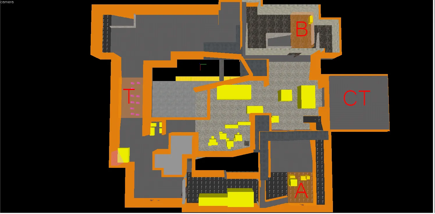
If there's any interest in playtest the map, just comment in this Thread. I would appreciate that.
Before i'm going to make the map good-looking i want the layout to be good.
