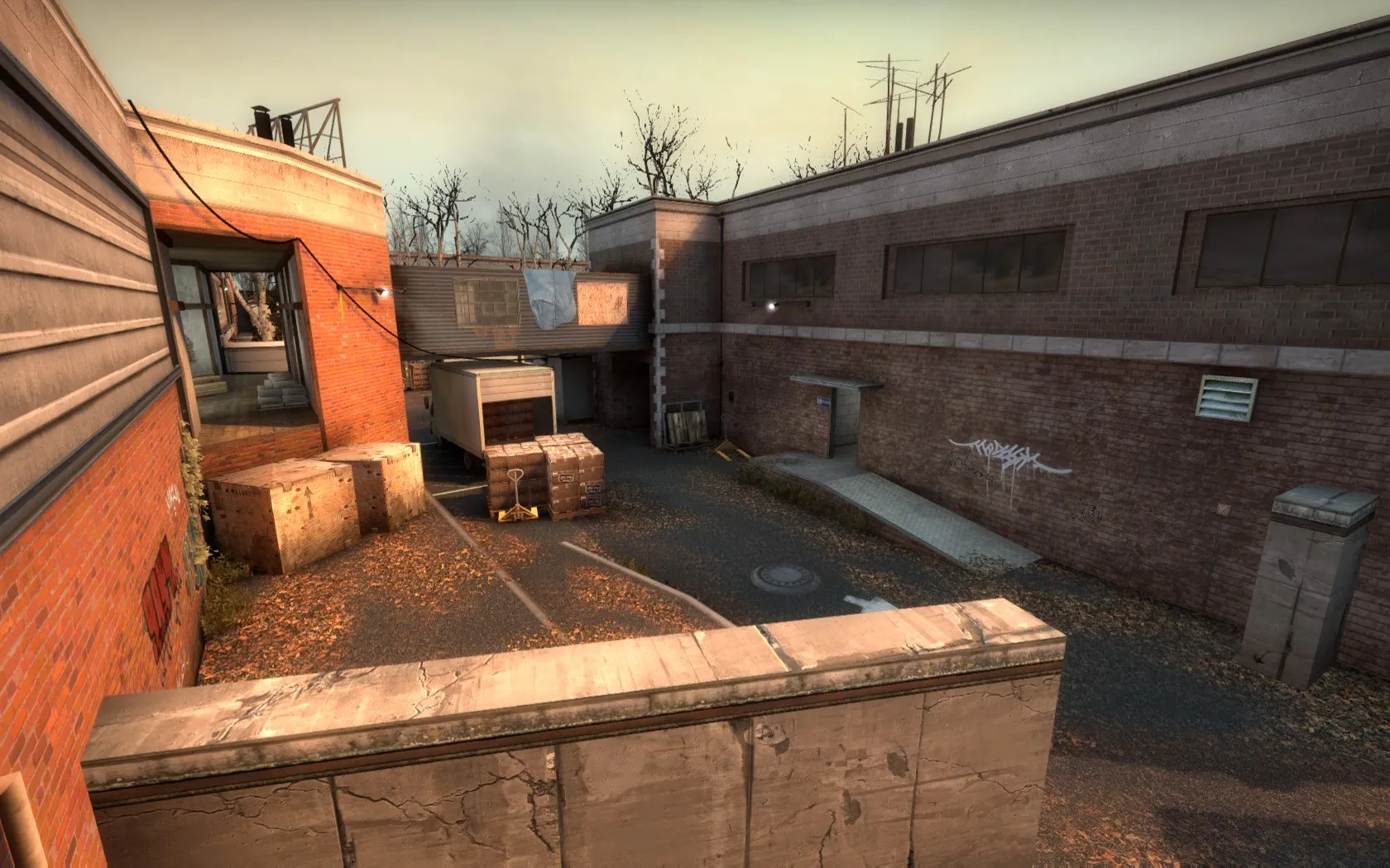
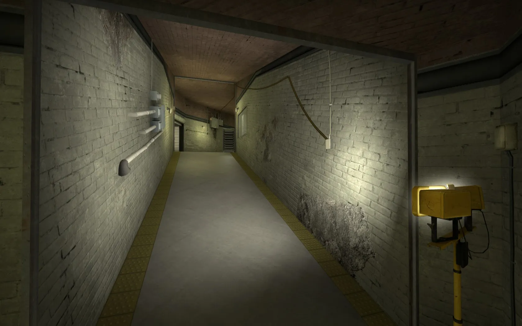
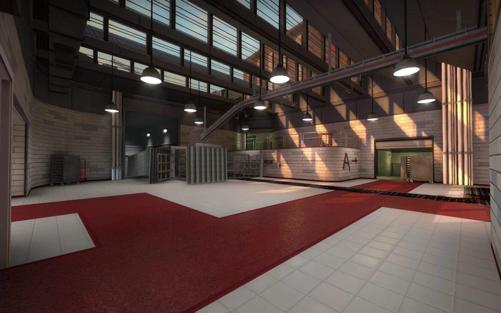
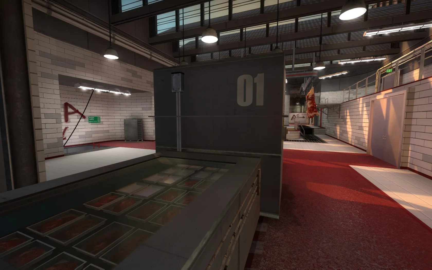
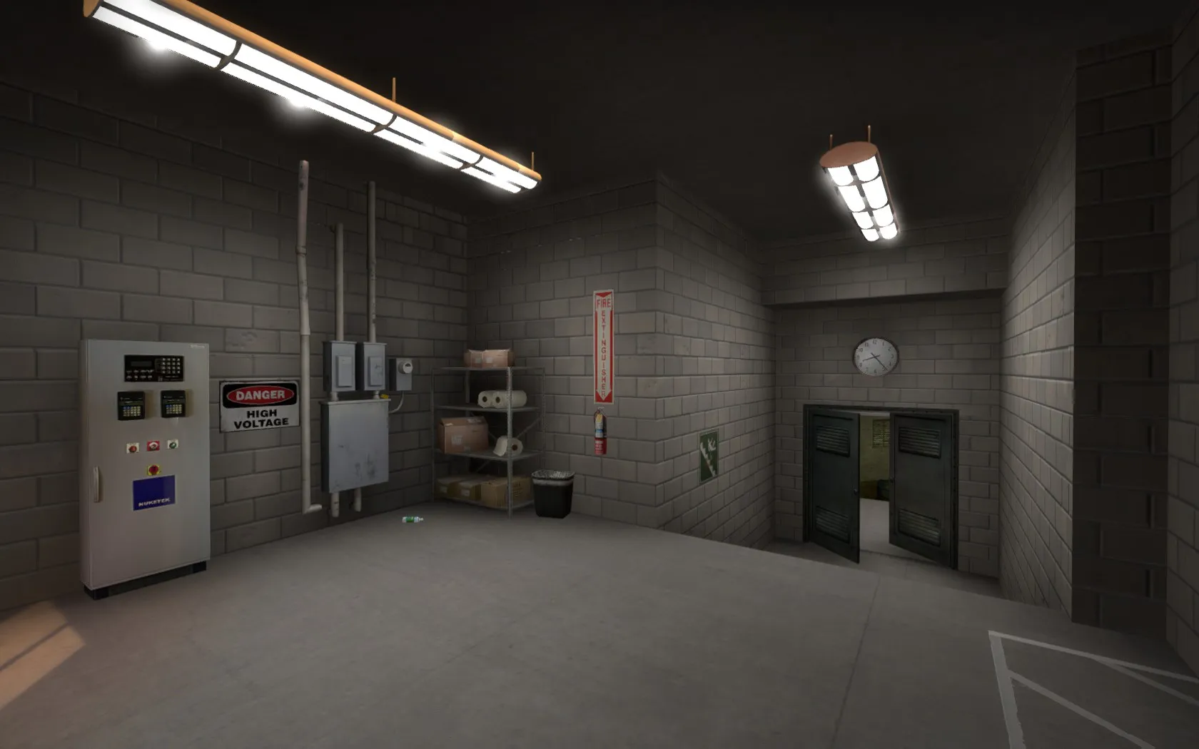
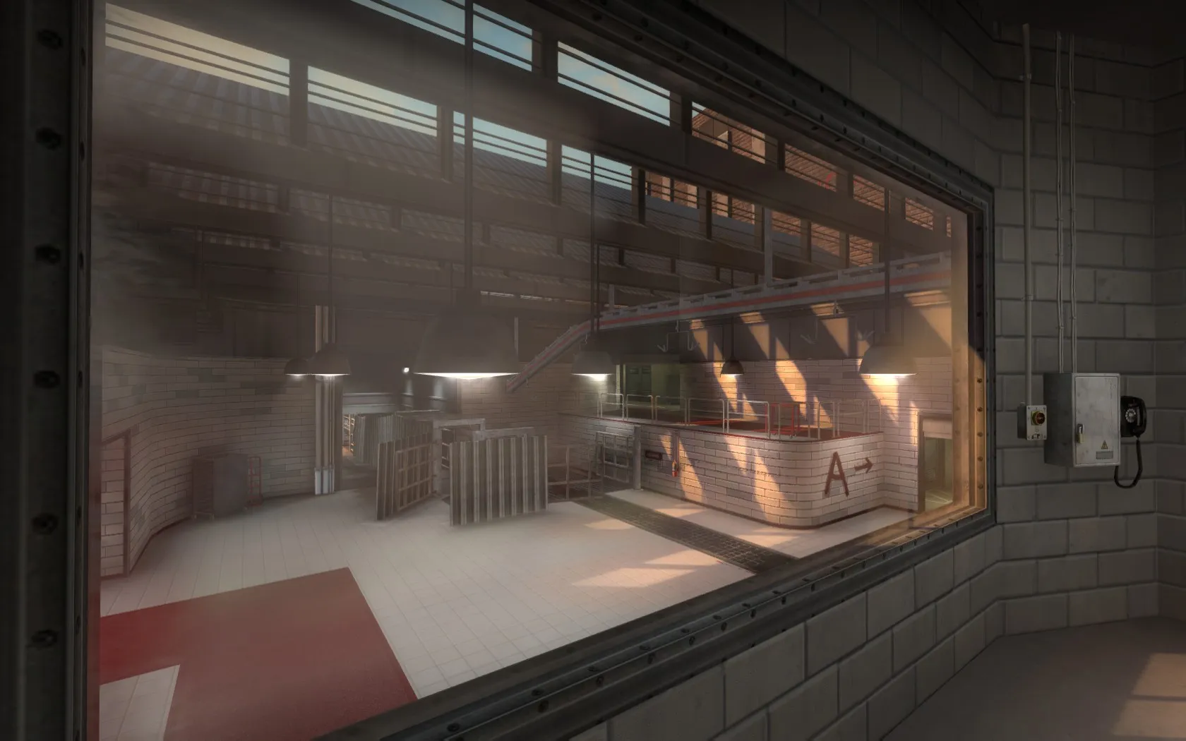
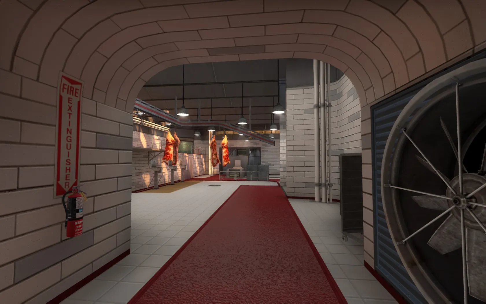
Quote from nicoreda
It was in the first topic page, using doors to make walls

Those have been removed! I now use a custom texture for those walls
Quote from nicoredaIt was in the first topic page, using doors to make walls
Those have been removed! I now use a custom texture for those walls
Quote from nicoredaHey, I don't really like textures you used, but in global it look really good !
What do you mean exactly? Is it the colour? Resolution? Trims or tiles? Which textures? And where?
Thanks to the CSGO subreddit I got a lot of playtesting done and got valuable data that I could view thanks to demo.ehvag.de: http://demo.ehvag.de/#56755c2a6e8df…e8dfd315732a5d0
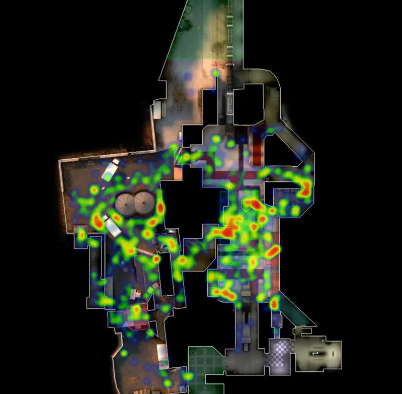
Which means plenty of gameplay changes were made, such as adding double doors, masking some sightlines, and adding more navigational and callout points.


If you are looking to play: It'll be on a mapcore playtest this Sunday January 3rd
Or you can connect to 85.236.109.80:27215 to check it out in-game.
Players can get up here, which is a bit annoying to check as it seems more like a pixelboost than a regular area to check.
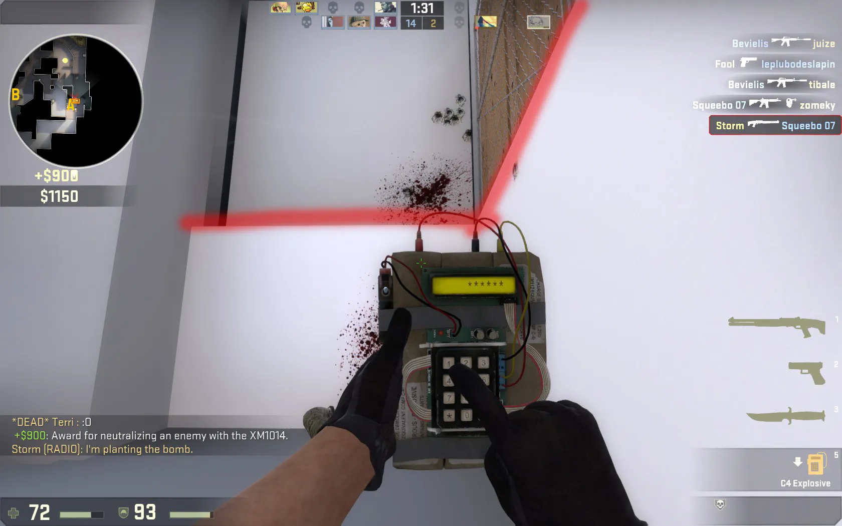
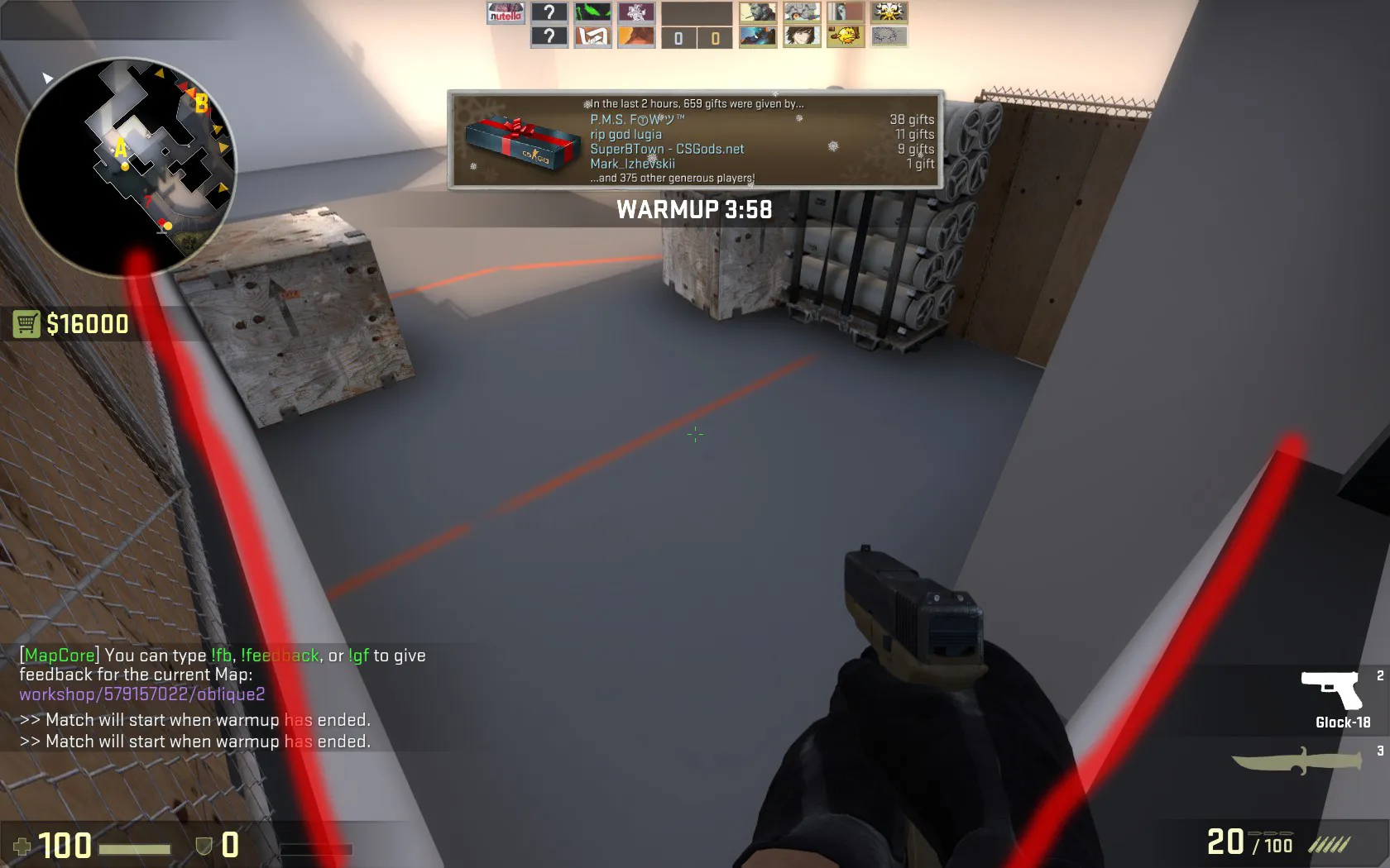
I really liked mid. Height variation, few spots to check, few spots to hide, and ambush areas from the side. Nice!
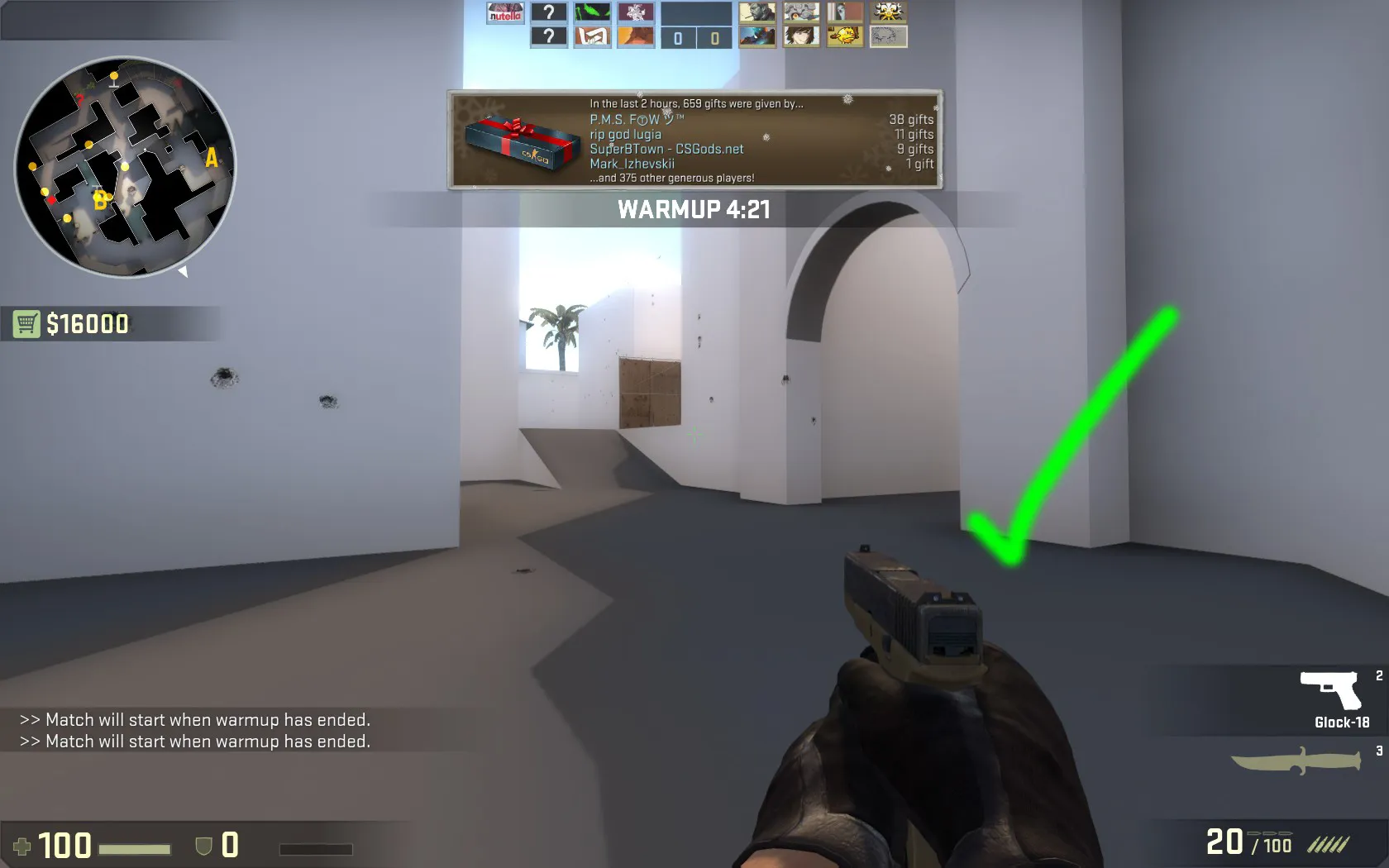
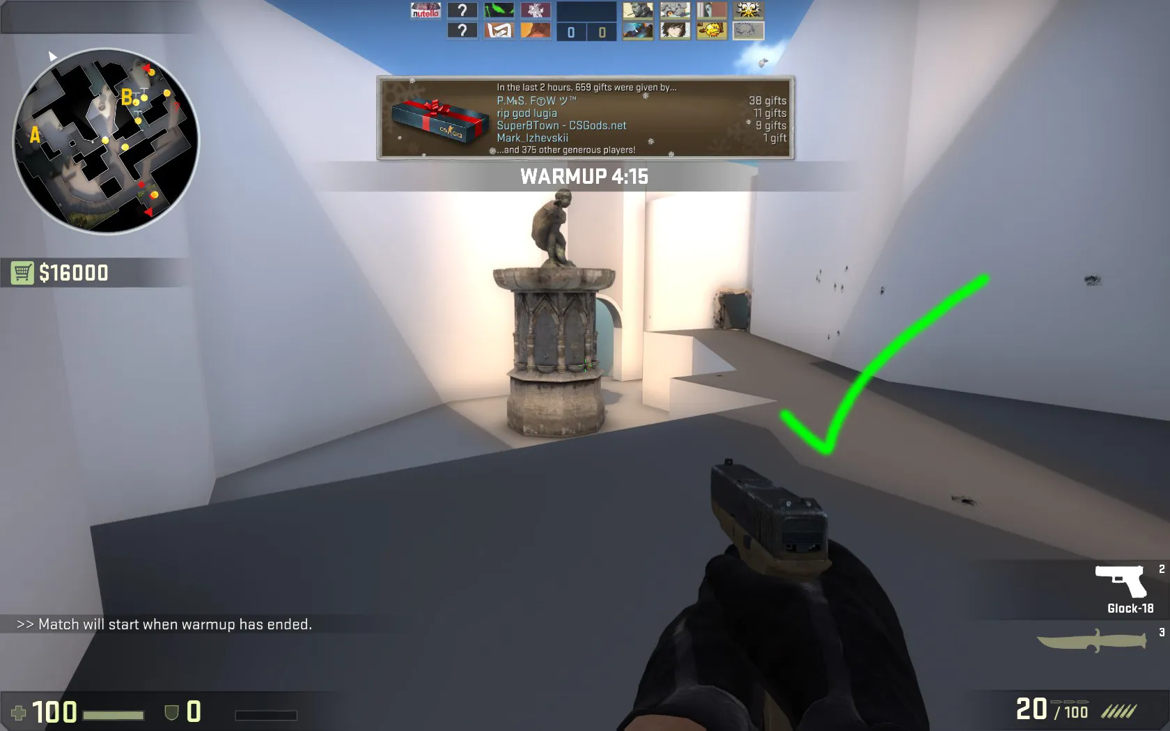
Thanks! That is very useful and constructive feedback!
You are right that it is very visual focused at the moment and can use more design visions and explanations. Heatmaps, concept whiteboxes, etc. I'll work on this!
And good catch on the enumeration! I wrote it down chronologically, but you're right that it's better to put up front what actually sounds the best.
Thanks again!
I heard this was a good place to get hardcore critque.
The portfolio is at: http://www.rystorm.com/
I've heard of people who really liked this portfolio, and some who disliked it. But it usually stays at an opinion, without feedback. I don't think I've ever seen a portfolio that please everyone. With that in mind: Could you give me constructive feedback, and tell me what your current job is? That way I can angle the portfolio towards those kinds of people that will probably look at it!
Thanks!
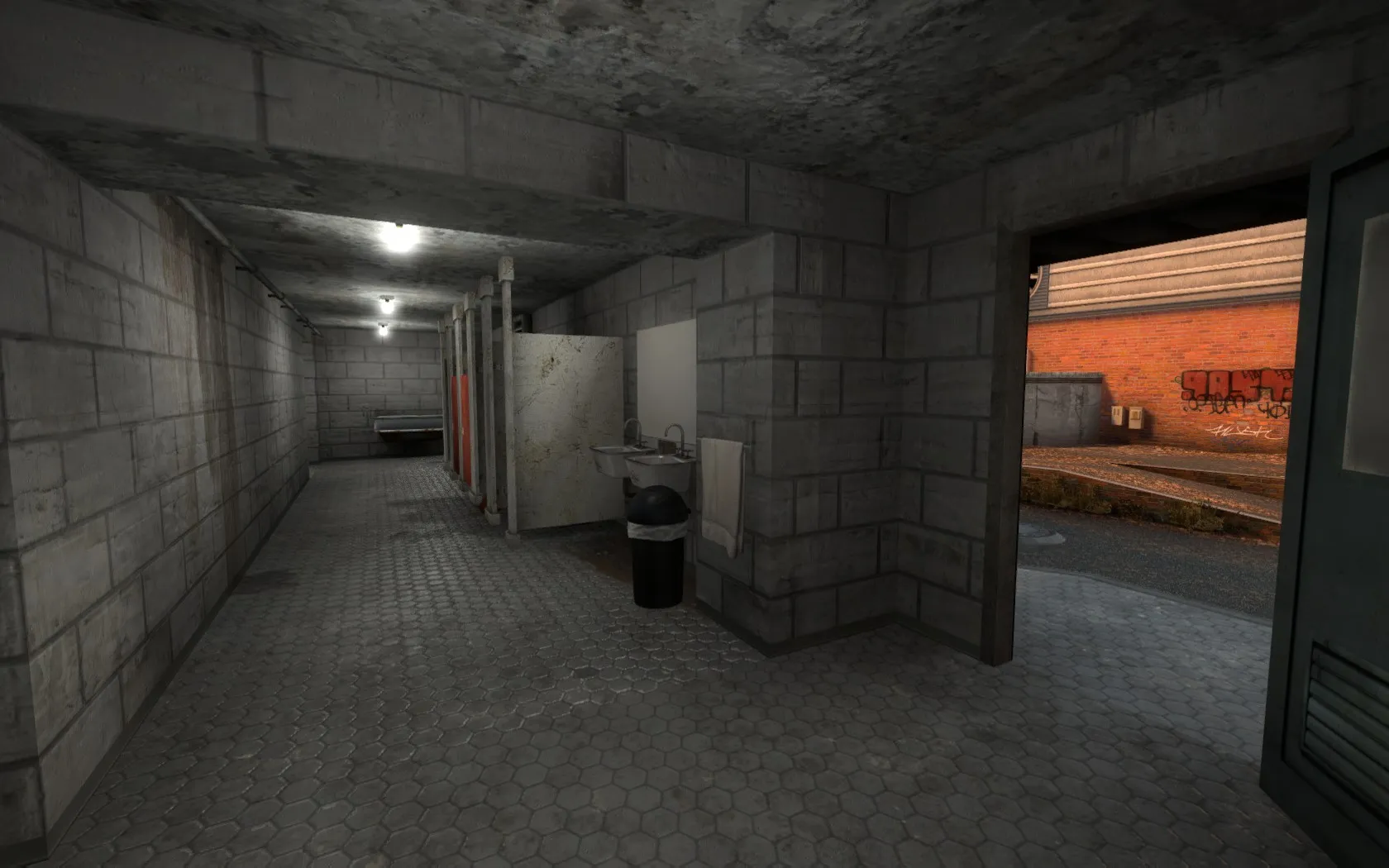
I've just made B site a bit easier to defend. The toilets are a bit longer now, and the stairs are replaced with a dropdown. Also, A site no longer has a dropdown from mid
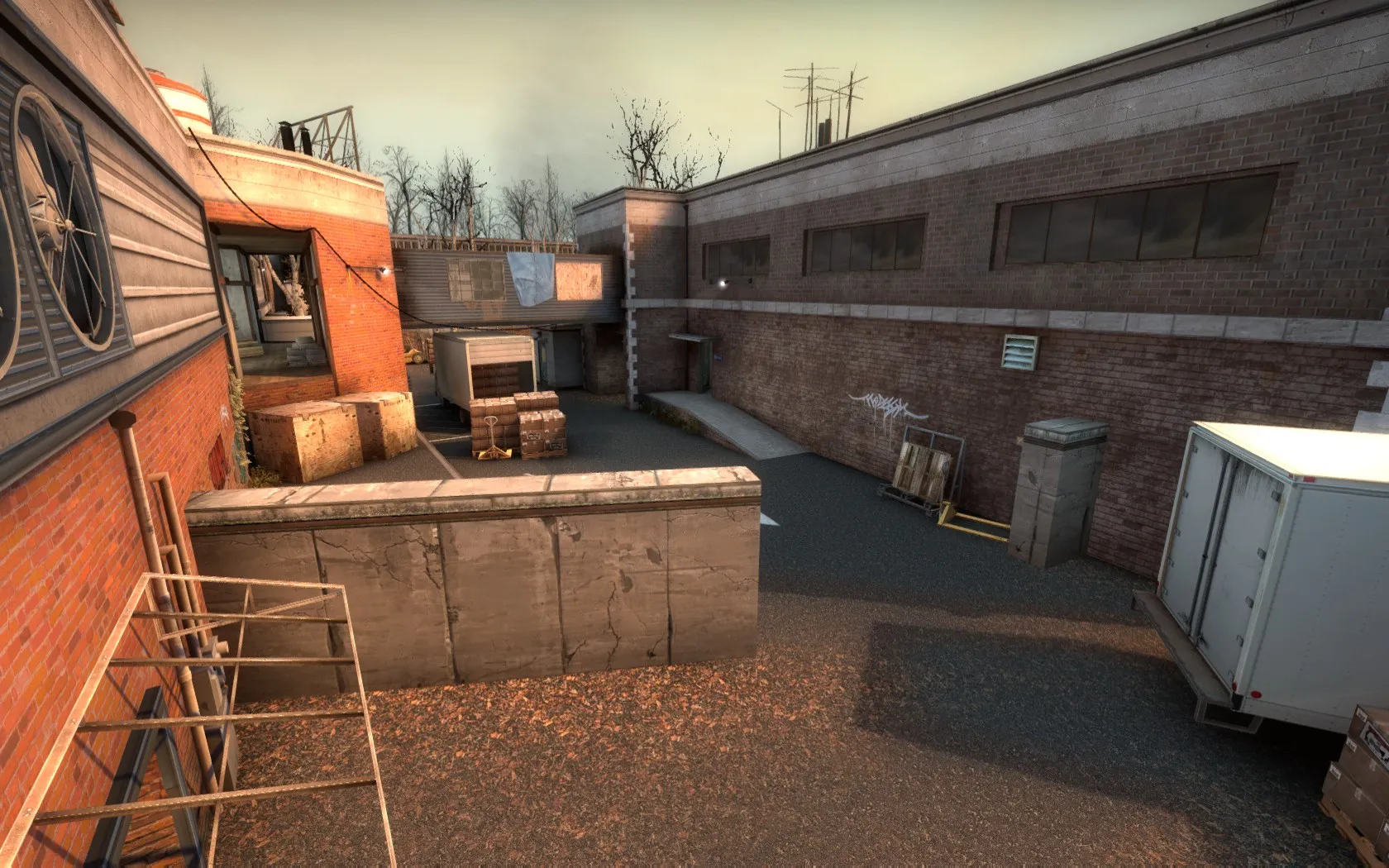
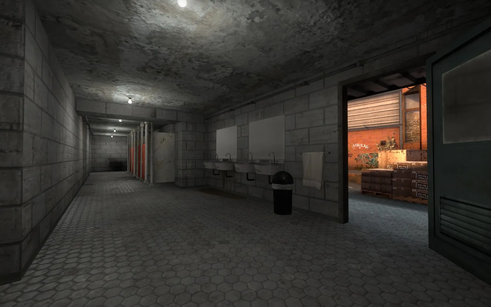
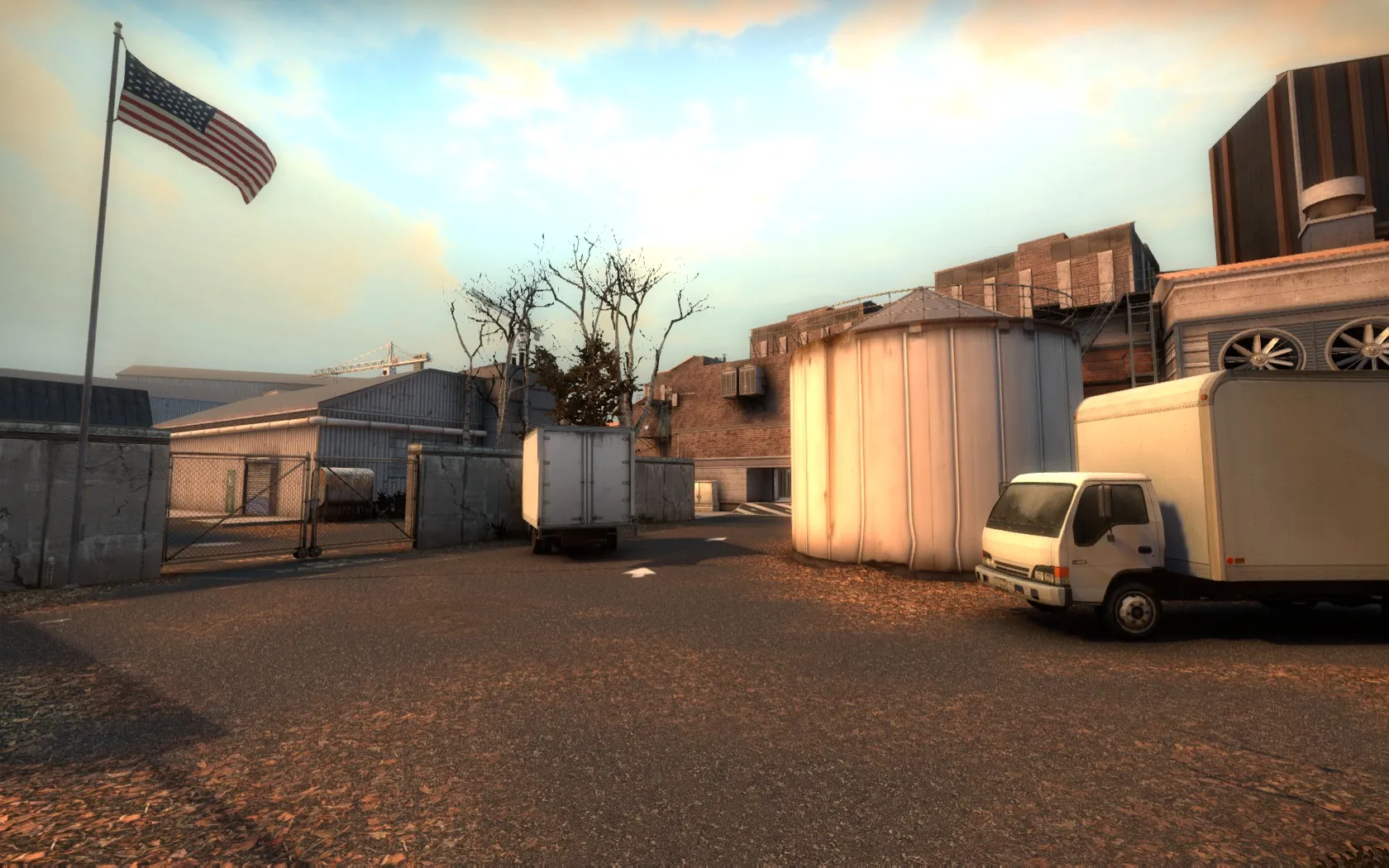
I really like the skybox texture. It's pretty.


The map is really bright sometimes. Maybe a tonemap could help this?

Weirdly enough, the minimap was confusing to me. I think it's due to everything being straight, with 90 degree angles. If some parts had 45 degree walls, I think it would be easier to look at and navigate through.
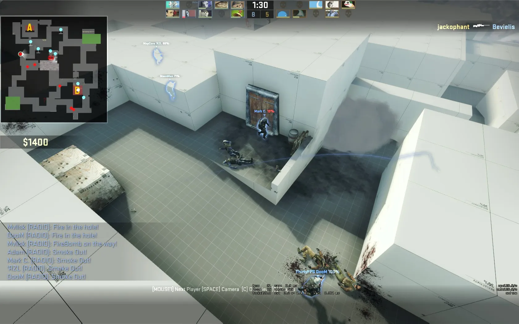
I'm not really sure I like the bloodbaths happening here. CTs cant arrive early, otherwise it's too easy to defend, T's can't arrive too early otherwise they can take the bombsite, so right now they both arrive at the same time which makes for a bit of a bloodbath-crazy-shooting thing. Maybe some hints in the map on where to throw grenades, or props and colours that guide players in different directions could help spice this up with some more strategy?
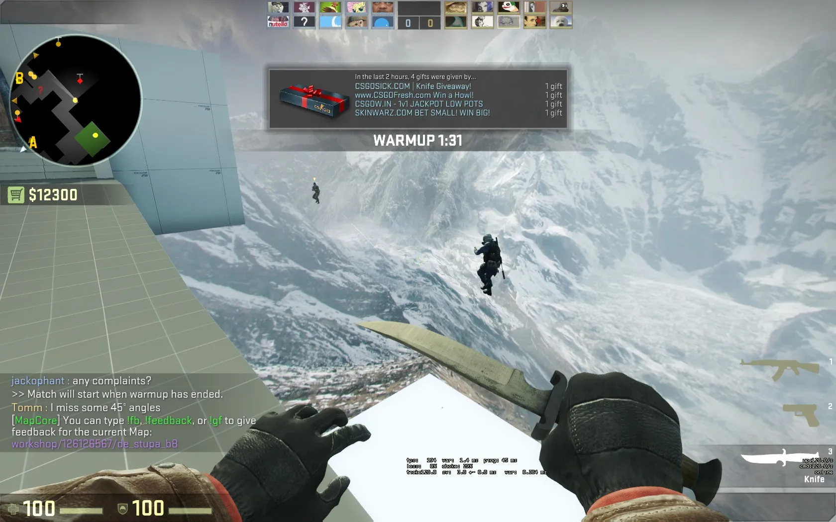

You can walk outside of the map!
I liked this jumpy thing, though jumping from box to box is a lot easier than making it to the window. I failed that jump a couple of times, even when using a knife and crouch jumping, which was a bit annoying.
That's about all. I think there were also many things mentioned during the playtest?
Remember, this is just my opinion! Use what you want and ignore what you want, it's your map!
Did you solve your problems with the fog that is generated differently for each player?
Nope! I've tried a bunch of things but nothing seems to work.
To all those who had FPS issues in the last playtest: This should be fixed now!
Please let me know if you still have any problems, and if so, at which location.
Here's a bonus webm because I can't post any visual improvements apart from my FPS counter:
I hope this doesn't break anything. Tell me if it does!
Thank you all very much for your feedback!
The stairs are now back, and an elevator texture was added.
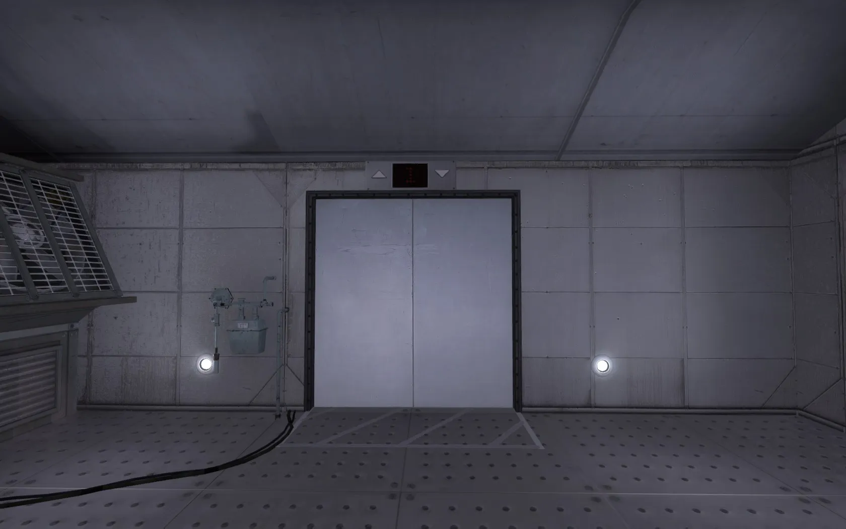
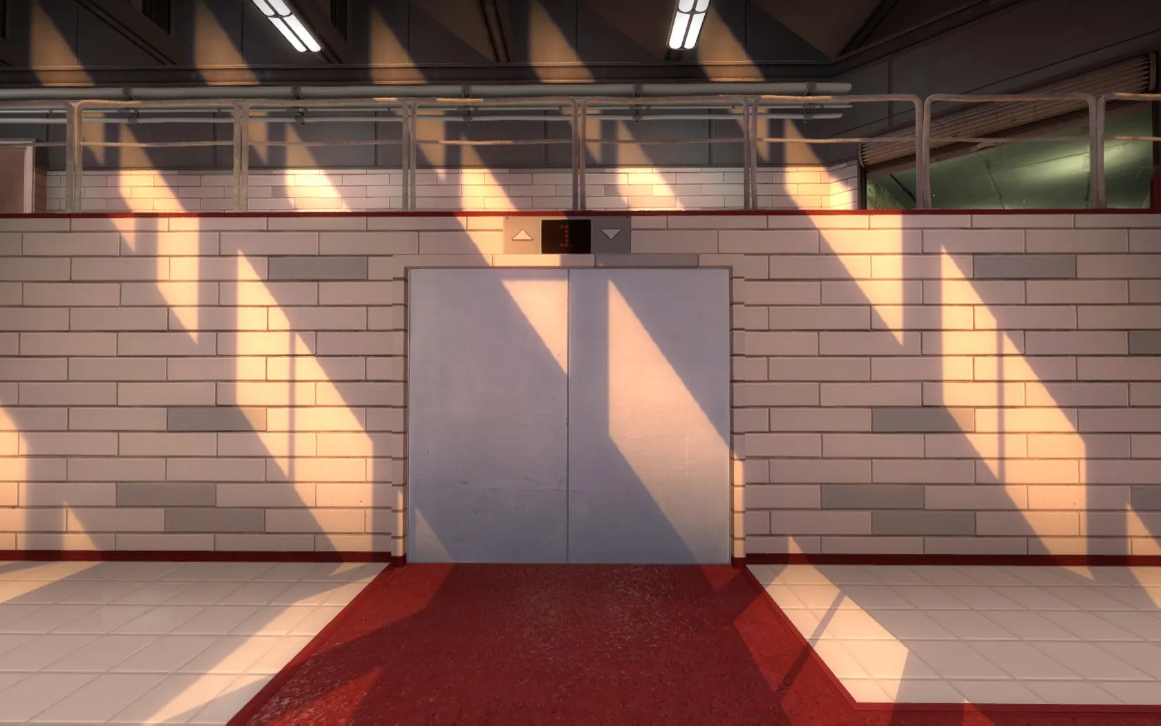
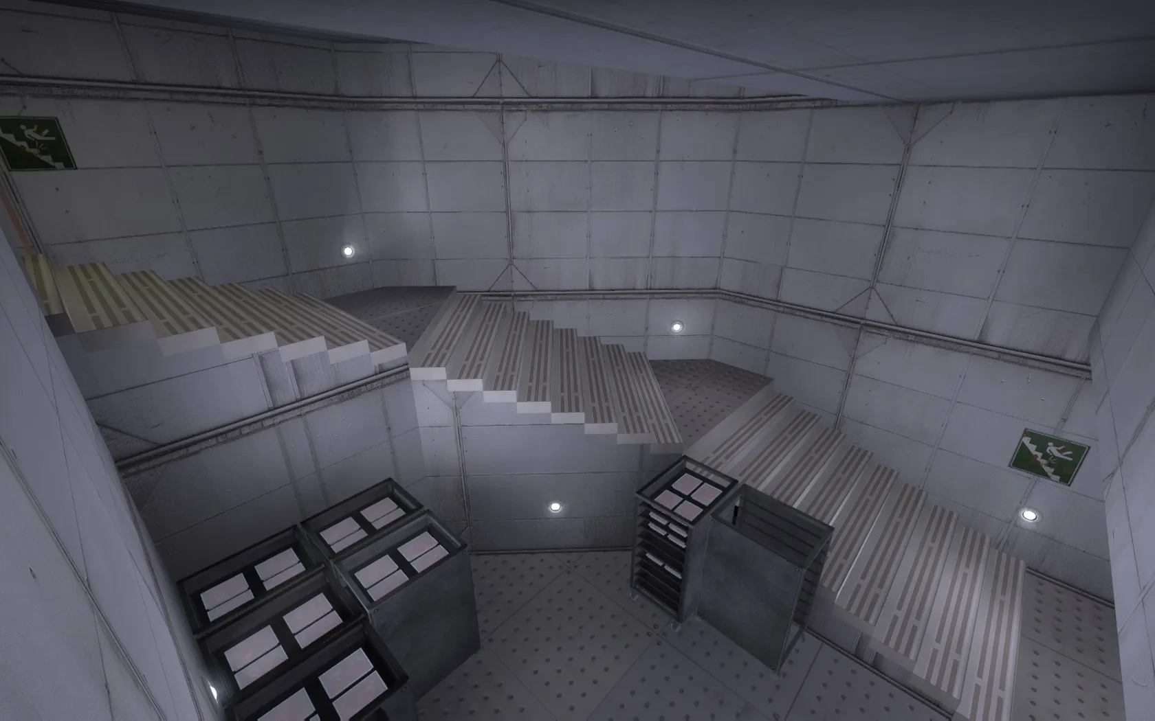
On top of that, the optimization has been improved incredibly. My laptop has moved from a minimal 120 FPS in the last version to a minimal 170 FPS in the latest version of this map!
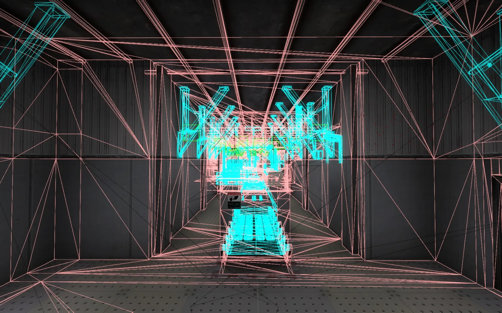
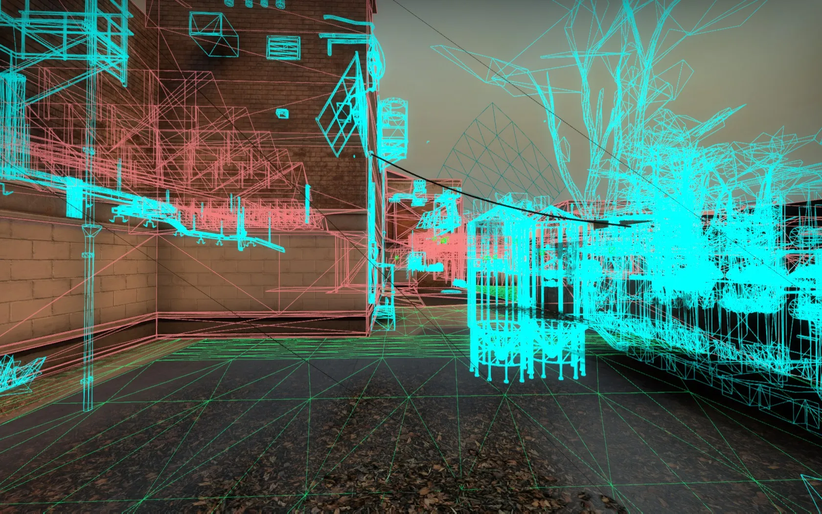
I'll put it on the workshop as soon as I've had it checked by some other machines for custom content.
 Quote from Pampers
why not just go with stairs? what purpose does that ramp serve?
Because there are carts throughout the level. If there are stairs there, then how are the carts going down to the freezer?
Maybe I could find a different solution to that instead, somehow!
 Quote from jakuza
If you want a ramp to look correct, you have to justify it being there. In this case, it's so steep that it becomes implausible. If you're set on using a ramp, look up how and why ramps are used instead of stairs.
That slope certainly looks cool, but abstract shapes don't cut it for believable levels nowadays.
I've tried the realistic ramps, but then the amount of space becomes huge, like this:
[Blocked Image: http://i.imgur.com/wJ69bbq.jpg]
[Blocked Image: http://i.imgur.com/y5fxXd8.jpg]
[Blocked Image: http://i.imgur.com/Tuod3rj.jpg]
Which works for a realistic setting, but gameplay wise might be a bit too spacious. But if the unrealistic ramp is too noticeable, I might have to stick with this realistic ramp that isn't very gameplay friendly.
 Quote from tomm
not being sarcastic, I felt like the map was rather clean overall.. which could be a good or bad thing, some people prefer cleanliness in maps.
You know, it could always be worse... 
(Slight gore warning)
[Blocked Image: http://i.imgur.com/gGjZdO8.jpg]Aftermath of a horses' nosebleed!
So I made a load of screenshots with feedback, but honestly the entire feedback can be cut down to something very simple:
Watch and listen to all 24 of these video tutorials: http://www.tophattwaffle.com/tutorials/
I'm not saying they are godly and you need to apply everything they do, but it would be good for you to learn a lot more about how Hammer, Source, and CSGO work before working further on this map. Many of your current decisions will have huge impacts later on. So watch all those tutorials, then go back to your map, and apply that knowledge. That would be my feedback.
Incoming feedback, lots of images in this cache!
[Blocked Image: http://i.imgur.com/VsPuoBa.jpg]
This looks a bit weird. Either clip it off or move it a bit higher
[Blocked Image: http://i.imgur.com/oRpyc6W.jpg]
I love the look of the skybox. It's super simple and good looking
[Blocked Image: http://i.imgur.com/gIYWpSG.jpg]
The radar is very clean and easy to read!
[Blocked Image: http://i.imgur.com/QwRzEdc.jpg]
I like the use of height and displacements. Better than flat ground everywhere!
[Blocked Image: http://i.imgur.com/6xEeEmt.jpg]
Again, good work on the skybox! More work will be done in the future of course, but this is good progress
[Blocked Image: http://i.imgur.com/iXnxzSW.jpg]
These need to be clipped off so that you can smoothly walk by them
[Blocked Image: http://i.imgur.com/gSzKoFU.jpg]
This is way too small of an opening with way too much cover for the AWPer. I have very little space to look at, and the attacker cannot take cover to get closer. It's too much of a killzone, resulting in very few bombplants
[Blocked Image: http://i.imgur.com/FW2binL.jpg]
The same goes for here. The rock is very large, so Ts walking from one side to the other will take a while, giving me ample time to re-aim at the tiny section they will appear at. Again: Very small range for me to look at.
[Blocked Image: http://i.imgur.com/j01qiZs.jpg]
[Blocked Image: http://i.imgur.com/4HqoE3b.jpg]
Also, the cover is way too good. I can see all enemies approaching, and by pressing crouch I can take cover from all of them instantly. That's a bit too safe, resulting in few bomb plants.
[Blocked Image: http://i.imgur.com/BnABRMU.jpg]
Because the Ts cannot check both sides, as the rock is very large, it's also trivial to push up as a CT, making it even more difficult for Ts, resulting in even fewer bomb plants.
[Blocked Image: http://i.imgur.com/BkofjK2.jpg]
[Blocked Image: http://i.imgur.com/VXqgzU9.jpg]
These door indents are a bit too large.
[Blocked Image: http://i.imgur.com/7fp8Bqr.jpg]
[Blocked Image: http://i.imgur.com/weSGWSt.jpg]
This is a lot better
[Blocked Image: http://i.imgur.com/hI731oE.jpg]
This side is way too long and way too open. I'd suggest shortening it by a lot, making it easier for Ts to push and faster to rotate.
[Blocked Image: http://i.imgur.com/PKYDA3J.jpg]
This looks a bit weird. Maybe add a trim.
[Blocked Image: http://i.imgur.com/WlFTQ1A.jpg]
I like the way this looks!
[Blocked Image: http://i.imgur.com/D7wWBMS.jpg]
Same here, this looks nice!
[Blocked Image: http://i.imgur.com/PREWaAQ.jpg]
This middle T crossing is a gigantic fire zone of death. It seems almost half the combat happens here and decides the map. If you make the map a lot smaller, it will be easier to approach from other sides and rotate around.
[Blocked Image: http://i.imgur.com/fmUAsGa.jpg]
[Blocked Image: http://i.imgur.com/kWMj5Vf.jpg]
[Blocked Image: http://i.imgur.com/raiJrVT.jpg]
[Blocked Image: http://i.imgur.com/n2OeJfM.jpg]
[Blocked Image: http://i.imgur.com/ccOzzUA.jpg]
[Blocked Image: http://i.imgur.com/mwZthgS.jpg]
There are a LOT of areas you need to nodrawn and optimize! Your compile times must be huge!
[Blocked Image: http://i.imgur.com/xkjkDBQ.jpg]
Your map size really needs to be cut down. Green is the entire B area, and in red are both T and CT bodies. They are insanely tiny! And look at that smoke. Smokes are usually used to smoke off an entire section of an area to safely pass through, but this smoke does not even cover 1/3rd of a route. It's simply too huge to be practical. It looks fantastic, but it's not practical for gameplay.
I hope this helps. Remember that this is my opinion and feedback. Use what you want to use, you don't have to take my word for truth. Decide yourself, depending on what you want your map to be!
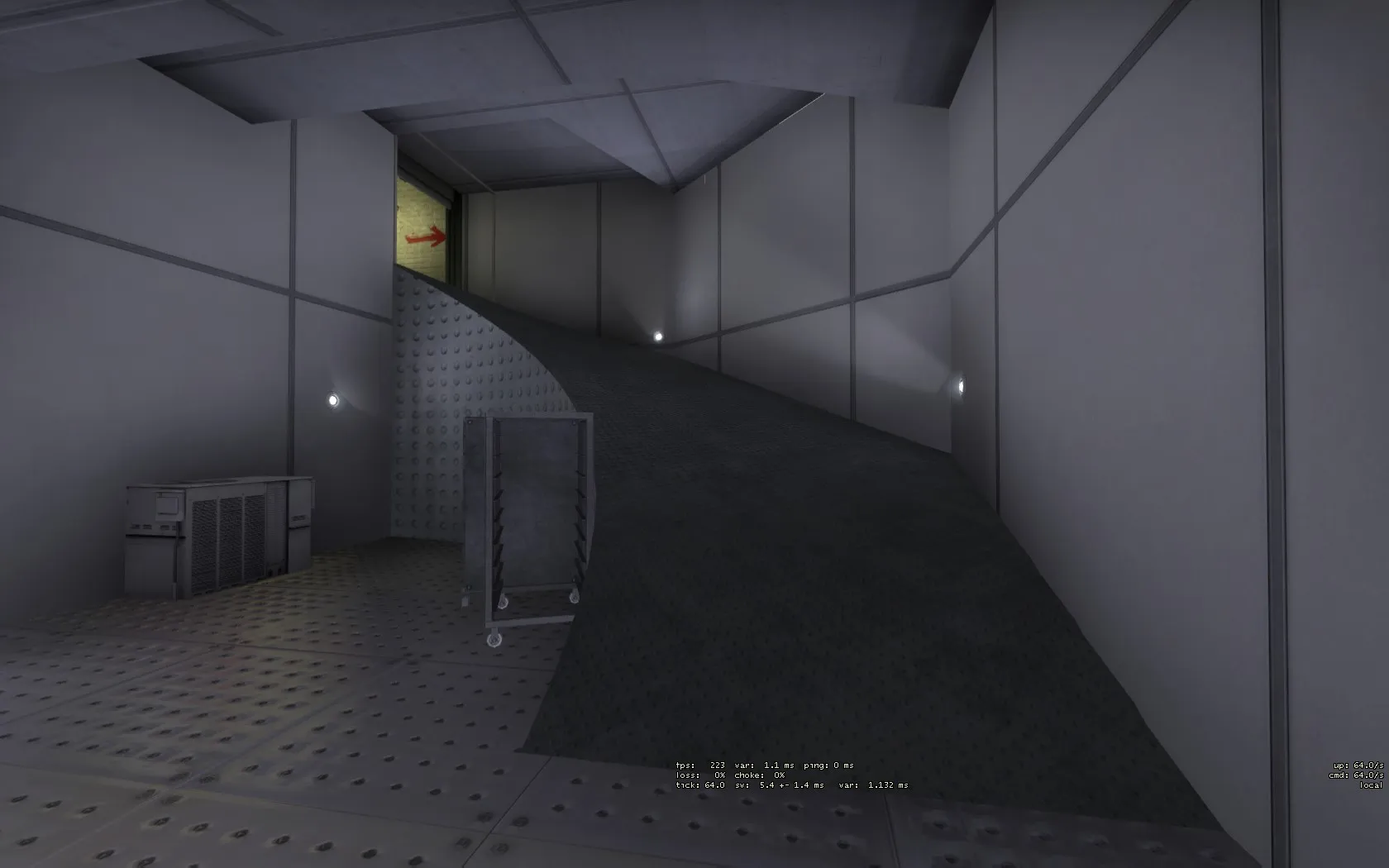
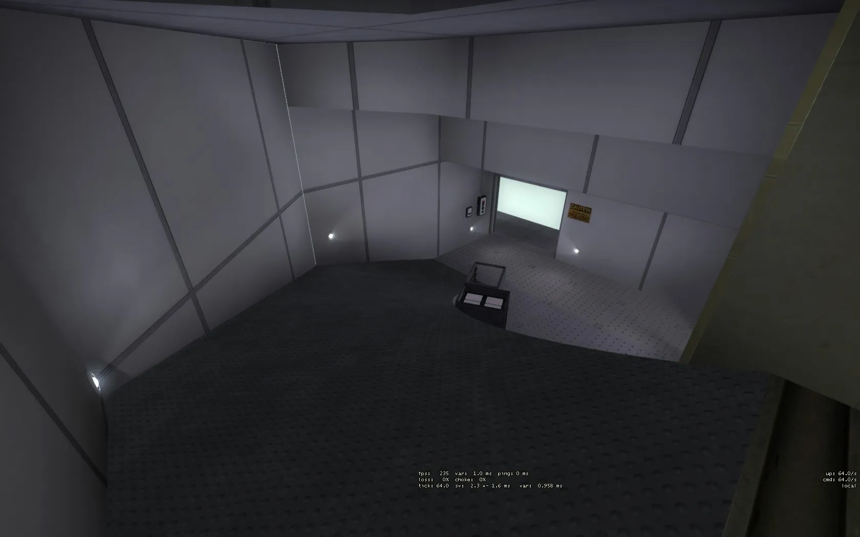
Thanks for the feedback! I've now fixed all of those things apart from the unnatural spiral.
Do you mean something more smooth would look better, like this? It's not a final texture of course, but the general shape would be like this.
 Quote from Klems
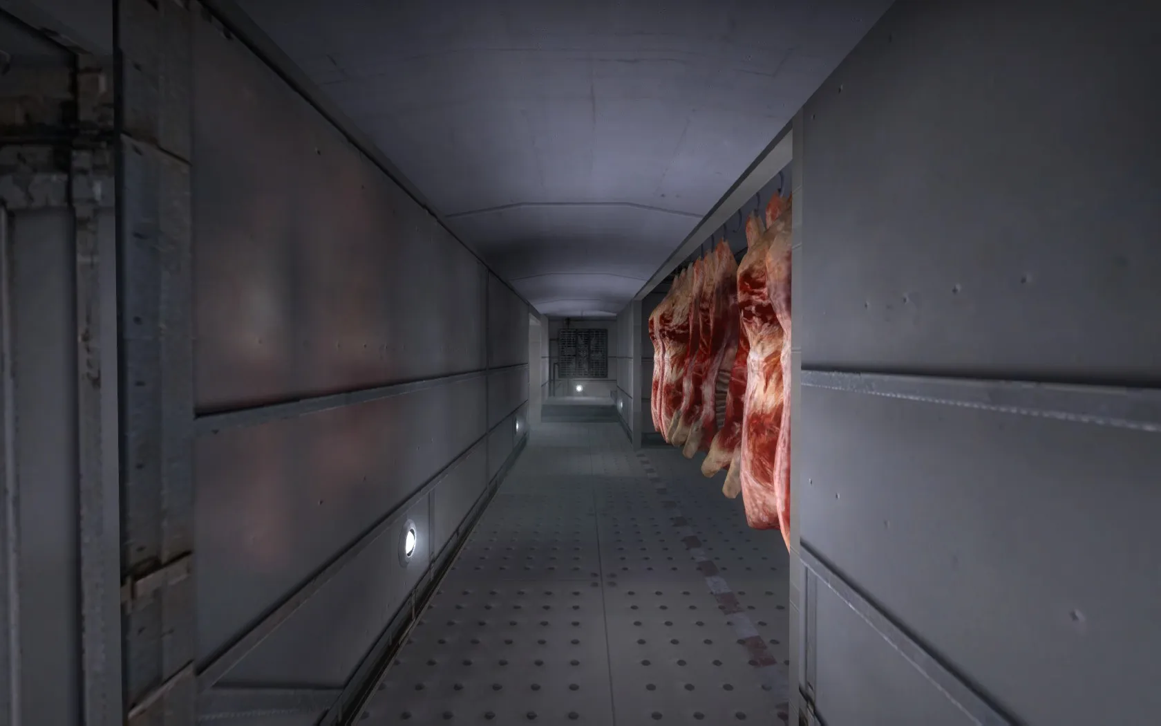
I like this, too bad I missed the playtest. Swinging meat on a moving func_train when?
 Quote from Overdoziz
Still needs carcasses moving around the map. :U
Sure! But only if:
1. You can find a way to do this that would not severely impact precision gameplay and server performance. Mind you: Performance wise the best case scenario for this map is 5v5 competitive and the worst case scenario is 15v15 on Deathmatch.
2. You can find a logical reason for them to be moving in a perpetual loop, considering in a real slaughterhouse the line has a start an end. Basically: Why would you lead a skinned and cut carcass back to be shocked? That's Frankenstein territory!
Quote from tommI'd expect more blood, maybe even bloody footsteps leading the player's eyes to an important point in the map.
Because this is text on the internet, I have no idea if you're being sarcastic or not! Do you actually think the blood on the grating in mid is too much?
 Quote from Logic
I understand players when they want to smoke off B-long from T-side but don't know the proper angles to do so. It is however very easy to do and not that hard to figure out. I just think players need too look for a way to do it and they will find one within minutes. Playtest is playtest I guess.
If it's very easy to do so and not hard to figure out, then wouldn't players have done so during the playtest to make themselves not die on long B?
Many people still died there every round. The screenshot with all the dead Ts on long B stands as evidence. (Unless you're going through the demo and finding completely different evidence, in which case disregard the rest of this post!)
If it's easy to do and figure out for you, that's fantastic! But apparently most players didn't. And in the end the map is not just for you to play, but for (hopefully) a large amount of different players. A big building on the side, for example, could really solidify the idea of being able to throw grenades onto it to many different players. Especially if you add reflective windows or props at certain locations to guide the aiming of grenades onto it.
Thanks! Although some of the gloomyness comes from a weird filter that either the source engine or imgur puts on the screenshots. In-game it looks a lot better, and playtesters also said this yesterday. I'm not sure where that problem lies. Maybe I can upload screenshots directly to mapcore instead?
Like this, testing 1 2 3: