Quote from Radu
On 3/20/2017 at 1:43 PM, Radu said: Plot twist: It's an oil rig on the borderworld of xen
That would be a cool easter egg 
Quote from RaduOn 3/20/2017 at 1:43 PM, Radu said: Plot twist: It's an oil rig on the borderworld of xen
That would be a cool easter egg
Looks like Europe can't BEAR it anymore 
 Quote from Radix
13 hours ago, Radix said: edit:
sexy new water in de_shipped
[Blocked Image: http://i.imgur.com/kE9w7HE.jpg]
Designer choice. hope you guys dig it.
Cool looks great it reminds me a bit of the level Silo in N64 Golden Eye. I'm going to check it out next sunday. btw on the screenshots some spots look a bit too dark maybe.[Blocked Image: http://vignette2.wikia.nocookie.net/goldeneye/images/1/13/Tumblr_lhx7i7ZICW1qhpzp8o1_500.jpg/revision/latest?cb=20110623190603]
I really dig the soft colors, lighting and sand/dune combo in this screenshot btw if you need any dune, beach or sea photos for textures or reference let me know I live 10m~ from the beach/dunes so it wouldn't be a big problem for me to go there and make some photos
- More cooking - More travelling - Be a more active member on mapcore - Waiting for Sprony to make a map
@kinggambit Glad you like the map! and if you want to go B long from mid you could climp up two crates next to the ramp so you wont have to run all the way to t-spawn and back to get to B long from mid. And yes I try to get all the models in as blockmeshes asap this way I know how much textures and meshes there need to be created and it also gives a good sense of scale and detail density early on
 Quote from gleddez
On 24/12/2016 at 9:42 PM, gleddez said: This looks really nice, I'll have to check this out on the Workshop. Where is the setting? Didn't Shipped, like, just get released? Do you ever take breaks?
Good stuff!
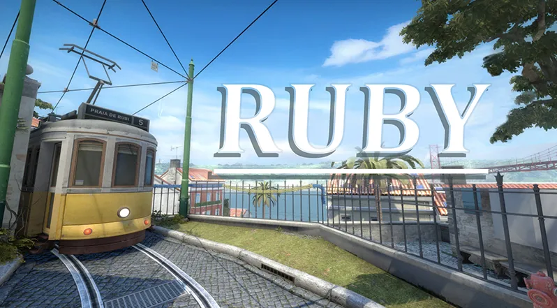
@gleddez @Roald Yes the map is based in Lisbon (not San Francisco!) and that's right de_shipped got released not that long ago but while I was working on shipped I was planning and preparing this map in the background so I could have a quick start on it.
 Quote from KODIAK
On 25/12/2016 at 3:46 PM, KODIAK said: Pretty awesome stuff! We might have time to playtest it in a few weeks. But at the rate it is advancing it might be ready by then
I like how the corridors got widened, I think it makes for better gameplay, mid changed for the better as well. The scenery is just stunning.
The only thing that bothers me still is that thing on B short that splits the route in two. It makes fights there a bit awkward there, not really sure what is the purpose of it
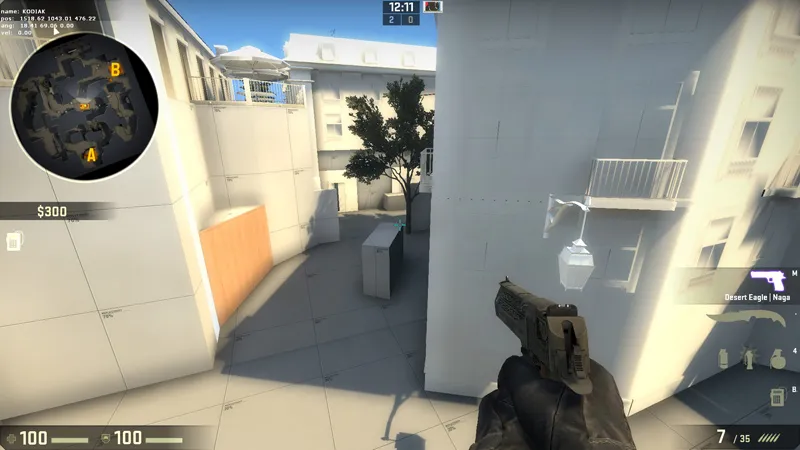
@KODIAK Thanks! it would be awesome and interesting to see you guys having a go on the new layout. And the purpose of the block is cover for the CT that's defending bombsite B on the Mid to B connector but I've heard more players complaining/asking questions about it so I could maybe try removing the block or tweak the cover a bit to see what happends
Hello! first I want to wish you all a Merry Christmas and I also want to share with you the progress I've been making on the map the past couple of weeks. Most of the time I worked on the cosmetic part of the map but I've also been busy fixing minor layout issues that were found during playtests. Here's the result in screenshot form:
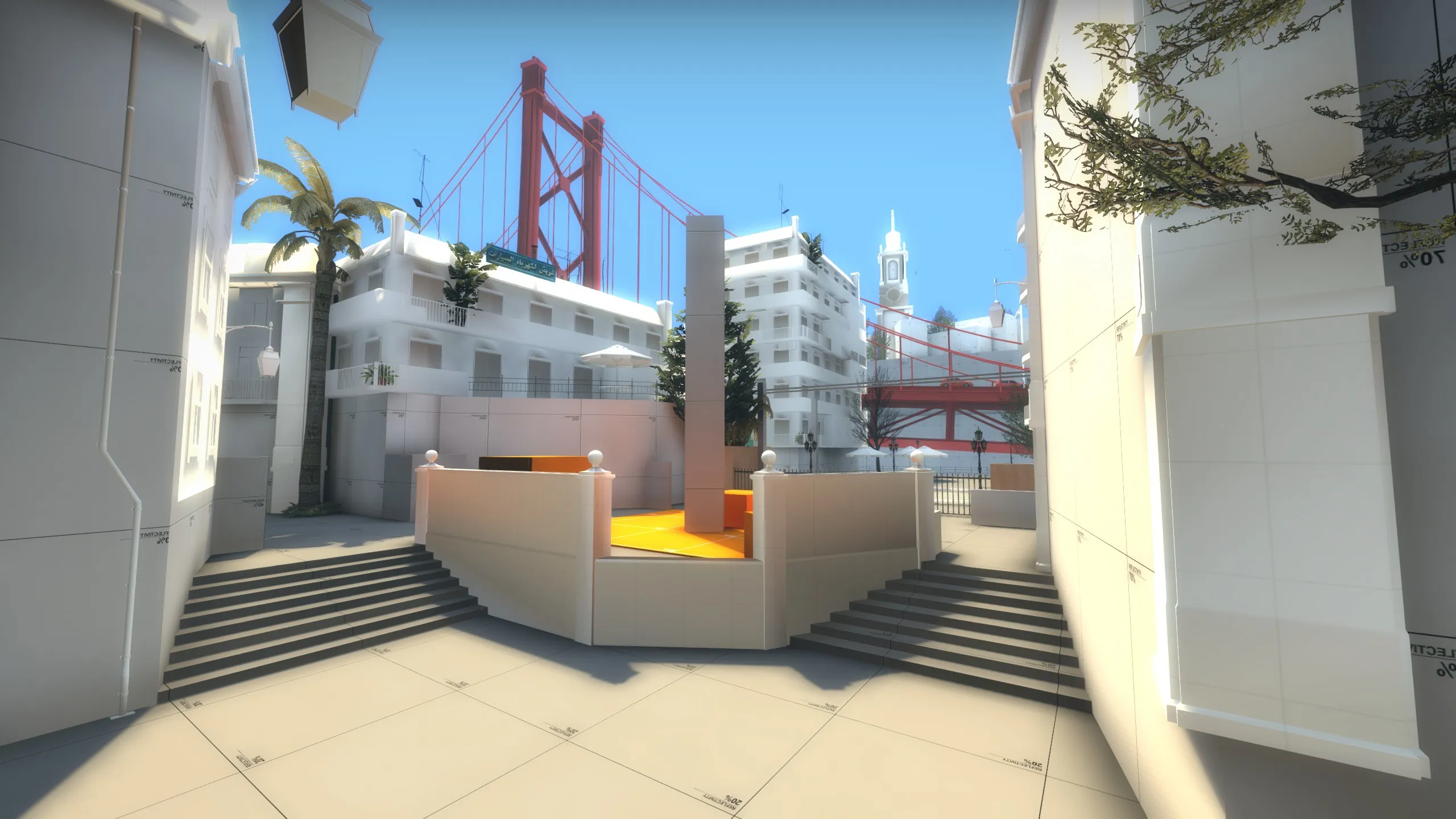

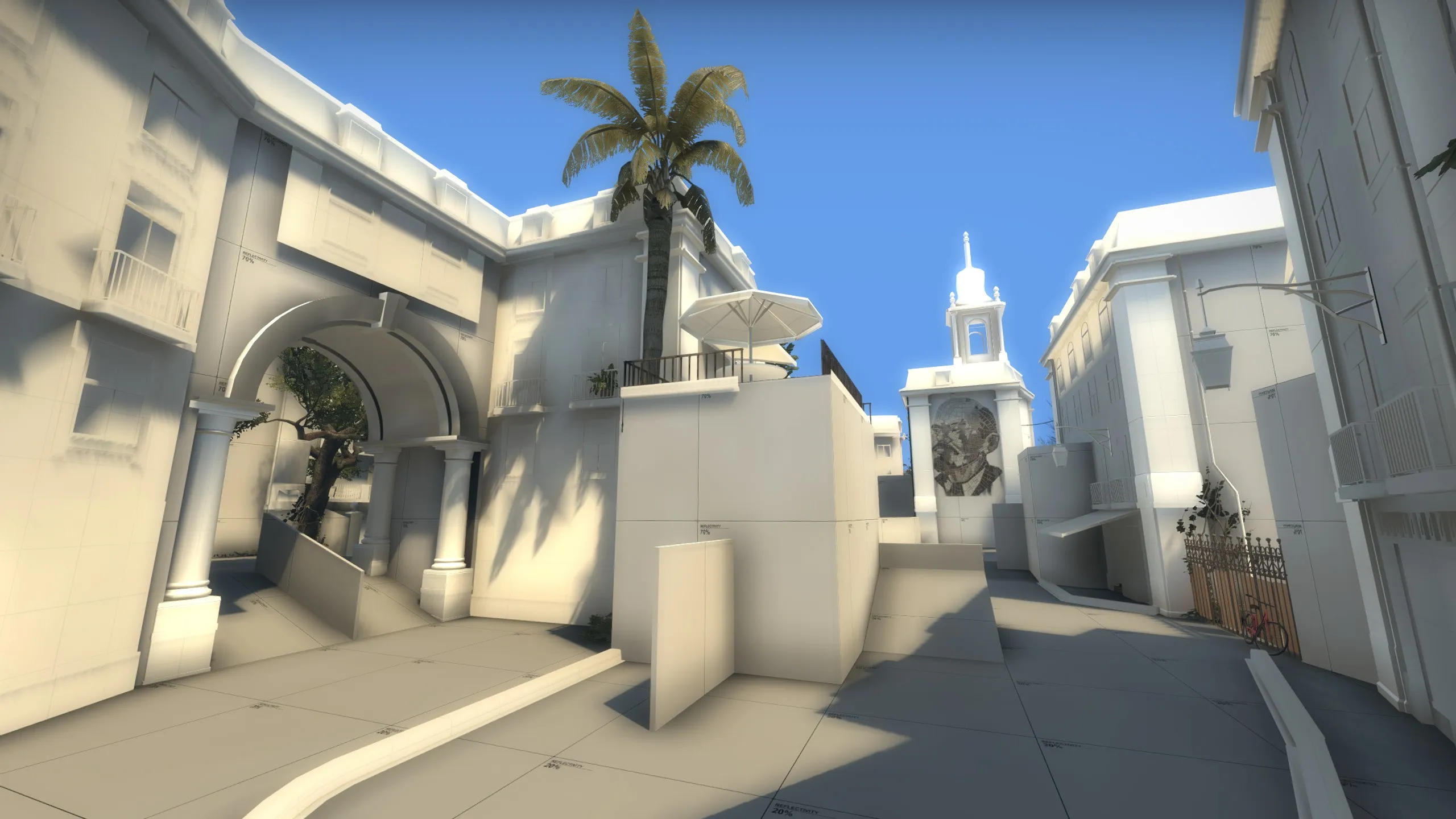
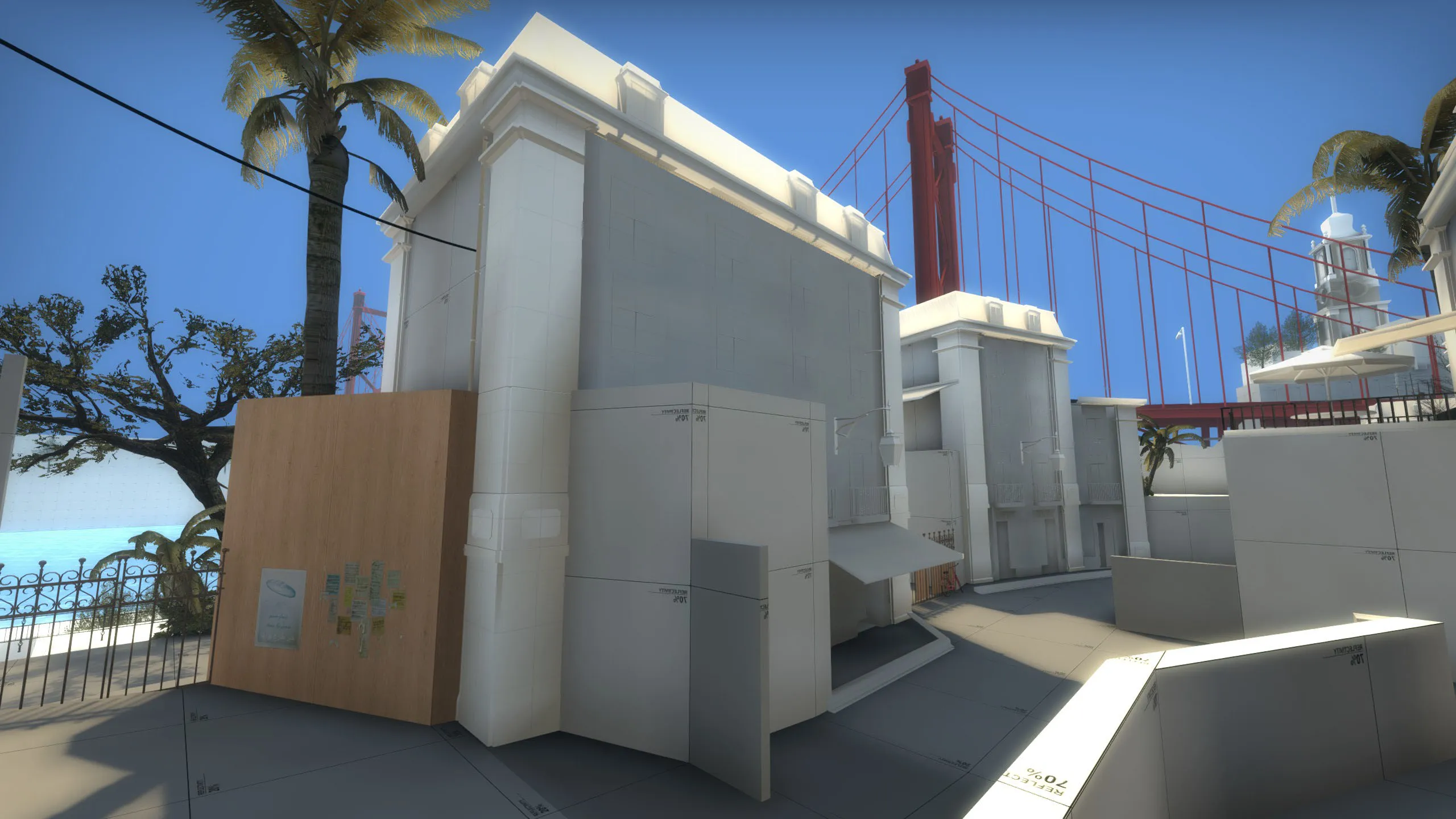
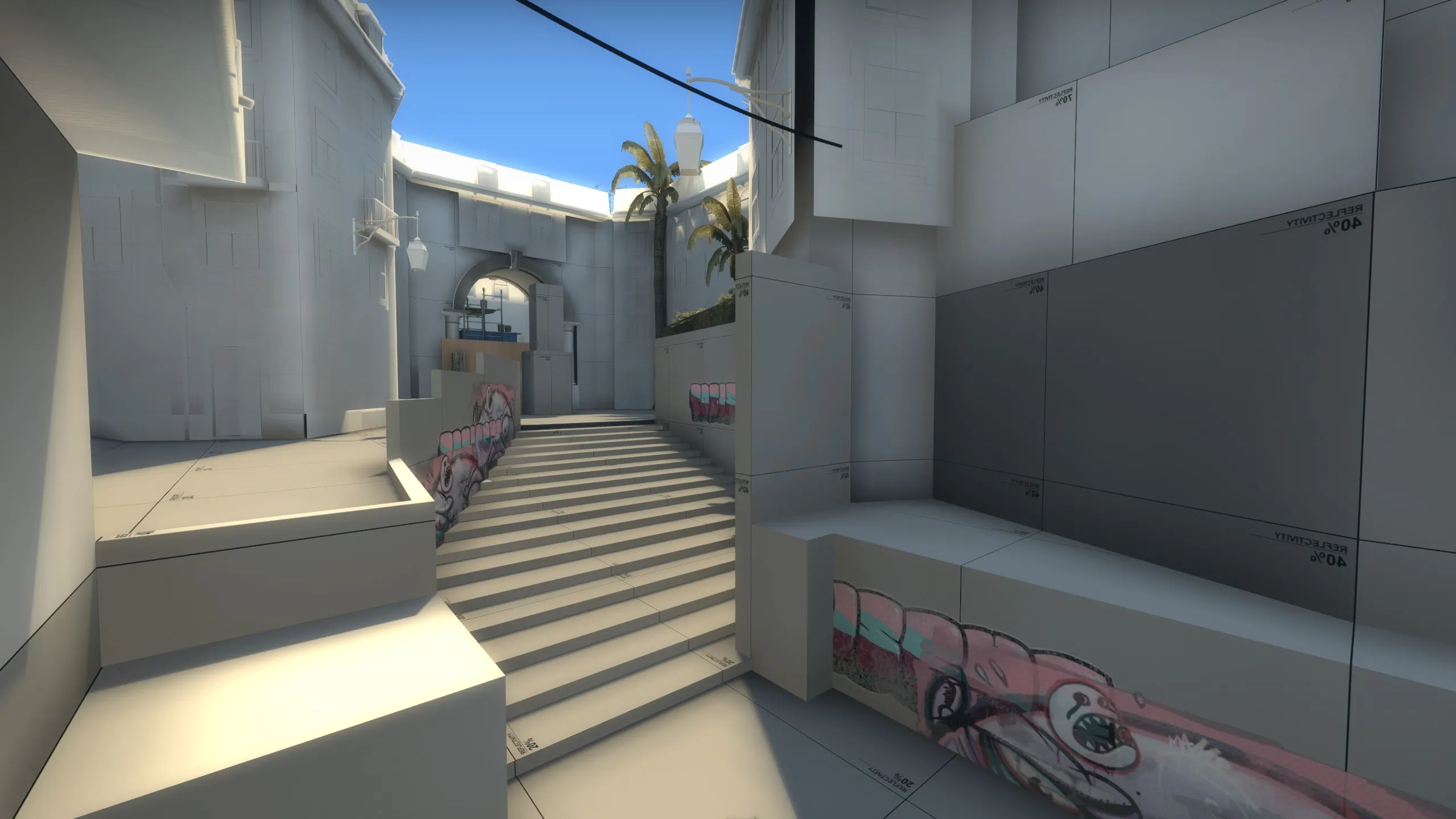
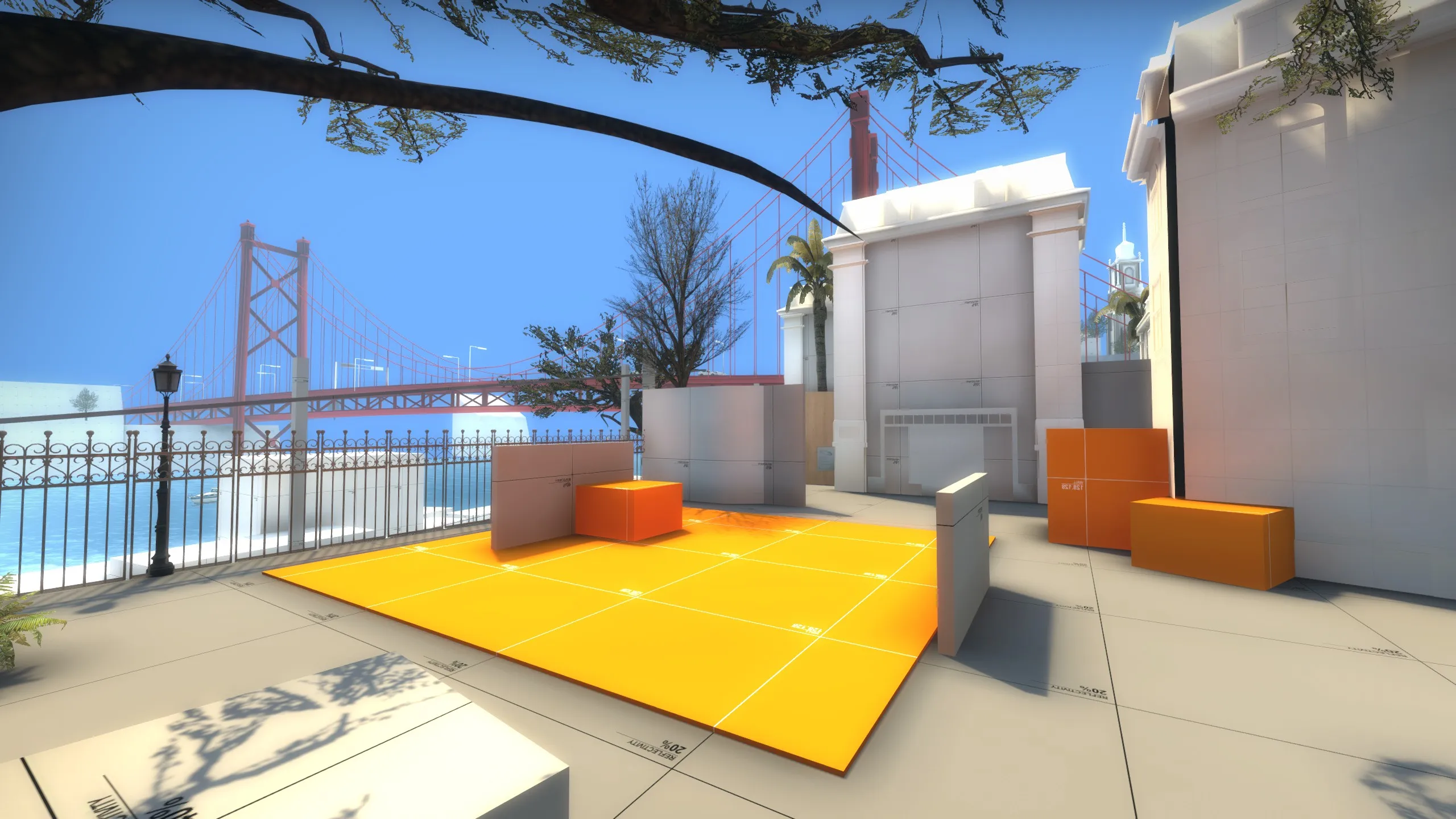
 Workshop link: http://steamcommunity.com/sharedfiles/fi…314&searchtext= Ps. the map location is not San Francisco but Lisbon!
my top 3 of this year



Wallworm is fucking awesome thank you so much 
from what i can see from the screenshots i think the map looks solid with interesting angles. one thing what the map could maybe use is a landmark or something that makes the map visually more unique like the empire building does in de_empire or the chinatown area in de_chinatown.looking forward to its progression
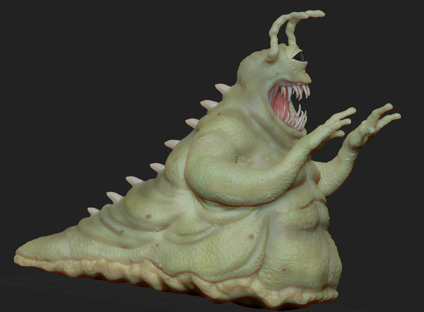
sculpt in progress:

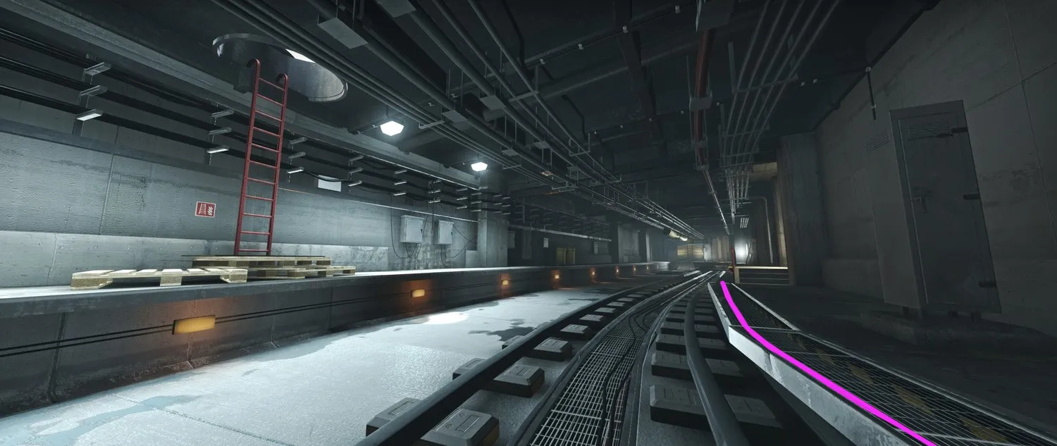
Awesome! that's one tight looking map you got there the indoor lighting looks slick and the yellow pipes work really well. there are only two things were I would like to nitpick on the first one is the outdoor brightness, maybe tone it down a bit atm it looks as if there is something nuclear going on in the city. it also makes some textures washed out like the floor bricks next to the orange markings in the second last screenshot. and two are the hard edges in the walkway next to the rails (pink line) these would make it hard for the trains to travel along to and It also breaks the flow of the rounded lines you have throughout the tunnel (rail track, cables). Apart from that I think it's a very good looking, clean and vibrant map 
 Quote from spa
2 hours ago, spa said: Ive seen that too and i just ended up deleting and rebuilding.
This could occur when you deleted a brush or entity and then used undo (ctrl+z). should be fixed after restarting hammer
 Quote from Vaya
On 15/09/2016 at 2:15 PM, Vaya said: I'd like to have a playtest on this one!
from the overview I'm wondering if mid will feel 'sluggish' to play since it's pretty long end to end. Top bombsite looks like a chore for CT players to get to at the start of the round too. Can't tell a great deal from just an overview though
Saw we both made a request for a public mapcore playtest this thursday, It's gonna be fun to crucify each others creation  I agree mid looks pretty long on the overview but I don't think it feels that way ingame due to the height differences and smoke/boost options but please let me know what you think after the playtest
Quote from spaOn 15/09/2016 at 3:24 PM, spa said: My gut reaction is that there's too many 'S' shaped narrow spaces that breaks flow and make the map hard to navigate and learn. At one point the CTs are actually moving backwards to get forward in the map. But I like the crooked angles conceptually I would just tone it down a bit
I'm not sure I see what you mean with where CTs have to move backwards to get forward, you mean the part when CT go mid through A site?
 Quote from baem123
On 15/09/2016 at 5:03 PM, baem123 said: First to the Bombsites: I have to say that my biggest concern about your last map was the similarity of A and B. In this map both bombsites offer a very similiar playstyle, too. Boths spots have around 3.5 entries and you will often try to hide in one of those arms till the CT touches the bomb. Both spots have only one small wall near the bomb for another option (especially B, A has one extra option between the wall with the crack and the crates). The A site is okay, and is clearly the better one. Stick to it but change B nearly completely to change the playstyle around the spot. Its not fun to get a shot in the back while defusing at B 90% of the time. btw the crate at the B site is not high enough. you dont feel safe while planting in the corner.
Thanks for your feedback on the bombsites. I noticed during playtests that both sites were played pretty much equally and while B was rushed almost every time A site got a more conservative approach, for instance the little alley next to the T entrance was used a lot to get a better view of what was going on onto the site before moving in. I get your point concerning hiding spots and cover on sites. Although everyone that attended to a playtest found nice spots to plant or defend sites, cover is still something I'm working on to get right and will probably change quite a bit over time.
I know RZL had a similar problem and he fixed it by copying the whole map into a new scene
[OLD POST]
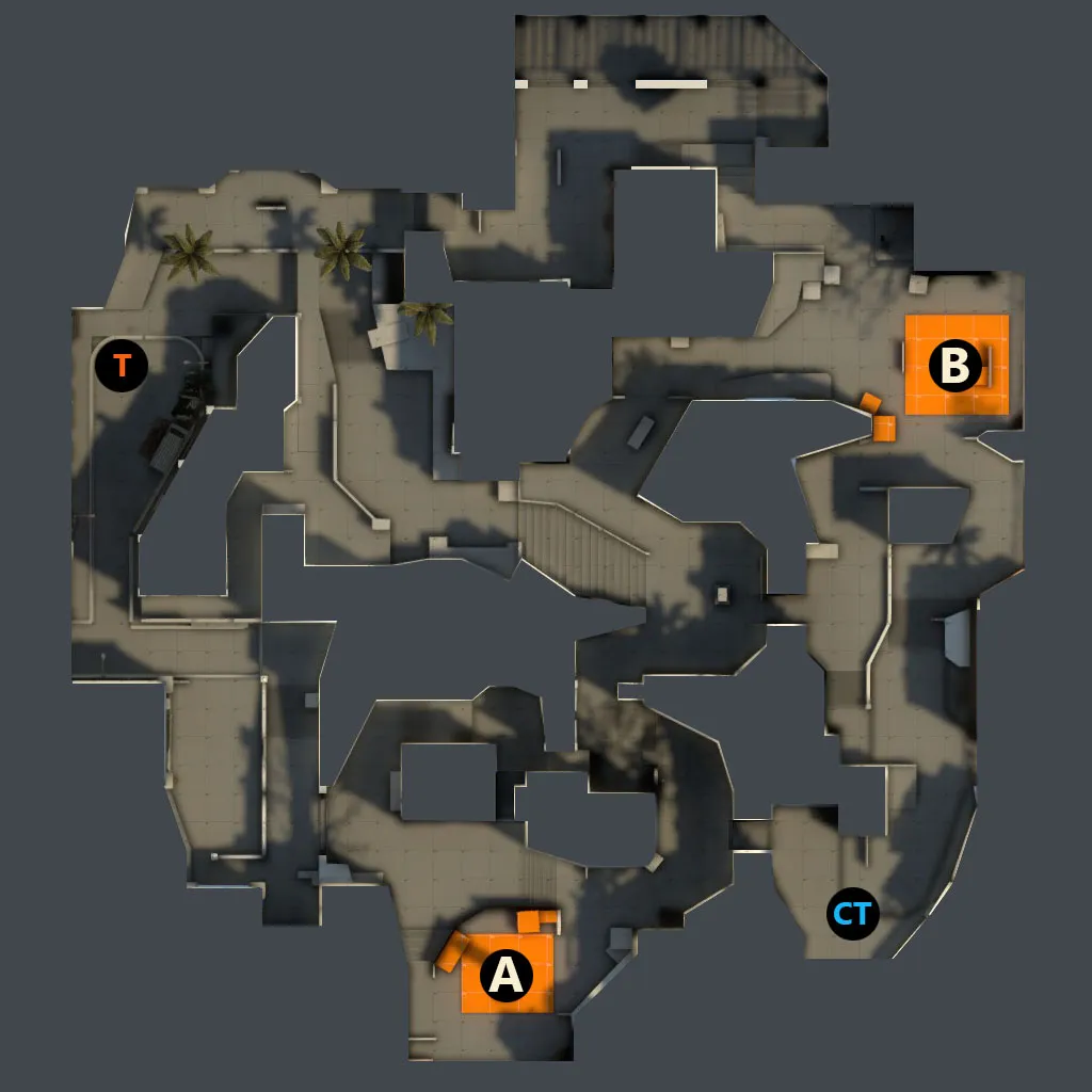
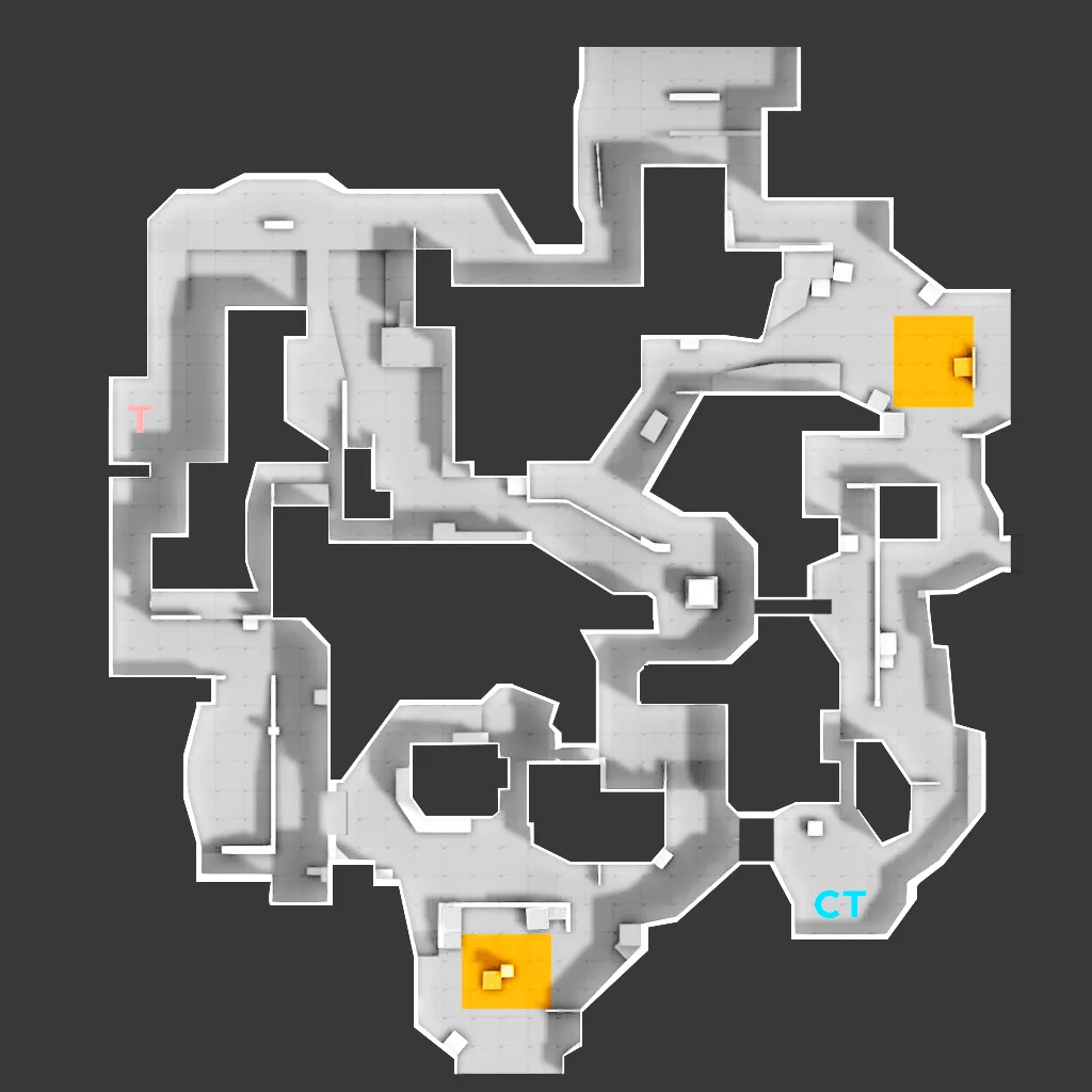
Hello Mapcore folk, First I want to say that everything about the layout is still quite rough, work in progress and open for suggestion. The reason I'm releasing this heavy wip concept is so that I can hopefully catch a glimps of other players and mappers thoughts on the layout early on. The current overview of the layout:
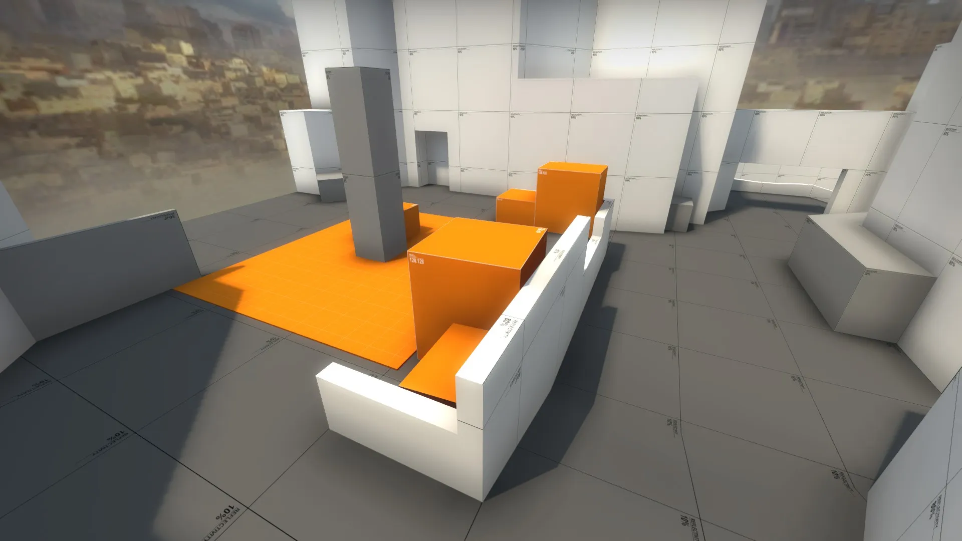
Mid CT side:
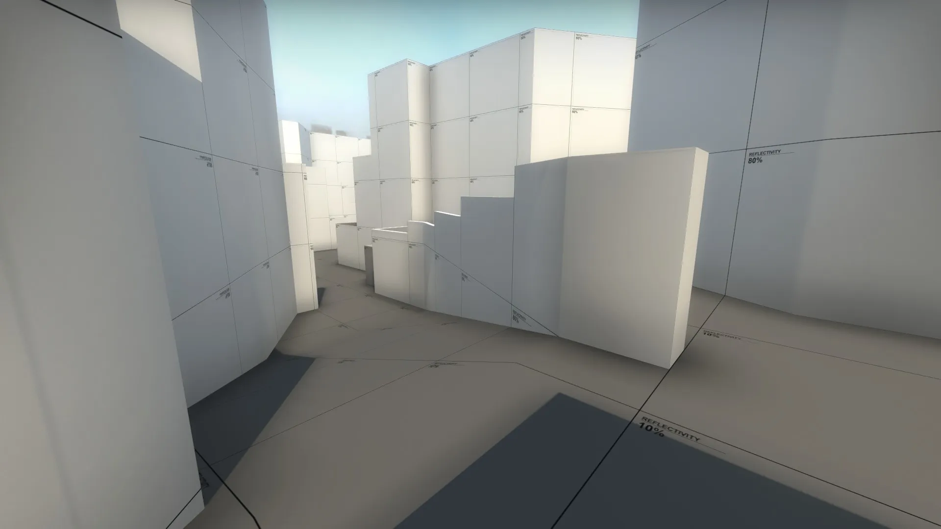
Mid T side:
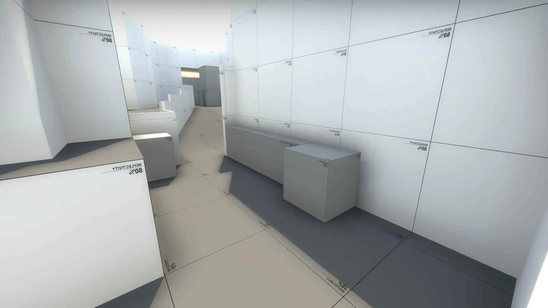
B site:
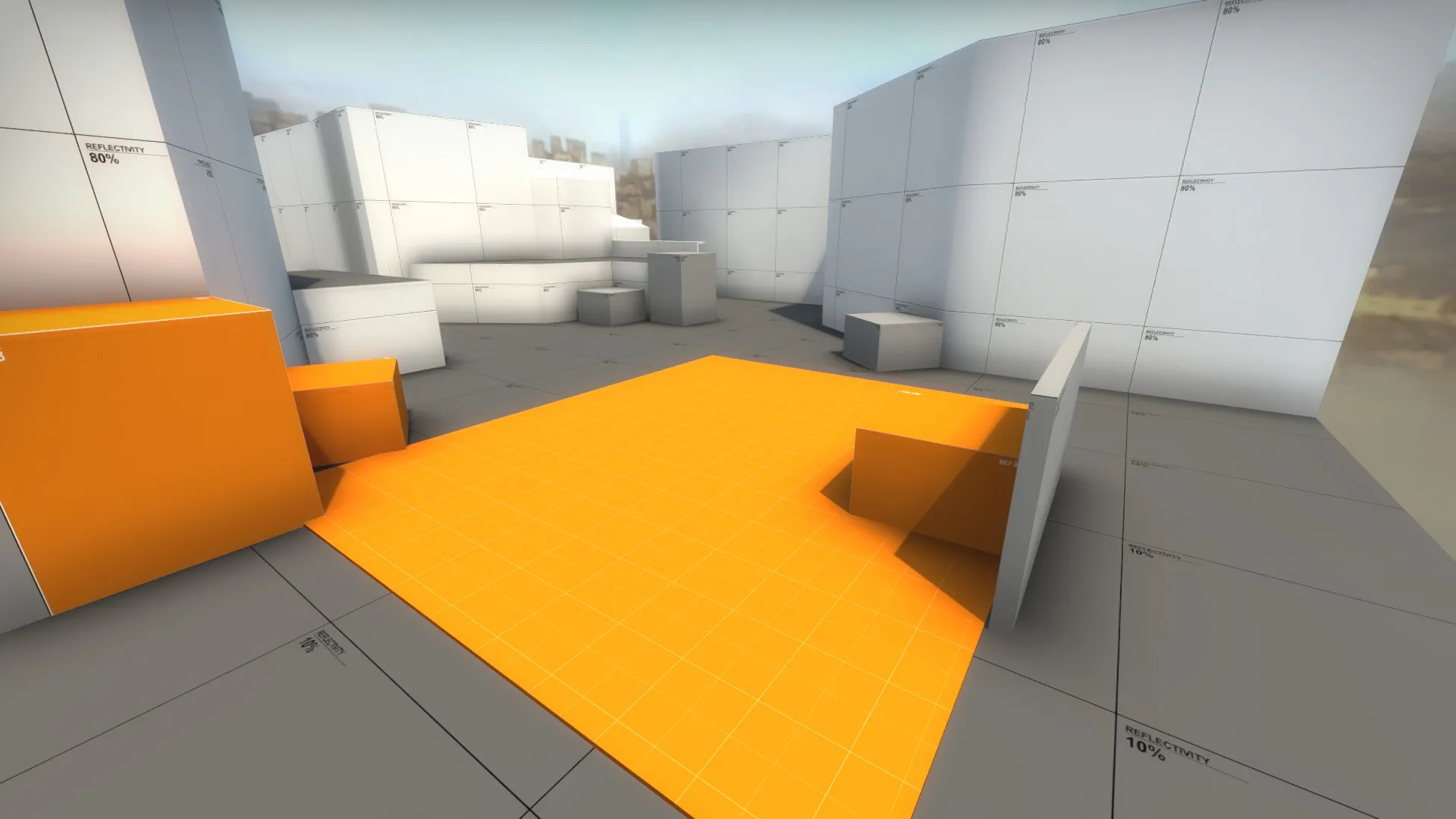
Although this build felt pretty stable after quite a few playtests I would still like more playtesting hours / feedback before making any drastic decisions on where to take the layout next. Here's the workshop link might you want to check it out ingame : LINK So if you already have some thoughts, angry feelings or whatever that come up when looking/playing the map Please don't hold back and just let it all out. Because the sooner this little unarmed infant baby map learns it's flaws the better right? no mercy. Thanks in advance!