

I like the name change.
 Quote from Dartius
Punch Club - prison time!
[Blocked Image: http://vhs-story.com/wp-content/uploads/2015/06/prison_668.png]
This looks great!
I like the name change.
Quote from DartiusPunch Club - prison time!
[Blocked Image: http://vhs-story.com/wp-content/uploads/2015/06/prison_668.png]
This looks great!
 Quote from Vaya
If you've reduced the connector length on a fully detailed map I don't envy you at all...
 Quote from General Vivi
I couldn't imagine spending the 4th of July any other way then getting my global wings!
MURICA!

fucking onliner
 Quote from El_Exodus
Though i'm curious what exactly you meant with the struggle when making Cache. What was it that made you almost abandon the project?
graphics pretty much. You can see what Cache used to look like here https://migrationtest.mapcore.org/topic/14537-it…he-day/?page=15 . I liked the look but the readability and mood were really bad
If no mapper who had been included in an Operation will be listed on your author page of your workshop listing for this map, it doesn't break any rules.
Good luck!
I'm purging this thread of any replies unrelated to critique or feedback. The contest rules are in place for good reasons, and this map is allowed. /end
Mmm... so good.
[Blocked Image: http://i.imgur.com/tvNANVs.gif]
[Blocked Image: http://gifyu.com/images/AK3-2.gif]
[Blocked Image: http://giant.gfycat.com/InferiorMediumFlyinglemur.gif]
looks dope, why'd they have to screw the pooch on the pc port :ubermad:
I was so close to buying this lol. NOPE
Quote from Vayado you amend the tones on a adhoc basis or did you have a 'plan' from the start (this area is going to utilise these shades of colour blah blah blah)
I've always textured as I go (based completely on I feel) but I'd like to know what your process is?
I've done a ridiculous amount of tweaking per-surface.
[Blocked Image: http://i.imgur.com/CbbrvXJ.jpg]
In an ideal world, all of these surfaces would have (roughly) the exact same shade of white. This is the amount of tweaking I have to do to get an even result in-game. "What if it's too bright?" -- I select the bright surface and downshift its RGB values by x amount needed to reduce harshness.
 Quote from yww
Sorry for my bad english,It seems that some people complain that the map might be too bright to be played for a long time,how will you solve the problem?
The map has been constructed largely using tonal shifting of one set of textures either to blue, red, or darker shades of white. This has a lot of practical use reducing texture memory usage and file size. I've also managed to use this shading method to get the level to a point where it's not particularly harsh despite having a lot of white surfaces, but if it were an issue, it's easy to tone the textures down even more using this shading technique.

Delete it and make your own stuff that doesn't resemble other maps.
I guess I misunderstood that you're deliberately trying to refer to prior maps. Seems odd but my mistake.
It's fine to take inspiration from a certain portion of an existing map, but you need to hide your inspiration, since that's what art is all about. If I can look at a screenshot and think it's a screenshot of Mirage, but it's actually your map, then you're not being creative.
The key is to be clever enough about it that no one knows. You aren't there yet.
 Quote from RivFader
Did you update the workshop link as well or will you only do so after you finished the details?
I will re-upload the map once the art is complete.
 Quote from jackophant
Map looks very nice, although the colours are a little more muted than I was hoping for.
This is good feedback, I'm going to experiment with richer color.
 Quote from Pampers
are the bells pitch corrected? will we be able to pop some sweet tunes by shooting at them?
That's the goal 
Helloooooooooooo~~~~~~ update time!!!
Santorini is roughly 40% complete right now. It's on track.
[Blocked Image: http://i.imgur.com/AsJKZFc.jpg]
[Blocked Image: http://i.imgur.com/VSWlLAT.jpg]
[Blocked Image: http://i.imgur.com/owYsGV0.jpg]
[Blocked Image: http://i.imgur.com/DRDJzEm.jpg]
[Blocked Image: http://i.imgur.com/HZvSziH.jpg]
I've also released a gun skin with my friend Thurnip (the guy who designed Mapcore's logo :D). It's called the Electro Spirit, and we're gonna make more!
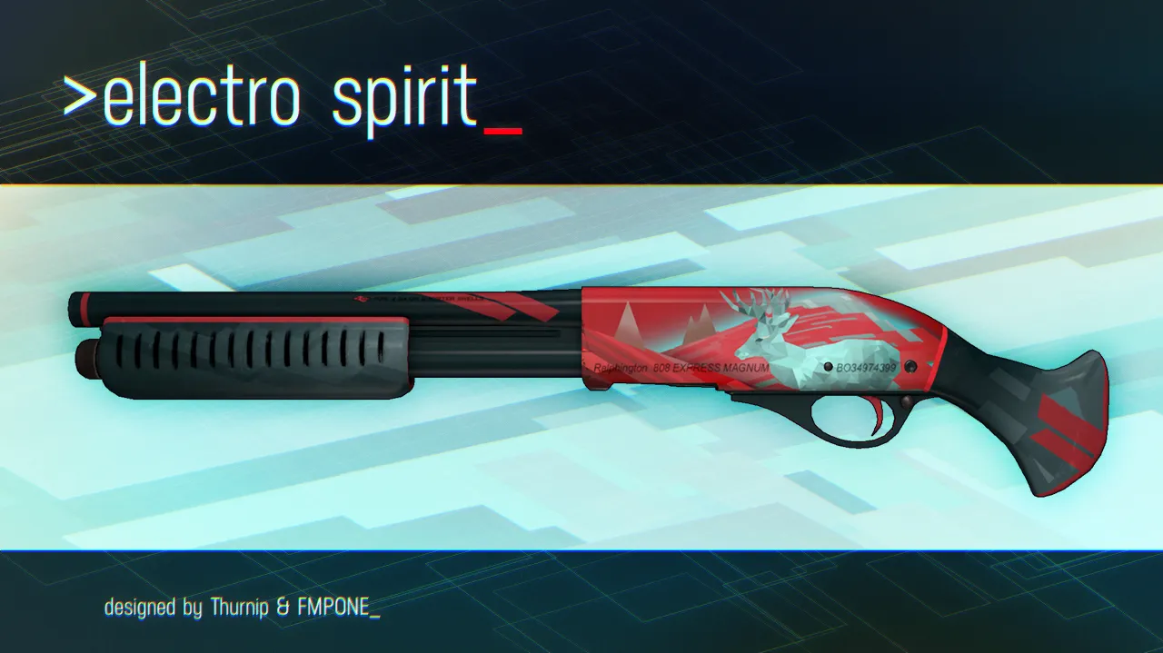
you can support our skin here http://steamcommunity.com/sharedfiles/fi…s/?id=466807664
The environments in that video look like insanely busy prop farms.
I'm not a big fan of the art direction they went in, it's extremely inconsistent and very random
Perfect video...
These are cool. Keep posting!