1. Forums
  2. Discord
  3. About Mapcore
  4. Patreon Supporters
  • Login
  • Register
  • Search
This Thread
  • Everywhere
  • This Thread
  • This Forum
  • Articles
  • Pages
  • Forum
  • More Options
  1. Mapcore
  2. Discussions
  3. Level Design

[CS:GO][WIP] Trailerpark

  • OrnateBaboon
  • December 12, 2016 at 2:54 PM
  • OrnateBaboon
    • February 10, 2017 at 5:35 PM
    • #21

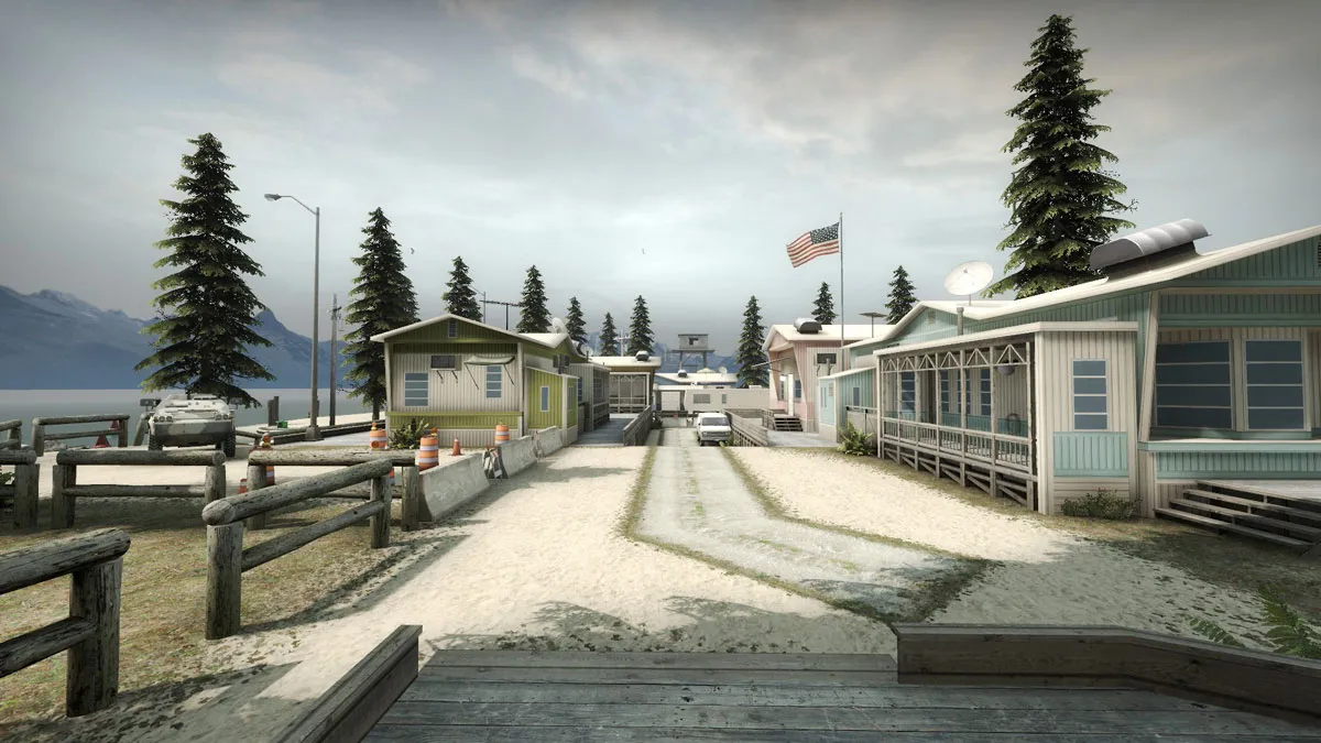
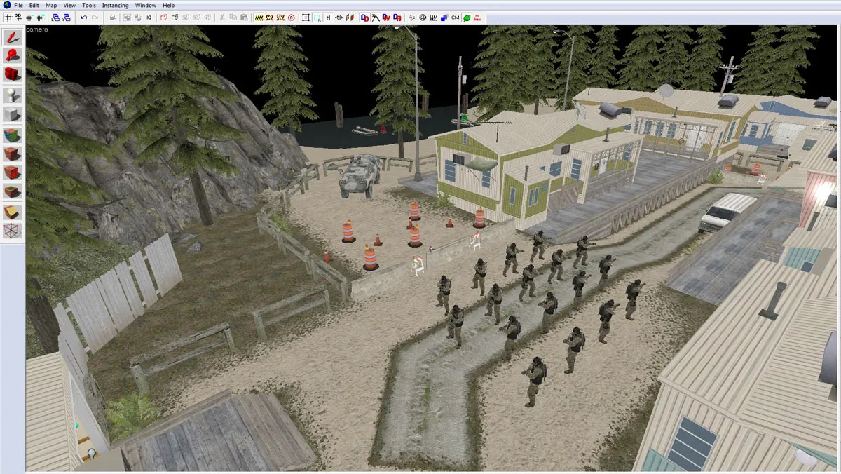
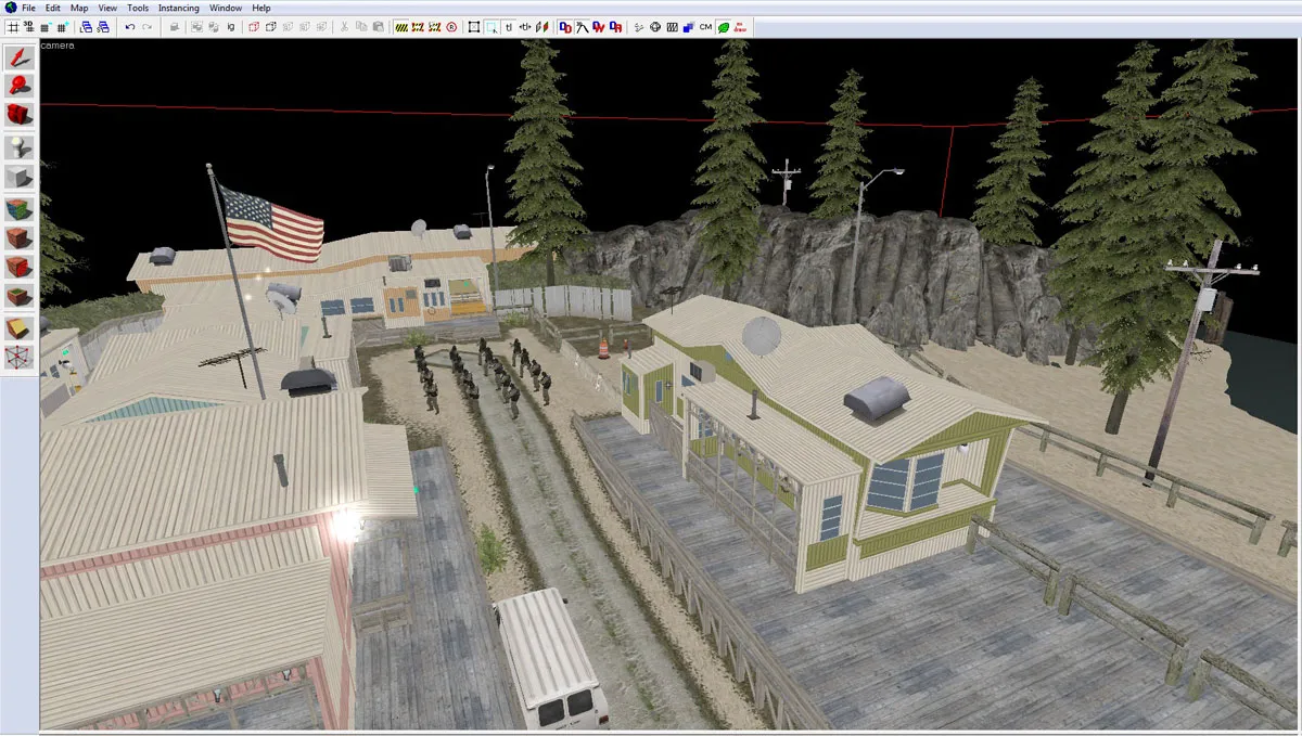
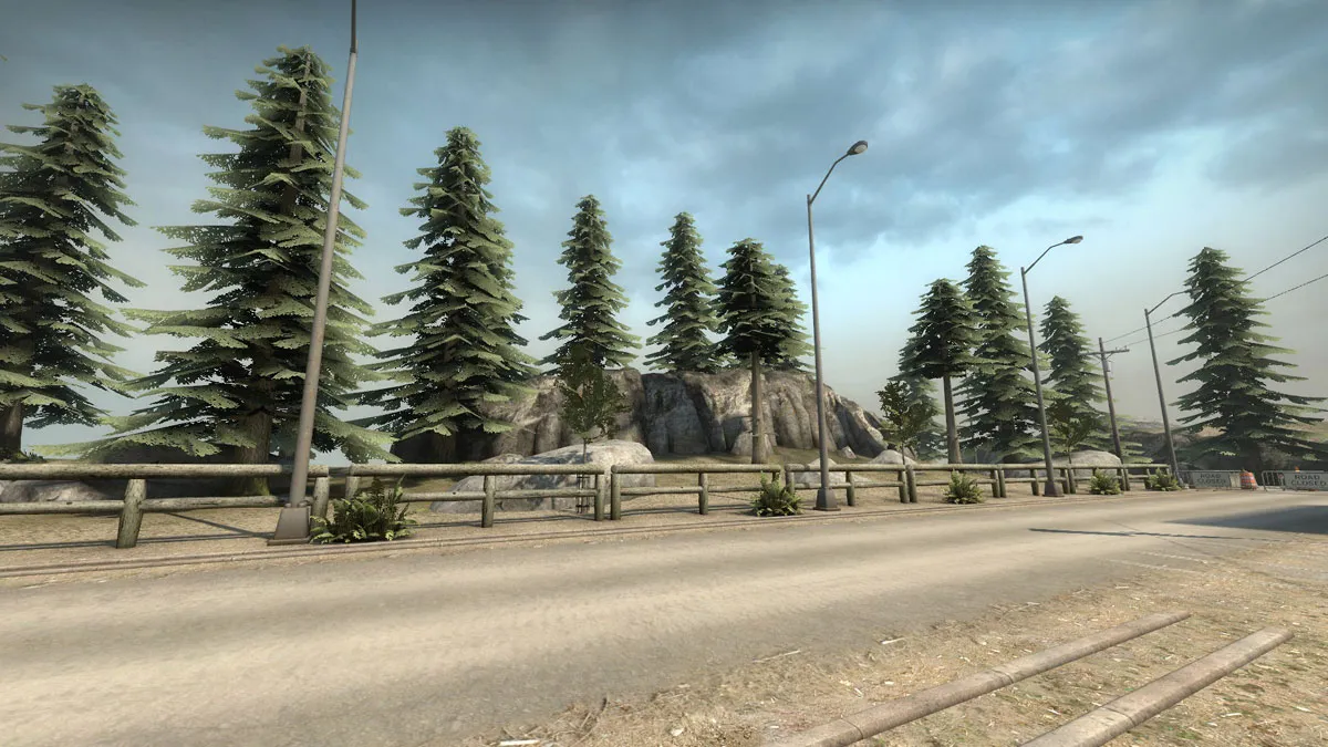
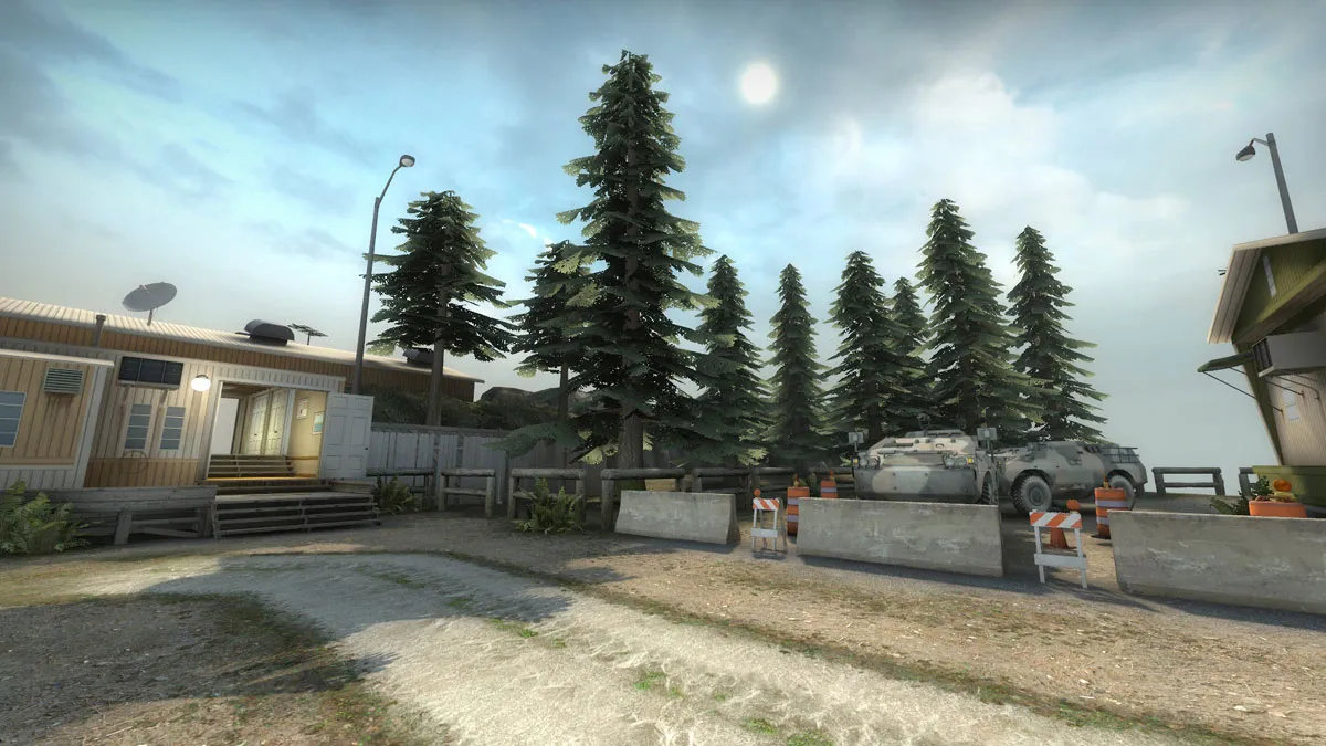
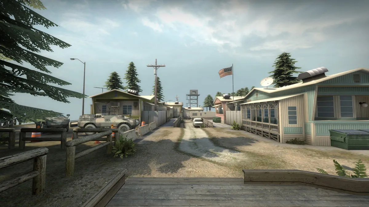
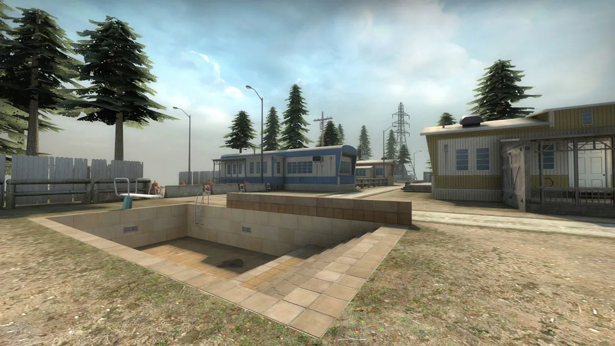
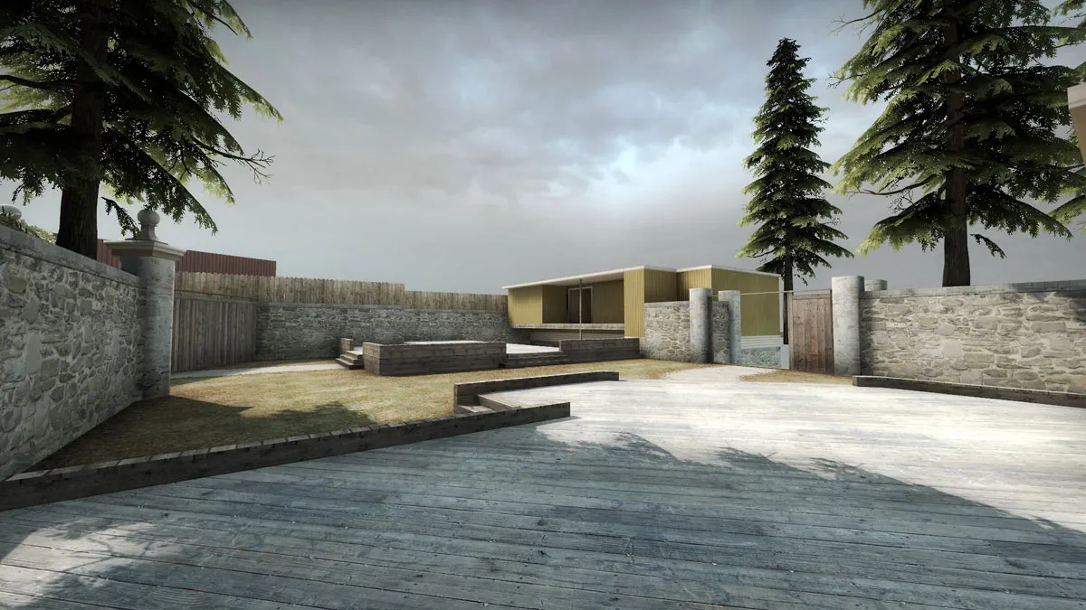
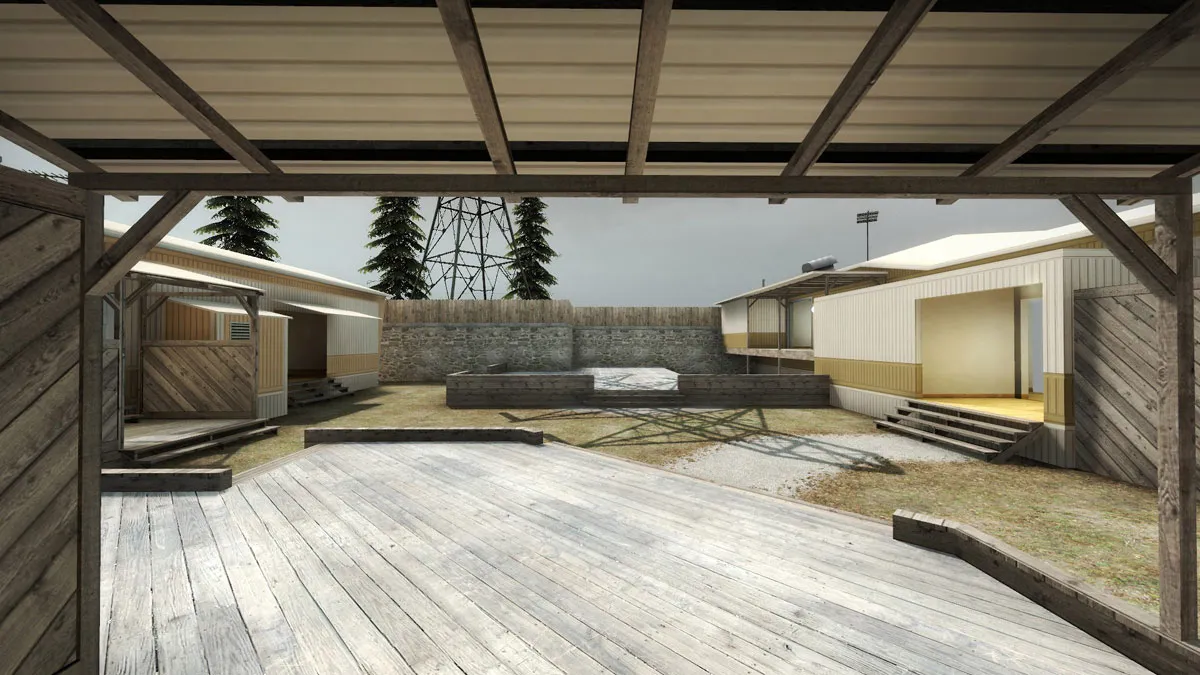
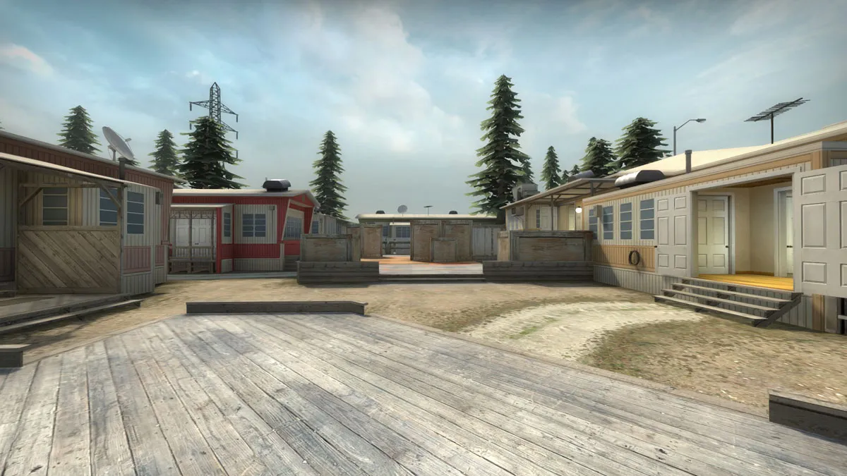
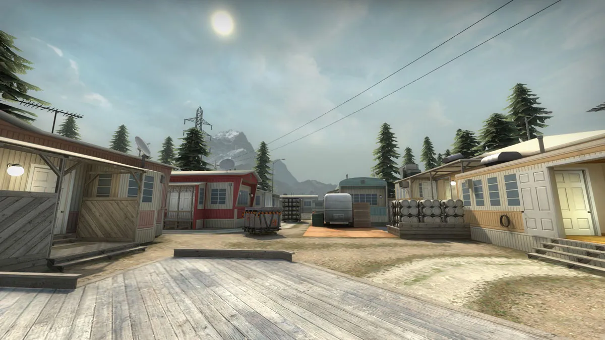
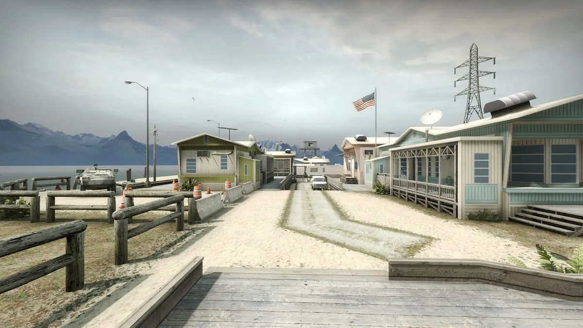
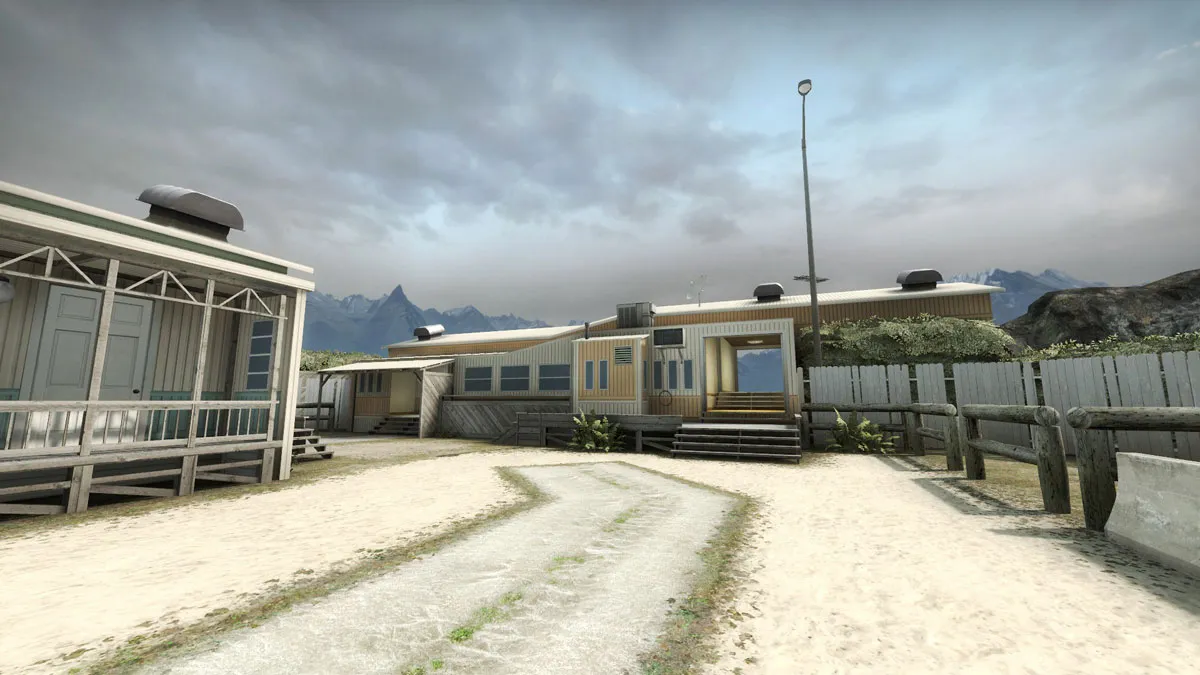
    This is the last set of screens from this area you will see for a while. I promise!

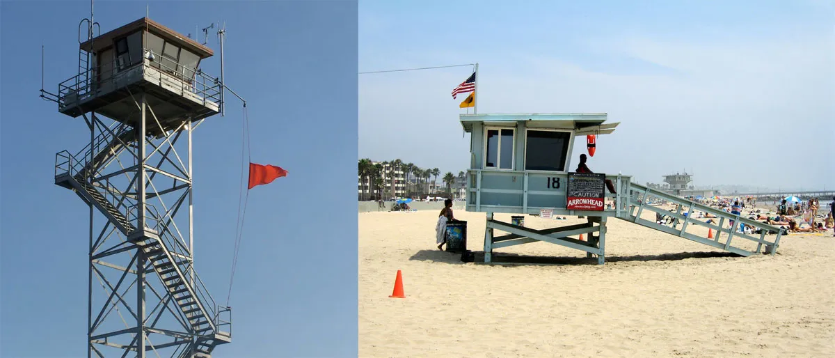
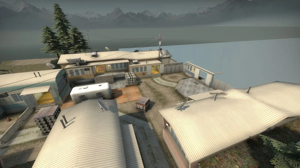
    Some parts, like the ground went backwards - I had to change the displacements. Even though three of the buildings are identical (apart from the colour) - I am calling this first pass, and will move onto another area. CT's now spawn on flat ground - previously it was a slope which felt strange. I also got some reference images for a beach tower and a beach hut which I will add for the next pass.
  • FMPONE
    • February 10, 2017 at 5:37 PM
    • #22

    Really liking it, I feel your textures are a bit too clean, 10-15% however.

  • WD
    • February 12, 2017 at 10:37 AM
    • #23
    Quote from FMPONE

    On 10.2.2017 at 7:37 PM, FMPONE said: Really liking it, I feel your textures are a bit too clean, 10-15% however.

    For me, it looks like a simulation town. Put some mannequins in there and it's Nuketown!

  • OrnateBaboon
    • June 1, 2017 at 6:09 PM
    • #24

    WD - when more junk, and a bit of grunge on the textures is added, that look will hopefully go away.

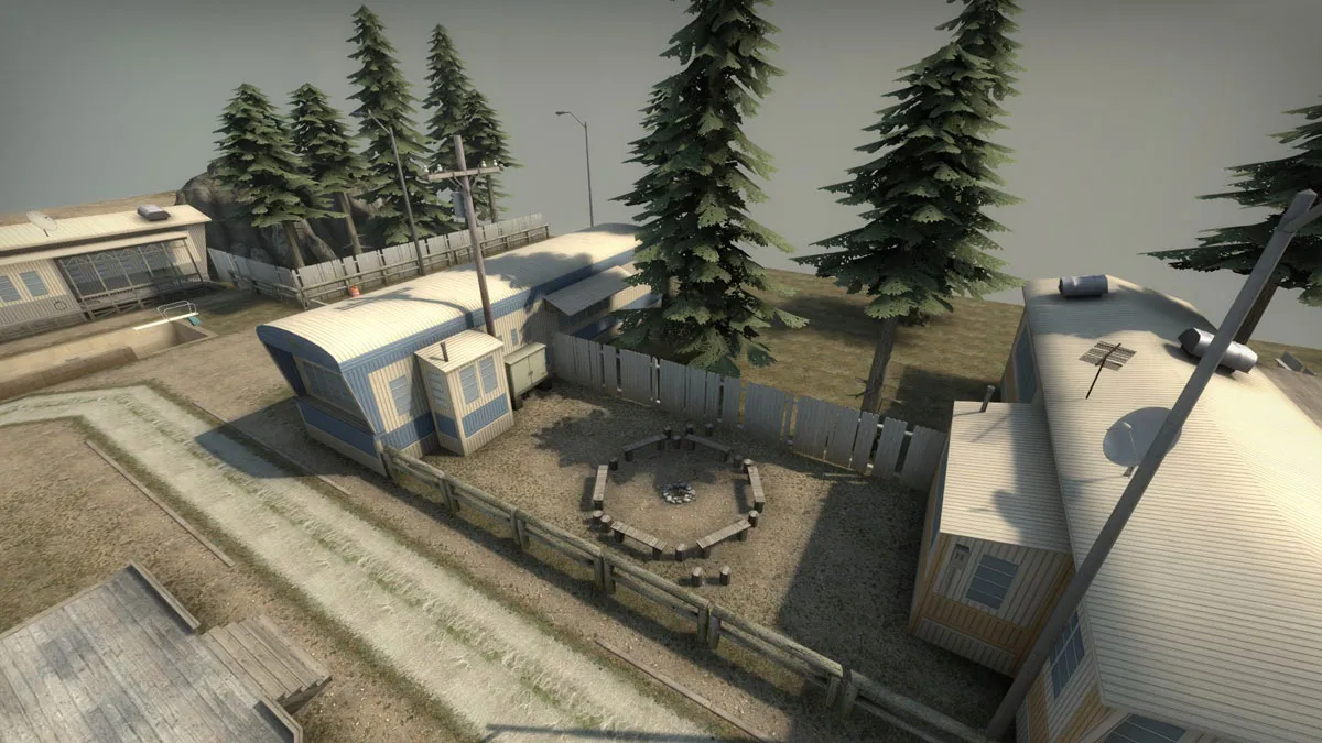
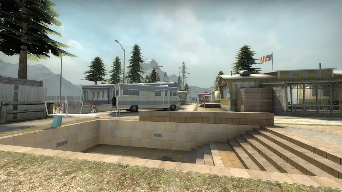
    Some more progress - change of colour on the lighting - I think maybe something between the two light environments might be best. I have set up the area in the last two shots, and I will be working on this section to bring the standard up. I added the campfire there, and will probably detail it with a BBQ, some chairs, beer bottles etc. This will be "long" in the callout. In between the pool and the blue trailer, there will be a camper van for cover. At the moment it is a dev block, but I hid that for screens.

    No 3d sky here since a change in light and fog has messed that all up for now.


  • NikiOo
    • June 1, 2017 at 8:51 PM
    • #25

    Gotta add some dirt to those houses ;D

  • Mazy
    • June 2, 2017 at 10:00 AM
    • #26

    Love the setting, love the look of it, great job!

  • will2k
    • June 2, 2017 at 10:04 AM
    • #27
    Quote from OrnateBaboon

    15 hours ago, OrnateBaboon said:

    Gives me vibes of GTA5, love it :)

  • OrnateBaboon
    • September 14, 2017 at 12:39 AM
    • #28

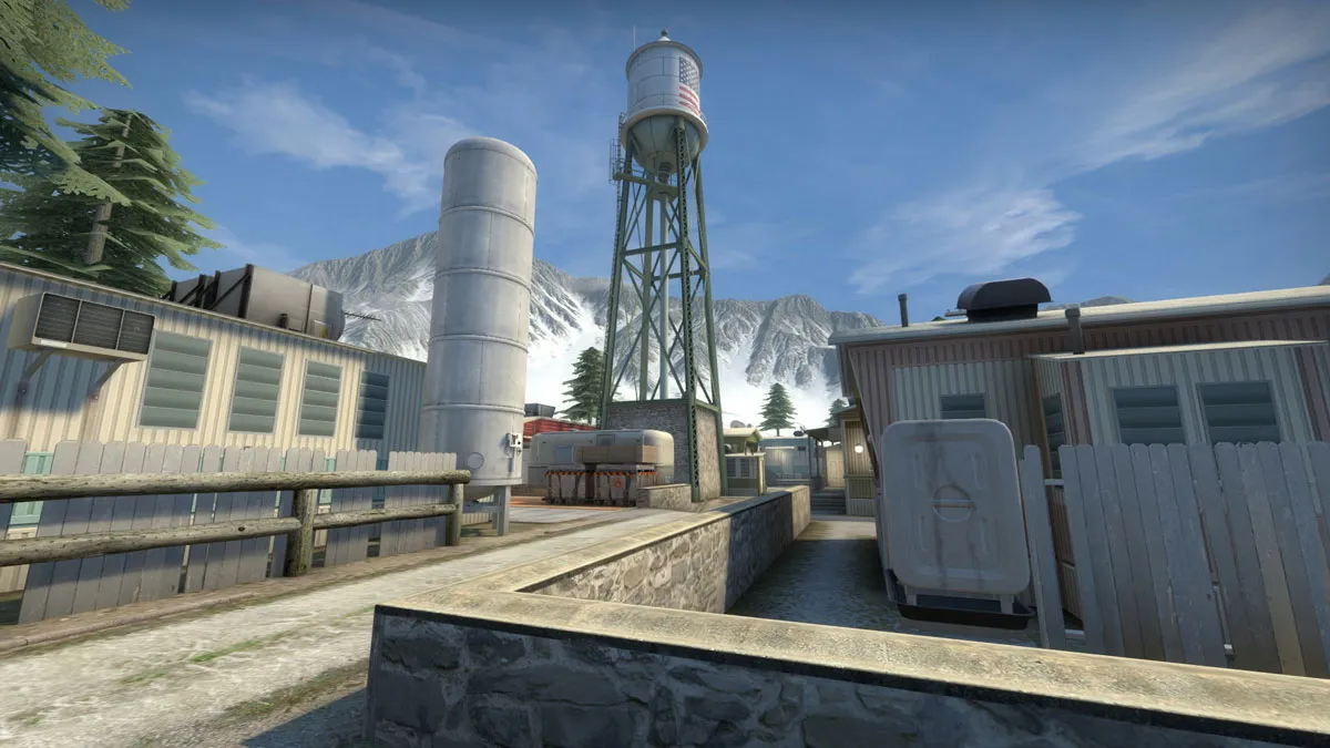
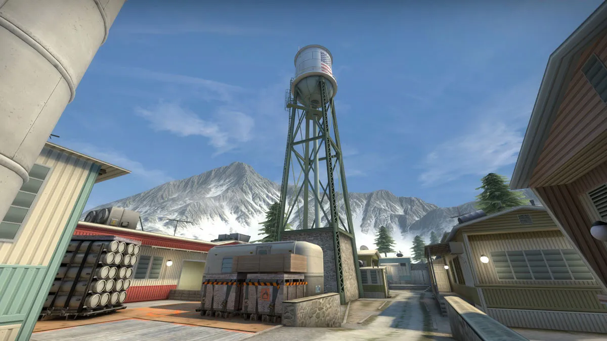
    More images of same areas, though I have done a lot more on other parts as well, and will hopefully post screens of those soon. Winnebago is first pass, and other areas have a better shape now I think. The 3d sky will have a tree line between the mountains to try and look like a forest, and fill in the empty spaces. The older one was a bit too close to the main map. When I work on it again, I will move it back a lot more so that it looks better under scrutiny.

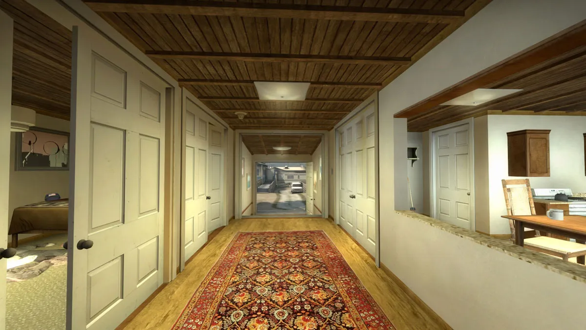
    Lot of hard edges in the interiors atm, but I will fix those when I get round to the polish stage.

  • RA7
    • September 14, 2017 at 4:37 PM
    • #29

    Looks supreme

  • Fnugz
    • September 15, 2017 at 2:31 PM
    • #30
    Quote from RA7

    21 hours ago, RA7 said: Looks supreme

    Looks Global to me! I'll see myself out...

  • TheOnlyDoubleF
    • September 15, 2017 at 4:26 PM
    • #31

    Wow it looks super cool @OrnateBaboon

  • VIOLATION
    • September 18, 2017 at 10:02 PM
    • #32

    Looks great. Really love how you've managed to make a generally simplistic and seemingly un-diverse (on the surface) theme into a really artistically beautiful map. The light pastel colors are really visually pleasing as well. Can't wait to see it in game.

  • OrnateBaboon
    • September 21, 2017 at 8:48 PM
    • #33

    Thanks for comments guys.

    VIOLATION - making things diverse is a challenge. Different colours will come in soon and more variety on the trailers, especially in areas that look too samey.

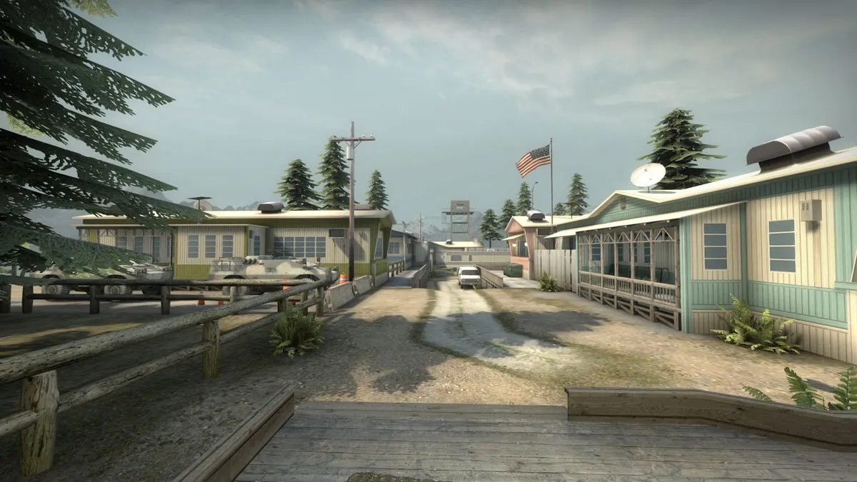
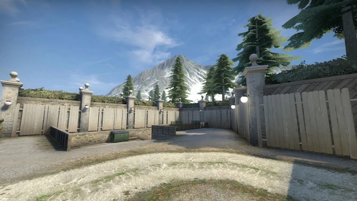
    Moved onto a new area, and thought I would show the development shots. Some horrid looking stuff in there! Last screen shows the entrances to the site which comes off the swimming pool screenshot.


  • Roald
    • September 22, 2017 at 12:27 AM
    • #34

    Simply Awsome! Maybe some plastic chairs or bench on those porches would do. Perhaps some empty beers and a beach ball or so ever. That would really make it trailerpark like

  • El Moroes
    • September 22, 2017 at 9:38 AM
    • #35

    It could become one of my favorite map, I really like the setting you choose ! :)

  • grapen
    • September 22, 2017 at 9:49 AM
    • #36

    Looking cool, though I'm not a fan of the super desaturated fog, it looks like smog to me currently :)

  • OrnateBaboon
    • March 26, 2018 at 12:58 AM
    • #37

    Some more updates. The map is at a stage where a few weeks represents a lot of progress, so all feedback on what you see is very welcome! Managed to get Skybex on board to deal with the custom art assets, so you won't be seeing any of my nooby art anymore

  • VIOLATION
    • March 26, 2018 at 4:15 AM
    • #38

    So glad to see more of this. Glad you're still putting work in, looking great!

  • fewseb
    • March 26, 2018 at 4:41 AM
    • #39

    Are the crate on the bombsite place holder or final?

    It seems strange to me that a map set in a trailer park that there would be weapon shells and large crate of something flammable just sitting around on some planks.

    Given that there a number of propane tanks in the game, I think they would be a more appropriate target for this map.

  • 'RZL
    • March 28, 2018 at 1:31 PM
    • #40

    [Blocked Image: https://i.imgur.com/u9f5j1I.png]

    Here a bit of feedback:

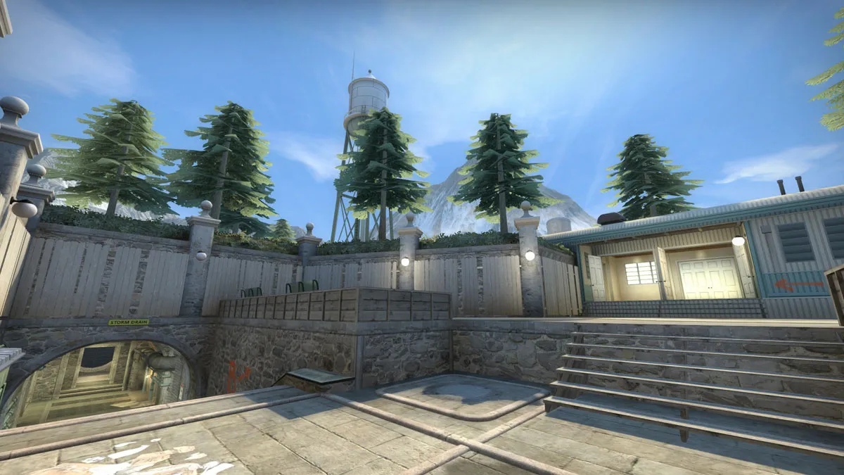
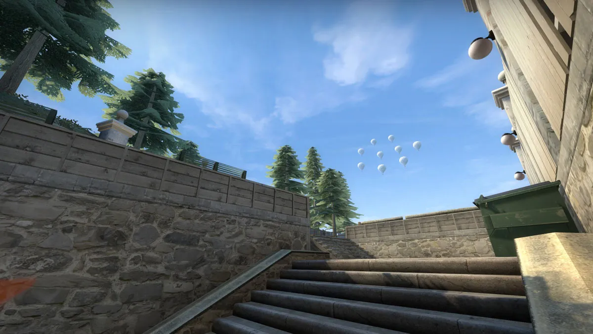
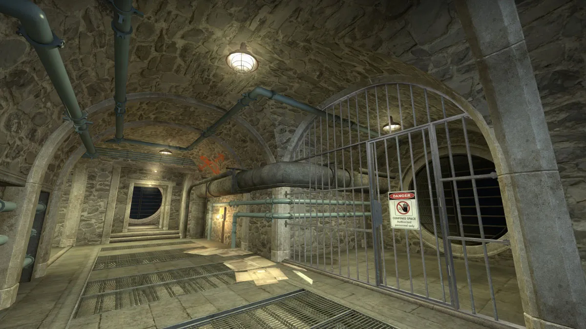
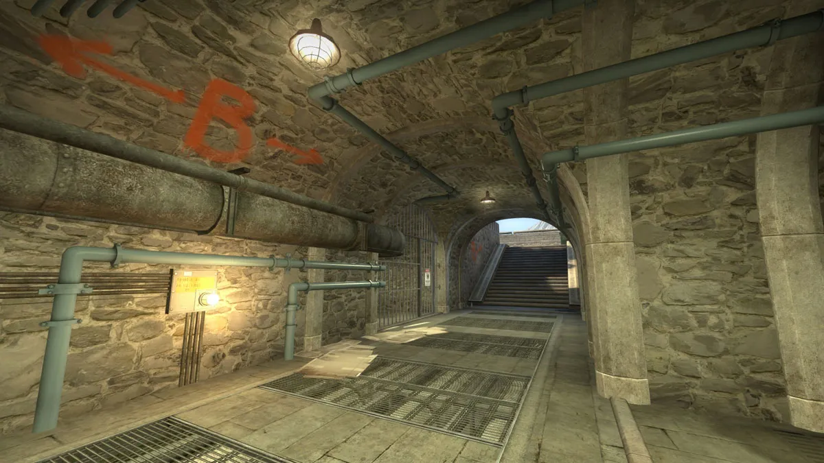
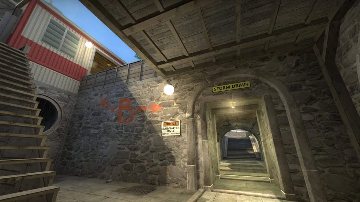
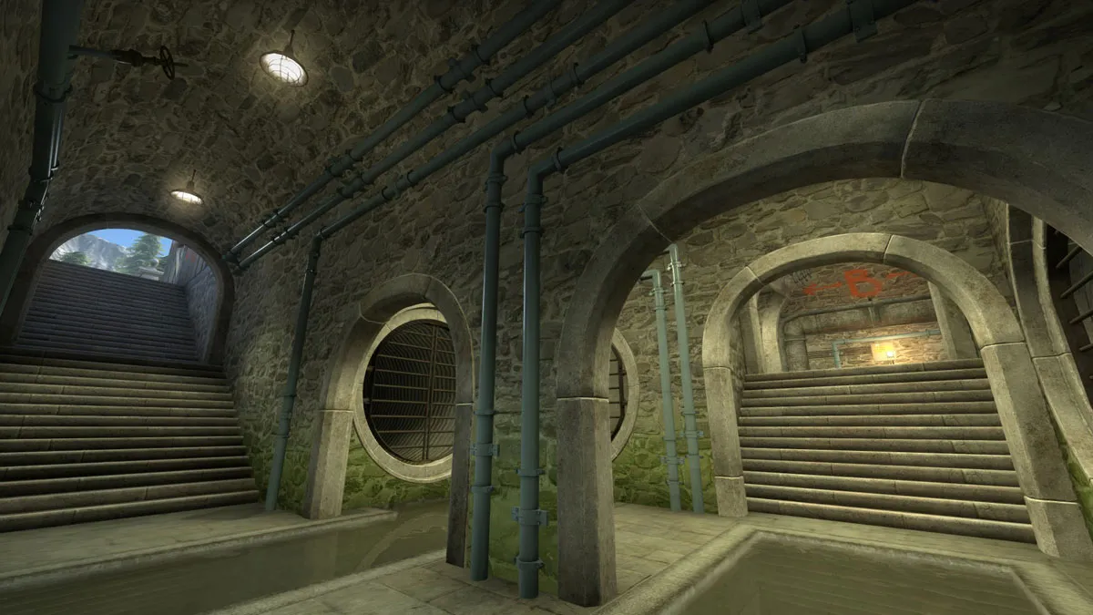
    1. The trees look a bit too repetitive and do not look very good from the angle you're looking (from below). 2. You seem to use the fence model a lot and it looks pretty wrong in front of the wall. I would get rid of that stuff there. 3. I would change the texture for the storm drain area to something that looks more like concrete, this one gives me too much of an italy vibe, especially since it looks similar to your map de_coast. Same goes to the floor trims. 4. The double double door entrance looks really wrong. I would definitely remove one of them (and replace them with a window you might be to jump through?). If it is two entrances to different parts of the interior (with a wall between) then I would replace the doors with single doors instead so you have some space between the entrances.

    Also the balloons are too repetitive and too uniformly clustered. I would spread them out a bit more in some parts and move them closer in others to break things up.

    Gameplay wise the whole map is an absolute mess and no fun at all to run around in. Prove me otherwise by giving me access to actually be able to play it

Participate now!

Don’t have an account yet? Register yourself now and be a part of our community!

Register Yourself Login
Discord

The Mapcore Discord is our lively IRC channel of the 2000s reborn. Chat about level design, gaming, and more.

Latest Posts

  1. Expert Dissertation Help for Academic Success

    smithanne090
    July 16, 2026 at 5:46 AM
  2. Any of the old guard still around? D:

    Warby
    July 12, 2026 at 8:23 PM
  3. About our archived forums

    Thrik
    June 30, 2026 at 2:12 PM
  4. Mapcore Discord

    mason_fan123
    June 24, 2026 at 8:52 PM
  5. [CS2] Valley

    Serialmapper
    June 22, 2026 at 11:56 AM
  6. Free Music / SFX Resource - Over 2500 Tracks

    Eric Matyas
    June 18, 2026 at 12:32 PM
  7. Pango [WIP]

    Elowen
    June 11, 2026 at 10:13 AM
  8. [CS2] Dvina

    Jeremy Rivera
    June 11, 2026 at 10:03 AM
  9. Bridges 2.0 by NEXSIDE, MAP SHOWCASE. ( Steam Workshop )

    MrTrane18
    June 1, 2026 at 7:46 PM
  10. Classic Maps Reborn For CS2

    SillySpaceCat
    May 31, 2026 at 10:33 PM

Users Viewing This Thread

  • 3 Guests
  1. Privacy Policy
  2. Contact
Powered by WoltLab Suite™