

Looks very good! I like the garden 

[CSGO]my first map: cs_seagull
-
-
Hey,your map looks very awesome !
The only thing that looks a bit weird is the pool.It looks like a storage for rainwater or something :D. Maybe you could add small stairs on the entrance side or texture the sourrounding soil/ground a bit different. Just my opinion and a little suggestion
edit:
Maybe add some chandelier or nice lights here it looks a bit empty
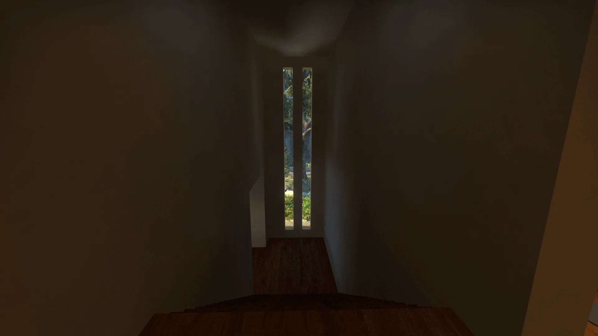
Have a nice day
-
This is the last update for the next week, because i will not be able to work on the map for that time. Still wanted to post my progress until now. Will work on the map in a week again.
 Quote from guerilla
On 30.4.2016 at 1:16 PM, guerilla said: Maybe add some chandelier or nice lights here it looks a bit empty
added lights:
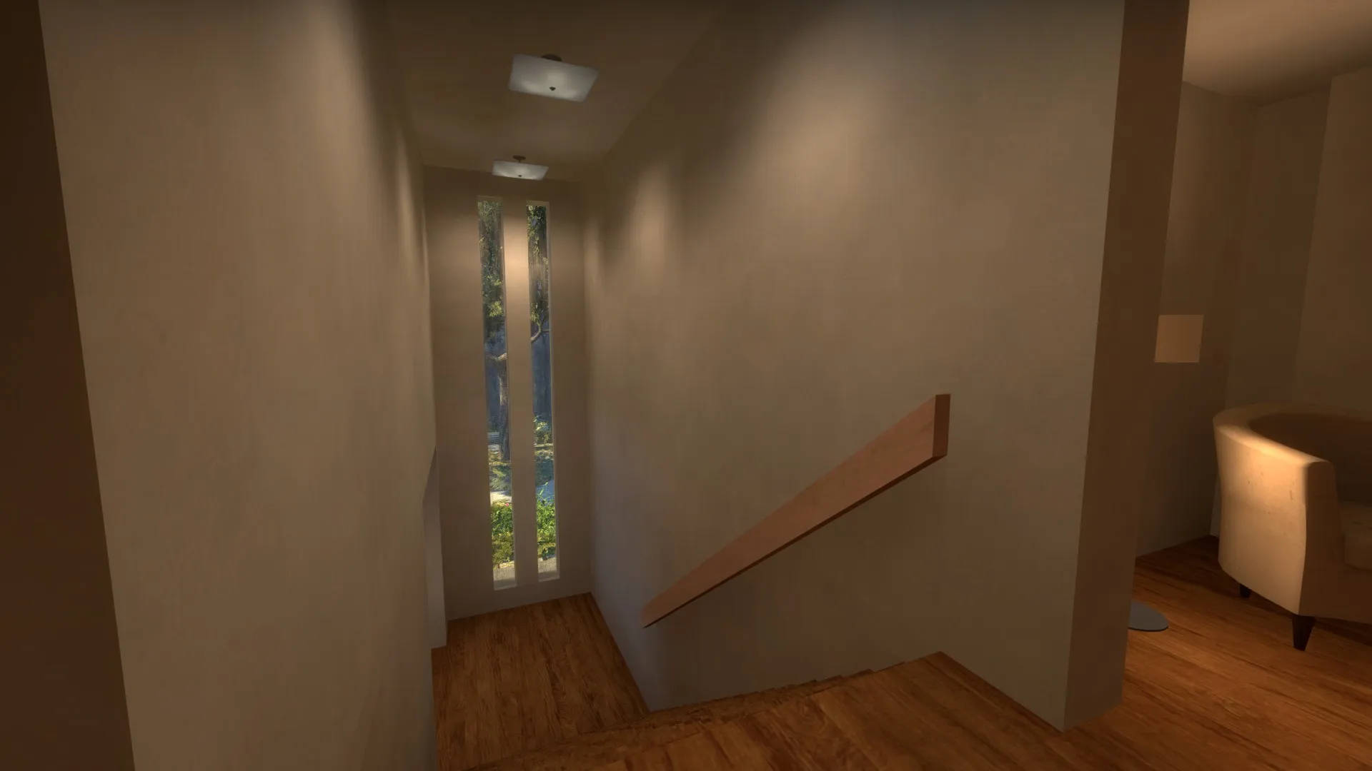
 Quote from Squad
On 29.4.2016 at 3:37 PM, Squad said: The color of the water doesn't look mediterranean at all. Try something more blue/green-ish.
changed water but I don't like it at the moment. Will change in the future
Quote from guerillaOn 30.4.2016 at 1:16 PM, guerilla said:
The only thing that looks a bit weird is the pool.It looks like a storage for rainwater or something :D. Maybe you could add small stairs on the entrance side or texture the sourrounding soil/ground a bit different. Just my opinion and a little suggestion
Will work on that in the future
-
Quote from guerilla
On 30 April 2016 at 0:16 PM, guerilla said: The only thing that looks a bit weird is the pool.It looks like a storage for rainwater or something :D. Maybe you could add small stairs on the entrance side or texture the sourrounding soil/ground a bit different
You talking of the round jacuzzi? Because the pool has steps in.
I think the round jacuzzi looks weird because the round shape contrasts a lot with the rectangle of the pool. I'm not sure how much steps would improve… I'm thinking maybe having a frame around it, so you climb over and in (usually jacuzzis are raised from the deck), or maybe just get rid of it and add detail with a couple sun-beds.
The other thing with the pool, which might look better in the game as I haven't tried it, is the deck is all a giant slab of the same color, which is in line with ultra-modern and minimalistic design, but still makes me think needs to be broken up in some way, dunno like a couple those giant square plant pots (I mean stuff waist high) and/or have the water at slightly lower level, have a bit of more visible side for the yellowish side already is there. Also water looks maybe too dark?
Might just be that the texture material needs to have some more specular and shine a little bit.
-
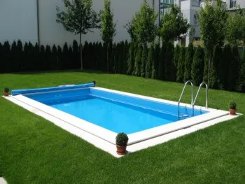
Like this. It has to be sourrounded by some other texture also it needs stairs inside so it doesnt look like a rain container or whatever you call it in english.
-
There is a step ladder to get in the pool, is visible in the screens.
As for the frame, like I explained I partially agree, but it's not absolutely necessary:
[Blocked Image: http://cdn.furniturefashion.com/image/2009/07/…ol%20Design.JPG]
Just search in Google "minimal pool design" and there are loads of decks with "no features"
https://www.google.co.uk/search?q=minim…biw=320&bih=460
thing is, you need to make it interesting by breaking up the deck around the pool, with a lounge area, deeper pool, plants etc.
Since I saw the first post I was thinking of the pool featured in Californication
[Blocked Image: https://s-media-cache-ak0.pinimg.com/736x/87/d2/22/…c0305dac2b5.jpg][Blocked Image: http://static1.squarespace.com/static/5053619…NLEY+169+v2.jpg]
no "frame" or raised edges, but you get a sense of depth and thanks to a different contrasting color on the sides, as well I think a deeper edge
-
 Quote from blackdog
On 3.5.2016 at 9:25 PM, blackdog said: There is a step ladder to get in the pool, is visible in the screens.
I never talked about ladders and a stair ladder and real stairs aren't the same thing.
-
Hey guys, i'm back and will be working on the map again. Thanks alot for all the feedback

I'm currently working on the pool should be ready by tomorrow.
I changed the texture of the pool and the texture of the water.
There seems to be a bit of confusion about the ladder/stairs. I'll try my best to clear things up.
Quote from guerilla17 minutes ago, guerilla said: I never talked about ladders and a stair ladder and real stairs aren't the same thing.
There is a step ladder like blackdog said.
I tried adding stairs but it just didn't look like i wanted it to look so i scrapped the idea.
The ladder i was using in the old version of the map is also really similar to the one in this picture of yours :
Quote from guerillaOn 2.5.2016 at 9:26 PM, guerilla said:
Like this. It has to be sourrounded by some other texture also it needs stairs inside so it doesnt look like a rain container or whatever you call it in english.
Since it isn't in a grass field i don't think it needs a different texture around it. I've seen many pools without it and i think it fits the more modern theme I'm going for.
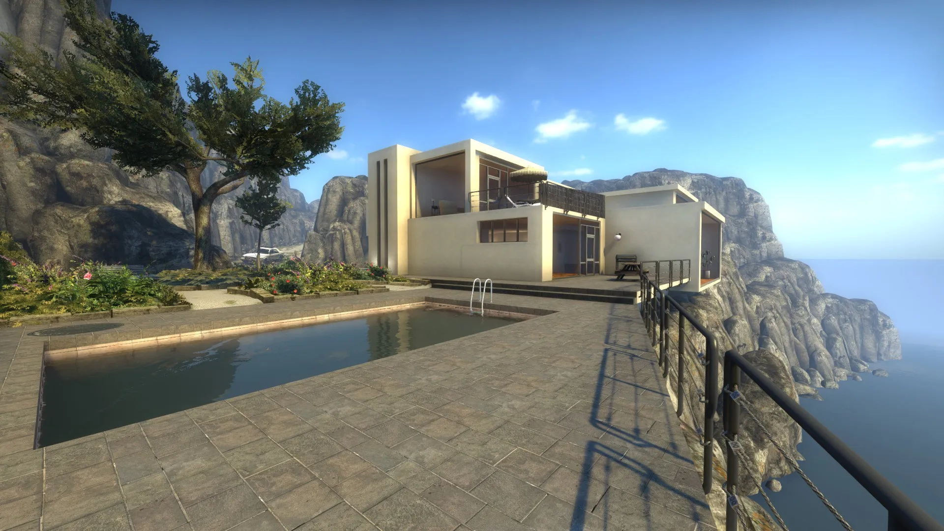
visible in this (older)screenshot:
-
Quote from PhetelysDisplay More
6 hours ago, Phetelys said: Hey guys, i'm back and will be working on the map again. Thanks alot for all the feedback
I'm currently working on the pool should be ready by tomorrow.
I changed the texture of the pool and the texture of the water.
There seems to be a bit of confusion about the ladder/stairs. I'll try my best to clear things up.
There is a step ladder like blackdog said.
I tried adding stairs but it just didn't look like i wanted it to look so i scrapped the idea.
The ladder i was using in the old version of the map is also really similar to the one in this picture of yours :
Since it isn't in a grass field i don't think it needs a different texture around it. I've seen many pools without it and i think it fits the more modern theme I'm going for.
visible in this (older)screenshot:
The pools looks awesome !
The changes made it look so much better. It was a good decision to stick with the stair ladder.Again some detail feedback :
I don't know if they are like placeholders but you used these lamps a bit often in a small area it looks a bit weird but still it's a matter of choice and perspective I just want to give my thoughts on it
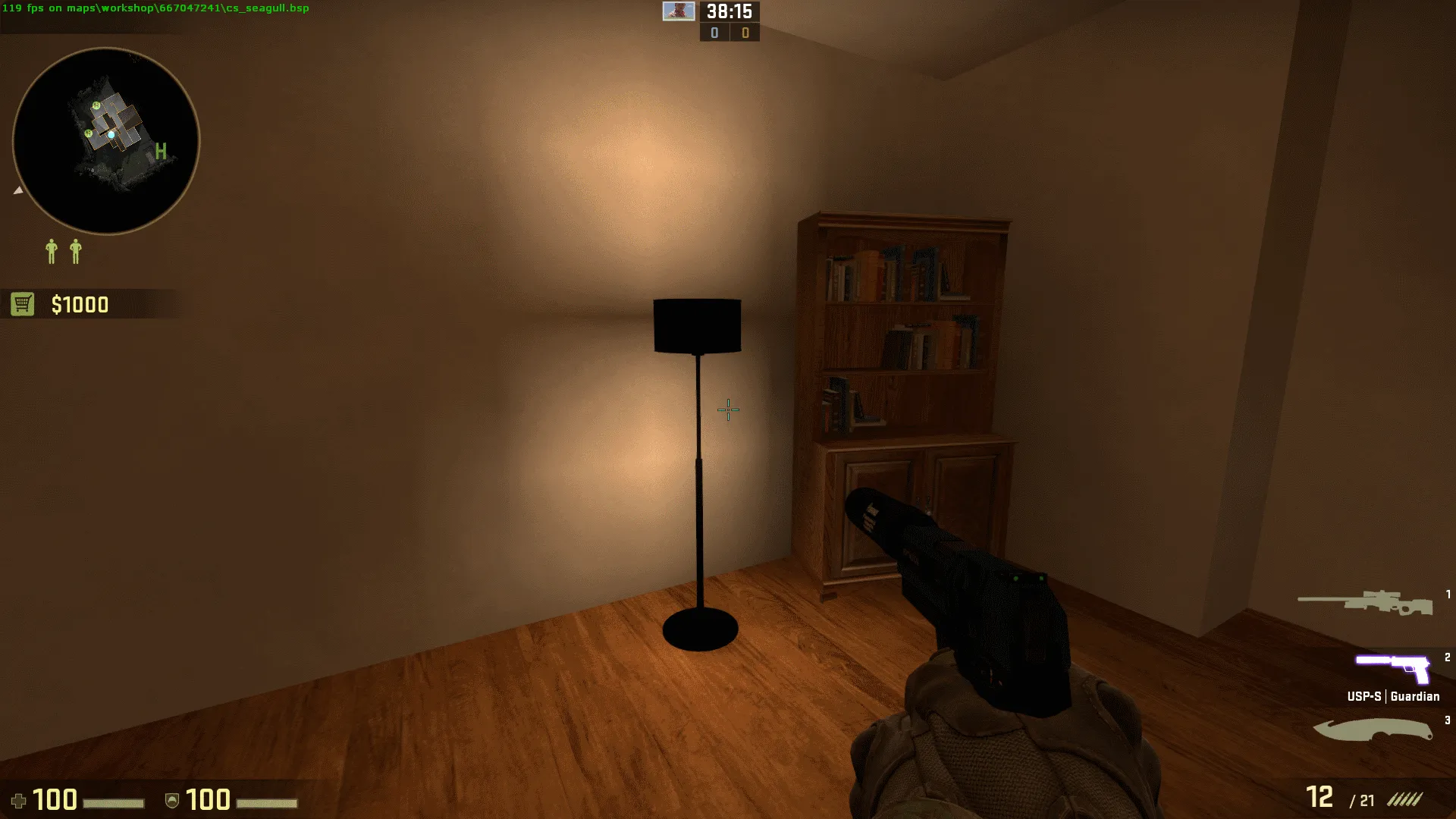
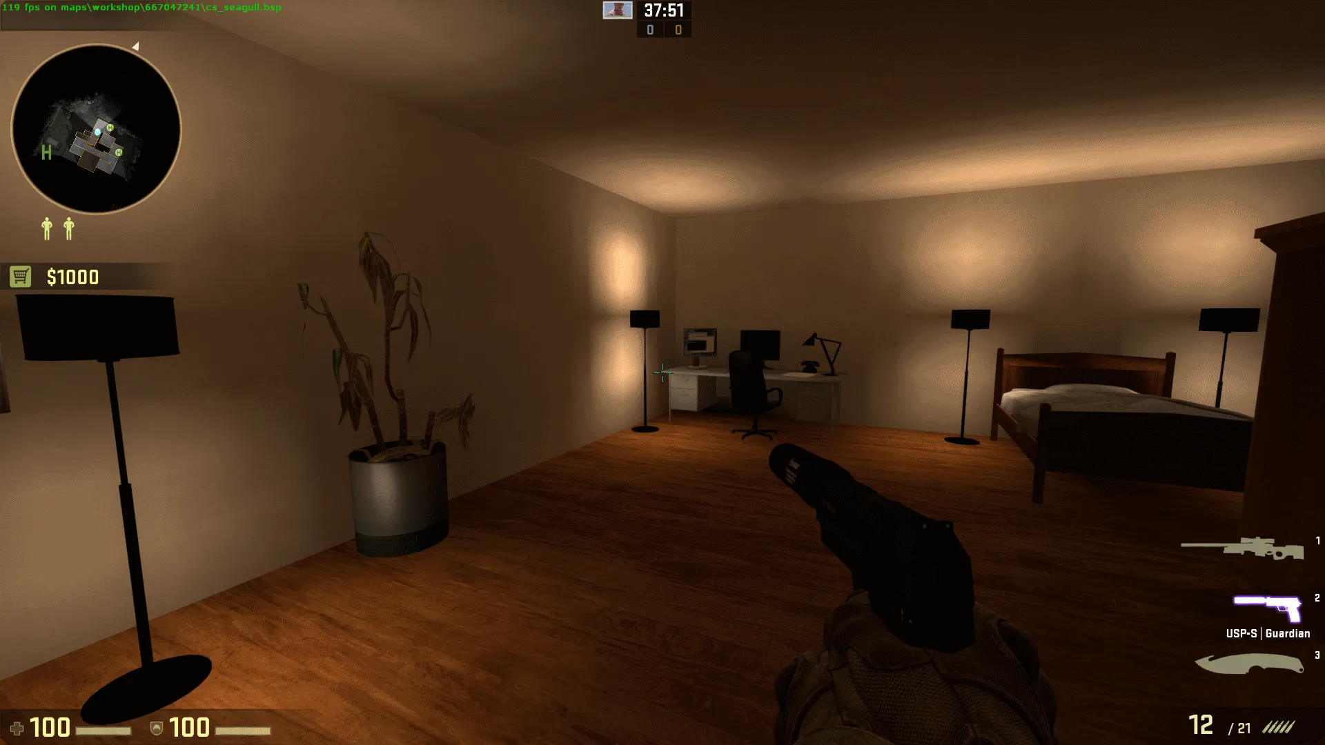
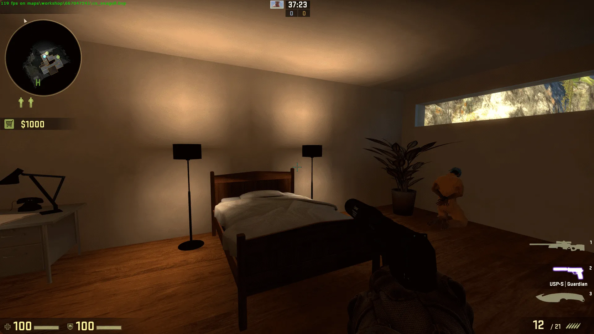
-
Quote from guerilla
11 hours ago, guerilla said: I never talked about ladders and a stair ladder and real stairs aren't the same thing.
Yes but the picture you posted didn't have steps carved in the pool itself so it was confusing what you meant.
~
Agree about the bedroom, I'd also say the window is too small for a bedroom (although there are some places like that for sure)
-
Quote from guerilla
8 hours ago, guerilla said: I don't know if they are like placeholders but you used these lamps a bit often in a small area it looks a bit weird but still it's a matter of choice and perspective I just want to give my thoughts on it
I'm really sorry about this but they aren't supposed to look that way. I forgot to add the textures to the workshop file. Thank you very much for the feedback so i could fix that mistake. This is how they normally look:
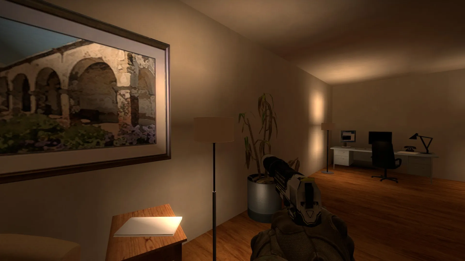
I will look into adding some windows to make the place less depending on lights. But I don't want to change the gameplay by adding windows, so i willl have to look into that.
-
I think that the bedroom doesn't look luxurious enough compared to the rest of the house (villa). Most houses with a modern style go for a much brighter look, with large windows, higher ceilings, etc. That floor also makes the whole room look dark and depressing unfortunately.
I think a room like the one below would suit the map better. It's big, clean and luxurious without being over-the-top
[Blocked Image: http://cdn.home-designing.com/wp-content/uploads/2014/06/Dusseldorf-Penthouse-Bedroom.jpg]
-
Quote from blackdog
8 hours ago, blackdog said: Yes but the picture you posted didn't have steps carved in the pool itself so it was confusing what you meant.
Ok sorry wasn't aware of that
Quote from Phetelys5 hours ago, Phetelys said: I'm really sorry about this but they aren't supposed to look that way. I forgot to add the textures to the workshop file. Thank you very much for the feedback so i could fix that mistake. This is how they normally look:
I will look into adding some windows to make the place less depending on lights. But I don't want to change the gameplay by adding windows, so i willl have to look into that.
So you could add windows and then just add this visual cover like in the picture Logic posted. Just make it in a way players cant look through.
 Quote from Logic
4 hours ago, Logic said: I think that the bedroom doesn't look luxurious enough compared to the rest of the house (villa). Most houses with a modern style go for a much brighter look, with large windows, higher ceilings, etc. That floor also makes the whole room look dark and depressing unfortunately.
I think a room like the one below would suit the map better. It's big, clean and luxurious without being over-the-top
-
Yeah the room feels cramped, ceiling is low…
To get more light what about a skylight or at least a big ceiling light and use the lamps for accent?
-
Quote from guerilla
6 hours ago, guerilla said:
So you could add windows and then just add this visual cover like in the picture Logic posted. Just make it in a way players cant look through.
I added windows and cover
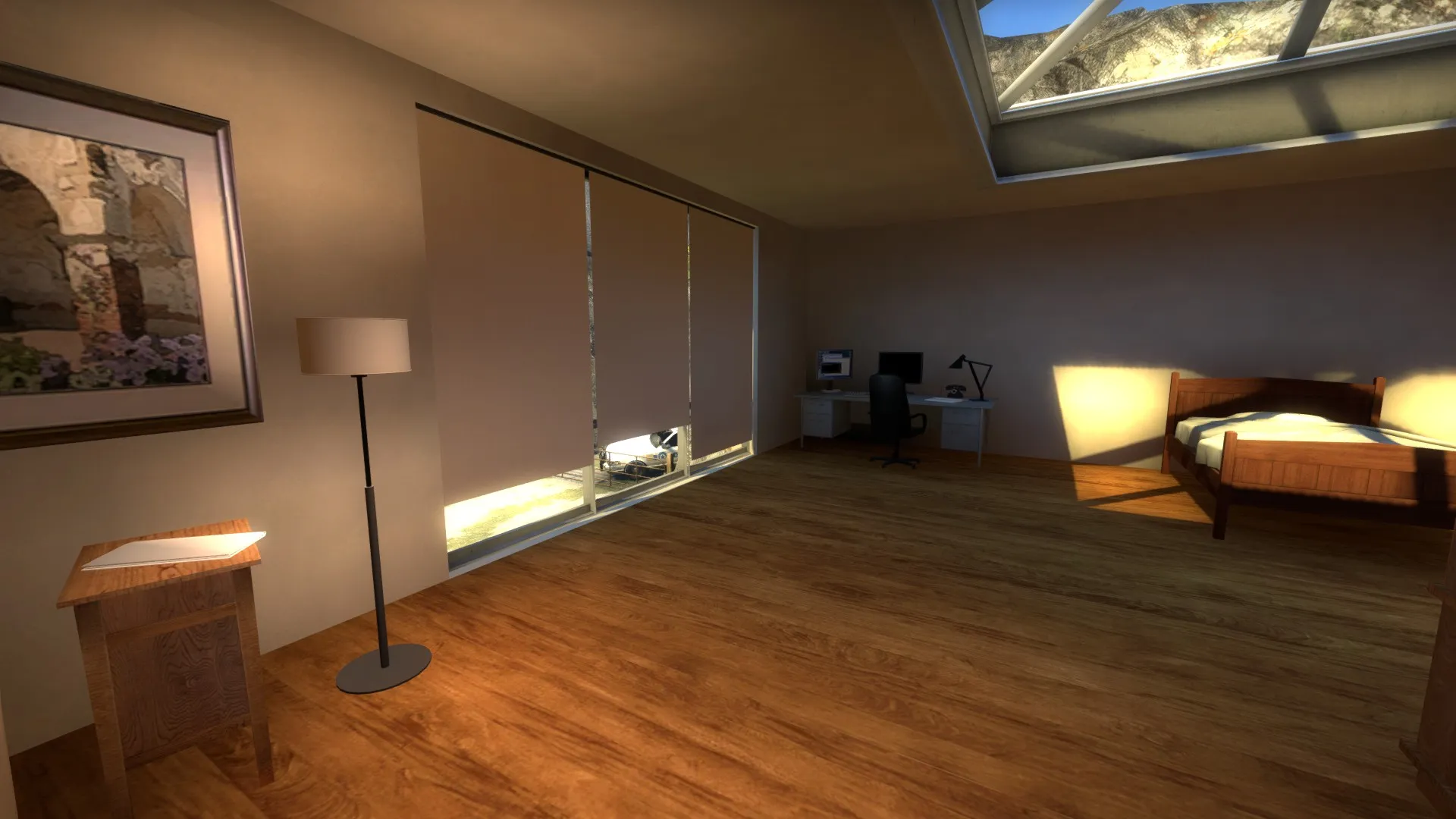
I left some space between the covers out of visual reasons, because of that i added a gap at the bottom so that cts can easily see ts when the ts are trying to peek between the covers so that it isn't a viable spot for ts to camp.
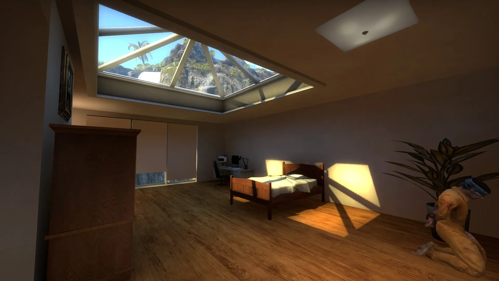
Also added this skylight to get a less cramped feel
Quote from blackdog6 hours ago, blackdog said: Yeah the room feels cramped, ceiling is low…
To get more light what about a skylight or at least a big ceiling light and use the lamps for accent?
-
Wow, you work fast!
Im loving it
now I'd say if you manage finding a more modern bed and furniture will fit better. Maybe even a feature wall/big canvas/painting to add color and break up the wall? -
Starting to look really good, but it needs more bounce light imo. And you know what Pixar says, if you can't make it right, fake it right.
To make the floor more modern I'd just make a gray version of it, boom, modern
-
Delicately an improvement!
I still think you can add some more height to the ceiling though. -
Quote from Phetelys
On 6.5.2016 at 8:42 PM, Phetelys said: I added windows and cover
I left some space between the covers out of visual reasons, because of that i added a gap at the bottom so that cts can easily see ts when the ts are trying to peek between the covers so that it isn't a viable spot for ts to camp.
Also added this skylight to get a less cramped feel
The Windows are a huge improvement on the map. The interior is now less claustrophobic.
Keep the good work up!
-
Participate now!
Don’t have an account yet? Register yourself now and be a part of our community!