

Uploaded a version to the workshop for playtesting. http://steamcommunity.com/sharedfiles/fi…s/?id=574947704
Going to fill out a mapcore playtest for it later today as well.

Uploaded a version to the workshop for playtesting. http://steamcommunity.com/sharedfiles/fi…s/?id=574947704
Going to fill out a mapcore playtest for it later today as well.
Playtest seemingly went pretty well, and while I was absent for it I have gathered a lot from the chat/feedback about various aspects of the map and how to improve it. From that time a lot of visual improvements have also occurred with layout out a lot more of the basic architecture.
[Blocked Image: http://i.imgur.com/OjcvhoZ.jpg]
this is the new A site, where I have entirely blocked off the dark back of A and detailed some surrounding buildings.
[Blocked Image: http://i.imgur.com/a3azzsA.jpg]
I have removed the bollards from the sidewalks almost everwhere throughout the map as they caused players to get annoyingly snagged at inconvenient times throughout the game. I have also moved this first fence out of the street in a sort of test. I absolutely hate blocking vision with crates and fences but I do not have an alternative as of now.
[Blocked Image: http://i.imgur.com/HR7oUgr.jpg]
With reports of the B bombsite feeling a bit too cramped, I removed some of the cover props in an attempt to open it up a bit, along with raising the fences on the stairs so players can not jump over them. If the site is still reportedly too cramped I may attempt to open some of the space more.
[Blocked Image: http://i.imgur.com/9y98mhw.jpg]
Finally some work was done on the Mid - A connector and its adjacent building, turning it into a sort of elevated cafe.
If anyone tested the map on their own, or heldback and type of feedback during the playtest, I'd greatly appreciate it if you could share it here. The map is still heavy WIP and I'm open to essentially any advice or changes.
I would rebuild B more. The actual site itself is so small...The two doorways right beside it led to really weird mini-flanks too.
Quote from VIOLATION[Blocked Image: http://i.imgur.com/9y98mhw.jpg]
Finally some work was done on the Mid - A connector and its adjacent building, turning it into a sort of elevated cafe.
Pretty!
Visually, like it was noted to OrnateBaboon for de_coast, in this screenshot the pointy platform should be probably softened by chopping the tip. You can very well cut it to have it the width of the "column"(?) and rotate the last column 90 deg to keep the geometry clean.
Fantastic map.Would like help you with models for this map write me on Facebook or Steam Cheroke98cz.
http://source.gamebanana.com/prefabs/7048 something from my work
 Quote from Pavel Turzo
http://source.gamebanana.com/prefabs/7048 something from my work
Your work? Not really, you stole it off the unity store!
 Quote from Quotingmc
Your work? Not really, you stole it off the unity store!
I think he was talking about the later link to facebook, when he stated "something from my work" (note that I do not have facebook and can not view the facebook link and its content). He states this at the bottom of the page for the rock models on gamebanana:
"
This models did someone else .I only recompiled them for source.
Source https://www.assetstore.unity3d.com/en/#!/content/6947"
I think it is very misleading and I don't think it's apropriate to be showing models that you have ported, when you're trying to promote your modeling skills.
@Pavel Turzo I do not think it was your intent to mislead anyone into thinking you made the rock models, only to show your ability to port models. But, I think you should rephrase and remove the links showing ported models and instead only show work by yourself, when proposing to help with modeling.
And try to be as clear as possible in messages to minimize the amount of misunderstanding.
Yeah I took this from Unity mean rocks, but others ? Is writen there from where is this model! I did this for one guy . Question is did you recompilation from Unity in to source ? With 20 models trust me hard work.But normaly I am doing models all original for map .Only recompiled stafs and not nice I am giving free on stupid website like Banana.For noobs.
It looks very nice, but for the future try making a greybox map then detail so that if you do mess up somewere you dont have to remake everything, only a few brushes
Some visual and layout updates. Turzo made a whole bunch of nice shutter models today and I threw them in a few spots as well.
[Blocked Image: http://i.imgur.com/Tk69rTd.jpg][Blocked Image: http://i.imgur.com/x4tZmir.jpg][Blocked Image: http://i.imgur.com/S93c18h.jpg]Mid cover updates:
[Blocked Image: http://i.imgur.com/A5NEqwf.jpg][Blocked Image: http://i.imgur.com/s4GZQDC.jpg]
Some routes/connectors:
[Blocked Image: http://i.imgur.com/kQgiQTg.jpg][Blocked Image: http://i.imgur.com/piNUnxZ.jpg]A bombsite:
[Blocked Image: http://i.imgur.com/gfoYC35.jpg]
New B Window (this is a bit of a test, will see how it plays out):[Blocked Image: http://i.imgur.com/txyt28i.jpg]
Cheers
B was already pretty hard to access as a T and that was before CTs had any proper height advantage. The whole main entrance for Ts into B is pretty convoluted:
I didn't find the route from mid to effectively really alleviate any of the access issues on B
New update to the workshop here: http://steamcommunity.com/sharedfiles/fi…s/?id=574947704
Probably planning on setting up another playtest shortly.
Quote from VIOLATIONWorked out a rough layout just with some bot playtesting over the past few days. Hoping to get a lot more on that done and get it tested it out on the server at some point.
This layout is unplayable. Each plant have only 1 linear way from T side. Map have bad structue. You need to improve the framework
Yeah thankfully that was never actually a layout I tested for more than a day back when I was initially struggling
It's been quite a while since the last update, but progress is still being made. A lot of work has gone into detailing the map and making more graphically pleasing recently, though I won't lie and will say I have been getting quite frustrated with creating the modern-city-look come off as natural while not seeming under-detailed or too bare.
Regardless, here's some screens from the latest compile:
[Blocked Image: http://i.imgur.com/2ASUDiS.jpg]
[Blocked Image: http://i.imgur.com/yDtPpm0.jpg][Blocked Image: http://i.imgur.com/xkDLhaB.jpg][Blocked Image: http://i.imgur.com/ZD7Iy6c.jpg][Blocked Image: http://i.imgur.com/vlqslof.jpg][Blocked Image: http://i.imgur.com/vZseEcX.jpg][Blocked Image: http://i.imgur.com/gaPjz8Y.jpg][Blocked Image: http://i.imgur.com/cjSD2Hm.jpg]
and here's an extra look at the building I created overlooking B bombsite and visible from a decent amount of the map as of now:
[Blocked Image: http://i.imgur.com/0zVvOna.jpg]
As always, cc/suggestions are greatly appreciated and encouraged.
Cheers.
It all looks really nice, but one thing I would say is that a lot of areas look too dark due to shadows?
Also, I personally dislike the birds flapping around as they cast shadows and are quite distracting at times. Easily mistakable for grenades.
And one final thing: Using "mat_postprocess_enable 0" will get rid of the vignette in your screenshots (but also any colour correction)
Back again, birds are gone.
Lots more buildings have been textured/new art pass, etc. Still kind of unhappy with how certain things are turning out but hoping to find the right balance soon enough. Also had a little skybox change (old one was bugging out so this is probably a temporary change) and still feel like I need to brighten some areas considering how many shadows there are (might end up entire redoing the lighting at some point)
[Blocked Image: http://i.imgur.com/MZYWRxu.jpg][Blocked Image: http://i.imgur.com/l0FFfeN.jpg][Blocked Image: http://i.imgur.com/m0rYjrd.jpg][Blocked Image: http://i.imgur.com/0XZr4B1.jpg][Blocked Image: http://i.imgur.com/e41WKh7.jpg][Blocked Image: http://i.imgur.com/WZ25yqP.jpg][Blocked Image: http://i.imgur.com/Cjl0eUv.jpg]
As you can see it's a lot of custom assets for the most part, and I hope to continue to increase the amount of new content used in the map.
Anyways comments and criticism is greatly appreciated and encouraged as always, especially with a lot of the new detailing done to some areas. Planning on updating workshop/possibly running another playtest soon as well.
Hey,
I can see this is turning into something special, so I thought I'd just point out one thing that really stuck out to me while looking at these.
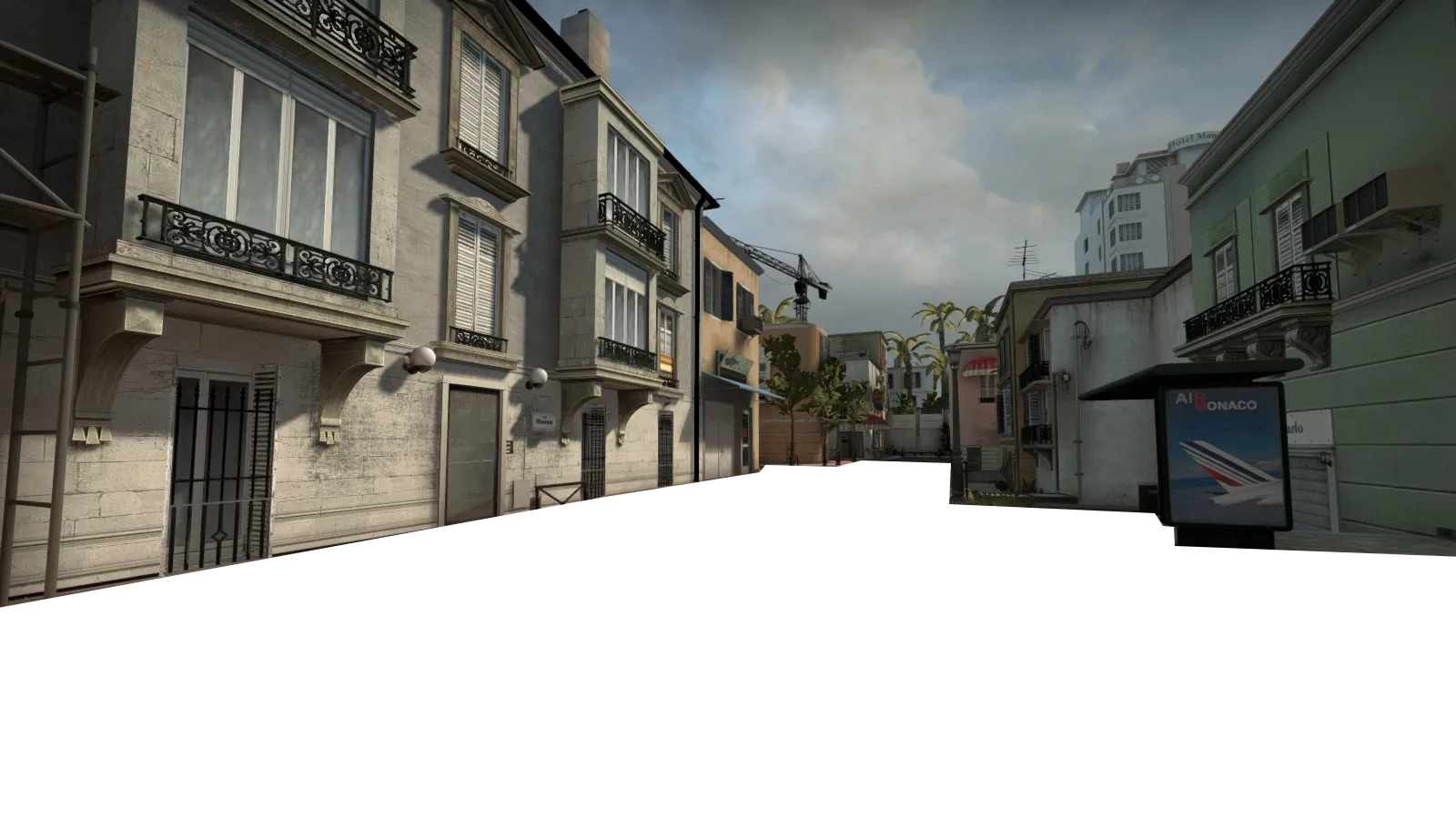
This looks like something you'd expect to see in a final level, great polish, lots of detail. On the other hand...
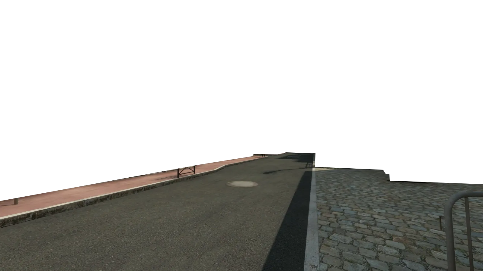
This looks like something from a really early detail pass.
I know Monaco is really clean, but it comes off looking really unfinished in these shots. Subtle detail work on the ground areas will really pay off in tying everything together I think.
Sorry if this is something you were already planning, just my thoughts.
Very nice! Hope to see this in a new operation! 
To start out, the layout of this map is very creative for clover and in fact probably the best clover I've seen
I could name pros for hours on this map, but currently it's even in gray wall, so I'll just go over kinda iffy things in my eyes:
Don’t have an account yet? Register yourself now and be a part of our community!